Showing posts with label design theory. Show all posts

Saturday, July 23, 2016

5 Must See Infographics for Design Students

An infographic about infographics
An infographic about infographics - click to enlarge
Don't know what an infographic is? Well we have even provided you an infographic on that too! See the example above. A well-designed infographic like the ones below can help you simplify a complicated subject, in case the subject is Design and we have carefully selected 5 must see infographics for any young designer or design student. We hope you find them useful.

Colour Theory Infographic

design colour theory infographic
design colour theory - click to enlarge

The design infographic above from paper-leaf.com covers all the main areas of colour theory for design. When presenting a design or an idea your choice of colours is very important. It is very important for a designer to understand the way colours are put together as this may help in the selection of the right colour scheme for a particular age group. You can learn more about colour design in design by clicking here.

Design Process Infographic

The steps in the design process
The design process - click to enlarge

The design process is the single most important piece of design theory that a designer needs to know. This design infographic outlines the stages of the design process and the order in which they are to be completed. It also highlights that design can be a cyclical process which is in constant evolution. If you want to know more about each stage of the design process then you can read more >>>


Design Careers Infographic

Careers in Design
Careers in Design infographic - click to enlarge

This handy little infographic is from photoshop-plus.co.uk and it outlines some of the main careers in the design area and the salaries available to designers. However the design of the infographic itself can also be used as an educational tool for design students as it's clean and crisp layout combined with the bright colours of each elements contrasting nicely with the light grey background. Click on any of these links to learn more about a career in web designinterior designgraphic designgames design or furniture design.

The Elements of Design Infographic


The elements of design
The elements of design - click to enlarge

The design infographic above simultaneously lists and demonstrates the elements of design.The Design Elements refer to the different types of parts that can be used in the creation of any given composition or design. These elements can be combined and arranged in a variety of ways to create an endless variety of designs, both two and three dimensional. If you would like to learn more about each of the elements of design you can read more >>>

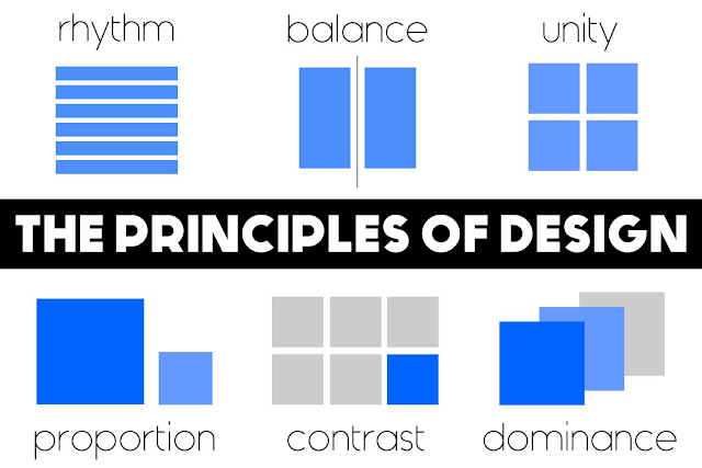
 The Principles Of Design


The principles of design
The principles of design - click to enlarge

The design infographic above simultaneously lists and explains the 6 basic concepts or theories in the area of design, collectively known as the principles of design. They are Balance (Alignment), Rhythm (Repetition), Proportion (Proximity), Dominance (Emphasis) Unity (Harmony) and Contrast. Theses principles are sometimes know by different names hence the brackets.They represent the basic rules of how to arrange a composition and create a successful design. In order words they guide us in the way we arrange the elements of design. Sometimes we look at an image or object and we find it aesthetically pleasing or easy on the eye but we may not quite understand why - the reason is that one or more of the principles of design are at work. If you would like to learn more about each of the principles of design you can read more >>>


Wednesday, May 25, 2016

Principles of Design

The Principles of Design

It is recommended that you read the notes on Design Elements before reading these notes as some of the terms used here are explained in that section.

There are 6 basic concepts or theories in the area of design, collectively known as the principles of design; they are Balance (Alignment), Rhythm (Repetition), Proportion (Proximity), Dominance (Emphasis) Unity (Harmony) and Contrast. Theses principles are sometimes know by different names hence the brackets.They represent the basic rules of how to arrange a composition and create a successful design. In order words they guide us in the way we arrange the elements of design. Sometimes we look at an image or object and we find it aesthetically pleasing or easy on the eye but we may not quite understand why. The reason is that one or more of the principles of design are at work. These principles can be applied regardless of the style or genre of the design being created..

Balance:

Balance refers to the arrangements of design elements within a composition, how they relate to each other and the overall composition. Elements can have different visual weights dependent on their size, shape or colour and if positioned poorly they can unbalance a composition. There are two types of balance - symmetrical and asymmetrical.

Symmetrical balance
Symmetrical balance

Symmetrical balance is where the weight of a composition is evenly distributed either side of the centre point of the composition, usually horizontally or vertically (although radial symmetry is also possible).

Asymmetrical balance

Asymmetrical balance is where the weight of a composition is not equally distributed (but is still visually balanced). This is much harder to judge than symmetrical balance but can be more visually interesting.


Contrast:

Contrast refers to the arrangement of opposite elements in a piece so as to create visual interest, excitement and drama. This can be done in a variety of ways such as through light vs. dark colours, rough vs. smooth textures, large vs. small shapes, etc.

design principle contrast
contrast

Dominance / Emphasis:

Dominance (also known as emphasis) may seem similar to proportion but is actually more to do with the visual weight of an element. The dominant part of a composition is the one that stands out the most or appears closest to you. There are 3 stages of dominance: dominant, sub-dominant and subordinate.
principles of design dominance
dominance in weight and positioning

Dominant is the primary object/area, the one with the most visual weight, usually appearing in the foreground.

Sub-dominant refers to the secondary object/area, usually found in the middle ground of the composition.

Subordinate objects/areas carry little visual weight and usually appear to recede into the background of the composition.


Rhythm:

Rhythm can create a sense of movement in a composition by repeating or alternating elements (often but not always in a pattern). There are 3 main types of rhythm, each defined by their suggested meaning or the feeling they evoke in the viewer.

Progressive Rhythm
Progressive Rhythm

Progressive rhythm shows a progression of lines or forms to create a sense of moving forward or up.

Flowing Rhythm
Flowing Rhythm

Flowing rhythm implies a more natural sense of movement in a composition through the use or wavy lines or fluid forms usually or unequal size and length.

Regular Rhythm
Regular Rhythm

Regular rhythm is where the elements used are of the same or similar size, length and weight and are positioned in a pattern (usually but not always).


Scale / Proportion:

Proportion (also known as Proximity) is simply the comparative size of elements (usually shapes) relative to each other or the overall composition. Proportion can be used in a composition to create a sense of distance or demonstrate a size difference. Proportion can also be used to create or unhinge the balance in a composition as their visual size and weight will automatically establish themselves in the composition.


Proportion/ Proximity:Proportion/ Proximity:


Unity / Harmony:

Unity refers to the relationship or connection between the various parts within a composition and their relationship or connection to the composition as a whole, it is often achieved by utilising a number of the aforementioned principles. Unity can give a sense of entirety or wholeness to the composition or equally break it up and create a sense of variety or disharmony.

Unity
Unity

An image with good unity will draw the viewer in and focus them around the one area or a few connected areas and generally get the point across very quickly, so are therefore ideal for advertising. Images/compositions without unity can be difficult to read or visually awkward.

Disharmony
Disharmony


Attention Grabbing Design Techniques

Any Of These Grab Your Attention...? The One that did says a lot about you.

People in modern day society have to deal with an overload of visual material on a daily basis. Advertisers, marketers and designers are now all fighting to get our attention. Ads, poster campaigns, street art, billboards, window displays and even the side of buses are used to promote new products and services. Designers do their best to create well laid out and visually interesting images using the design elements, principles and composition techniques.

But with all that's going on in our own lives and around us how do they stand out from the crowd and grab our attention? Here we discuss 7 commonly used attention grabbing techniques.

Humour:


Funny Image

This is where a funny image, slogan or video is used to make us laugh or smile. It is proven that people tend to remember and retell funny stories, jokes and forward funny e-mails. In this way the product or service is also being remembered. Fun is also a positive image for a company, especially one that is trying to reach a younger audience. What examples can you think of?

Sexy:


Sexy Image
Bet you didn't scroll past that image! This is a simple and straight forward technique where a sexy/beautiful man/woman is used to grab the attention of the viewers. Often the person or people being sexy or scantly clad has absolutely nothing to do with the product or service. For example an ad for bikinis would warrant having a woman wearing a bikini in the ad where as an ad for a car or perfume would not, yet it a a common practice in both.

Surreal:


Surreal Image
This refers to something that appears real but that logic tells you cannot or should not be real. For example should you awake to see a giraffe in your room, your eyes tell you it is real but your mind tells you it is not logical! These type of ads have become more common in recent years with the rise in software technologies such as Photoshop and Final Cut. These has also given life to a new type of internet ad referred to as virals.

Original:


Original Artwork
This is where a totally new idea/image/drawing/buzz word is created. It will stand out from the crowd because it is new and has not been seen before. Sounds simple but it is very difficult to create something totally new that is unlike anything seen before or at least different enough to grab attention.

Bright Colours:


Bright Coloured Attention Grabbing Technique Used In This Advertisement
Red and Yellow are traditionally the brightest colours with red being the brightest during the day and yellow the brightest at night. This is why road signs are predominantly red and yellow. Multinational companies such as McDonalds and DHL use both colours in their logos. Bright tones of all other colours can be just as effective though. For example the marketing material for the International Fleadh 2010 and 2011 in Cavan used vibrant, almost fluorescent cyan, magenta and green.

Shocking:


This technique is fairly self-explanatory in that it uses shocking imagery or language to shock the viewer into paying attention.


Iconic:


iconic advertising technique
The icon that is Beyonce is used by Pepsi in an iconic advertising technique

This is where an iconic (instantly recognisable) image, person, symbol or even voice is used to grab attention. Celebrities endorsing products falls into this category but using symbols such as the Nike 'swoosh' or the McDonalds 'golden arches' is also a form of iconic attention grabbing.


Tuesday, March 29, 2016

Games Design Process

Games Design Process
The Games Design Process

The computer games design process is based on the general design process but has a process which is solely focused around the area of computer games. The headings differ from those in the general design process but they are effectively the same steps just broken down further and retitled for a particular task. The overall process takes on the form of 3 major stages with each containing a subset of more specific stages. The stages are called pre-production, production and post-production. As the names suggest the processes central objective is the creation of the game. The stages are discussed in theory below and the application of this theory is explained through text and video tutorials on this website. Just use the search bar to find what you need.

Pre-production:

Analysis of Brief/Sector:

If you are designing a game for a client or for a college project you will be given a brief (set of instructions) that you will need to follow. Read these carefully and identify the key requirements that you need to fulfil. If you are designing the game for yourself then you will need to analyse the existing market, identify a gap or choose a game genre, engine and target audience. In this way you are creating your own brief.

Research:

Research is an important part of any design project and it will help you to identify possible software to use, genres to choose, ideas to develop, characters to animate and much, much more. It is also important to familiarise yourself with games already on the market as these will be the competition for your game and they will have set the standards that you need to meet or beat for your game to be successful.

Brainstorming: 

This is just a buzzword for idea generation and although the process may sound simple coming up with an idea for a game that is both original and interesting is very difficult. For example a FPS where a senile granny goes on a shooting rampage in a local park wearing a hospital gown, carrying two bags of shopping and shouting "quiet down!" may well be original but is it interesting to your target audience or even politically correct? I think not. This stage needs time and consideration; For help and assistance visit our article on idea generation.

Game Concepts/Objectives: 

Once you have decided on the basic idea for the game you then need to develop it further. What is it called? What are the characters called? What are they like? What is the objective of the game? How many levels? Where is it set? In what time is it set? All these questions and more need to be answered in order to develop a fully working, feasible and interesting game world that the player will want to get involved with and interact with.

Concept Art: 

Having decided on all the details, you then need to develop the style of the game. You will do this through concept art. Concept art demonstrates how the characters, terrains, building and objects will look. They may be in a cartoon style, a photo realistic style or anywhere in between.

Map development: 

Now that the details are in place and the style has been chosen, the layout of the game world must be considered. Is it a free roam map? Is it broken into territories or sections? Is it an island? These choices are yours to make (unless specified in the brief). This stage does not need to be too detailed and is merely intended as a basis for the main structure of the game.

Sketched Level Design: 

This stage develops on the level/game map and breaks it down into more detail. In these sketches you will sketch building plans, and map plans, level paths and more. These sketches will include the positioning of enemies, objects, pick-ups etc. It is a vital stage in the game design process as it the first and last time that you should be making actual game layout decisions which will directly affect the gameplay. You should base these decisions around the previous stages and the outcomes of your work during them.

Production:

Scale and Proportion:

Any game or level can appear huge or tiny depending on the scale of things relative to the character. As soon as you begin the production stage of your game, regardless of the software or game engine being used, you should place a character template or similar in the level to guide you in the correct scaling of your level.


Blocking out the Level:

This process is used to quickly layout the main sections and areas of a level. Each block may represent a building or cliff or vehicle or object etc. and doing this will allow you to quickly and easily get a sense of the environment you have created and make any necessary positional changes. It is also an ideal way to break down a large level into more manageable areas/blocks which can be detailed one at a time.


Adding Textures:

Textures should only be added after a level has been blocked out and all static meshes have been added. This is because textures are easier to edit and change than meshes and it is therefore better to match textures to meshes than vice versa. Most game engines will have a library of ready-made textures but creating your own is recommended as it will give your game a more original feel.

Adding Lighting: 

Lighting is one of the most important elements to a 3D game. Good lighting creates atmosphere, hides enemies, build tension for the player and makes a game look more realistic. Subtle changes and constant lighting rebuilds will take a lot of time so allow for that in your planning. Poor lighting cheapens a game, makes it look false and boring. Put in the time the time to get the rewards.

Adding Functionality and Interactivity:

As good as quality textures and feature lighting will make you game look unless it also has interesting and challenging elements for the player to interact with or use then it will not be successful. Things as simple as adding light switches and sliding doors add so much to a game by keeping the player constantly active as they roam around. More complex elements like elevators, vehicles, countdown clocks etc. will further enhance the player's experience.

Adding A.I.:

Artificial intelligence refers to elements in the game which can react to the players' movements, actions or decisions. They may be enemies or friendlies or other. Although complex to programme, once one is programmed correctly the same code can be used on an infinite amount of the same characters or only subtly edited for different characters.

Cinematics: 

These are short "movie" like interludes in the game used to inform the player on the game mission or objectives, give character information, hand out clues, show dialogue between characters etc. The reasons for using them are up to you but they are undoubtedly a great feature and add a sense of professionalism to your game while allowing the player a short respite from the action.


HUDs and Menus:

H.U.D. stands for heads up display and refers to the on screen game information which is displayed to assist or inform the player of what is happening. Items commonly displayed in the HUd are ammo, time, game map, health etc. The HUD needs to provide this information without intruding into the view of the player while playing the game, in most games the HUD can be toggled on/off. The menu is the first thing the player sees so it is great if it is interesting and enticing however the main function of the menu is of course to provide options for the player. Be sure your menu is clear and easy to use above all else.

Post-Production:

Testing: 

Once the game is packaged the process would appear to be complete but rigorous testing through gameplay is still required. Testing the game in the UDK editor as you go along is not sufficient to guarantee the game will be bug or glitch free. Many glitches are obvious after a few plays of the game and even if glitches are absent it is important to sure the game does not lag or freeze during certain elements of play.


Redesign: 

Based on the findings during the testing process various elements may need to be fixed or redesigned.

Packaging: 

Packaging the game refers to the act of compiling the game folders and files into an executable version of the game that others could download, install and play. Although this is one of the last stages its success is dependent on the correct set up of the level map and related files in the early stage of the production stages.

Promoting: 

Any game needs to be well promoted through eye-catching disc covers, DVD box packaging, internet ads, posters etc. Without good promotion, no matter how good the game is nobody will ever hear about it and therefore will never get the chance to play it. For help and assistance in creating the promotional graphics for your game visit our Photoshop and Illustrator tutorials.


What Next...

Now that you understand the theory why not try to apply this theory using the text and video tutorials in the UE4 section to guide you along the way. If you enjoyed this article then perhaps our articles on the webgraphicinterior or furniture design processes may also be of interest.


The Meaning of Colours

The colour wheel
The Colour Wheel

The Colour Wheel

Designers have a large range of colours at their disposal and most are well aware that certain colours are associated with feelings and emotions. Designers, companies and manufacturers use colours cleverly to promote a certain feeling about their products.
The interpretation of a colour depends on culture, profession, and personal preference. In general, the colours red, orange, and yellow are "exciting" colours and the colours purple, blue, and green are "calming" colours. It is very important to consider your target audience, the psychology of colour, and the image you wish to project before you construct your web-site, printed materials, and logo.

Primary Colours: 

These are colours that cannot be created through the mixing of other colours. They are colours in their own right.

The three primary colours are RED - YELLOW - BLUE.

Primary colours can be mixed together to produce SECONDARY COLOURS. 

Secondary Colours:

Secondary colours are made by combining two primary colours as shown below.

YELLOW + BLUE = GREEN
BLUE + RED = PURPLE
RED + YELLOW = ORANGE

The colour wheel can be seen above and this can be used to help remember primary and secondary colours. The secondary colours are in between the primary colours - for example - between red and blue is purple. Quite simply, mixing the primary colours of red and blue paint together will produce the secondary colour purple.


Complimentary Colours:

An important rule of the colour wheel is that colours opposite to each other on the colour wheel usually work well together as a colour scheme. These are known as complimentary colours. Complimentary colours are often used together in graphic design as they tend to give the image/graphic a sense of balance and are visually more aesthetic.

The Meaning Of Colours

Meaning of colours
The meaning of colours
The interpretation of a colour depends on culture, profession, and personal preference. In general, the colours red, orange, and yellow are "exciting" colours and the colours purple, blue, and green are "calming" colours. Interpretation of colour is not always a matter of personal preference. For example, in Western cultures the colour white symbolizes purity; however, in China the colour white symbolizes death.
  • Colour emphasizes, highlights, and leads the eye to important points or links.
  • Colour identifies recurring themes (i.e. titles and subtitles are usually the same colors).
  • Conversely, colour can differentiate, such as different colors in pie charts and bar graphs.
  • Colour symbolizes and triggers emotions and associations.

Colour Meaning Can Change With Context...

Colour can also work for your web site and printed materials in various other ways:
Colour meanings in context
The context can also effect the meaning and effect of a colour

Colours also have an effect on your visitors before they begin to read the content of your web site or printed design. Thus, it is very important for you to consider your target audience, the psychology of colour, and the corporate image you wish to project before you complete your design.

When colour is used correctly, it can add impact and clarity to your message and highlight important points. Alternatively When colour is used incorrectly, it can compromise your message and confuse your target audience. The diagram below outlines the main emotions associated with each of the main colours.

Conclusion

To summarise, it is very important to consider your target audience, the psychology of colour, and the image you wish to project before you construct your web-site, graphic design, printed materials or logo.

Saturday, March 5, 2016

Top 5 Graphic Design Tips

1. Avoid Image Overload...

We are now bombarded with more images and information than ever and our brain simply can't process it all

We are now exposed to more information than ever before through TV, radio, emails, text messages, snap-chats, skype calls, viber etc. There are screens everywhere we look and it is simply impossible for us to process and remember everything we see. But we do remember some things of course.

As a designer, the question is how can you make your designs memorable? The answer is simple...no really it is simple! Complex visuals with multiple images or areas of focus distract the eye from each other and actually prevent people from taking in any message at all. On the flip side, simple images/visuals with a single focal point and a consistent design style can be processed more easily and are therefore more likely to transit their message to the viewer. All the design tips which follow also have simplicity at their core.

So before you start a design project, identify the key requirements and focus on translating the single most important message. For example in a movie poster make sure the viewer walks away remembering the movie's name, if they remember that they can look it up online to find on when it's out, where it's on etc.


2. Grab Attention...

An attention grabbing image
Did I Catch You Looking...?
Made you Look! Good, I was trying to. The first tip was to keep your designs simple and have a single focus so that they will be more easily remembered but that will of course only work if you can get people to look at it ion the first place.

There are actually 7 different image types that are proven to grab attention, make sure your designs main image contains one of them. The first one is obvious (I've used it above) and that's sexy. The others include Funny, Surreal, Iconic, Shocking, Bright (vividly so) and, the hardest to achieve, Original. Read more about Attention Grabbing Techniques.

3. Get Vector Friendly...

A vector image
This image is made up of layers of flat colour tones and vector shapes

Vector images are another great way to keep an image simple, as you can use them to reduce an image down to it's most basic form and yet (if done correctly) it will still be instantly recognisable by the viewer. In fact, a vector image will be more recognisable and memorable than a photo as they are less common and therefore stand out as being original.

Once mastered, the vector tools in Photoshop or Illustrator are also a really quick way to block out a designs structure and form which can help you visualise the final design more easily. In graphic design projects where an image might be reused in a variety of situations like a advertisement which can appear on anything from the side of a bus to pop up on a mobile website then vector images also have an extra advantage as they can scale up and down without losing quality or pixelating.

4. Forget Colour*

A black and white or other high contrast image has greater impact
Black and white images are more powerful due to the contrast 
A lot of designers make the mistake of starting a project by adding colour to their design in the form of a gradient background or by inserting their main feature, often a colour photograph. Although it would seem to make sense to get the main features of a design in place early it can actually slow you down in the long run.

*Working in just black and white at the start of a project allows you to focus on the composition and layout of the design without the distraction of trying to choose and match colours as you go. Think about any design template you see, they are all in black and white and focused on structure. Here and here for example.

If the composition in a design is poor the viewer will not be drawn in to look at it no matter how nice the colour scheme is. A good composition also allows you to structure the design to ensure the key message is in focus compared to the other elements which may surround it.

5. Have Principles...

The principles of design help your project come together
This image uses 2 of the 5 design principles
Every self respecting designer should be familiar with the principles of design but more important than that every designer should use them! Using at least one of the design principles in every design project will immediately improve the quality of your work. Read more about the principles of design here.


Monday, February 29, 2016

Interior Design Styles at a Glance

Interior Design Styles

At the start of any interior design project, you wonder what style should I choose? what style do I like? what style will look good in that space? what style will I feel comfortable with? Whether you're decorating a single room or a whole house, a bungalow or a mansion the style will change dependent on the existing space and what is appropriate for it.

The above image of interior design styles is not a definitive list but rather a selection of some of the most common or popular interior design styles, more styles exist and more are being created all the time. If you want to learn more about any of the interior design styles shown above, read the full interior design styles article HERE.


Magazine Cover Design Features


Magazine Cover Design Features
Magazine Cover Design Layout

Designing a Magazine Cover? Then you need to be aware of these industry standard features, Both from a technical and a design point of view. First the Technical...

TECHNICAL

Size: 

Professional Magazine Covers (and therefore magazines themselves) are not A4 in size. This is a common misconception. The actual size is similar to A4 though; 8.5 inches x 11 inches is the standard.

Text: 

Your Magazine Cover should include the magazine name, tagline and selected article headings.

Main Image: 

You should ideally use just one main image. It should be a high quality image ideally on a plain background.

Little Details:  

Don't forget the Date, Price, Issue No. and Barcode

So with all those things in place you will technically have a magazine cover, but how do you make sure it is a good one...? Now lets look at the design.

DESIGN

Main Image:

Your image should be the dominant element on the cover, it should take up at least two thirds of the cover and should contrast with the background, keeping it centrally aligned it also best. It should also utilise at least one of the Attention Grabbing Technique. The most effective being Sexy or Iconic, if you use an attractive celebrity you will be achieving both at the same time, hence the reason they adorn the cover of most magazines. When using people use either head and shoulders or waist up photos for best impact.

Magazine Cover with Iconic Celebrity
Magazine Cover Using Iconic Celebrity On The Cover
The magazine title text is best large and bold old in a sans-serif font. The style of the font should also be appropriate to the style and topic of the magazine.  

Sub-Headings are best aligned to the sides, should include a variety of font styles, colours and sizes all still in sans-serif (see the sample below), contrast with the background and use buzz words or better still any of the 12 most powerful words


Magazine Cover
Magazine Cover utilising variety of sub heading styles, colours and sizes

And not forgetting the little details: They should be kept small, discreet and out of view (unless they are a feature of the sale – e.g. special discounted price)


So if you have taken all this on board are are still interested in creating your own magazine cover design then see our create a magazine cover tutorial. You may also be interested in reading about the most powerful words in the English language, which tend to feature regularly and prominently on magazine covers.


Friday, February 26, 2016

Top Advertising Techniques In Graphic Design

Good Graphic Design Is A Key Aspect Of Advertising
Today every company needs to advertise its product to inform the customers about the product, make sales, acquire market value and gain reputation and stature in the industry. Every business spends lot of money to advertise their products but the money spent will lead to success only when the best techniques of advertising are used as part of a well designed image. So here are some very common techniques used by the advertisers in web and graphic design to get their desired results. These techniques can be used regardless of the design style but some techniques do work best when matched up with a particular design style.

Avant Garde

This ad on the official apple website used the avant garde technique to promote the iPad


Avant Garde is a French phrase used to refer to people or works that are experimental or innovative, particularly with respect to art and culture. In graphic design advertising it is the suggestion that using this product puts the user ahead of the times. Phrases like "revolutionary" or "cutting edge" are often used too but overall a general sense of the product/service being futuristic is the key aspect. Apple are the masters of this technique with all their recent product launches using this technique.

Weasel Words

"Bang and the dirt is gone" - an example of weasel words in an advert

“Weasel words" are used to suggest a positive meaning without actually really making any guarantee. A classic example being the Cillit Bang catchphrase "Bang and the dirt is gone!". IT sounds simple, has impact and is memorable but what does it really mean?

Magic Ingredients

Actimel advertise their magic ingredient in their advertisemnts

The suggestion that some almost miraculous discovery makes the product exceptionally effective such as the "L. Casei Immunitas" in Actimel. They constantly mention this ingredient in ads despite the fact that very few people outside of micro-biologists knows what it is! It sounds impressive though and "if we haven't heard of it then it must be very special",  that's what they want us to think.

Patriotism

An example of an advert using the patriotism advertising technique

The suggestion that purchasing this product shows your love of your country or supports your country through your purchase. In these ads there is often no effort to talk about the superiority of the product/service or it's attributes, the emphasis is solely on the fact it is a local or national product/service.

Diversion

Katy Perry is used as the diversion in this advertisement for .... chips! Sorry I got distracted.

Diversion seems to discuss a product or service or tackle a problem, but then throws in an unrelated topic or distraction. What distracted you in this above ad...?

Snob Appeal

The imagery and the text in this advertisement portray an elegant, sophisticated service through the snob appeal technique 

Snob appeal is the suggestion that the use of the product or service makes the customer part of an elite group with a luxurious and glamorous life style. We all aspire for a better life, that is human nature, and this type of ad appeals to that desire.

Bribery


This one is very simple and is therefore very common. The bribery advertising technique seems to give a desirable extra something when we use/buy a service/product. We humans tend to be greedy so getting something for free or for a reduced cost is very appealing, sometimes even if we didn't need or want the product in the first place!

Testimonial


Another simple one that advertisers use is to get a famous personality to endorse the product. In this way they can grab our attention using the iconic attention grabbing technique as well as adding a sense of the products appeal by associating it with the right type of person. In the above example the young, beautiful, talented and successful Taylor Swift adds a lot of positives to the Diet Coke brand.


Humour


Customers are attracted to products that give them a reason to laugh or to be entertained by clever use of visuals or language. Ads using humour also give a brand a fun factor which can make a customer "like" the brand's approach to doing things and thus favour them over competitors. The above ad uses humour but also a hint of the sexy attention grabbing technique as well.

Simple Solutions


Avoid complexities, and attack many problems to one solutions. Seems good, doesn't it! Thats what the advertisers are relying on of course. Phrases like "all in one" and "multi-purpose" are commonly used in these types of ads. We can tend to be lazy and is offered an easy, all in one solution to multiple issues then why wouldn't we take it?

Bandwagon


Bandwagon is a form of propaganda that exploits the desire of most people to join the crowd or be on the winning side, and avoid winding up the losing side. It's a popularity contest with these type of ads which often compare their customer base to competitors or suggest that "everyone" is with them so why aren't you. "Join us", "be part of it" or "get on board" are commonly used phrases in these type of ads.

Sexy...?

If you are thinking that surely sex is an advertising technique seen as beautiful people are commonly used in ads and of course we've all heard the phrase "sex sells". So why is it not in the list? Actually is it an attention grabbing technique as opposed to an actual advertising technique.


close
Banner iklan disini