Showing posts with label colours. Show all posts

Thursday, October 6, 2016

Read How to create Pause Screen in UE4 Now

This image shows a finished Paused screen.

Step 1:

Before you open Unreal Engine go to http://www.dafont.com/ for download a font suitable for your game. One you download extract the file and installed ttf file. Copy the ttf file and paste in C:\Program Files(Program Files (x86))\Unreal Engine(Epic Games)\4.5(engine version)\Engine\Content\Slate\Fonts

After when you installed font open Unreal Engine. Content Browser is located in folder “Game” create new folder for User interface screens call it “UI”. In UI folder press right mouse bottom and select “User Interface” option then select “Widget Blueprint” in order to save press right click on widget blueprint and select save. Then double click on the widget blueprint to enter to edit menu.

This image show where you should create folder for User Interface.

This image shows where you should create Widget Blueprint.


Step 2:

On left top corner of the screen there is a folder called “Palette” expand “Common” select “Text Box” hold and drag on canvas or you can hold and drag on canvas under [Root] but make sure that you put on canvas.

This image shows Pause Screen editor.

This image shows canvas for screen.

Steps 3:

If you select text box then on the top right side of User Interface editor you can see “Details” options. Chose “Layout (Canvas Panel Slot) and press on Anchors and choose the middle. You can mess around and change “Style”, “Appearance” and other options. In “Content” option you can type the heading of your title.

This image shows options for Pause Screen.

This image show Text Block applied on canvas.
This image shows Text Block operation.

This image shows text applied on canvas.
This image shows colour options.
This image shows costumer font style. This is spot where you should put the font name that you want use.

Step 4:

You can add image if you want by dragging image box. To select image that you want to use and drag to “UI” folder. When your Pause screen is finished and you are happy of it than press Compile. Save and close the editor. You can find good image on http://www.freeimages.com/ .

This image shows an image box applied on canvas.


This image shows an image box applied on canvas.
The image that I chose is grunge border from http://vyawie.deviantart.com/art/Border-Black-Grunge-187744467 . You can search in Google Image for grunge border.

This image shows an image that I use for Paused Screen.

Step 5:

Select “Blueprints” then select “Open Level Blueprint”. Press right click and search for letter “P” to pause game and “X” to un paused game and add other important objects that will be needed for “Pause Screen” to work. Create new variable and select and then in variable type change to Boolean. Then create new Variable but this time change to Float.

This image show programmer for Paused screen.

This image shows the program for Paused screen.

Step 6:

If you finish coding press compile and save your Pause screen and you can exit programming. The last thing that is left to test if pause screen is working is to “x” out of programming editor and see if it works.

This image shows a finished Game Paused screen.
You can also watch a video tutorial about how to create a Pause Screen.


Read Create A Decal Texture Now


This image shows a finished decal texture.

Steps for Decal

1. You can look for an image that you want to be your decal or you can create decal by yourself by open new Photoshop file in power of 2 for example 512x512 with transparent background and you can unlock the layer.

This image shows the Photoshop settings for the canvas.


This image shows a finished decal texture.
2. You can download a suitable brush in ABR file format if you want to create your own decal from scratch. If you have downloaded an image you can remove parts from the image that you want use for your texture and place them into your canvas prepared in step one.

3. Press Ctrl and hover over your layer until you see the symbol (Thumbnail) hand with square and just press once on the layer.

4. Then press X and D to change front colour to white and background to black

5. Go to channel section.

This image shows Channel panel in Photoshop.
This image shows Where you can create new channel.

6. Add another channel which is an alpha channel.

This image shows Alpha channel added.
7. Select the area of your image than you want to be visible and with the alpha channel still selected use the paint bucket tool to fill that area white. Don't worry it won't damage your image, just set that area as solid and visible in your alpha while at the same time, masking the rest of the image.

https://youtu.be/2pEpg5Mg9t4

This links to a video tutorial about creating a decal texture.


Thursday, August 11, 2016

Graphic Design Colour Schemes

Before reading this section it is recommended that you first read the section on colour theory as a basic understanding of colour related terminology is expected.

Colour Schemes for Graphic Design
With so many colour variations to choose from settling on a colour scheme can be difficult

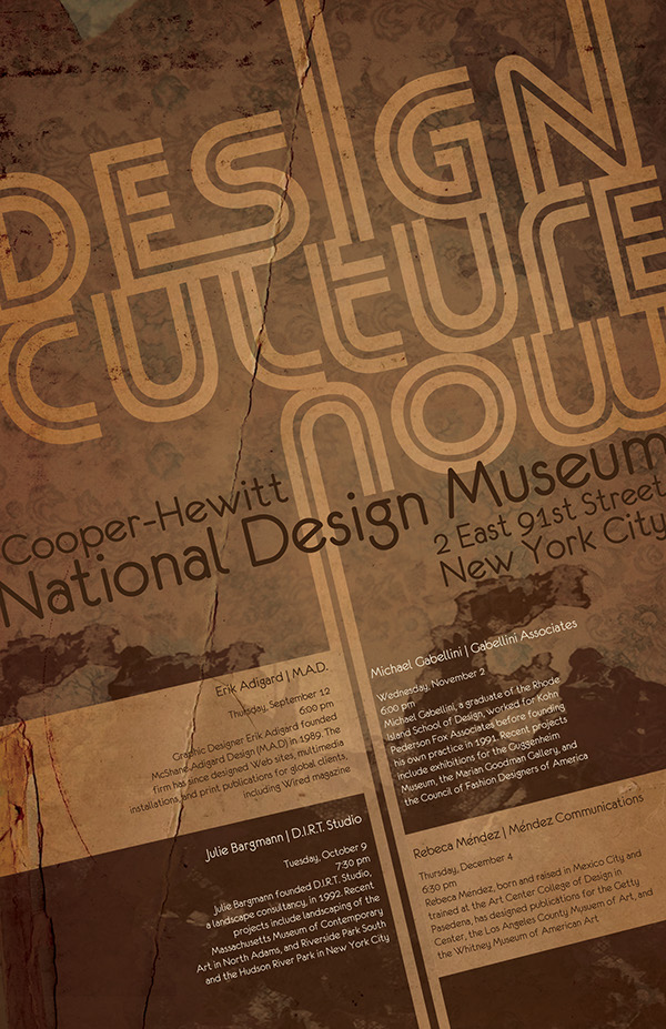
A colour scheme is a combination of colours that, when put together, compliment or contrast one another in an aesthetically pleasing way. Colour schemes are used by artists, graphic designers and interior designers to create visually appealing imagery. Colour schemes can be put together at random, but most professionals choose colours based on their relationship to each other in the colour wheel. The colour scheme types explained here are monochromatic, primary, secondary, complimentary, analogous, triadic, warm and cool.


Monochromatic colour scheme:

Poster with a monochromatic colour scheme

A monochromatic colour scheme is made up of just one main colour, but features a number of shades of that one colour. A simple example of this would be a colour scheme of blue, dark blue and light blue, as seen below. Monochromatic colour schemes could also feature the base colour, shades of that colour, and white and black.

Sample Monochromatic colour swatch


Primary Colour Scheme:

Poster using primary colours

This is another basic type of colour scheme where the basic primary colours of red, yellow and blue are used. A primary colour scheme can be made up of any shade of each primary colour but works best when the shades match evenly. In other words don't mix a bright red with a muted blue and yellow.

 Sample Primary colour scheme


Secondary Colour Scheme:

Image with a secondary colour scheme

This is a type of colour scheme where the secondary colours of purple, green and orange are used. A secondary colour scheme can be made up of any shade of each secondary colour but works best when the shades match evenly. In other words don't mix a bright purple with a muted green and orange.

Sample Secondary colour scheme


Complimentary Colour Scheme:

This images uses the complimentary colours of blue and orange

This colour scheme involves matching a primary colour with the secondary colour opposite to it on the colour wheel. For example, a colour scheme based on shades of yellow and purple would comprise a complimentary colour scheme, as seen below. Other complimentary colour pairs are blue with orange and red with green.

Sample Complimentary colour scheme


Analogous Colour Scheme:

Poster using an analogous colour scheme

An analogous colour scheme is created by pairing colours that appear side by side on the colour wheel. For example, an analogous colour scheme may include purple, blue and green. More subtle combinations may also be created by matching mixed colour tone combinations such as blue-purple, blue and blue-green, as seen below.

Analogous colour scheme


Triadic Colour Scheme:

This graphic design images uses a triadic colour scheme

A triadic colour scheme is made up of three colours spaced evenly apart from each other on the colour wheel. The primary colour scheme made up of the primary colours--red, yellow and blue is an example of this. These colours are all an equal distance from each other on the colour wheel, and form a triangle on the colour wheel when connected to each other. To produce a different triadic colour scheme, move the triangle until it points to different colours on the colour wheel such as yellow, red-purple and blue-green.

Triadic colour scheme


Warm Colour Scheme:

This movie poster uses a warm colour scheme


The colour wheel is divided into two halves, warm colours and cool colours. The warm colours include reds, oranges and yellows, including all variations of these colours. The warm colours are associated with action, passion, love, rage, danger and heat.

Warm colour scheme

Cool Colour Scheme:

This movie poster uses a cool colour scheme

The cool colours are found on the opposite side of the colour wheel, and these colours include all blues, greens and purples. Cool colours are associated with coolness, peace, calm, depression,
sadness, sky and water.

Cool colour scheme


Tuesday, June 14, 2016

Mixing Metals & Colors in Interior Decor

You’ve spent days poring over sample paint colors for your room, but have come no closer to deciding the right shade than when you started. We totally understand. Choosing the perfect color for a room can be difficult and stressful. The wrong color can make a room look completely drab and uninteresting, while the right one can bring it to life. Moreover, colors have been show to impact the moods and thoughts of people. Bright, cheery colors such as orange and yellow have a positive effect on people. Many shades of black or brown, on the other hand, are often associated with depression and negativity.And if that was not difficult enough, some colors look different at different times of the day, depending on the amount and nature of light in the room. Phew!

When choosing wall colors for your room, you also have to make sure that the color matches the various finishes and accessories in that room. Since the current trend is all about incorporating metals in interior design, today seems like a better day than any to find out how to team metallic accessories and lighting fixtures with various shades and colors. And the below infographic from Industville attempts to do exactly that!

In addition to some amazing color ideas for various rooms in a house, it also shows you how to marry those colors with metals so that you have an absolutely stunning home. For instance, did you know that the gorgeous gold tone you’ve been eyeing for a long time could lift your living area to a different level altogether? Yes, that’s right! These subtle, but warm and inviting shades are “in” right now, especially when you pair them with muted reds, crimsons, and navy blues. But don’t use them in your study. The best color for a study would be a nice blue. Blues are generally associated with calm, serenity and intelligence. A strong blue aids in stimulating clear thoughts, while lighter shades help in calming the mind and improving concentration. And if you love pink, you are in great luck! Blush pink/rosy shades work in almost every room, except perhaps your gym or exercise room. And what’s even better is that the color is so versatile that you can match them with a whole lot of metallic shades, including gold and copper.


Tuesday, March 29, 2016

The Meaning of Colours

The colour wheel
The Colour Wheel

The Colour Wheel

Designers have a large range of colours at their disposal and most are well aware that certain colours are associated with feelings and emotions. Designers, companies and manufacturers use colours cleverly to promote a certain feeling about their products.
The interpretation of a colour depends on culture, profession, and personal preference. In general, the colours red, orange, and yellow are "exciting" colours and the colours purple, blue, and green are "calming" colours. It is very important to consider your target audience, the psychology of colour, and the image you wish to project before you construct your web-site, printed materials, and logo.

Primary Colours: 

These are colours that cannot be created through the mixing of other colours. They are colours in their own right.

The three primary colours are RED - YELLOW - BLUE.

Primary colours can be mixed together to produce SECONDARY COLOURS. 

Secondary Colours:

Secondary colours are made by combining two primary colours as shown below.

YELLOW + BLUE = GREEN
BLUE + RED = PURPLE
RED + YELLOW = ORANGE

The colour wheel can be seen above and this can be used to help remember primary and secondary colours. The secondary colours are in between the primary colours - for example - between red and blue is purple. Quite simply, mixing the primary colours of red and blue paint together will produce the secondary colour purple.


Complimentary Colours:

An important rule of the colour wheel is that colours opposite to each other on the colour wheel usually work well together as a colour scheme. These are known as complimentary colours. Complimentary colours are often used together in graphic design as they tend to give the image/graphic a sense of balance and are visually more aesthetic.

The Meaning Of Colours

Meaning of colours
The meaning of colours
The interpretation of a colour depends on culture, profession, and personal preference. In general, the colours red, orange, and yellow are "exciting" colours and the colours purple, blue, and green are "calming" colours. Interpretation of colour is not always a matter of personal preference. For example, in Western cultures the colour white symbolizes purity; however, in China the colour white symbolizes death.
  • Colour emphasizes, highlights, and leads the eye to important points or links.
  • Colour identifies recurring themes (i.e. titles and subtitles are usually the same colors).
  • Conversely, colour can differentiate, such as different colors in pie charts and bar graphs.
  • Colour symbolizes and triggers emotions and associations.

Colour Meaning Can Change With Context...

Colour can also work for your web site and printed materials in various other ways:
Colour meanings in context
The context can also effect the meaning and effect of a colour

Colours also have an effect on your visitors before they begin to read the content of your web site or printed design. Thus, it is very important for you to consider your target audience, the psychology of colour, and the corporate image you wish to project before you complete your design.

When colour is used correctly, it can add impact and clarity to your message and highlight important points. Alternatively When colour is used incorrectly, it can compromise your message and confuse your target audience. The diagram below outlines the main emotions associated with each of the main colours.

Conclusion

To summarise, it is very important to consider your target audience, the psychology of colour, and the image you wish to project before you construct your web-site, graphic design, printed materials or logo.
close
Banner iklan disini