Showing posts with label images. Show all posts

Thursday, October 6, 2016

Read How to make a moving Elevator for UE4 Now

Elevator
Elevator

In this tutorial, we will be showing how to make a working elevator. 

Getting Started

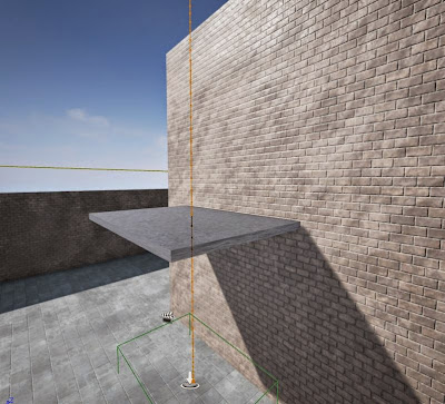
First we will add a block and then scale it for the elevator to travel its way up the side.

Tower
Tower
Then we make a platform for the actual elevator. Note: when making an elevator, make sure that you change it form a BSP to a Static Mesh. Also, you change the mobility for Static to Moveable.

Platform
Elevator Platform

Mobility
Moveable

Static Mesh
Static Mesh

Triggering

As we showed in a previous tutorial about triggering an open door, now were going to trigger a lifting elevator. First we drag a box trigger, onto the platform. You also need to change the mobility to Moveable.

Box Trigger
Trigger
You then add a Matinee to your elevator.

Matinee
Matinee

Moving

You select all actors and select a movement. Add a key frame of 5 seconds. Now your elevator can move.

Movement
Movement

Movable Elevator
Movable Elevator

Add your blueprints for triggering the elevator to lift.

Blueprints
Blueprints
Make sure that your platform is a collision, so your player is able to stand on it. That's it, your done!


Read Optimising Images for the web Now

Optimising an image in Photoshop
In this tutorial you will learn how to change the size by using the crop tool and how to optimise an image for the web in Photoshop. When an image is optimise it helps for a faster download when using the image on the web.

Step One:

In Photoshop, open up an image that you have saved by clicking on open and selecting the image you need.

Opening the image to be used in Photoshop


The image I am using the below image for the demo. I downloaded the image from google images. It is a non-copyright image,that means it’s free to use without having to pay any fees. I searched in the “Search Tools” area in google images and selected “Usage Rights” and selected “Labeled for reuse with modification”.

Selecting the usage rights on Google Images

Image used for the demo 

Image used for cropping and optimising in Photoshop

Step Two:

If you would like to get rid of any unwanted area of the image, you can crop the image. You can use the crop tool as show below to get rid of unwanted areas.

Selecting the Crop Tool in Photoshop


Appearance of the Crop Tool on Photoshop

Selection area on the image once the Crop Tool is selected in Photoshop

Step Three:

To save this image to use for the web. Click on file and the selected “saving for the web”.

Selecting  "Save for Web" in the file area on Photoshop

Step Four:

The “Save for web” window will appear. In this window, selected 4-Up, select png-24 for a faster download and for a greater number of colours of the image to be displayed when using it for on the web. 


Pop up menu to help you to select the correct format for your image to use for the web

Then you can save your image as beach_opt.png. 

Saving your optimized image 

Read Restoring A Damaged Black & White Photograph Now

Black and white photograph for restoring.
In this tutorial, you will learn how to restore a damaged Black and white photograph by using tools you would find in Photoshop.

Step 1

The photograph that was picked

I looked around for an old Photograph with as much damage to it as I could. I settled on this picture of a Man and Women on their wedding day.

Step 2

Touching up using the Clone stamp tool

Using the “Clone stamp tool”. I clicked ALT + left click on the area that had a bit of colour (Note. This should be as close to the rip and tear as possible) and once the colour was selected I stared clicking on the tears and rips, bringing the colour to them.

Step 3

Fixing the big tear.

I picked a part on the photo which was the most damaged, which was the two faces and I planned out what I would have to do and what tools I would have to use.

Step 4

Using the spot healing tool.

I zoomed in on the biggest part of the tear, which was the tear by the lady’s eye and I fixed it up using the spot healing tool and the clone stamp tool. The spot healing tool is for smaller rips and tears. While the spot healing tool is selected find the area you want to fix. Click several times around the rip and tear and the colour should be brought into the rip and tear.

Step 5

The lace shawl

I used the clone stamp on the tears and when I was finished I used the spot healing tool on the patch by the lace on her shawl.

 Step 6

The roof of the car.

I then picked the tear up by the back window of the car and again I used the clone stamp and spot healing tool and I was able to get the tear to look like the roof again

Step 7

The bouquet of flowers  

After that I moved down to the tear just by the bouquet of flowers and zoomed very close to the tear and spot healed it once more.

Step 8

The finished product.

I used a magnetic lasso which is a tool that automatically clicks around the edge of a colour/graphic. I used this tool to circle their faces and I used a noise reduction filter and this is the finished product.


BEFORE
Black and white photograph with rips and tears.
AFTER
Black and white photo after its restoration.


Saturday, July 23, 2016

5 Must See Infographics for Design Students

An infographic about infographics
An infographic about infographics - click to enlarge
Don't know what an infographic is? Well we have even provided you an infographic on that too! See the example above. A well-designed infographic like the ones below can help you simplify a complicated subject, in case the subject is Design and we have carefully selected 5 must see infographics for any young designer or design student. We hope you find them useful.

Colour Theory Infographic

design colour theory infographic
design colour theory - click to enlarge

The design infographic above from paper-leaf.com covers all the main areas of colour theory for design. When presenting a design or an idea your choice of colours is very important. It is very important for a designer to understand the way colours are put together as this may help in the selection of the right colour scheme for a particular age group. You can learn more about colour design in design by clicking here.

Design Process Infographic

The steps in the design process
The design process - click to enlarge

The design process is the single most important piece of design theory that a designer needs to know. This design infographic outlines the stages of the design process and the order in which they are to be completed. It also highlights that design can be a cyclical process which is in constant evolution. If you want to know more about each stage of the design process then you can read more >>>


Design Careers Infographic

Careers in Design
Careers in Design infographic - click to enlarge

This handy little infographic is from photoshop-plus.co.uk and it outlines some of the main careers in the design area and the salaries available to designers. However the design of the infographic itself can also be used as an educational tool for design students as it's clean and crisp layout combined with the bright colours of each elements contrasting nicely with the light grey background. Click on any of these links to learn more about a career in web designinterior designgraphic designgames design or furniture design.

The Elements of Design Infographic


The elements of design
The elements of design - click to enlarge

The design infographic above simultaneously lists and demonstrates the elements of design.The Design Elements refer to the different types of parts that can be used in the creation of any given composition or design. These elements can be combined and arranged in a variety of ways to create an endless variety of designs, both two and three dimensional. If you would like to learn more about each of the elements of design you can read more >>>

 The Principles Of Design


The principles of design
The principles of design - click to enlarge

The design infographic above simultaneously lists and explains the 6 basic concepts or theories in the area of design, collectively known as the principles of design. They are Balance (Alignment), Rhythm (Repetition), Proportion (Proximity), Dominance (Emphasis) Unity (Harmony) and Contrast. Theses principles are sometimes know by different names hence the brackets.They represent the basic rules of how to arrange a composition and create a successful design. In order words they guide us in the way we arrange the elements of design. Sometimes we look at an image or object and we find it aesthetically pleasing or easy on the eye but we may not quite understand why - the reason is that one or more of the principles of design are at work. If you would like to learn more about each of the principles of design you can read more >>>


Monday, March 14, 2016

HTML Images

HTML Images
Images are very powerful tools in web design and help convey the message and style of a business instantly

HTML Images work in a similar way to links in that they require a single element but also only work together with one specific attribute. So with links the element <a> always uses the attribute 'href', with images the element <img> (for image) always uses the attribute 'src' (for source).

The <img> Element

The element <img> tells the computer you placing an image in the web page and the attribute 'src' tells the computer where to find the image. Like with links the image can be an existing online image that you link to or an image saved on your own hosting space. For example,


The code above links to a file called 'html' which is a .gif file (more on file types in a moment) and is save in a subfolder called images. Note the attribute title can also be used with images. Also note how the element does not need a closing tag, this is because there is now content, the image is stand alone.

The image would appear in the browser like this...

The HTML5 logo


There are three main types of image files that you can insert into your web pages, gif, jpeg and png. For a more in depth look at file types, see the section on common graphic design file types.

HTML Image Attributes

You always need to use the attribute 'src', which tells the browser where the image is located but there are a number of other attributes which can be useful when inserting images. Another attribute you should always use is 'alt', this allows you to set a value which describes the image. This value will appear if the user hovers over the image (try the image above) while also helping search engines to correctly index the image. Two other attributes to the 'img' element are width and height, for example,


The above code results in a 64 x 64 pixel sized representation of the original image, as seen below.

The onlinedesignteacher logo

With images it is also recommended that you always use the 'alt' attribute to describe what the image shows. This is valuable for 4 reasons...
  • The alt attribute helps search engines understand the content of the image.
  • The alt description will be displayed as text if the image fails to load.
  • Text readers will read the alt attribute for the blind or visually impaired using your website.
  • When you hover over an image the alt attribute will be displayed.
The example below shows the html code for an image with the alt attribute in use.


The above code will result in the image below and if you hover over it the alt text will display.

The html5 logo

Image Sizes and Resolution

Pixels are the units of measurement used to measure the resolution of screens. (The most common screen resolutions are 1024 x 768 and 1366 x 768 pixels). Unlike centimetres, pixels are relative units of measurement which depend on the resolution of the screen. To a user with a high screen resolution, 25 pixels may correspond to 1 centimetre, while the same 25 pixel in a low screen resolution may correspond to 1.5 centimetres on the screen. If you do not set the width and height, the image will simply be inserted in its actual size. 

However, it is worth keeping in mind that the actual size in kilobytes of the image file will remain the same so it will take the same time to load the image as it did before, even though it appears smaller on the screen. Therefore, ideally you should never decrease the image size by using the width and height attributes but instead, you should resize and optimise your images in an image editing program to make your pages lighter and faster.

That said, it is still a good idea to use the width and height attributes, even if you are not changing them, because the browser will then be able to detect how much space the image will need in the final page layout before the image is fully downloaded. This allows your browser to set up the page nicely in a quicker way. Another article you may be interested in is How to get your images up the Google rankings.

Next Up


Saturday, March 5, 2016

Top 5 Graphic Design Tips

1. Avoid Image Overload...

We are now bombarded with more images and information than ever and our brain simply can't process it all

We are now exposed to more information than ever before through TV, radio, emails, text messages, snap-chats, skype calls, viber etc. There are screens everywhere we look and it is simply impossible for us to process and remember everything we see. But we do remember some things of course.

As a designer, the question is how can you make your designs memorable? The answer is simple...no really it is simple! Complex visuals with multiple images or areas of focus distract the eye from each other and actually prevent people from taking in any message at all. On the flip side, simple images/visuals with a single focal point and a consistent design style can be processed more easily and are therefore more likely to transit their message to the viewer. All the design tips which follow also have simplicity at their core.

So before you start a design project, identify the key requirements and focus on translating the single most important message. For example in a movie poster make sure the viewer walks away remembering the movie's name, if they remember that they can look it up online to find on when it's out, where it's on etc.


2. Grab Attention...

An attention grabbing image
Did I Catch You Looking...?
Made you Look! Good, I was trying to. The first tip was to keep your designs simple and have a single focus so that they will be more easily remembered but that will of course only work if you can get people to look at it ion the first place.

There are actually 7 different image types that are proven to grab attention, make sure your designs main image contains one of them. The first one is obvious (I've used it above) and that's sexy. The others include Funny, Surreal, Iconic, Shocking, Bright (vividly so) and, the hardest to achieve, Original. Read more about Attention Grabbing Techniques.

3. Get Vector Friendly...

A vector image
This image is made up of layers of flat colour tones and vector shapes

Vector images are another great way to keep an image simple, as you can use them to reduce an image down to it's most basic form and yet (if done correctly) it will still be instantly recognisable by the viewer. In fact, a vector image will be more recognisable and memorable than a photo as they are less common and therefore stand out as being original.

Once mastered, the vector tools in Photoshop or Illustrator are also a really quick way to block out a designs structure and form which can help you visualise the final design more easily. In graphic design projects where an image might be reused in a variety of situations like a advertisement which can appear on anything from the side of a bus to pop up on a mobile website then vector images also have an extra advantage as they can scale up and down without losing quality or pixelating.

4. Forget Colour*

A black and white or other high contrast image has greater impact
Black and white images are more powerful due to the contrast 
A lot of designers make the mistake of starting a project by adding colour to their design in the form of a gradient background or by inserting their main feature, often a colour photograph. Although it would seem to make sense to get the main features of a design in place early it can actually slow you down in the long run.

*Working in just black and white at the start of a project allows you to focus on the composition and layout of the design without the distraction of trying to choose and match colours as you go. Think about any design template you see, they are all in black and white and focused on structure. Here and here for example.

If the composition in a design is poor the viewer will not be drawn in to look at it no matter how nice the colour scheme is. A good composition also allows you to structure the design to ensure the key message is in focus compared to the other elements which may surround it.

5. Have Principles...

The principles of design help your project come together
This image uses 2 of the 5 design principles
Every self respecting designer should be familiar with the principles of design but more important than that every designer should use them! Using at least one of the design principles in every design project will immediately improve the quality of your work. Read more about the principles of design here.


Monday, February 29, 2016

SEO For Images

SEO for images
Screenshot from the Google search results page


If your web graphics are optimized for Image search engines like Google they will help to generate an alternate source of traffic to your website. But unlike regular web search where we are more familiar with how search engines rank content, the rules associated with Image search rankings are very different and often based on assumptions.

Why do I say this ? Try a search for "Google" on Google Image Search. None of the top results show images from the actual Google websites or even associated websites. Now if you repeat the search for Amazon, none of the top 5 images displayed are from the official Amazon website. So how do individuals and small companies manage to stay ahead of corporate giants in Image search results? It's to do with image optimization techniques like the ones discussed below.

Regarding optimization, here are 6 simple things that you should keep in mind for getting good rankings in Google Images Search:

1. Image File Name

Use a descriptive image file name which includes keywords related to the content of the image. If your webpage has pictures of an old country farm house - use file names like 'old-country-farm-house.jpg' instead of the default camera file name like IMG_401.jpg. In this way you are providing relevant information about the image to Google rather than just a string of meaningless numbers or letters.


2. Alt and Title

Attach a 7-8 word description with both the ALT and TITLE attributes of the IMG tag. Make it a habit to use these attributes. An example could be...

<img src="old-country-house.jpg" alt="dilapidated old county farmhouse in countryside" title="country style farm house ageing and run down">

3. Discuss The Image

A short two line description of the image just beneath the graphic is the best way to describe an image. It can work wonders for your image search rankings as well. For a live example, read any news story on the BBC websiteThe HTML tags enclosing the image descriptions will also matter. A description alongside a heading enclosed in H3 or Bold tag will have more weight than the one with just a description enclosed in the paragraph tag.

4. Wrapping Text

If possible, try to wrap text around your images using the CSS code of "float", like the old country farmhouse image above. If you site design won't allow wrapping text or if the image is large in size, try to place the images near text that describes the context of your image. Web Photo Galleries which have no text on the page can make use of the Title and Meta tags to insert information about the images.

5. Image Position On Page

From personal observation Web Images placed at the top of the page are more likely to appear in search results than the ones which are at the bottom. They do not have to be at the very top of the page but certainly 'above the fold' images tend to perform better than those below the fold.

6. Image Size

Another personal observation is that images which are very large or very small tend not to do very well in the search results. Try to keep images at sizes which will be useful to others who may be looking for them. In my experience images around 600px x 400px tend to do well.


If you do decide to use some or all of these tips, please keep an eye on your image performance and let us know how you get on.


close
Banner iklan disini