

 |
| Design Quote from Steve Jobs |
In this tutorial you will learn how to download a font from the website "dafonts", install onto your computer, and how to change and style the font using the properties of the Text Tool in Photoshop.
Step one:
Create new file
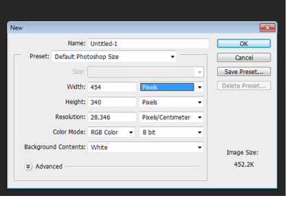 |
| Creating a new file |
Step Two:
Go to the website “dafont”. And select desired font to download. I have chosen the font called “Elkwood” for this demo.
 |
| "dafont.com" Logo |
The file will download as a zip file in the download area. Double click to unzip the folder and install the font file. This will then appear in the text section in Photoshop.
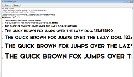 |
| Installing of the font |
Step Three:
In Photoshop select the Text tool to create new text.
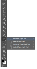 |
| Text Tool option on Photoshop |
Selected the font “Elkwood”. And click on the canvas. This will create a new layer.
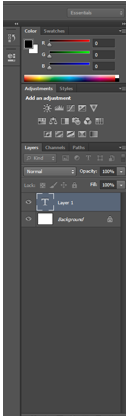 |
| Creating a new "Layer" in Photoshop |
Step Four:
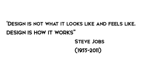
Enter your desired text. For the demo I am using a quote from Steve Jobs creator of Apple “Design is not what it looks like and feels like. Design is how it works”.
 |
| Example of the text used |
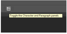
I am now going to add different character setting using the character and paragraph panels.
 |
| Selecting the Character and Paragraph panels to change the text |
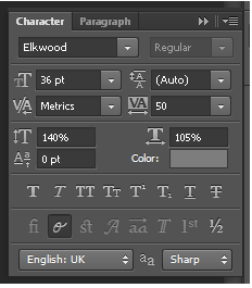
By changing the settings in the character and paragraph panels, it allows you to selected different sizes for the font, different colours. It also gives you the option to space out the letter both horizontal (across) and vertical (up and down). I have changed the font size, the colour and both the horizontal and vertical of the text. As shown in the image below.
 |
| Different options used in the Character and Paragraph for the text |
Step Five:
Effects after changing the settings in the character and paragraph panels.
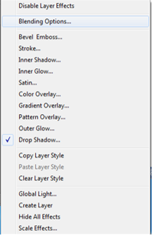 |
| Blending Options on the drop down menu |
Then I selected to add a drop shadow to the text. I added in different settings as show in the image below. This gives a shadow effect to the text. The sample is not intended to be inspiring! But rather a simple example showing that the text can be edited. Explore the various layers styles to create a text effect that suits your design project.
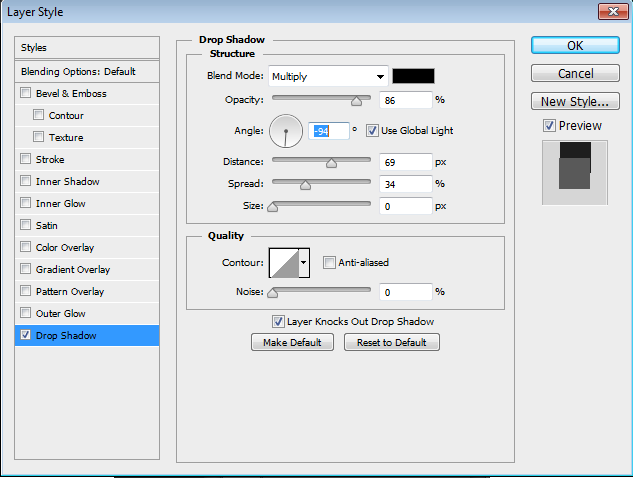 |
| Setting for adding a Drop Shadow to the text layer in Photoshop |
Before:
|
| Original text with no effects in Photoshop |
After adding the different effects on the text:
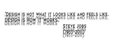 |
| Drop Shadow effect and Character effects done to the text in Photoshop |


