Showing posts with label onlinedesignteacher. Show all posts

Wednesday, June 20, 2018

10 Free Ways To Improve Your Website

how to improve your website for free
The internet has a whole world of great free resources for your website

If someone told you that you could quickly and easily improve your website and that it wouldn't cost you a penny, what would you say? Probably something like "what's the catch?". Well no catch here as I highlight 10 great (and free) website add-ons that can immediately improve your website.


1. Google Analytics

Google analytics is really a must have for any business website. By adding a couple of lines of code to your website Google can provide you with a wealth of data about your website, who visits it, where they come from, what they look at and for how long, what they click on.... The list goes on. Data like this is especially useful when tracking the performance of an online marketing campaign, a new product, a special offer or sale. You can sign up for Google Analytics here.

2. Share Buttons

Lets says someone visits your website and likes the content or thinks a friend would like it and would like to share it with them. You should make this as easy as possible for them using share buttons. Share buttons make it easier than ever for your audience to spread your content around the web, therefore increasing traffic and sales for you. AddThis is one of many companies that offer this free service.

3. Email Sign Up


email or newsletter sign up form
Gathering email addresses can help create a customer database

Another free and easy way to help traffic and sales is by adding an email/newsletter sign up widget to your website. The sign-up form needs to have a purpose of course (receive a free monthly newsletter, etc.). Make sure you mention that you will not sell email addresses to third-party businesses. This will give visitors reassurance that they won’t receive hundreds of spam emails. If you feel you don't have content worthy of sharing with your customers then you need to start a website blog, we'll discuss that in number 9. MailChimp is my recommended place to get a free email signup widget.

4. Contact Form

Sometimes people don't like giving you their email or phone number but they still want to get in touch to ask a question or make an enquiry about a product/service. Adding a contact form to your website allows them to do just that. Contact forms are also a better way to be contacted as your email address will be hidden too so you won't get any of that online spam that comes with having your email address on your website. JotForm is a great place to get free website contact forms.

5. Testimonials Widget

Testimonials area great way to build trust with potential customers and show a more human side to your business online. Studies show that people trust online testimonials almost as much as peer recommendations. So get going and add a free testimonials widget to your website using a company like GlowBoard or Spectoos.

6. Social Feed Widgets

online digital marketing
Social Media is a great place to promote your business

If you are active of social websites like Facebook, Twitter, Instagram or others then you should look into adding a widget to display your latest social posts on your website. This keeps visitors on your website as opposed to sending them offsite to your social media page where they can easily get distracted and drift away from your content. Click on the links to learn more about the Twitter, Facebook and Instagram plugins.

7. Social Follow Buttons

If you've got great social media content worthy or displaying on your website then why not go a step further and offer social share buttons where website visitors can easily follow your social accounts in a single click? AddThis which I mentioned earlier offer this service but you can also try ShareThis.

8. Google Translate

Perhaps your business is local, perhaps not, either way english may not be the first language of your customers so you really should be offering your website in multiple languages. Sounds complicated but thanks to Google translate it really isn't. Click to learn how to add Google Translate to your website.

9. A Blog

This one is less of a widget or plugin and more of a website add-on. A blog is short for a web log but really it is just a place to write little articles related to your business or share information about news and events your business is involved in. For example, this is a blog! The great thing about a blog, apart from being free, is that by sharing new content on a regular basis Google rewards your website with a higher ranking in search results. If your website is built on a CMS there is likely a blog function built in already but if not Google's Blogger is the best free option.

10. Live Chat Widget

free website livechat plugin
Never miss an opportunity to engage with customers.

This one is only really workable if you work from a computer most of the day or if you have dedicated customer services staff. If you do then a live chat widget is a great way to engage you visitors to your website in real time. The live chat can be video, text or audio based depending on the plugin you choose. Tawk, MyLiveChat and PureChat are 3 free options.

11. FAQs Page

I know I said 10 add-ons but this is more of an extra web-page as opposed to a plugin, widget or add-on to your website. A frequently asked questions (FAQs) page help your customers find the information they need without having to contact you. It also shows a level of professionalism on your behalf as well as being a sign of good customer service as you try to solve possible issues or answer possible questions before they have even been asked.

About the Author

This article was written and shared with OnlineDesignTeacher by Opus Web Design.


Thursday, October 6, 2016

Read How to set up margins and guidelines in Photoshop Now

Rulers Set up in Photoshop
In this tutorial you will learn how to set up the use of Rulers in Photoshop. Rulers are use to help you to position images and text in the exact position you require when using Photoshop.


Step One:

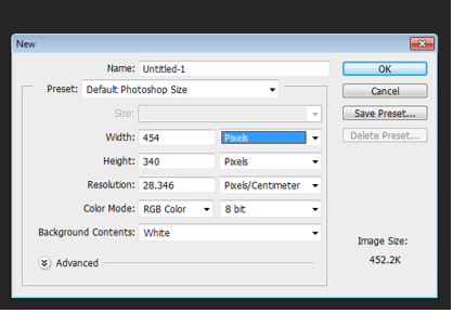
Select file and new and create a new file. I have chosen the settings off 8.5 inches for the width, 11 inches for the height, with 300 for the resolution and RGB color for the color mode.


Setting up a new file for Photoshop

Step Two:

For this demo I am going use some text to show how using rulers can position your text correctly.

Sample of a new canvas for setting up the ruler example

Step Three:

To set up the rulers manually, click view and a drop down menu will appear.
View drop down menu in Photoshop

Click to turn the rulers on. A guide will then appear with numbers on the top (Horizontal) and on the left hand (Vertical) side of the page. This is your rulers guide.

Image of Rulers as the appear in Photoshop


Step Four:
Now with your mouse, hover over the numbers until a white cursor appears. Click and drag down the top line and place onto the template at desire level. Clicking and the pulling down of the rulers (Horizontal).


Adding of the Rulers (horizontal)

Bring the rulers in from the left hand size (Vertical)

Adding of Rulers (Vertical)

All the rulers in place.

All the Rulers in the correct positions

Step Five:

As you can see from the above image the text is on the outside of the rulers on the left hand side. To move the text into the correct place, select the text layer, on the right hand size and with the move tool and move into position. 

Rulers and Text in the correct position

Step Six:

You can also set up the rulers to the exact measurement required. To do this, again select view, and the drop down menu will appear, scroll down and select “New Guides”. A pop up menu will appear and you are able to select the correct measurement for the rulers by selecting either horizontal or vertical position.

Drop down menu once selected the View option on Photoshop

Pop up menu to select the correct measurements 

Selecting the measurements in the New Guide

For this demo I selected the measure for the Horizontal (top) for 3cm, with the Vertical (left side) set also at 3cm. Again for the bottom Horizontal and right side Vertical set the setting to this time 3mm for the rulers to appear.  Example show in the images below.


Creating the Horizontal Ruler with the correct measurement

New guides rulers for Horizontal and Vertical (3cm)

Horizontal and Vertical rulers appearing in Photoshop


Rulers in place after creating them with the new guide option in the view section of Photoshop. To move the text into the correct place, select the text layer, on the right hand size and with the move tool and move into position. 

Rulers and Text in the correct position on Photoshop

Read How to model and texture a chair in Blender Now

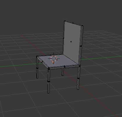
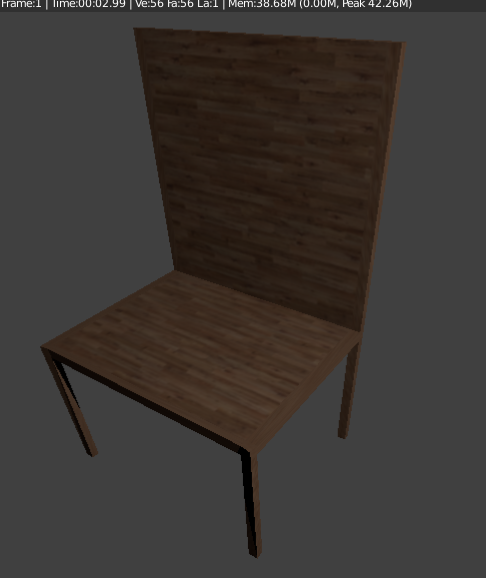
Chair with texture

In this tutorial you will learn how to create a basic chair and add a texture onto the chair.


Step 1

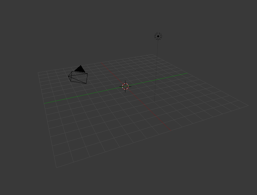
Delete the default cube by pressing X and delete.

with no cube 

Step 2

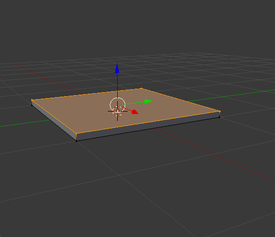
Add mesh plane or shift A mesh and plane.Zoom in with the middle mouse button, or press 1 for a side view, press Tab to go into edit mode it should turn orange. E to extrude.

plane that's extruded


Step 3 

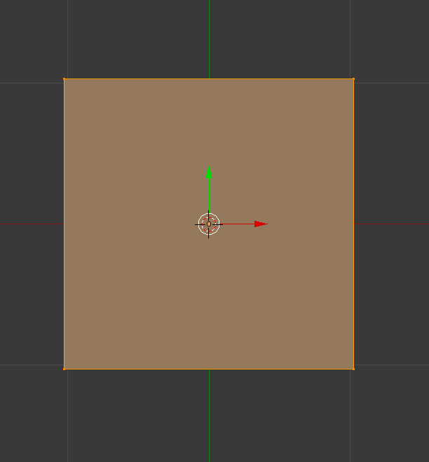
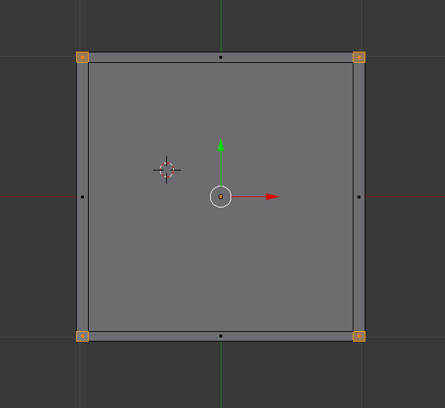
Press 7 on the number pad to get a better view. Use the middle mouse button to zoom in or out.

top down view of the plane in edit mode

Step 4

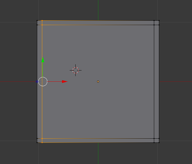
Press ctrl R to create a loop and place a loop at each side. Total of 4 loops.

plane with four loops

Step 5

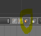
Select face select. 

face select

Step 6 

Press the number 8 to flip to the opposite side(underneath the plane),Select one box then press Shift and right click on each of the boxes.

plane with all four corners selected

Step 7 

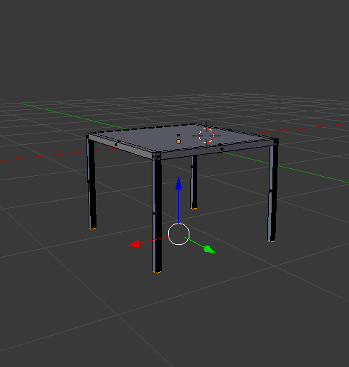
Press number 1, press E to extrude to your desired length. Use the middle mouse button to move around to get different angles.

plane with all legs

Step 8 

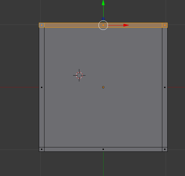
Press A to deselect, select one side and E to extrude. 

top down view with one side selected

basic model of a chair

Step 9 

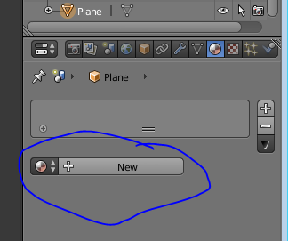
To add a texture onto the chair go to materials bar on the top right corner of the screen, click on new.

adding a new material

Step 10

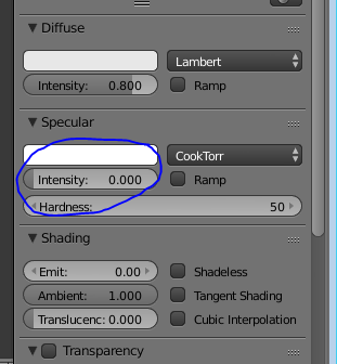
Change the specular to zero so a glossy effect wont appear onto the chair.

lowering the specular

Step 11 

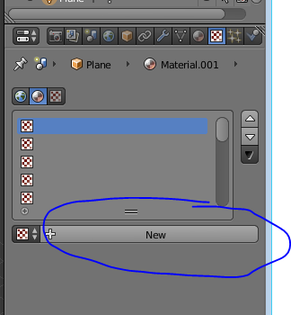
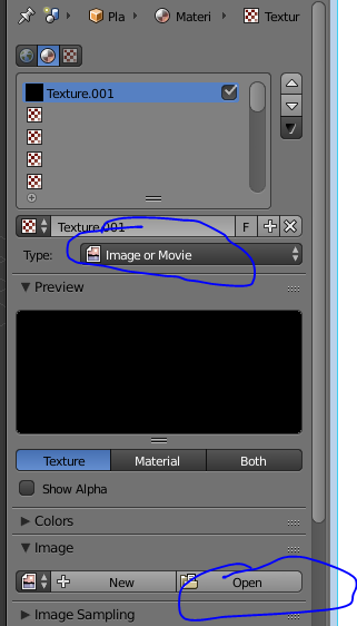
Go to the texture section beside the material on the top right corner, click on new, change the type image to image and movie, click on open and navigate to your texture that you have downloaded.

adding a new texture

importing a texture

Step 12 

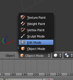
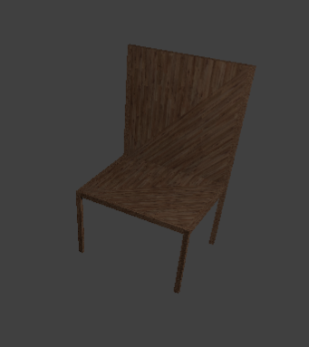
The texture will look like this on the chair, to fix this the texture needs to be unwrapped. Change object mode to edit mode.
changing to edit mode
chair with texture

Step 13 

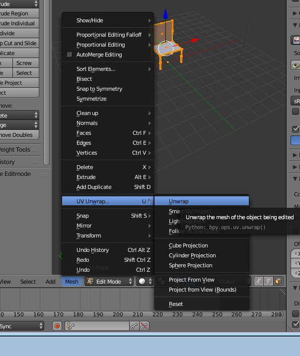
Go to mesh, uv unwrap, unwrap. this will fix the texture on the chair.

unwrapping 


rendered result 

finished chair with a texture

Read Blender Animation Basics Now

Title Image
Finished animation

What is animation in blender?

Animation is making an object move or change shape over time. You would use animation in blender for very obvious reasons such as making a character walk, run, crouch. making an object move around in your scene. Animating a scene so it becomes entertaining...etc. Objects can be animated in many ways. 

Moving as a whole object 

Changing their position, orientation or size in time.

Deforming them 

Animating their vertices or control points.

Character Animation via Armature 

Animated to deform by the movement of bones inside the mesh if you use a human model, a very complex and flexible interaction that makes character-shaped objects appear to walk and jump.

In this chapter we will cover the first two, but the basics given here are actually vital for understanding the following chapters as well. Three methods are normally used in animation software to make a 3D object move:

Key frames 

Complete positions are saved for units of time (frames). An animation is created by interpolating an object fluidly through the frames. The advantage of this method is that it allows you to work with clearly visualized units. The animator can work from one position to the next and can change previously created positions, or move them in time.

Animation Curves 

Curves are interpolated from keyframes, and can be drawn for each XYZ component for location, rotation, and size, as well as any other attribute in Blender. These form the graphs for the movement, with time set out horizontally and the value set out vertically. The advantage of this method is that it gives you precise control over the results of the movement.

Path

A curve is drawn in 3D space, and the Object is constrained to follow it according to a given time function of the position along the path.

The first two systems in Blender are completely integrated in a single one, the F-Curve system.

In Blender 2.5x, everything can now be animated. Previously, only certain datablock had the ability to be keyframed. Now users have the ability to animate nearly any type of data that can be changed to multiple values.

How to animate in blender

Go to scene editor and select animation. This is located at the top of the screen.

scene editor
scene editor
You should get a layout like as follows

layout of animation
layout of animation

2. Find any free space and press "I" then select LocRotScale and this should open up a tab that looks like this. We use this as it allows us to move the object more easily. 

Location/Rotation/Scale
LocRotScale

3. Next go to your timeline and select frame 10

10 Frames
timeline ten frames

Then move your object along the axis by pressing G + Y then move it to your desired location

moving an object on frame 10
moving object frame 10

Then press I and this will complete your keyframe

4. Now select frame 20 and move your object further down the axis rotate it as well by pressing "R" and moving it

moving object on frame 20
moving object 20 frames

timeline 20
timeline 20

5. Continue these steps until you have at least 100 frames then move the amount of frames down to 100

6. Next you go to the render tab and select render animation

7. Next press Ctrl +F11 and that will play your animation. That is your animation completed.