Showing posts with label tips. Show all posts

Wednesday, November 22, 2017

How To Speed Up Your Website

How to make your website load faster
Although it is unlikely you will make it to a perfect score the tips below can help you get in the green for page speed

As far back as 2010 Google admitted it uses a web pages loading speed as part of it's ranking algorithm and as the mobile web has grown so has the importance of a website's loading speed. So with that said let's get to the point. Here are my top tips to speed up your web pages...


Go Direct...

No landing page redirects please. Why? Well redirects trigger an additional HTTP request-response cycle and delay page rendering. In the best case, each redirect will add a single round-trip (HTTP request-response), and in the worst it may result in multiple additional round-trips to perform the DNS lookup. So you should therefore minimize your use of redirects where possible.

Google identifies these examples of redirect patterns...
  • example.com uses responsive web design, no redirects are needed - fast and optimal!
  • example.com → m.example.com/home - multi round-trip penalty for mobile users.
  • example.com → www.example.com → m.example.com - very slow mobile experience.

Cut The Crap...

Remove any unnecessary content, especially widgets and plugins that you only put into your sidebar or footer to fill it out, yes I'm looking at you! Only present that content that is actually relevant or related to the web page's topic.

WordPress sites especially, tend to have sidebars or footers full of widgets or plugins that are serving no real purpose but yet are slowing down your webpage a lot. "But they are so easy to add and they look really pretty..." I hear you say. That may be true but are they actually serving a purpose? If not, get rid of them.

Tip: If you want/need to link to Twitter, Facebook, Google +, Pinterest etc. just use a linked icon (font awesome icons are great for this) or image as opposed to a widget or plugin.

Prioritise Above The Fold

What we mean by this is that you should limit the size of the data (HTML mark-up, images, CSS, JavaScript) that is needed to render the above-the-fold content of your page. Structure your page so the initial response from your server sends the data necessary to render the critical part of the page immediately and defer the rest. This may mean that you must split your CSS into two parts: an inline part that is responsible for styling the above the fold portion of the content, and the part that can be deferred.

Google suggests the following examples of how a site could be restructured to load faster:
  • If your HTML loads third-party widgets before it loads the main content, change the order to load the main content first.
  • If your site uses a two-column design with a navigation sidebar and an article, but your HTML loads the sidebar before the article, consider loading the article first.

Optimise Images

It really is amazing how much you can reduce image file sizes without any loss of quality. You literally can't see any difference visually but the impact on web page loading speeds can be immense. Here are 2 options for software to help you optimise your websites images.

Minify, Minify, Minify

That heading isn't for dramatic effect as you can, and should, minify your HTML, CSS and JavaScript. This is actually a lot easier than you think. It basically means removing any unnecessary spaces from your HTML, CSS and JavaScript code. There are even lots of websites that will do it for you for free, my personal favourite due to it's beautiful simplicity is this minifier.


Enable Compression

The word compression tells you all you need to know about what this does but how does it work? All modern browsers support and automatically negotiate gzip compression for all HTTP requests. Enabling gzip compression can reduce the size of the transferred response by up to 90%, which can significantly reduce the amount of time to download the resource, reduce data usage for the client, and, most importantly, improve the time to render of your pages. See Google's explanation of text compression with GZIP to learn more.

Good News: If you have a Blogger website then you automatically have gzip compression. If you don't believe me then test your website's compression.

Bad News: Some other hosting providers' basic hosting package do not support compression so be sure to check before you waste your time and effort working on it.


Browser Caching

Caching involves storing information from your website for reuse. Fetching information over the network is both slow and expensive: large responses require many round-trips between the client and server, which delays when they are available and can be processed by the browser, and also incurs data costs for the visitor. Therefore, the ability to cache and reuse previously fetched resources will optimize performance and speed up your website. The most common way to leverage browser caching for increased page loading speed is using a .htaccess file.

Learn how to leverage browser caching.

Tip:  If your website is hosted by Blogger you cannot use browser caching through the .htaccess method as you have no access to the .htaccess file. However you can try this alternative.


Monday, May 30, 2016

Top 5 Web Design Tips

1.What's The Point?

What's the point of your website
What's the point of your website? That must be your first decision

Believe it or not there are only 3 types of websites - information, entertainment and transaction.

  • Information websites provide information- obvious example is Wikipedia
  • Entertainment website provide entertainment- obvious example is YouTube.
  • Transaction websites will either buy goods from you and/or sell goods to you - obvious example is eBay.

Every website falls into one or more of these categories. The first thing you need to decide before designing your website is what is  its purpose? Secondly who is it aimed at? Once you have made those decisions you can more easily design your website to meet the demands associated with that website category and that target audience.

2. Mobile Is Bigger Than Desktop*

Internet usage is now greatest on mobile device

It goes without saying nowadays that your website should be responsive but I have found that people tend to create the desktop design and then use media queries to work down to tablet device design and finally mobile design. This is the wrong approach. Why?

*For the first time more people now access the internet using mobile devices than desktops or tablets so it makes sense to prioritise your websites mobile design then scale up using a fluid design and/or media queries.


3. Show The Way

An organised, obvious and functional menu
An organised, obvious and functional menu is key to a successful website

Web navigation has many well established and functioning characteristics and you should not stray away from them,; there is no need to reinvent the wheel and if you try it will likely confuse your visitors and spoil their browsing experience. On the flip side, an effective navigation system encourages browsing within the website which can in turn increase revenue.

Your menu is obviously the main navigation device for your website and it should be immediately obvious when the webpage launches, ideally fixed at the top of the page with no surrounding elements to distract from it. This also makes the links easier to click on a mobile device. If the website's style allows it then perhaps add an additional (relevant) icon with each menu link, this creates an immediate association for the visitor with the purpose of the link.

Links within the body text should at least be a different colour than the body text and you should retain the default link underline as without it the links may just look like bold text. Ideally all links should have a hover effect added using CSS and a title attribute using HTML.


4. Nobody Reads

nobody reads text any more
If nobody reads text any more then how do you get your message across

Let's face facts, nobody reads all the text on a website, in fact I don't even know if anyone will read this sentence. What people do is scan the page for what they want, when they do this images, headings, sub-headings and links are what they notice (in that order).

Just checking if you are reading or scanning...

With this knowledge in mind you should provide images and/or icons to go with all key links/points and break any large areas of text into sections, each with a heading and possibly sub headings also like I have tried to do with this article. As a general rule in terms of website text, just get to the point.


5. Optimise, Optimise, Optimise**

website optimisation
There are 3 key areas of your website to be optimised

**I wasn't repeating the word optimise for fun or even for emphasis. I actually want to advise that you optimise 3 keys areas of your website: the layout, the loading speed and the content.

The layout optimisation should focus on utilising one of the recognised web layout techniques such as the F layout or the Z layout. The purpose of which is to direct visitors to the outcome that you want such as clicking on a link, signing up to a newsletter or buying a product. An optimal layout will result in optimal outcomes.

The loading speed can be optimised by removing unnecessary content, minifying you HTML and CSS, keeping slow loading content below the fold, optimising images for web viewing etc. Our tips to improve website loading speed and the Google page speed insights tool is a great help. Faster loading is not just appreciated by your visitors but also the search engines who now factor it into their indexing algorithms.

Optimising content is old news but remains an important activity which still makes lots of companies lots of money. The reality is that it is actually a relatively simple but highly tedious process, so if you got the time then you can save the money. Learn more about SEO here.

You may also be interested in the web design process and our 10 steps to designing and creating a website.


Wednesday, May 25, 2016

Top 5 Games Design Tips

Level design
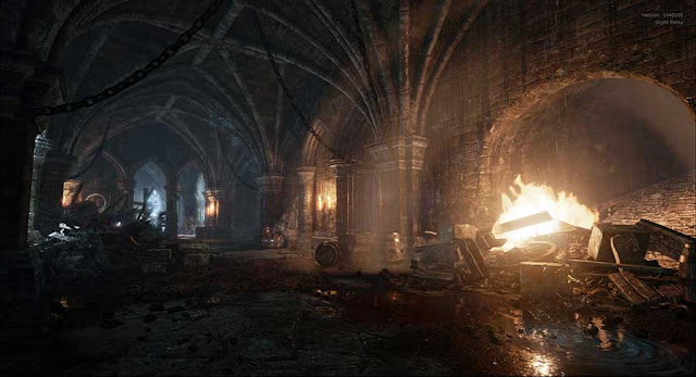
Level design image from Scott Petty
The games design tips below are intended to help you improve your overall games design process but are not a replacement for it. So before we get to our top 5 games design tips our first piece of advice is to always, always use the games design process when creating games.

1. Be Original

Original Game Concept Ideas
Game Concepts Should Always Be Original

One of the best thing about games is that there are no limits to what they can be about, where they can be set, the characters involved or the games' missions or objectives. The only limit is your own creativity, so why on earth would you consider starting your project by copying or mimising an existing game?

Sure you can learn from successful games and sure you can create a game in the genre of existing games but you should always have a unique game concept. New characters, stories, settings and missions are what will attract people to play your game in the first place and with literally no limits on what you can choose there is nothing stopping you from doing that.

The random game idea generator activity is a great way to help you get started. It helped us come up with this gem of a game concept for Colossus Cleaner...
"Arnold Schwarzenegger astride a unicorn carrying a mop in the Colosseum of ancient Rome"
It's weird, it's crazy, it's bordering on stupid but ..... it is original.

2. Prepare All Assets First

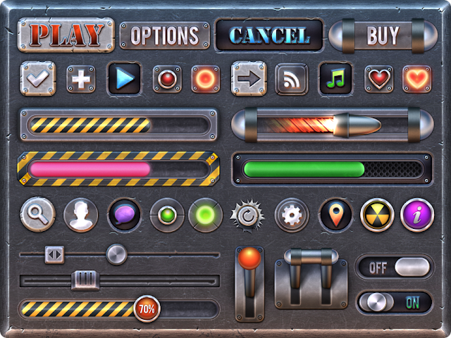
A selection of game button assets
A selection of game button assets ready to be used in a game

It is always very tempting to jump straight into the actual level design of the game once you have settled on your idea. However this is one of the worst things you can do as it will lead to you wasting more time than you can imagine as you will have to stop and jump back and in and out of the level design process every time you need an asset whether that be a sound, a texture, a mesh, a font etc.

This will also lead to inconsistency in the overall look and feel of the level as if the assets are not all created together they tend to end up being of a different type, scale or style from each other. This will make the game look unprofessional and even difficult to play/understand as players won't recognise one pick up from the next or understand one symbol from another.

The message is simple, plan ahead and take the time to create or gather all sounds, fonts and images (for UI screens), textures and meshes before you even open the level editor or games engine you are using.

Here are a few good places to get your game assets for free....


3. Detail in Clusters

Detail in Clusters
This room looks full of details and objects at first glance but look closer....

We all want to create realistic and interesting game worlds but the more meshes and foliage and particle effects and lights etc. that we add the more likely the game is to lag. Also it is actually becoming less realistic! 

Even in the real world things tend to cluster; clothes pile up in the corner of your room, letters pile up on the hall stand, coats get draped over the back of the same chair, rubbish gathers at the back door waiting to be put out, one kitchen press seems to hold all the random, unused utensils..... Any of those sound familiar to you?

All the while the circulation paths of our home remain clear and uncluttered no matter how untidy we are. When I say circulation paths I am referring to  hallways and corridors but also common directional paths such as from the living room door to the couch or from the bedroom door to the bed.This information can be used in your level design to make it more realistic but also faster and more efficient. Basically, you should not try to detail the entire level but rather create small areas of high detail which then become focus points for the character as they move through the empty (in comparison) circulation paths.

Tip: In outdoor scenes use tall building, trees or other landmarks as focal points for the player to move towards and look at during otherwise empty grasslands or open areas.

4. Create Reusable Elements

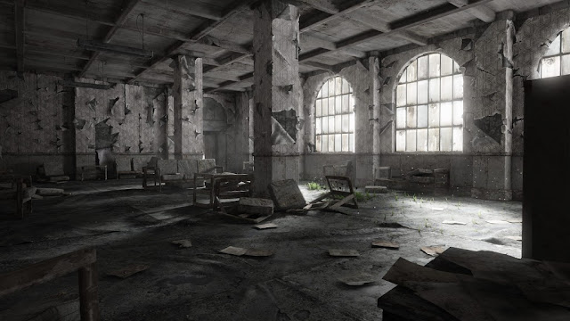
dilapidated and derelict building
The seats in this dilapidated and derelict building are made up of the same parts but have been use differently 
We have already told you to prepare your assets and create clustered areas of detail in you game and this tip is partly related to those from a mesh point of view. The image above is a good example of what I mean as it shows the same seat in different positions and in different states of disrepair.

This might seem simple and obvious but if you were planning ahead you would have made the parts of the seat as separate meshes to allow you to do this easily put it together in different ways. On the other hand if your weren't thinking ahead and if you just made the entire seat as a single mesh you would then need to go back and make another mesh for the broken seat and another for the one missing one cushion and another for the one with a missing leg and another, and another....

It's not just meshes that can be reused either. Clever programming can save you a lot of time too. How you do this will vary depending on which game engine you use so lets just use a generic example to explain the point. Let's say you are creating a game where you collects coins, a la Mario. Rather than creating 100 separate coins but each with the same programming code you would instead create a coin 'actor' with built in programming code that can then be added and duplicated within the level editor.

This is an obvious example of course but when you break down your game objectives and requirements you will find that the same actions or events are required for multiple different objects or characters. So why would you create more work for yourself? Plan out your game logic to identify these repeat events and then create a single reusable 'actor' for that event.

5. Don't Neglect The Audio

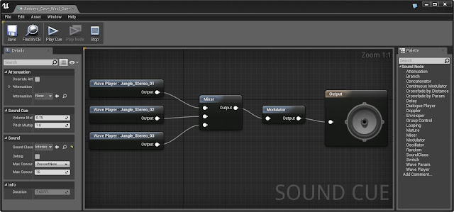
sound cue editor in Unreal Engine 4
Screenshot from the sound cue editor in Unreal Engine 4

Firstly we must understand that audio is not just the background music in the game. Audio covers a wide range of areas such as...
  • Background music
  • Characters voices
  • Character sound effects (eg. footsteps)
  • Weapon sound effects
  • Ambient sounds
  • User Interface (U.I.) button click sounds
  • U.I. background music
  • Voice overs/ narration
  • Objects/ Pick-ups sound effects
It is very easy to start to create a game without a clear concept of what the game audio will be but by considering game audio at the very beginning of the game’s concept you can then design the other level features to match it and create an overall consistency to the game's atmosphere as opposed to just quickly downloading and importing stock sounds at the end of the project.

With the emergence of Virtual Reality headsets and VR gaming the importance of game audio is becoming more important than ever. The right sounds, in the right place, at the right time will be vital to ensure a fully immersive VR experience for the gamer.


Saturday, March 5, 2016

Top 5 Graphic Design Tips

1. Avoid Image Overload...

We are now bombarded with more images and information than ever and our brain simply can't process it all

We are now exposed to more information than ever before through TV, radio, emails, text messages, snap-chats, skype calls, viber etc. There are screens everywhere we look and it is simply impossible for us to process and remember everything we see. But we do remember some things of course.

As a designer, the question is how can you make your designs memorable? The answer is simple...no really it is simple! Complex visuals with multiple images or areas of focus distract the eye from each other and actually prevent people from taking in any message at all. On the flip side, simple images/visuals with a single focal point and a consistent design style can be processed more easily and are therefore more likely to transit their message to the viewer. All the design tips which follow also have simplicity at their core.

So before you start a design project, identify the key requirements and focus on translating the single most important message. For example in a movie poster make sure the viewer walks away remembering the movie's name, if they remember that they can look it up online to find on when it's out, where it's on etc.


2. Grab Attention...

An attention grabbing image
Did I Catch You Looking...?
Made you Look! Good, I was trying to. The first tip was to keep your designs simple and have a single focus so that they will be more easily remembered but that will of course only work if you can get people to look at it ion the first place.

There are actually 7 different image types that are proven to grab attention, make sure your designs main image contains one of them. The first one is obvious (I've used it above) and that's sexy. The others include Funny, Surreal, Iconic, Shocking, Bright (vividly so) and, the hardest to achieve, Original. Read more about Attention Grabbing Techniques.

3. Get Vector Friendly...

A vector image
This image is made up of layers of flat colour tones and vector shapes

Vector images are another great way to keep an image simple, as you can use them to reduce an image down to it's most basic form and yet (if done correctly) it will still be instantly recognisable by the viewer. In fact, a vector image will be more recognisable and memorable than a photo as they are less common and therefore stand out as being original.

Once mastered, the vector tools in Photoshop or Illustrator are also a really quick way to block out a designs structure and form which can help you visualise the final design more easily. In graphic design projects where an image might be reused in a variety of situations like a advertisement which can appear on anything from the side of a bus to pop up on a mobile website then vector images also have an extra advantage as they can scale up and down without losing quality or pixelating.

4. Forget Colour*

A black and white or other high contrast image has greater impact
Black and white images are more powerful due to the contrast 
A lot of designers make the mistake of starting a project by adding colour to their design in the form of a gradient background or by inserting their main feature, often a colour photograph. Although it would seem to make sense to get the main features of a design in place early it can actually slow you down in the long run.

*Working in just black and white at the start of a project allows you to focus on the composition and layout of the design without the distraction of trying to choose and match colours as you go. Think about any design template you see, they are all in black and white and focused on structure. Here and here for example.

If the composition in a design is poor the viewer will not be drawn in to look at it no matter how nice the colour scheme is. A good composition also allows you to structure the design to ensure the key message is in focus compared to the other elements which may surround it.

5. Have Principles...

The principles of design help your project come together
This image uses 2 of the 5 design principles
Every self respecting designer should be familiar with the principles of design but more important than that every designer should use them! Using at least one of the design principles in every design project will immediately improve the quality of your work. Read more about the principles of design here.


close
Banner iklan disini