Showing posts with label design. Show all posts

Monday, February 12, 2018

Unusual Menu Designs You Will Want to Copy

Unusual Menu Designs You Will Want to Copy
A great menu design can have a huge impact on your restaurants overall image

A great menu is much more than a variety of choices and readable font. The way a restauranteur presents the food items on the menu can greatly influence the choice of a meal of the guest. Creating an inviting design for a menu is vital for everyone in the restaurant industry.


Important Elements of a Good Menu Design

Did you know that the menu design can influence the entire dining experience of the guests? Starting from the number of orders they will make for the table, to the time they’ll spend on choosing a meal, you can change this experience solely by making the right changes on the menu. In fact, the menu design is often the main determinator of the spending on behalf of the customer.

Basically, if you know how to create an excellent menu, you can increase the sales and boost the interest in the customers. Before we introduce some of the most unusual, yet successful menu designs, here are some things you must know when creating the menu for your restaurant:

Location and First Impressions

Where you locate each food choice on your menu can make an impact on the sales. In most cases, a customer will look in the top center of the menu, regardless of the menu format. Then, they will start from the top-left, since this is the place where they start reading.

First-impression is key to menu design, too, so try to pay special attention to these two locations on the menu. The courses should take natural progression and present the courses in the common chronology. This should allow the customer to choose what they want for appetizer, main dish and desert, without having to turn pages over and over again.

Images Must Be Real

Many restaurateurs choose to use stock images in their menu design. Customers can easily detect these by only looking at a menu, and even if they don’t, they will probably be disappointed when they see the actual dish in front of them. Even if this dish looks and tastes deliciously, a customer should never feel like you didn’t bother to show them the true dish in the menu.

People like to know what to expect. If you plan to introduce food photography as part of your menu, hire a professional photographer or use a professional camera to take real images of the actual dishes.
Of course, always mention the name of the dish under the image to avoid confusions.

Typography is Important for Distinguishing Items

Using bold font or different font size is an element that helps you emphasize an item over other items in the menu. If you want some help selling an item from your menu, go bold or italic.

Mind the Price Presentation

One of the biggest tricks of great restauranteurs is the price presentation. If you fail to focus on this part of the menu design, customers will just keep scanning the menu for the cheapest items to order. 

Here are some tricks that will help you avoid such scanning:
  •        Do not go for the vertical or horizontal price alignment
  •     Consider some nontraditional pricing options (for example, instead of two decimal, use one decimal)
  •          Choose typography and colors that are more subtle and attract less importance visually
  •          Stop ranking the items from low to high or high to low. Mix them up instead.

Interesting Copy Helps Avoid Confusions

Accompany the photos and food choices with interesting, descriptive copy that will help the customer understand what they will be ordering. The trick here is to describe each of the items in the menu, but in a short and concise manner.

‘It is important to use the right tone. This will depend on the type of establishment. For example, you should use a very formal style for an upscale restaurant, while it is acceptable to have some fun with the wording when creating a menu for a less-upscale establishment’
– advices Gregory Mason, content writing expert at an Aussiewriting service.

10 Highly Unusual Menu Designs Worth Considering

Your menu is much more than a simple list of the dishes offered at the restaurant. You should look at the menu as your portfolio, the most important marketing material that will influence the sales. If something meets the eye of the customer and draws his attention, you did a great job. If the menu is more confusing than helpful, you did a terrible one.

Now that you heard our advice on what to include in the menu, it is time to see which restaurateurs got it right.

1. Toko, Dubai

Great Menu Graphic Design by Toko


This restaurant is located in Dubai. As you can see, the visual identity of this restaurant is different from all other restaurants and yet, it combines both modern subculture and the traditional Japanese painting techniques.

2. Smith, Toronto

Great Menu Graphic Design by Smith


This is probably the simplest, yet highly effective menu design in the restaurant world. Smith is both a club and a restaurant located in downtown Toronto, and this is the design created by Tracy Ma, an employee at Bloomberg Businessweek.

This menu features font that is very easy to read, and simple black-and-white photography of all food on offer. The most interesting approach here is that the designer decided to create a menu that takes the form and appearance of a newspaper.

3. El Kapan, Varna

Great Menu Graphic Design by El Kapan


Located in Varna in Bulgaria, the restaurant El Kapan offers a very interesting food combination of barbecue and seafood. This restaurant is very popular among young people, and uses a fun logo that says ‘Fish and Shish’.

The logo was designed by Marka Collective, who came up with the idea for the entire brand, including this menu that combines colorful photos of the meals and interesting menu design.

4. The Clifford Pier, Singapore

Great Menu Graphic Design by The Clifford Pier


Designed by Foreign Policy, the menu of this popular restaurant in Singapore has created an amazement in many. The use of thoughtfully combined colors in a combination with retro-styled design made for an excellent menu design. The addition of architectural elements to the equation and postage stamps certainly remind everyone of Singapore pre-war.

5. Sano Juice, Barcelona

Great Menu Graphic Design by Sano Juice


So simple, yet so powerful – the design of Marina Soto uses interesting color gradients and fun illustrations in a combination with rounded sans sheriff word type.

6. Holly Burger, Spain


Two people worked on the entire design of the popular ‘Holly Burger’ in Spain, and did an excellent job. The design by Manuel Astorga and Rodrigo Aguade turns simplicity into success. According to them, the main idea behind this fresh mix in the form of a menu came from a ‘banana leaf wallpaper and typographies found in windows of old shops’.

7. The Pelican, Singapore

Great Menu Graphic Design by The Pelican


This menu is one more restaurant-masterpiece by the agency Foreign Policy. By combining sea animals and humans interacting with them, the designers transformed the menu into real pleasure to read.

8. Hubbly Bubbly, Orlando

Great Menu Graphic Design by Hubbly Bubbly


The name of this restaurant is as fun and as petite as the restaurant itself, but the menu is the real deal. This cute menu design was the work of Mark Unger, who decided to go for bright colors. These turned out to be the best aesthetics for the new, small falafel restaurant located in Orlando.

9. Vera, Zaragoza

Great Menu Graphic Design by Vera


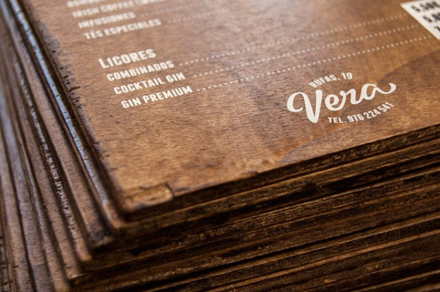
A wooden menu for a restaurant based in Zaragoza, Spain – this is what the workshop El Calotipo came up with when requested to create the menu for the cute café Vera. Simple white lettering, with prices printed on stickers for easier updates, wonderfully put on an in house press.

10. Cellarmaker Brewing Co, San Francisco


The Cellarmarker Brewing Company of San Francisco asked Gamut to create their intoxicating menu. This menu is so insightful, it provides all the details of offered beverages, accompanied by a reminder of what you tried so far.

11. L'Encant, Spain

Great Menu Graphic Design by L'Encant


Nuria Vila is a very creative agency located in Spain, proven with the very popular menu at the L’Encant sushi bar. Combining both the Catalan and Japanese culture, this menu features a wooden cover and stone paper menus inside it.

12. Maddigan's Freehouse, London


Aaron Kitney is an amazing graphic designer, whose most popular design is undoubtedly the menu at Maddigan’s Freehouse in London. This menu is eye-catching and unique, combining gothic and modern faces.

13. RAGU Cafe, Novosibirsk

Great Menu Graphic Design by RAGU Cafe


This is one of the restaurants that decided to invest into good food photography, and definitely made the right decision. The menu was a result of the work of a team of designers from Russia, who used fully color-packed photos of the food, allowing customers to see what they choose before it even comes to the table!

14. Mr. Brown, Mexico

Great Menu Graphic Design by Mr. Brown


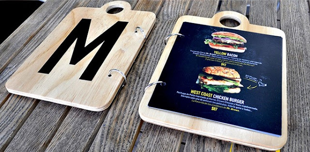
The popular duo – Jerome and Zimmerman designed the menu for the restaurant called Mr. Brown. This Mexican restaurant now has an interesting addition to the wooden décor in the form of a menu on wooden boards.

15. Montero, Mexico

Great Menu Graphic Design by Montero


Finally, the gorgeous masterpiece of the agency Anagrama, based in Mexico. The Montero restaurant now has an interesting menu inspired by the traditional values in the kitchen, with the use of raw materials from the region.

These menus should inspire you to follow your imagination and create something the restaurant world has not seen so far. Use the tips and samples above to create a menu design that makes your customers happy, and one that will bring many benefits for your restaurant. Remember – a great menu is one more step towards a successful business!


About the author: Olivia Ryan is a passionate blogger who writes on topics of digital marketing, career, and self-development. She constantly tries to learn something new and share this experience on different websites. Connect with her on Facebook and Twitter.


Thursday, January 5, 2017

Top Web Design Trends for 2017

web design trends 2017
What web design trends will merge in 2017? Find out here.

2017 is here and it’s bringing more technological breakthroughs and surprising web design trends than the world has ever seen. With each passing day, the modern world hits a new record for digital advancement. The future of web design looks bright for those ready to embrace positive changes.

In this article we shine some light on the web design trends that we think will be big in 2017, so here they are, our tips for the big web design trends of 2017 ...

Touch...

We think haptic technology will be a big deal in 2017
The mobile-first approach has been around for a few years now, but with mobile-phones now officially named as the primary devices used for browsing the web, more companies are realising the importance of having a site that effectively delivers content on a smaller screen. Furthermore, engaging users on mobile devices is becoming more difficult as the 'scroll' and 'swipe' design approach  used in many apps has led to users having a very short attention span when using their mobile device. This is where haptic technology comes in.

There are three sensory systems related to sense of touch in humans: cutaneous, kinesthetic and haptic. All perceptions mediated by cutaneous and/or kinesthetic sensibility are referred to as tactual perception.

The sense of touch may be classified as passive and active, and the term "haptic" is often associated with active touch to communicate or recognize objects.

Haptic communication recreates the sense of touch by applying forces, vibrations, or motions to the user through their mobile device.  Currently the Samsung Anycall Haptic enables users to feel clicks, vibrations and other tactile input. In all, it provides the user with 22 kinds of touch sensations in response to various user actions.

But how does all this relate to web design? Well, for example a strong vibration could be activated to discourage users when exiting a website or app. On the flip side a relaxing, pulsing sensation could be output from a meditation app on your mobile device. There are, of course, numerous other possibilities and I think 2017 is the year when we will see haptic technology emerge as a major feature in web and app design for mobile devices.

Back To Top

Big...

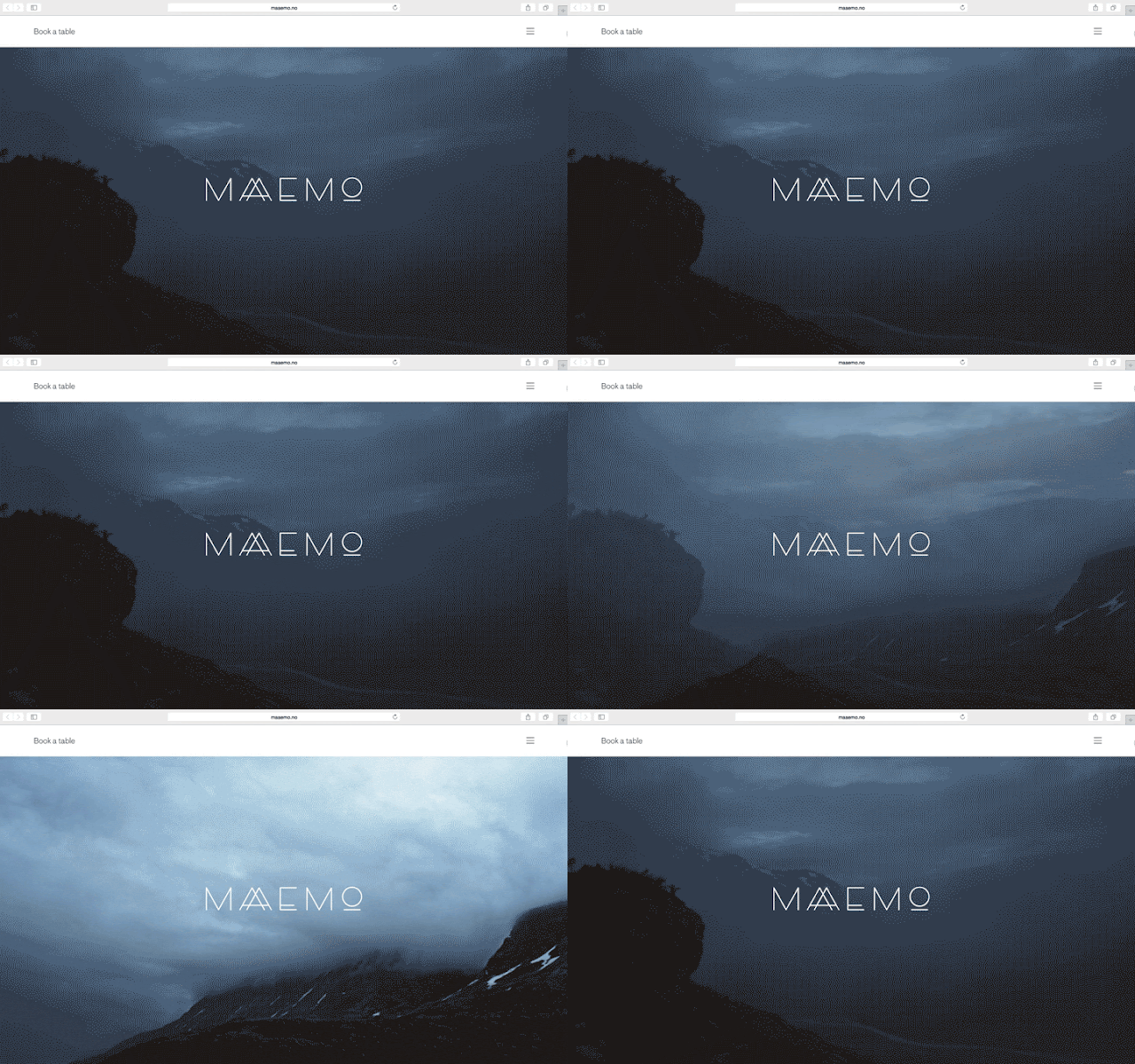
This website utilises big text and big images to dominate the screen
Images, Text and Video are all set to be big in 2017, and I mean that literally.

With the rise in mobile usage, users are reading less, scrolling more and browsing quicker so designers are having to go big to grab attention.

Full screen background images were popular in 2016 and we also saw the introduction of full screen video backgrounds too on websites such as pay-pal, more on that later though. This trend is expected to continue and become more widespread in 2017 as websites try to get their point across quickly and visually.

Large custom typography is also set to be used more to create personality, evoke emotion and set tone. As device resolutions become sharper and type becomes more easy to read on-screen, companies will look to push the limits of typography even further in 2017 to appeal to their target audience.

So expect to see an increase in over-sized and full screen type this year, hopefully it'll be of the beautiful, unique and hand-rendered type and not the bold, blocky and in your face type. We'll have more on the benefits of a custom approach later.


Back To Top

Space...

This website makes good use of space in 2 ways!

The right amount of empty space can make or break a design. Whether it is white space, a background color or image, “empty” space in a design can have a huge effect on the content that is there. if done correctly it will draw the user to the content you want them to focus on, and as mentioned earlier this is not easy nowadays!

Think about it from the user perspective. They will likely be drawn immediately to the open part of the design (whether they think about it consciously or not). From there, the eye will hop to the more populated part of the design. This simple two step process grabs users’ attention and almost shows them where to look. 


Open space is an extension of minimal styles
For this reason we think exaggerated use of space is one of those design trends that will be utilised a lot in 2017. Open space is an extension of minimal styles that have been popular for some time but, this year, rather than a symmetrical outline with space all around, web designs will balance images and text with space in a more asymmetrical format.

This simple balancing act is also visually interesting and great for making a strong impact, another reason we think it'll trend in 2017.

Back To Top

Original...

Expect to see more illustrations like this in 2017

As discussed above, the rise of mobile device and UI patterns now places UX as the most important aspect of design, meaning that many sites now look and work in similar ways. This is fine for users as they now know, instinctively, how to navigate around a website that they have never visited but it's not fine for a company who wants to stand out from the crowd.

In order for a brand to really stand out and strike a connection with it’s audience, while still using a design users can manage, they’ll need carefully considered and completely bespoke visuals which are more representative of who they really are. We can see this being a big web design trend in 2017 and is one that we really look forward to seeing.

Original illustrations are fantastic, versatile mediums for creating playful and friendly visuals which add an element of fun to a site. 

Talented illustrators are able to create illustrations which are full of personality and tailored to match the tone of the brand, something which brands will be striving for more than an ever in 2017.

A custom, purpose taken photograph is the main feature of this website

With a unique style of illustration established, brands are then able to roll that out through their entire identity, for use in large header images, custom iconography and beautifully animated visuals. Dropbox, is a great example of a brand who uses illustration to create beautiful, friendly and totally unique visuals which are full of character to appeal to their users.

This demand for originality will hopefully lead to the death of the dreaded stock imagery that we see everyday across the web and lead to a rise in more authentic photography in 2017. Brands and designers will now be thinking more carefully about the imagery they use on site, hiring professional photographers to take their shots which frame them in the way they want to be seen.

Unfortunately, it’ll probably be a long time before much of the cheesy stock photography completely disappears, but expect to see it disappear a little in 2017.

Back To Top

Video...

This website utilises a full screen video background to epic effect

One trend that grew quickly the past year is video content and we expect to see it grow further in 2017 especially as video content is now increasingly cost-effective to produce, with apps that enable quick and easy live video recording and professional-grade productions. The combination of decreasing costs of video and growing popularity of this medium is the perfect storm for video to overtake written content as king in 2017.

They say a picture paints a thousand words, but a video does that tenfold,

Video, although by no means new, is long-established and versatile medium, useful for story-telling, marketing and vlogging alike, and has several advantages over traditional photography. Where static imagery is flat and motionless, video is altogether more dynamic, using sound and movement to appeal to the senses and hold attention for longer.


Watch the video image above for a few seconds and see how encapsulating it can be. Much like with animation, a moving image on a page instantly captures the users attention, drawing them in so brands are able to get across their carefully constructed narrative and message.

Video is quickly taking over the internet, and the above reasons are testament to how successful it is as a means for content delivery. As well as using video for marketing purposes, it’s becoming more widespread in social media, with the recent releases of live-streaming services Periscope, and Meerkat illustrating the demand people have to not only view video content, but produce their own.

The benefits of video outlined above are reason enough for brands to want to incorporate it, but they are also great reasons for any freelance web designer to start using more video as a feature in their designs.

Back To Top

Custom...

Top Web Design Trends for 2017
Unique and personalised online user experiences are increasing sought after
It’s no secret that responsive web design has taken the web dev community by storm. In 2017, however, we think responsive design will reach a whole new level. Instead of simply adapting based on device, websites will adapt based on each user to give them an entirely custom experience. For example a website’s content, color scheme, font sizes, and spacing could respond to accommodate a user based on their age.

If you're a marketer today you probably know that targeted emails are effective. But what happens when someone clicks through that targeted email only to end up on a static, generic website? The natural progression of personalized emails should lead to a personalized website, but limitations in technology and strategy have delayed this realization so far. There are signs, however, that the time for more personalization across the online experience has come.

A 2013 Monetate/eConsultancy Study found that in-house marketers who are personalizing their web experiences see on average a 19% uplift in sales.

When it comes to shopping online, experiences tend to fall into two categories: The almost seamless experience offered by major retailers such as Amazon or the clunky too-many clicks to checkout experience that is common among small shops. In 2017 a third could emerge, a fully cutomised web experience to suit your exact and specific needs and desires - now doesn't that sound great!

Back To Top

Voice...

Web Design Trends for 2017

Consumers are drawn to systems like Siri, Cortana and Alexa, who respond to voice commands and spoken questions. Voice search developments have made this the preferred search method for many consumers, who now ask their devices questions such as “Where are the nearest shops to me?” In 2017 businesses must consider these voice searches when creating content for their websites by making it more conversational and using natural phrases instead of generic keywords.

But it's not just the content creators that need to pay attention, the web developers and programmers have a bit of homework to do too. Although there are not a lot of studies and data currently available on the subject,you can be sure that users are likely to use different language when creating a search query by speaking, rather than typing.

Here are a few simple steps that web developers can take to ensure that their websites are making the most of their potential voice search opportunities...

  • Schema is a markup language that works alongside HTML to provide information to search engines and other services that want to use the data that you provide to learn about your website. The information that you provide through schema already has an affect on your search optimization, but becomes even more important when targeting users that are using voice search. The more information that you are able to provide to search engines, the better that they will be able to understand the content on your website and connect relevant to voice searches that are performed by users.
  • A website might provide search engines with a large number of feeds that provide data and information to help them properly categorize their listings. For instance, XML sitemaps and location data are integral for helping Google to crawl the entirety of your website and help to provide information that can help your business to rank in local search engine pages. Ensure that you are providing all data that is relevant to your company in the feeds so that search engines can correctly classify and detect when your content is appropriate for voice commands and search.
  • Often, users that are using voice search are looking for very quick answers to their question. They want to know the answer and have it read back to them as quickly as possible. For this reason, you should try to ensure that the answers to common questions that users might have about your company, product, or industry are answered clearly on your pages. Frequently Asked Questions pages are an excellent way to provide quick, relevant answers to questions that voice searchers might have.


Back To Top

Animation...

Design Trends for 2017
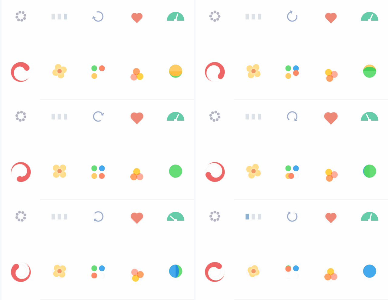
css animation loading icons
As browsers and languages become more advanced, we’re seeing more websites move away from the use of static imagery and finding new ways to engage users and be unique in their approach to communicating. Animation is one of the main ways to do this and having seen many brands start the trend in 2016 we think 2017 is going to see that trend grow further.

Animations  can come in all different shapes, sizes and styles; and can serve different purposes. For example animations can range from tiny loading-devices (see above) which entertains the user while waiting for content to load, to an interesting hover-state used as a UX device to show a user they’re hovering over a link.

They can also be used on a much larger scale, as rich, full-screen animations, which can integrated to work with scrolling, navigation or be used as the focal point of the entire site. Animation is another useful mechanic for brand’s to create meaningful micro-interactions between themselves and their users.

With such a broad array of internet capable devices ‘the fold’ is now harder to define, as users are viewing content of screens of all different sizes and resolutions. Scrolling, once reserved for getting from top of a page to the bottom, is being used in more creative capacities to deliver content online. Apple is a high profile brand making great use of scroll within their site.

Animated scrolling (as used on this website) and parallax scrolling are versatile mechanics which, when executed well, can work great with all varieties of content delivery. It works with video based content, where large full screen videos play and pause as the user scrolls, as well as static content, which can animate, move, or change depending on the users input.

With content creation happening at a far greater pace than ever seen before, and companies finding more innovative solutions for delivering their content to users, we expect the clever use of scroll and parallax effects to be big in 2017.

So web animation has many applications, but if abused, or executed badly can be disastrous to usability. However, as with most developments, we expect that as more designers experiment and gain feedback from users, it’ll be something which gets better and better, adding more functionality and additional levels of interaction.

Back To Top

Conclusion...

There are 100’s of ‘trends’ going on in any creativity industry at any one time, and it’s hard to pin-point every single one, but we believe that the above are some of the more core ones to be focusing on in 2017 and beyond.

As with all trends, the above points have come about for good reason; as creatives and clever-thinkers across the globe have all learnt and borrowed from one another to form similar patterns which we see emerge online today. Not all of these trends may be relevant to you and your content, but it’s always beneficial to know what’s happening in the industry and to see where you’re able to improve in order to develop and progress.

With all this said, they should only be used sparingly, and carefully, to enhance the user’s experience and not detract from it. No-one wants to wait forever for content to load because of unnecessary design 'features' holding it up.

Tuesday, January 3, 2017

Learn A New Skill For The New Year

Learn A New Skill For The New Year
Giving things up for new year is a common practice but also a very difficult one that most people break after just a few weeks. So this year make your resolution be to learn something new, to up-skill, to re-skill; here's a few good reasons why ...

  • A new skill to put you ahead of other job candidates
  • A new skill for a change in career, 
  • A new skill to enhance your studies 
  • Or just a new skill for fun! 

But what skill should I choose? Well, design skills are one of the most adaptable and sought after skills around as they show you to be creative and innovative but also logical and organised. So here are the top 5 design areas for you to up-skill in...

Web Design:


More and more business is being done online everyday and because of this every business from your local coffee shop to the multinational corporations has a website. This means there is a growing demand for web designers to create, update, moderate and redesign all these websites. To get in on the action, you will need to learn HTML5, CSS3 and at least a little JavaScript. These programming skills will be further enhanced with knowledge of SEO (Search Engine Optimisation) and design skills like the ability to use Photoshop. Using the web design process is also an essential skill that is unfortunately overlooked by many web developers who call themselves "designers".


Graphic Design:

Sample Poster

A lot of people group the ability the use Photoshop and being a graphic design together as if they were the same thing... they are not! Photoshop is a great software and the Adobe Creative Suite of which it is part is certainly the industry standard for graphic designers but there is a lot more to graphic design that using software, after all, graphic design still existed before computers! Back then, just like for modern graphic designers, the graphic design process, an understanding of colour theorytypography and composition were all keys skills. Some more modern techniques such as the use of attention grabbing techniques in your imagery and the use of the most powerful words in your typography will further enhance your skill base.


Games Design:

Games design with Unreal Engine

The games design process can be completed by just one person but that person would need to be highly skilled in many different areas of the design process and production stages and have a lot of time on their hands! For these reasons computer games, much like anything else, are designed and built by a team of people each with their own specific set of relevant skills. See which role would interest you most or dabble in a little bit of each before focussing on one area to learn. Start your journey here.


Interior Design:

An example of the Urban Interior design style
 Interior design is another misunderstood craft with numerous people claiming to be interior designers simply because they have "an eye for it". The interior design process, when done properly, is a complex task which requires multiple skills and the knowledge of key areas such as interior design styles, colour theory, room layout techniques and an awareness of a multitude of materials and finishes for walls, floors and furniture. Perspective drawing skills and the ability to create presentation boards for potential clients are also valuable skills for any professional interior designer.


Furniture Design:


The most practical and hands on of our top 5 skills for the new year is furniture design. Like all the others understanding the process is key and the furniture design process should be your starting point. After that a look into furniture design history will give you an understanding of traditional and contemporary furniture styles. An awareness of the available and industry standard furniture materials is also a must which will be complemented by a knowledge of the different furniture joinery techniques when you go to build your design prototypes.

Thursday, October 6, 2016

Read How to create Pause Screen in UE4 Now

This image shows a finished Paused screen.

Step 1:

Before you open Unreal Engine go to http://www.dafont.com/ for download a font suitable for your game. One you download extract the file and installed ttf file. Copy the ttf file and paste in C:\Program Files(Program Files (x86))\Unreal Engine(Epic Games)\4.5(engine version)\Engine\Content\Slate\Fonts

After when you installed font open Unreal Engine. Content Browser is located in folder “Game” create new folder for User interface screens call it “UI”. In UI folder press right mouse bottom and select “User Interface” option then select “Widget Blueprint” in order to save press right click on widget blueprint and select save. Then double click on the widget blueprint to enter to edit menu.

This image show where you should create folder for User Interface.

This image shows where you should create Widget Blueprint.


Step 2:

On left top corner of the screen there is a folder called “Palette” expand “Common” select “Text Box” hold and drag on canvas or you can hold and drag on canvas under [Root] but make sure that you put on canvas.

This image shows Pause Screen editor.

This image shows canvas for screen.

Steps 3:

If you select text box then on the top right side of User Interface editor you can see “Details” options. Chose “Layout (Canvas Panel Slot) and press on Anchors and choose the middle. You can mess around and change “Style”, “Appearance” and other options. In “Content” option you can type the heading of your title.

This image shows options for Pause Screen.

This image show Text Block applied on canvas.
This image shows Text Block operation.

This image shows text applied on canvas.
This image shows colour options.
This image shows costumer font style. This is spot where you should put the font name that you want use.

Step 4:

You can add image if you want by dragging image box. To select image that you want to use and drag to “UI” folder. When your Pause screen is finished and you are happy of it than press Compile. Save and close the editor. You can find good image on http://www.freeimages.com/ .

This image shows an image box applied on canvas.


This image shows an image box applied on canvas.
The image that I chose is grunge border from http://vyawie.deviantart.com/art/Border-Black-Grunge-187744467 . You can search in Google Image for grunge border.

This image shows an image that I use for Paused Screen.

Step 5:

Select “Blueprints” then select “Open Level Blueprint”. Press right click and search for letter “P” to pause game and “X” to un paused game and add other important objects that will be needed for “Pause Screen” to work. Create new variable and select and then in variable type change to Boolean. Then create new Variable but this time change to Float.

This image show programmer for Paused screen.

This image shows the program for Paused screen.

Step 6:

If you finish coding press compile and save your Pause screen and you can exit programming. The last thing that is left to test if pause screen is working is to “x” out of programming editor and see if it works.

This image shows a finished Game Paused screen.
You can also watch a video tutorial about how to create a Pause Screen.


close
Banner iklan disini