Showing posts with label photos. Show all posts

Thursday, October 6, 2016

Read Optimising Images for the web Now

Optimising an image in Photoshop
In this tutorial you will learn how to change the size by using the crop tool and how to optimise an image for the web in Photoshop. When an image is optimise it helps for a faster download when using the image on the web.

Step One:

In Photoshop, open up an image that you have saved by clicking on open and selecting the image you need.
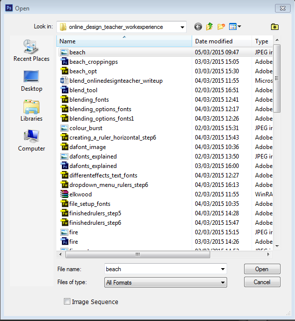
Opening the image to be used in Photoshop


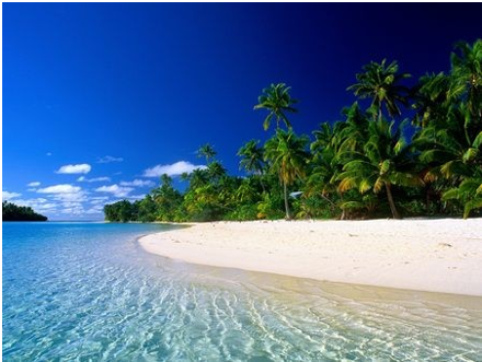
The image I am using the below image for the demo. I downloaded the image from google images. It is a non-copyright image,that means it’s free to use without having to pay any fees. I searched in the “Search Tools” area in google images and selected “Usage Rights” and selected “Labeled for reuse with modification”.
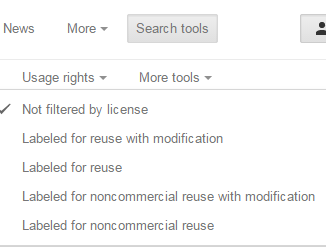
Selecting the usage rights on Google Images

Image used for the demo 

Image used for cropping and optimising in Photoshop

Step Two:

If you would like to get rid of any unwanted area of the image, you can crop the image. You can use the crop tool as show below to get rid of unwanted areas.
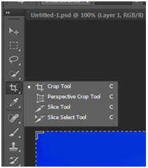
Selecting the Crop Tool in Photoshop


Appearance of the Crop Tool on Photoshop
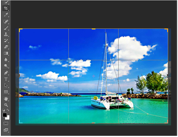
Selection area on the image once the Crop Tool is selected in Photoshop

Step Three:

To save this image to use for the web. Click on file and the selected “saving for the web”.
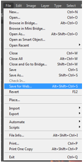
Selecting  "Save for Web" in the file area on Photoshop

Step Four:

The “Save for web” window will appear. In this window, selected 4-Up, select png-24 for a faster download and for a greater number of colours of the image to be displayed when using it for on the web. 
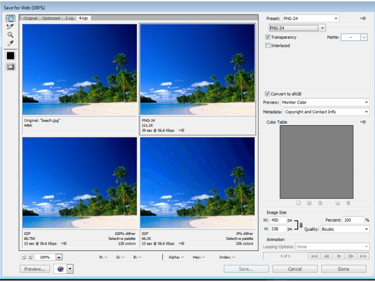

Pop up menu to help you to select the correct format for your image to use for the web

Then you can save your image as beach_opt.png. 
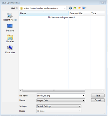
Saving your optimized image 

Monday, February 29, 2016

SEO For Images

SEO for images
Screenshot from the Google search results page


If your web graphics are optimized for Image search engines like Google they will help to generate an alternate source of traffic to your website. But unlike regular web search where we are more familiar with how search engines rank content, the rules associated with Image search rankings are very different and often based on assumptions.

Why do I say this ? Try a search for "Google" on Google Image Search. None of the top results show images from the actual Google websites or even associated websites. Now if you repeat the search for Amazon, none of the top 5 images displayed are from the official Amazon website. So how do individuals and small companies manage to stay ahead of corporate giants in Image search results? It's to do with image optimization techniques like the ones discussed below.

Regarding optimization, here are 6 simple things that you should keep in mind for getting good rankings in Google Images Search:

1. Image File Name

Use a descriptive image file name which includes keywords related to the content of the image. If your webpage has pictures of an old country farm house - use file names like 'old-country-farm-house.jpg' instead of the default camera file name like IMG_401.jpg. In this way you are providing relevant information about the image to Google rather than just a string of meaningless numbers or letters.


2. Alt and Title

Attach a 7-8 word description with both the ALT and TITLE attributes of the IMG tag. Make it a habit to use these attributes. An example could be...

<img src="old-country-house.jpg" alt="dilapidated old county farmhouse in countryside" title="country style farm house ageing and run down">

3. Discuss The Image

A short two line description of the image just beneath the graphic is the best way to describe an image. It can work wonders for your image search rankings as well. For a live example, read any news story on the BBC websiteThe HTML tags enclosing the image descriptions will also matter. A description alongside a heading enclosed in H3 or Bold tag will have more weight than the one with just a description enclosed in the paragraph tag.

4. Wrapping Text

If possible, try to wrap text around your images using the CSS code of "float", like the old country farmhouse image above. If you site design won't allow wrapping text or if the image is large in size, try to place the images near text that describes the context of your image. Web Photo Galleries which have no text on the page can make use of the Title and Meta tags to insert information about the images.

5. Image Position On Page

From personal observation Web Images placed at the top of the page are more likely to appear in search results than the ones which are at the bottom. They do not have to be at the very top of the page but certainly 'above the fold' images tend to perform better than those below the fold.

6. Image Size

Another personal observation is that images which are very large or very small tend not to do very well in the search results. Try to keep images at sizes which will be useful to others who may be looking for them. In my experience images around 600px x 400px tend to do well.


If you do decide to use some or all of these tips, please keep an eye on your image performance and let us know how you get on.


Magazine Cover Design Features


Magazine Cover Design Features
Magazine Cover Design Layout

Designing a Magazine Cover? Then you need to be aware of these industry standard features, Both from a technical and a design point of view. First the Technical...

TECHNICAL

Size: 

Professional Magazine Covers (and therefore magazines themselves) are not A4 in size. This is a common misconception. The actual size is similar to A4 though; 8.5 inches x 11 inches is the standard.

Text: 

Your Magazine Cover should include the magazine name, tagline and selected article headings.

Main Image: 

You should ideally use just one main image. It should be a high quality image ideally on a plain background.

Little Details:  

Don't forget the Date, Price, Issue No. and Barcode

So with all those things in place you will technically have a magazine cover, but how do you make sure it is a good one...? Now lets look at the design.

DESIGN

Main Image:

Your image should be the dominant element on the cover, it should take up at least two thirds of the cover and should contrast with the background, keeping it centrally aligned it also best. It should also utilise at least one of the Attention Grabbing Technique. The most effective being Sexy or Iconic, if you use an attractive celebrity you will be achieving both at the same time, hence the reason they adorn the cover of most magazines. When using people use either head and shoulders or waist up photos for best impact.

Magazine Cover with Iconic Celebrity
Magazine Cover Using Iconic Celebrity On The Cover
The magazine title text is best large and bold old in a sans-serif font. The style of the font should also be appropriate to the style and topic of the magazine.  

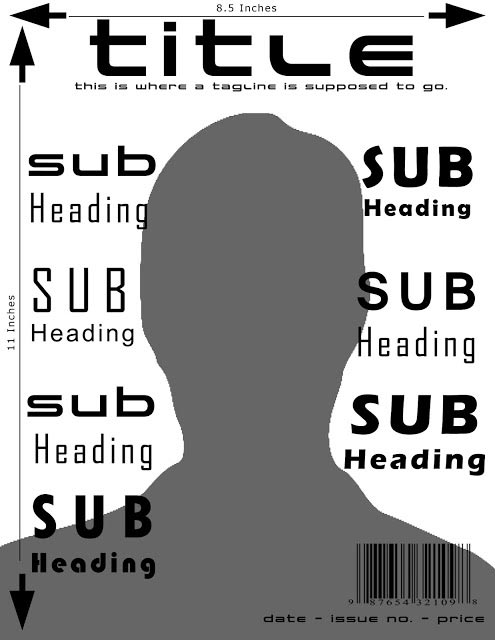
Sub-Headings are best aligned to the sides, should include a variety of font styles, colours and sizes all still in sans-serif (see the sample below), contrast with the background and use buzz words or better still any of the 12 most powerful words


Magazine Cover
Magazine Cover utilising variety of sub heading styles, colours and sizes

And not forgetting the little details: They should be kept small, discreet and out of view (unless they are a feature of the sale – e.g. special discounted price)


So if you have taken all this on board are are still interested in creating your own magazine cover design then see our create a magazine cover tutorial. You may also be interested in reading about the most powerful words in the English language, which tend to feature regularly and prominently on magazine covers.


close
Banner iklan disini