Showing posts with label how to. Show all posts

Tuesday, April 24, 2018

Everything You Need To Know About 3D Modelling

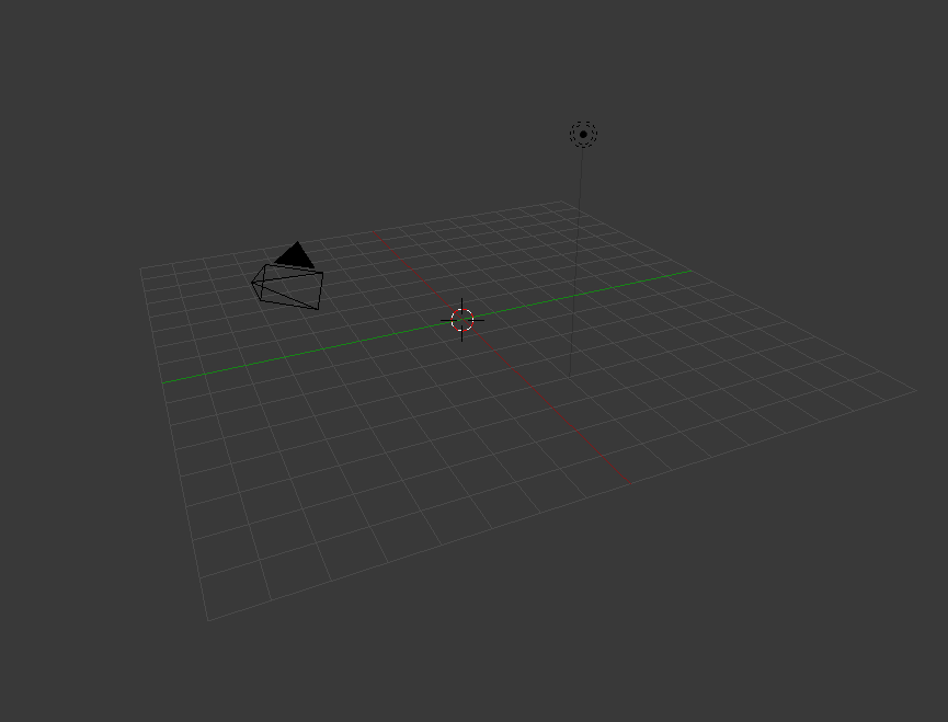
These series of updated articles aim to provide you with everything you need to know about on 3D modelling and graphics. In 3D graphics, elements are visualized by creating three-dimensional models out of them. The final image is rendered from a virtual scene that utilizes several elements which are familiar from real life such as lights, materials and cameras. 3D graphics can be seen in multiple different forms such as an image, an animation or real time visualization inside of a computer game. If you are interested in a career in animation or gaming then this series is especially relevant for you!

We recommend reading this articles in the order presented if you are a beginner, however they are designed in such as way as that they are relatively independent of each other.

Select an area of 3D modelling to get started...


The creation of 3D graphics is a complicated process and therefore is, in my opinion, easier to understand when discussed in small pieces, hence this 8 article series. we hope that you find it useful and as always we welcome your feedback.


Monday, February 26, 2018

eCommerce Conversion Rate Tips and Tricks

eCommerce Conversion Rate Tips and Tricks

The ultimate goal of any online business is to have a great conversion rate. That means to get as many of your visitors to complete a desired action on the website. For example, for online stores, that means to get more people to complete a transaction. That is how you measure the efficacy of conversion marketing.
As an example, if a customer decides to abandon their online shopping cart, the seller would often make some special offers include a discount code or free shipping in order to convert that visitor into a paying customer. Or perhaps the company would try to recover this visitor through another online engagement method, such as reminding her via email or even using a proactive chat to help the customer through the purchase process.

As an online business, this is a long-term investment that you can make to improve your online customer service channels, your site flow, and the entire customer experience.

Additional tips to increase your conversion rates are to keep your homepage simple and the website navigation user-friendly. If you make sure that the structure and the site navigation can be used with minimal effort, you are already doing a great job. Naturally, placing a discount code or two on the homepage itself could also significantly increase your conversion rate.

When a visitor decides to look at the details of a certain item or a certain service that you offer on your website, another great method for increasing your conversion rate is to generate some user reviews of the product or the service that you are selling.

This means that after a customer receives their item or service, they should be able to provide feedback, both on your website and on the purchase that they’ve made. They can write about the quality of the purchase, their shipping experience, the way product that was advertised beforehand and anything else they’d like to include. Then, when another person visits your website and is interested in the same product or service but is not sure whether to make the same purchase, she is going to be convinced by that review that your previous customer left.

Two other extremely important tips to include in your website are a PayPal button and the feature to have customers checkout as guests.

The first one is going to increase your mobile conversions by up to 34% because most of the world uses PayPal already, and the transactions via PayPal are simple and confidential. This also means buyers won’t have to go looking for their credit card and then go through the hassle of inputting all their information to make said purchase. Because if they’re buying something on impulse, research shows that they are likely to change their mind if they have additional steps that they need to do before they finalize their transaction, which results in your business losing a customer. The same idea goes behind allowing people to check out as guests.


See the infographic below for more tips and tricks on how to increase your business’ conversion rate.


Infographic URL: https://websitebuilder.org/resources/conversion-rate-Optimization-Hacks


Friday, January 19, 2018

Tips for Designing and Building a Multilingual Website

Create a multilingual website
English is not the only language out there, so why only design a website with one language in mind

As a modern society, the human race is continuing to grow, expand and connect to one another more instantaneously than ever before. In just a click of your mouse or a tap of your finger, you can be reading about the entire life and legacy of another human being that could have existed hundreds of years ago.

It’s amazing when you think about.

However, with such a connection comes the problem of language barriers. While you might be writing your content in English, statistics show that only 20% of the entire world population actually speaks the language, meaning your website is relatively inaccessible to the remaining 80%, which equates to around 6.6 billion people.

So, to counter this issue, you’ll want to design and build your next website as a multilingual platform that’s accessible to people around the world, or at least your target market. But how you do go about doing this? What problems and milestones will you need to overcome and what features does your website need to include?

To get you off on the right foot, here’s a complete guide to everything you need to know.

Getting Started

To start with, the first thing you’re going to want to consider is not actually the building of your website, but the content itself. You’re going to need to get it translated. Of course, translation services, such as Google Translate, are constantly improving and are updated or a near-daily basis.

However, these services definitely aren’t reliable if you’re looking for a professional finish. Ideally, you’re going to want to hire a human translator to edit and convert your content properly. For this, you have multiple options available.

Firstly, you could use translating companies such as International Translating or Big Assignments to translate your content for you on your behalf. This is of course if you have the budget. If you’re translating hundreds of pages of content, this can prove quite expensive, and you’ll need to find another way, perhaps by hiring someone long-term, such as a freelance translator from Upwork or Ukwritings.

If this is the case, or you plan on translating your content yourself, you’ll need to remember to proofread your content for errors, so your website remains professional. According to recent statistic, 59% of people said that they won't trust the company of service which has errors and mistakes on their website. So proofreading and editing is vital for your business reputation.


Implement Language Change Features

Of course, no multilingual website would be complete without the ability to actually change the language that the viewer wants to read your website in. Most commonly, you’ll notice that a lot of websites use a traditional drop-down menu which is clearly visible in the header or footer of the website.

In theory, you can put it wherever you want, but you want to make sure it’s clear and easy to see as soon as your website loads as people accessing your website will want to change it straight away.

Another key element to consider at this point is adding flag images to your drop-down menu. While this is a graphically powerful element to include, there are a few problems that come with this approach. Most notably is the fact that flags represent countries, not languages and many countries will have more than one official language.

Finally, you’re going to want to make sure that you refer to each language in its own language form, for easier identification purposes. For example, German should be referred to as ‘Deutsch’, French as Français, and Spanish as Español.

Checking Your Readability

You may not speak multiple languages but you can still create a multi language website with the right tools

While you may invest a lot of time in choosing fonts for your website and you’ve chosen one that looks clear and precise for your English readers, it’s important to make sure that the font will still be as legible when it comes to another language.

Sarah Stanford, a translator for Paper Fellows shares...
“One of the biggest problems that trip up multilingual websites up is choosing a fine and relatively small font that went translated, the symbols that appear in certain languages, such as the ‘n’ in ‘Español’ can become unreadable”

To alleviate this problem, be sure to check your character encoding, typically found in the head of your page. If your website is using Unicode, UTF-8 may work perfectly since it supports multiple languages, helping them to maintain their readability.

Reading Line for Line

One of the most common misconceptions that people have regarding other languages is the fact that languages don’t have a reading direction. However, the script in which the language is written in does. For example, Arabic script is read from right to left (RTL) whereas English and other European languages are left to right (LTR).

Of course, the vast majority of languages do read LTR, but if you include language settings for those who read RTL, this is something you’re going to need to consider. To achieve this easily, you simply need to mirror your website pages, which includes everything.

This means your menu bars, your icons, the layout of your navigation menu, the buttons and even the scrollbars will all need to be flipped and mirror what they are usually. Fortunately, there are a number of ways you can do this using basic code which can be found online, depending on what code you’re using to build your website.

Customising Your URL

Another important factor you’ll want to consider is the URL that your website is using when it changes the language. A country code top-level domain, more commonly referred to as ccTLD, are all linked to specific countries. For example, .fr is France and .es is for Spain.

This is such a vital part of the process that you’ll need to remember to complete since this is how search engines will help users to find the content they’re looking for. If you don’t implement it, users won’t be able to find your website easier. Of course, this will eat into your budget, but the ROI is worth it in the long run.

For more information on using ccTLD, as well as for your sub-domains and sub-directories, check out this Google guide on the matter.


Creating a Multilingual Store

If you’re creating a blog with content, this point may not concern you, but if you’re creating a multilingual website that sells products, this is very important as there are a few aspects you’ll want to consider.

Firstly, are all the products that you’re selling on your store available in all the countries you’re trying to sell in? If not, you’ll need to find a way to make certain products only available in a certain language, but of course, this solely depends on what framework and store platform you’re using.

Tom Dewis, SEO-expert at Ox Essays shares, 

What you have to consider is the currency options that are available to your customers. The cost and price tag of each product will need to be converted automatically in regard to the language that is selected, or using a clearly placed drop-down menu where users can choose their preferred currency.

Finally, you’ll want to consider your posting and delivery options. For example, if you’re not going to be able to sell products in France, you need to make this clear in your terms and conditions.


Consider the Details

This is one point that will solely depend on the content of your website and blog, but it’s definitely worth bearing in mind throughout the entire building process. Many cultures will have a different outlook on certain subjects in life, for example, sense of humor, sexuality, gender equality and symbolism.

When translating your content, be sure that you won’t offend anybody’s beliefs with the content you’re posting to avoid it becoming a problem in the future.

What’s more, if you’re using Captchas on your website, have you investing time in making sure the Captchas are in each language rather than just in English? The same if you’re adding citations to your website for this process, be sure to use tools like Cite It In to make sure they’re correct.

Finalising Your Content

Now that your website is nearing completion regarding the multilingual side of things, you’ll need to invest time in finalising your content to ensure that it’s perfect for release. The first thing you’ll want to do is to make sure that all your content has been translated properly.

One simple way to do this is using a tool for Easy Word Count. Using this tool, you can copy and paste in your original content and then your translated content and then refer to the word count. If the word counts are roughly the same, give or take a few words, you’ll know that nothing has been missed during the translation process.

Secondly, you’re going to want to check your translated content to make sure that it doesn’t breach any plagiarism requirements. While your original content may not be plagiarised, your translated copy might be. However, this is easy to check using plagiarism checking services like Academized or Plagium.

Conclusion

In reality, there is a tonne of features and aspects of your website you’ll need to consider when designing and building a multilingual website, but this will solely depend on the kind of website you’re building, its purpose and the industry that you’re operating in.

However, this article has covered the majority of the basics that you’ll need to consider and should give you the best shot at creating a successful multilingual website.


About The Author

Brenda Berg is a professional with over 15 years of experience in business management, marketing and entrepreneurship. Consultant and tutor for college students and entrepreneurs. She believes that constant learning is the only way to success. You can visit her personal blog at Letsgoandlearn.com


Thursday, October 6, 2016

Read How to add a texture in Blender Now

rendered result

In this tutorial you will learn how to add a texture in Blender using Cycles render.

Step 1

Using whatever you have made or imported change the default screen layout to compositing for a detailed result.

changing layout to compositing 

Step 2 

Change blender render to cycles render at the top of the screen.
Blender Render

Cycles Render

Step 3

Right click in the plane, click on the material button on the top right corner of the screen, click new.

adding a material

Step 4

If a material is already in place use the subtract button then press new.

subtracting the existing material 

Step 5

Click on the dot right of the white colour.


Step 6


Select image texture, press open and navigate to the image you want to use, once selected open the image/texture.
opening a image texture

Step 7

To map the image on the plane go to edit mode by pressing Tab or changing it from the bar menu.

changing to edit mode

Step 8

Press A to deselect then A again to select everything. go to mesh, UV unwrap, unwrap.

unwrapping the cube

Step 9

On the left side the plane will be unwrapped. Next load the image.

applying the image onto the cube

Step 10 

Switch back to object mode, switch back to the default layout, go to render to see the result.

changing to rendered view


Rendered result 


Read How to set up margins and guidelines in Photoshop Now

Rulers Set up in Photoshop
In this tutorial you will learn how to set up the use of Rulers in Photoshop. Rulers are use to help you to position images and text in the exact position you require when using Photoshop.


Step One:

Select file and new and create a new file. I have chosen the settings off 8.5 inches for the width, 11 inches for the height, with 300 for the resolution and RGB color for the color mode.


Setting up a new file for Photoshop

Step Two:

For this demo I am going use some text to show how using rulers can position your text correctly.

Sample of a new canvas for setting up the ruler example

Step Three:

To set up the rulers manually, click view and a drop down menu will appear.
View drop down menu in Photoshop

Click to turn the rulers on. A guide will then appear with numbers on the top (Horizontal) and on the left hand (Vertical) side of the page. This is your rulers guide.

Image of Rulers as the appear in Photoshop


Step Four:
Now with your mouse, hover over the numbers until a white cursor appears. Click and drag down the top line and place onto the template at desire level. Clicking and the pulling down of the rulers (Horizontal).


Adding of the Rulers (horizontal)

Bring the rulers in from the left hand size (Vertical)

Adding of Rulers (Vertical)

All the rulers in place.

All the Rulers in the correct positions

Step Five:

As you can see from the above image the text is on the outside of the rulers on the left hand side. To move the text into the correct place, select the text layer, on the right hand size and with the move tool and move into position. 

Rulers and Text in the correct position

Step Six:

You can also set up the rulers to the exact measurement required. To do this, again select view, and the drop down menu will appear, scroll down and select “New Guides”. A pop up menu will appear and you are able to select the correct measurement for the rulers by selecting either horizontal or vertical position.

Drop down menu once selected the View option on Photoshop

Pop up menu to select the correct measurements 

Selecting the measurements in the New Guide

For this demo I selected the measure for the Horizontal (top) for 3cm, with the Vertical (left side) set also at 3cm. Again for the bottom Horizontal and right side Vertical set the setting to this time 3mm for the rulers to appear.  Example show in the images below.


Creating the Horizontal Ruler with the correct measurement

New guides rulers for Horizontal and Vertical (3cm)

Horizontal and Vertical rulers appearing in Photoshop


Rulers in place after creating them with the new guide option in the view section of Photoshop. To move the text into the correct place, select the text layer, on the right hand size and with the move tool and move into position. 

Rulers and Text in the correct position on Photoshop

Read How to model and texture a chair in Blender Now

Chair with texture

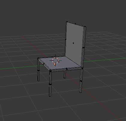
In this tutorial you will learn how to create a basic chair and add a texture onto the chair.


Step 1

Delete the default cube by pressing X and delete.

with no cube 

Step 2

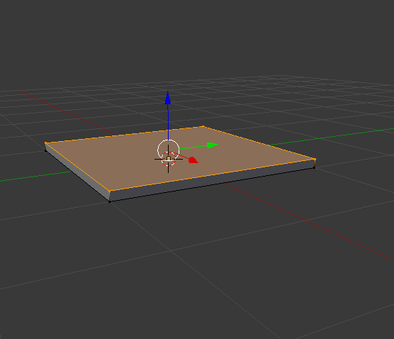
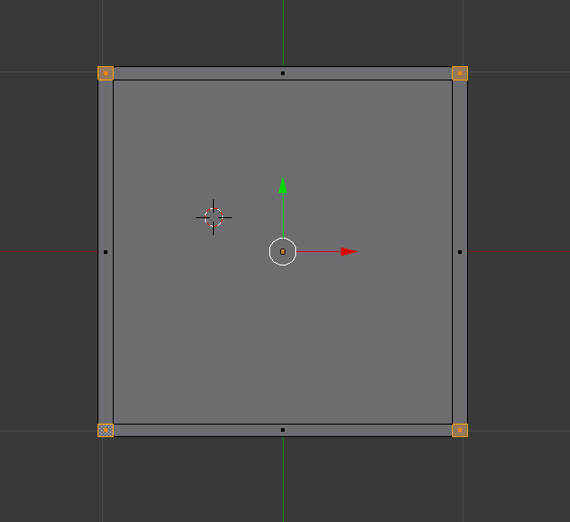
Add mesh plane or shift A mesh and plane.Zoom in with the middle mouse button, or press 1 for a side view, press Tab to go into edit mode it should turn orange. E to extrude.

plane that's extruded


Step 3 

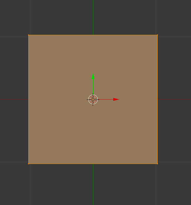
Press 7 on the number pad to get a better view. Use the middle mouse button to zoom in or out.

top down view of the plane in edit mode

Step 4

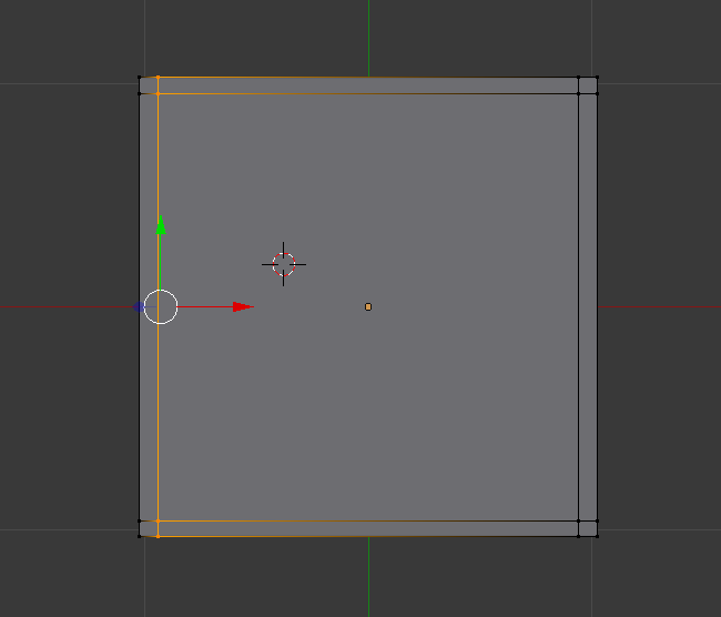
Press ctrl R to create a loop and place a loop at each side. Total of 4 loops.

plane with four loops

Step 5

Select face select. 

face select

Step 6 

Press the number 8 to flip to the opposite side(underneath the plane),Select one box then press Shift and right click on each of the boxes.

plane with all four corners selected

Step 7 

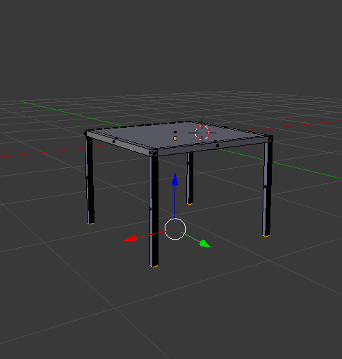
Press number 1, press E to extrude to your desired length. Use the middle mouse button to move around to get different angles.

plane with all legs

Step 8 

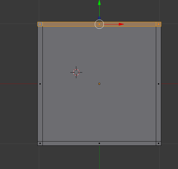
Press A to deselect, select one side and E to extrude. 

top down view with one side selected

basic model of a chair

Step 9 

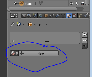
To add a texture onto the chair go to materials bar on the top right corner of the screen, click on new.

adding a new material

Step 10

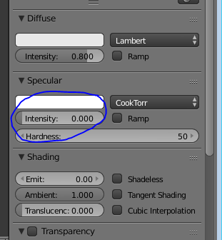
Change the specular to zero so a glossy effect wont appear onto the chair.

lowering the specular

Step 11 

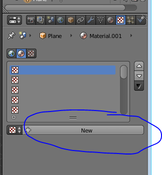
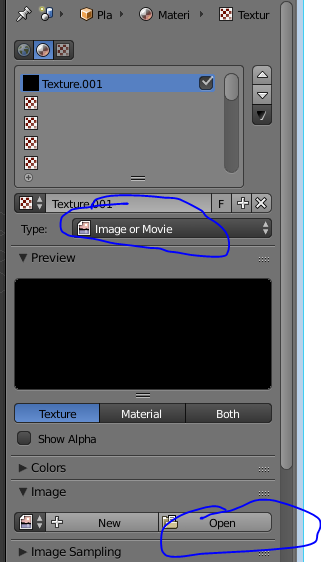
Go to the texture section beside the material on the top right corner, click on new, change the type image to image and movie, click on open and navigate to your texture that you have downloaded.

adding a new texture

importing a texture

Step 12 

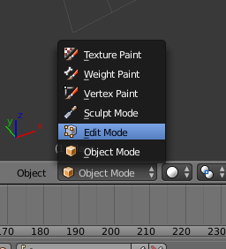
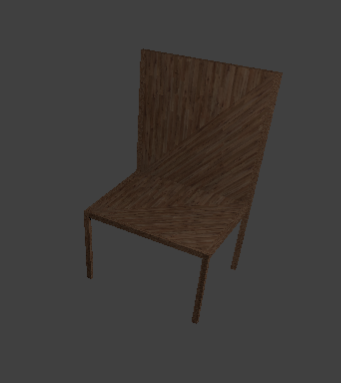
The texture will look like this on the chair, to fix this the texture needs to be unwrapped. Change object mode to edit mode.
changing to edit mode
chair with texture

Step 13 

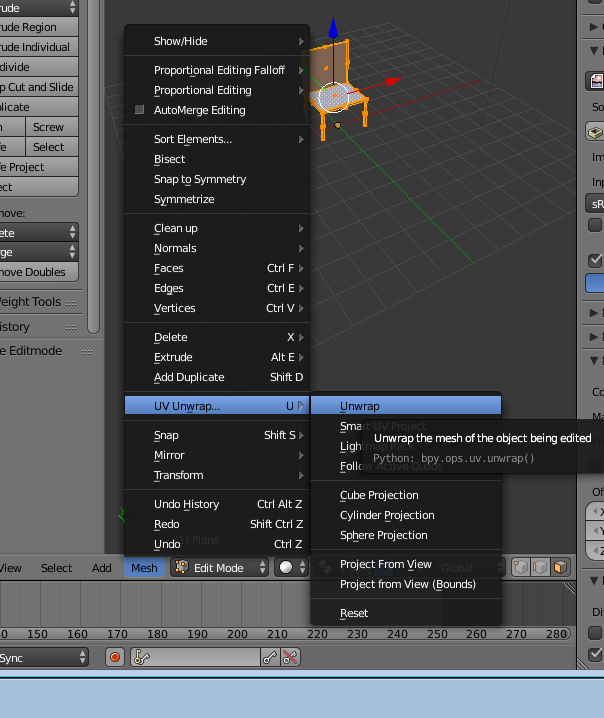
Go to mesh, uv unwrap, unwrap. this will fix the texture on the chair.

unwrapping 


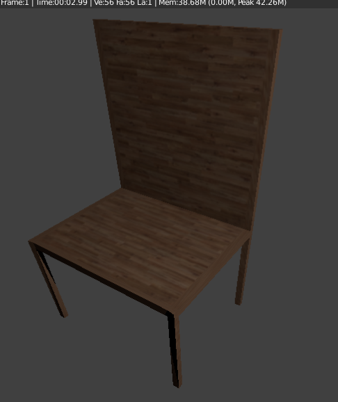
rendered result 

finished chair with a texture

close
Banner iklan disini