Showing posts with label design theory. Show all posts

Friday, April 27, 2018

5 Approaches For Creating A Recognizable Logo Design For Your Brand

A Strong, Distinctive Logo will represent your brand as strong and distinctive

Strong Logo, Strong Brand

Many companies out there require a strong logo to discern them from all the others out there. One of the best ways to do this is to create a powerful logo that engages people and serves as a recognizable symbol of your brand. If you have this, your customers can easily identify your products or services from those of others.

The right logo is an essential part of branding. Think about all the biggest brands: Nike, Apple, Starbucks - they all have great logos that prove their success and make them stand out even when there is no context around them. A great logo will allow you to instantly capture a user’s attention, and let them understand what your brand represents.

Look at the Nike tick. What does this tell you and what can one learn from this logo? It’s certainly recognizable and only created using two skewed lines, so its simplicity is the key to its design. The design indicates a strong sense of positivity and motion that is synonymous with this brand, and its ethos of providing the best sporting equipment. This logo has survived the test of time and has become affiliated with all aspects of transcendence through sports – from basketball to running. Nike and its tick have penetrated all sports markets and much more.

So what is the right logo? You’ll need something that can represent your brand in a visual way, whilst also embodies your company ethos without sacrificing its visual appeal in any way. How can one work to create this perfect logo? We’ve come up with five key tips to help you out.


1. Simplicity Is the Key
Clever design can allow a very simple logo to be effective

Good logo design means that your logo should be kept simple. Too many distractions for the eye and too many things for the eye to focus on will serve to not recognize the logo, not remember it and not let it represent your brand as easily as possible. Try and represent your brand as best you can with a punchy and simple logo. Why is design so difficult when it should be so simple? Your logo should be able to thrive in a variety of different contexts, just like Nike’s logo, through pure simplicity.

If you’re coming up with a logo from scratch or redesigning an outdated but effective one, you should keep it simple and in tune with your brand. Keep things appealing visually, whilst also retaining a clean and simple design. A good design tip is to make sure your logo appears strong in black on a plain white background, or with a duo-tone. As an example, consider the Windows logo - what is it about this logo that retains the brand image over time, even as the logo has undergone several design changes? 

The simple and digital feel of two windows shows that the brand is at the forefront of the digital age, and will continue to be through the rest of time. It’s a statement that is easily read from the logo in its simplicity. A simple logo will also fit harmoniously with other materials that your company produces.


2. Where Will the Logo Go?

Your logo will appear is a wide variety of locations, it's important to have it right

As a part of the design process, one needs to consider just where the logo will go within your brand, and how this will appear among other materials? You may have a logo that would look great on a poster, but wouldn’t work well on a business card, so you’ll want to think it over to visualize where your logo will be. Think about flexibility and where your logo can work, and where it can’t.

Deliveroo recently took major design steps to simplify and more accurately represent their brand story given that most of their users work with smartphones. This is a good example of thinking about where your logo will go - failing to grasp this, as your brand is growing, can lead to difficulties further down the line. Deliveroo may have been thinking about the fact that their logo would have looked good on a delivery motorbike bag; however, most people are seeing it online via their phone and app. 

The result of their change was to take a complex drawing of a kangaroo carrying food to a much more minimalist abstract shape depicting the kangaroo’s face – this can work well and be placed in all sorts of places now that it is a whole lot simpler. Something may look good on a motorbike bag that might not necessarily be appealing on an app - redesigning for a smartphone use was the clever solution. If you fail to grasp this at first, this could result in a lot of future failure for your brand further down the line.


3. A Design that Lasts Through Time

A logo should not be designed to be trendy, it needs to be timeless

The best thing one can do is try and stick to a design that lasts through time - something iconic and timeless that people can remember forever. A common mistake is that brand's design logos are trendy, but these trends won’t last forever. The best approach is not to go down a trendy feel and look because it won’t work over a long period of time, and we can expect that you’re in it for the long haul. However, you’ll want to pay close attention to the fact that if you choose something too classic and timely, there is a good chance that a lot of other brands have also used a similar design and also it may not fit in with your brand value. Think about your brand and its message more than what the trends of the year are. You will want your logo to shine and engage through every year.


4. But... Update the Design When it Needs to Be

The ford logo has evolved over time, most noticeably twice in 1912 as the initial redesign was not well received.

Your company may change over time and even though you want your logo to be timeless, it won’t last forever. To stay as up to date as possible, whilst also keeping your theme current, one needs to occasionally change their logo to keep up with the times. If your logo has been rather successful in the past, it’s not ideal to significantly change from the design you’ve already been using for a whole, so sometimes just a simple change of type or a slicker icon will make your logo more appropriate for the current times.

A good example of this is with Marriott hotel’s recent shift from an old to a newer look, whilst also refraining from giving into current trends. The logo was redesigned, keeping their giant “M” but also making the other text within colored black as opposed to red. This logo is now a whole lot more modern and wasn’t a great shift from the original, but it certainly packs more of a punch. 


5. Don’t Copy Clichés

All these company logos are too similar for any of them to stand out from the crowd

When designing a logo, one should make a serious effort not to use clip art or copy other people’s work. The final approach to any logo design should be that you don’t copy cliché work and come up with something unique; otherwise, your logo will look like someone else’s and won’t help cement the brand image. You’ll need something that’s instantly recognizable and not confused with someone else’s brand.

Your logo should have some form of original art that tells the audience what the company is and how their ethos shines through. Sure, you can draw inspiration from other logos, but make sure your work is unique and not just a copy of something else.

Definitely, don’t try and emulate commonplace forms of art in your logo such as clipart. This will cause your logo to have an amateur and childish appearance, without being special in any way at all. If you want something that’s memorable, it needs to be special. Your logo will want to make an instant click with whoever is looking at it. Make it stand out from your competitors in an instant – don’t make your audience have to think about how your logo is similar to something else. 

Conclusion

Approaching a logo designing process isn’t a walk in the park, it’s a walk along several different paths in one’s mind, exploring different possibilities whilst always trying to channel the audience into the direction you want them to go in. Take note of the five tips above to help you do well on your way, ensuring that you have a cutting edge and unique design that will engage your audience in an instant.

Remember that your design should aim to depict your brand and ethos in a way that is instantly recognizable without any thought. You should have a logo that packs a punch but is also simple and visible, wherever you decide that you want to use it.

We hope that you have fun in your creative process and create a logo that your company can look back on with pride through the ages.

About the Author:

Richard Nolan is a professional educator and team building coach, sharing his experience in spheres of writing, blogging, entrepreneurship, web design and psychology. Currently, Richard works as an editor-in-chief for essaywritersite.com. Follow him on Facebook


Thursday, January 18, 2018

Common Mistakes New Graphic Designers Make

Common Graphic Design Mistakes
Common Mistakes New Graphic Designers Make - And How To Avoid Them

No matter if you are a new graphic designer that's looking forward to landing a first gig or a steady job, or you are the one in need of graphic design, the most important thing is to make sure that the job is done right. Some of the most common mistakes can be overlooked, and even though they are basic, they can cause a lot of harm to the end result.

The difference between good and bad graphic design is a subjective thing to an extent. However, there are some basic rules that must be respected. In the end, a good graphic design has the power to communicate clear information and inspire responses and this is something that is essential. So, in order for the designs to be effective, you must make sure that you avoid making these mistakes.


Missing The Point

Although there is no formula that helps a graphic designer always deliver designs that will leave an impact on 100% of the people looking at it, you can still reduce mistakes to a minimum by finishing your homework and seeing some examples of good designs in a similar niche. 

The focus of the designs should be on the brand for which they are made and not the personal preferences of the designer. Considering the industry, the audience and the brand is essential for delivering effective designs.

After a few years as a designer you can look at the successful examples that customers loved and gave great feedback on. Analyse those projects/campaigns and learn why a certain strategy worked or not. This is how you will be able to learn what suits your target audience and how your designs can be relevant to them.

Solution:

Sit down with the client and set out a short but specific brief detailing the key requirements that the design must meet. Then follow that brief, checking on it regularly during the course of the project to ensure your not straying off track.


Too Many Fonts

Always try to use a minimum of 2 fonts and a maximum of 3

Combining and using different types of fonts can be fun for the designer, but if you put yourself in the shoes of the viewers, you will realize that this has no value to them. When a person is reading a paragraph where several fonts constantly change, they will find it difficult to understand what is written.

This can easily tire out the reader and annoy them. In these situations, people will simply turn off the content and go somewhere else. A general rule is to stick to a maximum of three different styles of fonts on a single layout. Still, this is only if you really have the need for emphasizing three different things.

Have a look at FreeDesignStuff.net for a review of the best websites to get free fonts for your design projects.

Solution:

Stick to the basic rule of  always try to use a minimum of 2 fonts and a maximum of 3. You can also get help pairing fonts at websites such as fontpair.co or typ.io


Too Many Stock Images

A lot of people turn to using stock images because they are cheap, or free, and they can save you a lot of time and work. Although using stock images is not wrong, using too much of them could actually ruin your designs. First of all, when it's obvious that you are using a lot of stock images the project will look cheap, and sometimes even unprofessional, after all, anyone can get their hands on a stock image. 

Stock images are also so common that they will make your design blend into the background. Think of the attention grabbing techniques, one of which is original. An original image will always stand out when compared with any stock image.

To a lot of people, it might seem like you are just stealing stuff from somebody else and this is not a good sign. Additionally, stock images are not uncommon as you might think and if you use a lot of them people will recognize them, which is also bad for the overall effect of the design.

Solution:

It's obvious really isn't it, you need to make or take your own images. Or at least edit them to suit.


No White Space

White space is important in graphic design - maybe not this much though!

Proximity is an essential design principle. All of the elements that you have in your layout should be grouped with visual logic. This is how people will better understand the information displayed and make the connection between different items in front of them.

One of the biggest mistakes is to splatter content everywhere around a page and make the whole design look cluttered. This way, you won’t be able to communicate information properly. 

Solution:

Don’t be scared to leave white space around your elements and give them more room to be recognized and acknowledged. People tend to scan images and text first before deciding whether or not to focus on it for longer so by giving the important elements of a design some space they can help draw a viewer in for a further look.

Design Overkill

New Designers are especially guilty of this. They have likely been studying for years and are keen and eager to show off all their skills so they can tend to overuse filters and effects in an effort to show off. Stick with the design principles

It's important to remember the design is not about you or your skills. Always focus on the products, service or event that you are designing for and ensure the design is what's best for them and not what's best for your portfolio. "Function before form" is the key mantra here. Sometimes that will involve showing of some cool techniques and graphic effects but often less is more. 

Solution:

Try to set out specific guidelines at the outset of the project with your client to help keep you in line. Even if the client gives you free reign over "artistic styling" it is still important to do what's best for them. 


Conclusion

By making the mistakes mentioned above, even some of the best ideas could get lost and lose their value. However, if you make sure that you don’t do the things mentioned above, your designs will fulfill their primary goal of delivering a clear and concise message to your audience.

Wednesday, November 22, 2017

The Difference Between Vector and Bitmap Graphics


vector or bitmap graphics
Vector or Bitmap? What is the difference?

Bitmap/Raster graphics and vector graphics are the two main types of image files used in the world of graphic design. People often struggle to understand the difference between vector and bitmap graphics despite the fact that they are very different file types. Both of file types have their advantages, and equally they have their disadvantages so it's important to know the difference between the vector and bitmap so you can make an informed decision about which one is best for your design project. Let's start with the definition of each so we know the basics first and your decision of bitmap or vector might be a little bit easier.


Vector v Bitmap - The Definitions...

Bitmap (Raster) Graphics

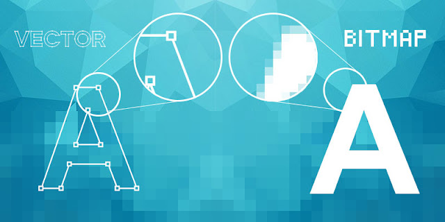
Bitmap (or raster) graphics are made up of as a series of tiny dots called pixels. Each pixel is actually a very small square that is assigned a color, and then arranged in a pattern to form the image.

Vector Graphics

Vector graphics is the use of polygons to represent images in computer graphics. Vector graphics use mathematical formulas to draw lines and curves that can be combined to create an image. These lines (vectors), lead through locations called control points/nodes/ anchor points.

Vector v Bitmap - The Differences...


difference between vector and bitmap
One of the main differences of vector and bitmap can be seen when you zoom in

So the obvious difference between vector and bitmap graphics is how they are created, as identified in the above definitions. Bitmap are made up of pixels while vector graphics are created using a mathematical formula. But there are numerous other differences between vector and bitmap graphics.

For starters, when you zoom in on a bitmap image you can begin to see the individual pixels that make up that image, most noticeably at the edges of the image. When a vector image is scaled up, the image is redrawn using the mathematical formula and the resulting image is just as smooth as the original.

In terms of file size, vector images tend to be smaller than bitmap images. That’s because bitmap images store color information for each individual pixel that forms the image while a vector image just has to store the mathematical formulas that make up the image, which take up less space. Unfortunately, vector formats have not always been well supported on the web. Currently the most popular image file formats used on the web, GIF, JPEG and PNG, are bitmap formats. Most vector images are first converted into bitmaps images (rasterized) before they are used on the web, although the SVG format is growing popularity due the rise in responsive web design.

In terms of colour, bitmap graphics are best for images that need to have a wide range of color gradations, such as photographs. Vector formats, on the other hand, are better for images that consist of only a few areas of solid color such as logos and type (text). This also means that vectors can't create realistic gradients, and although some vector softwares will allow it, they are actually using raster effects on the vector graphic.

When To Use Vector...

Vector graphics are excellent for graphics that frequently require resizing. A company logo is a prime example of a file that should be created as a vector and saved as a master file so you can use it with smaller items such as your business card, letterhead and brochure, but also on larger surfaces, such as billboards or the corporate jet. Vectors can also be used to create stylized modern graphics as their solid colours and sharp lines help them to appear crisper and with more visual impact that a bitmap image.

When To Use Bitmap...

Bitmap graphics are best used for photographs or other graphics with a wide range of colours such as a movie poster. They are also ideal for graphics with effects such as drop shadows (as they use gradients). Bitmaps can also be used to create realistic graphics and images using image editing or "paint" softwares such as Photoshop or CorelDraw. They are the most common type of graphic used and are supported on all digital systems.


Vector & Bitmap File Types...


vector and raster file types
Vector and Raster Graphics can come in different file types

Vector File Types

  • .ps (Adobe PostScript) 
  • .eps (Encapsulated PostScript)
  • .svf (Simple Vector Format)
  • .ai (Adobe Illustrator)
  • .cdr (Corel Draw)
  • .svg (Scalable Vector Graphic)

EPS, PDF (for transferring vcector files) and SVG (responsive web design) are the best file types in which to save your vector graphics outside of the editing software you are using.

Bitmap (Rater) File Types

  • .jpg (Joint Photographic Experts Group) 
  • .gif (GIF transparent file) 
  • .png (Portanble Network Graphic Transparent file)
  • .tiff or .tif (Tag Interleave Format)
  • .psd (Photoshop Document)

The best file types in which to save your bitmap graphics are JPG (for photos), GIF (for basic images like cartoons) and PNG (for images with transparency).

Vector and Bitmap File Types

Encapsulated PostScript files (.eps) are self-contained files that are the same mathematically as vector files, though they can be created from raster images as well. The format is one of the most compatible and portable because they are supported by almost all graphics software.

Then there is the Adobe Portable Document Format (.pdf) files in which files render as they were created thus using (potentially) a combination of vector and raster images.In a PDF file vector images are rendered as such as and be scaled and extracted. Fonts are embedded within a file and are rendered as type, not flattened as an image element. Raster images, such as photos, will appear as intended at 100 percent but, being bitmap graphics, they will still lose quality if they are over-enlarged.


Vector v Bitmap - Web or Print?


vector or bitmap for web or print
Which graphic format is suited for web or print or both?

This questions is much more relevant to bitmap graphics due the fact that they can lose quality when scaled up. Units of measurement such as dpi (dots per inch) or ppi (pixels per inch) refer to the number of pixels in one inch of the image. To determine whether your bitmap images are a suitable resolution for a specific situation (poster/business card/web banner etc.), you should first need to check their pixel density. 

As mentioned earlier, vector graphics have not always been well supported on the web and currently the most popular image file formats used on the web are bitmap formats such as .jpg or .png. The web displays 72 dpi, a relatively low pixel density, so raster images with a low dpi (such as 72 dpi) look nice and crisp on the web but this same image may not be suitable for printing on a brochure, poster or packaging which require a higher pixel density to maintain quality when printed. 

Why is this relevant you ask? Well to correctly print an image, it should be at least 300dpi, a much higher pixel density than the web displays so if you try to resize a low dpi image pulled from the web to use for your high dpi print project it won’t work because the image still has the same amunt of pixels and will distort (pixelate) when you try to scale it up. For example, if have a 72 dpi .jpg of an image it will need to be “stretched” to more than 3 times it's size to get it up to 300dpi. So that 72dpi image will look fine on your computer monitor, but when it prints at 300dpi it will look pixilated.

In this situation you should use a vector image (.EPS or .AI format) or create a bitmap/raster (.JPG or PNG or GIF) in the exact final print dimensions and at 300dpi.


Vector v Bitmap - Conclusion...

So after all that what we can say is that neither vector or bitmap is a better format than the other but rather that each format has it's advantages and disadvantages. The main thing is that once you know what these advantages and disadvantages are you can make an informed decision on which format is the right one for your design project. Vector or Bitmap... it's your call!


Wednesday, December 21, 2016

How to Create a Concept Board

Game Design Concept Board
Sample Game Design Concept Board
This article will focus on the development of a concept board (also know as a presentation board) for a game, however the same approach can be applied for the design of any type of design project in areas like architecture, 3D modelling, product design, interior design etc. So whatever design project you are pitching or presenting then you can follow these steps to ensure you create a great concept board design. To prepare even better you might also like to read our article on design presentation boards which gives a good insight into the theories and techniques to creating a great concept/presentation board. For now though, we are focused on the practical, so let's get started!

The Concept:

It may sound obvious but the first thing you need to do when creating a concept board is to create the concept and write it down! Of course everyone does this but not everyone does it correctly. Your concept board should have details of all areas of your proposed project design and therefore your concept/idea needs to be fully developed with all decisions finalized so you don't have to edit your concept board after you thought you were finished or even worse, leave something out that you should have displayed. For example, for a computer game concept board your idea should include....
  • The full story/plot of the game to set the scene.
  • Where and when the game is set and details about how it looks eg. abandoned water mill in the valley between two snow covered mountains ranges
  • Who are the game players/enemies and what do they look like 
  • What objects/vehicles will be involved in the game
  • What is the main game objective eg. kill enemies, score points, survive, collect objects, solve puzzles etc.
Just a reminder to write all these things down as our memories are not as good as we like to think!

Research:

Concept Board Research
A selection of images on the concept theme which could be used in the concept board
There are two stages of research that need to be completed - I call these general and specific research.

The first stage, general, involves researching existing concept boards to help you gain an understanding of what a concept board is, what it can look like, the variety of possible style and layouts etc.

The second stage of research, which I call specific research, is where you will search for images of the things which you described in your concept board. You will later use these images to create a single image "collage". This might not make sense yet but basically, we will use a combination of multiple images (all edited from their original state) to form a single image which, along with some text will explain your idea is a way that is visually interesting and informative.

Blocking Out:

Concept Board Layout and Composition
"Blocking out" is a graphic design layout technique
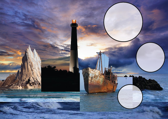
"Blocking Out" is a graphic design technique used to quickly mock up the composition or layout of a design in a software package using only blocks to represent different areas or aspects of the design. The colour of the blocks does not matter so it is best to keep them in shades of grey to allow you to focus on their shape, scale and position within the design. If it helps you can also add text into each block to remind you what it is for.

In the sample image above the top-right represent where the title and story text will go. The vertical block in the center represents a lighthouse on a rock (the horizontal block it is on). The large horizontal block taking up a third of the canvas represents the ocean while the blank white space in the background is the sky. Finally, the 3 circles represents areas for explanatory text to go. Can you visualize it yet?

It may seem a strange way to start a concept board design but it has many advantages...

  • Helps you quickly and easily arrange a suitable layout of the content you need to include
  • You can easily add, remove, scale and rotate elements within the layout.
  • Creates all the main layers that you will need
  • You can focus on layout without the distraction of actual images or colour
  • Helps you to visualize the final design before you have any images in place

Breaking The Ice:

Getting started with your Concept Board
Add in the images you want in a "rough and ready" way just to get started
Once you know the composition/layout you want to achieve, roughly at least, the next stage is to get all the pieces of the puzzle on the one canvas. It is a common mistake to edit each part separately, trying to get them all perfect and then bring them together at the end only to realise the colours/resolution/style don't match.

Breaking the ice simply means getting started. The best way to start is to put all the images you think you will need onto the canvas, ideally overlapping them on your "blocking out" layout.

As these elements will eventually all be viewed together it is important that you edit them all together so you can easily judge their scale, colour, resolution and style proportionate to one another. It also removes any confusion about the potential complexity of bringing images together properly, which would arise if you have edited each one separately.

Finally, it forces you to start. It can be hard to imagine how a design will look when it is completely finished and people often stop themselves from starting or judge their designs too soon. This leads to hesitation, time wasting and unnecessary editing. Once you break the ice and put all the pieces of the puzzle in place it will be much easier to finish, after all you wouldn't try to do a jigsaw without having all the pieces there!

Blending Images:

Concept Board Image Collage
Try to make your separate images look like part of one large image
Blending images refers to the process of editing all the imported images so that they appear as a single image, like in this Photoshop tutorial. This is possibly the most difficult stage of the process but if you take the right approach to it then it can be made much easier. I would recommend the following steps to blending the images together to form a single scene.....
  1. Remove all the background/unneeded content from each individual image
  2. Scale, position and layer the images as you want them
  3. Use filters/effects/layers styles to ensure the images are all of the same graphic design styles
  4. Edit the images hue/saturation so that they are all of similar colouration
  5. If images over lap or meet in a non exact way, such as waves crashing over rocks, use the clone stamp tool or a semi opaque eraser tool to help them blend together more realistically

Adding Text:

Concept Board Text
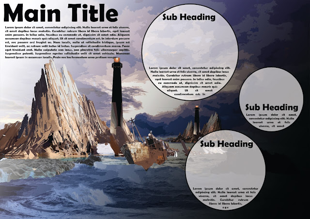
Keep the text to a minimum and utilise headings for each section
Probably the most obvious step in the process. The heading says it all really - add text. The advice I can give you is short and simple.
  • www.dafont.com is a great place to get place to get interesting and unique font.
  • Make sure any fonts you choose are still legible (easy to read)
  • Make sure the colour of the text contrasts with the images behind it, possibly use semi transparent layers to help with this. (see image above)
  • Use headings for each section
  • Only include important information - the less text the better
  • Try out these Photoshop text tips

Optimise:

Sample Game Design Concept Board
Add detailed content and additional images to complete the effect
This step should be completed after you have reflected on your progress so far, evaluating the look of the design and checking that all required content is in place. Take note of all the changes you want to make - this will be your final "to do" list. You might also consider making use of some of the design principles to make your concept board more aesthetic.

So tips to consider when optimising your concept board are...

  • Print off the design, it will look different when printed than on the screen and will give you a better idea of scale and colour.
  • Show it to others and ask for feedback - you don't have to agree with them but their opinions may spark an idea for you or may identify something you overlooked.
  • Try to have a foreground, middle ground and background to your image. This helps draw people into it.
  • Whatever you do, don't clutter it by adding in too many images or too much text. The simpler the better.
  • Consider these presentation board tips.

Some More Sample Concept Boards...

Click on any of the sample concept boards below to view full size...


Thursday, August 11, 2016

Our Top 3 Idea Generation Techniques

Idea Generation Techniques
Coming up with ideas is tough so here are our top 3 idea generation techniques

As mentioned in the design process section coming up with an idea for a design, a slogan for a campaign, an image for a poster, a name for a website etc. can be difficult. However, by focusing on fulfilling the key requirements of the brief and allowing your research to inspire you it is possible to generate original designs for your project. Here we discuss our top 3 idea generation techniques.

Brainstorming:

Brainstorming can be useful but only if you relax and let the ideas flow, don't over think things

Brainstorming is often used where a lack of ideas is a problem. There are numerous approaches and theories on brainstorming and the different types and their levels of success are open to interpretation. In design, like many other things, different approaches suit different people and it is up to you to test out some of the brainstorming techniques and decide for yourself which one best suits you.

There is already a large amount of existing resources and lists on brainstorming techniques so it would be fruitless to repeat another one here, instead a selection of recommended links are listed below for your examination. Everyone is different and different different techniques work for different people so browse through all the links below and find a brainstorming approach that works for you - and then stick to it!


Mind Mapping:

A mind map is a diagram used to visually outline information. A mind map is often created around a single word or text, placed in the centre, to which associated ideas, words and concepts are added. Major categories radiate from a central node, and lesser categories are sub-branches of larger branches. The image below is a mind map which is explaining mind maps!


Sample Mind Map


This can be a useful technique when you want to come up with ideas, images, words or anything that you can associate with a particular theme, perhaps given to you by a client. You pre existing connotations of a word, place or colour tend to come out in a mind map easier than they might in a discussion on the topic.

Random Idea Game:

This is my personal favourite, probably because it is the most fun to do. One thing is certain with this technique is your ideas will be original.

What you do will differ slightly depending on the type of idea you need but basically create 5 columns with the headings time, place, person, object and animal. Then as quickly as possible, so as to prevent over-thinking, write down 10 to 15 related items in each column. For example in the time column you could write down anything from 2.45pm to the year 2099 or in place it could range from the corner of your living room to the forest moon of endor! All items can be real or imaginary so don't think just write.

Once you have done that the fun can begin. At random choose one item from each column at random (as quickly as possible) and force yourself (again as quickly as possible) to create a scenario/scene/story that involves them all. You will get some truly weird and wonderful ideas that you can then use as settings for a computer game, the basis of a novel, an image for a poster or anything at all really.

Here's one for you.....

"Arnold Schwarzenegger astride a unicorn carrying a mop in the Colosseum of ancient Rome".  

Surreal and weird but also unique and memorable!

http://www.onlinedesignteacher.com/2015/11/what-file-type-should-i-use_24.html
close
Banner iklan disini