Showing posts with label surreal. Show all posts

Wednesday, May 25, 2016

Attention Grabbing Design Techniques

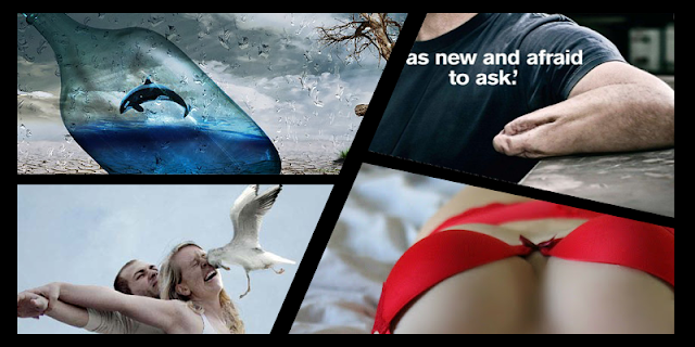
Any Of These Grab Your Attention...? The One that did says a lot about you.

People in modern day society have to deal with an overload of visual material on a daily basis. Advertisers, marketers and designers are now all fighting to get our attention. Ads, poster campaigns, street art, billboards, window displays and even the side of buses are used to promote new products and services. Designers do their best to create well laid out and visually interesting images using the design elements, principles and composition techniques.

But with all that's going on in our own lives and around us how do they stand out from the crowd and grab our attention? Here we discuss 7 commonly used attention grabbing techniques.

Humour:


Funny Image

This is where a funny image, slogan or video is used to make us laugh or smile. It is proven that people tend to remember and retell funny stories, jokes and forward funny e-mails. In this way the product or service is also being remembered. Fun is also a positive image for a company, especially one that is trying to reach a younger audience. What examples can you think of?

Sexy:


Sexy Image
Bet you didn't scroll past that image! This is a simple and straight forward technique where a sexy/beautiful man/woman is used to grab the attention of the viewers. Often the person or people being sexy or scantly clad has absolutely nothing to do with the product or service. For example an ad for bikinis would warrant having a woman wearing a bikini in the ad where as an ad for a car or perfume would not, yet it a a common practice in both.

Surreal:


Surreal Image
This refers to something that appears real but that logic tells you cannot or should not be real. For example should you awake to see a giraffe in your room, your eyes tell you it is real but your mind tells you it is not logical! These type of ads have become more common in recent years with the rise in software technologies such as Photoshop and Final Cut. These has also given life to a new type of internet ad referred to as virals.

Original:


Original Artwork
This is where a totally new idea/image/drawing/buzz word is created. It will stand out from the crowd because it is new and has not been seen before. Sounds simple but it is very difficult to create something totally new that is unlike anything seen before or at least different enough to grab attention.

Bright Colours:


Bright Coloured Attention Grabbing Technique Used In This Advertisement
Red and Yellow are traditionally the brightest colours with red being the brightest during the day and yellow the brightest at night. This is why road signs are predominantly red and yellow. Multinational companies such as McDonalds and DHL use both colours in their logos. Bright tones of all other colours can be just as effective though. For example the marketing material for the International Fleadh 2010 and 2011 in Cavan used vibrant, almost fluorescent cyan, magenta and green.

Shocking:


This technique is fairly self-explanatory in that it uses shocking imagery or language to shock the viewer into paying attention.


Iconic:


iconic advertising technique
The icon that is Beyonce is used by Pepsi in an iconic advertising technique

This is where an iconic (instantly recognisable) image, person, symbol or even voice is used to grab attention. Celebrities endorsing products falls into this category but using symbols such as the Nike 'swoosh' or the McDonalds 'golden arches' is also a form of iconic attention grabbing.


close
Banner iklan disini