Showing posts with label movie poster. Show all posts

Saturday, March 5, 2016

Top 5 Graphic Design Tips

1. Avoid Image Overload...

We are now bombarded with more images and information than ever and our brain simply can't process it all

We are now exposed to more information than ever before through TV, radio, emails, text messages, snap-chats, skype calls, viber etc. There are screens everywhere we look and it is simply impossible for us to process and remember everything we see. But we do remember some things of course.

As a designer, the question is how can you make your designs memorable? The answer is simple...no really it is simple! Complex visuals with multiple images or areas of focus distract the eye from each other and actually prevent people from taking in any message at all. On the flip side, simple images/visuals with a single focal point and a consistent design style can be processed more easily and are therefore more likely to transit their message to the viewer. All the design tips which follow also have simplicity at their core.

So before you start a design project, identify the key requirements and focus on translating the single most important message. For example in a movie poster make sure the viewer walks away remembering the movie's name, if they remember that they can look it up online to find on when it's out, where it's on etc.


2. Grab Attention...

An attention grabbing image
Did I Catch You Looking...?
Made you Look! Good, I was trying to. The first tip was to keep your designs simple and have a single focus so that they will be more easily remembered but that will of course only work if you can get people to look at it ion the first place.

There are actually 7 different image types that are proven to grab attention, make sure your designs main image contains one of them. The first one is obvious (I've used it above) and that's sexy. The others include Funny, Surreal, Iconic, Shocking, Bright (vividly so) and, the hardest to achieve, Original. Read more about Attention Grabbing Techniques.

3. Get Vector Friendly...

A vector image
This image is made up of layers of flat colour tones and vector shapes

Vector images are another great way to keep an image simple, as you can use them to reduce an image down to it's most basic form and yet (if done correctly) it will still be instantly recognisable by the viewer. In fact, a vector image will be more recognisable and memorable than a photo as they are less common and therefore stand out as being original.

Once mastered, the vector tools in Photoshop or Illustrator are also a really quick way to block out a designs structure and form which can help you visualise the final design more easily. In graphic design projects where an image might be reused in a variety of situations like a advertisement which can appear on anything from the side of a bus to pop up on a mobile website then vector images also have an extra advantage as they can scale up and down without losing quality or pixelating.

4. Forget Colour*
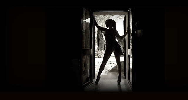
A black and white or other high contrast image has greater impact
Black and white images are more powerful due to the contrast 
A lot of designers make the mistake of starting a project by adding colour to their design in the form of a gradient background or by inserting their main feature, often a colour photograph. Although it would seem to make sense to get the main features of a design in place early it can actually slow you down in the long run.

*Working in just black and white at the start of a project allows you to focus on the composition and layout of the design without the distraction of trying to choose and match colours as you go. Think about any design template you see, they are all in black and white and focused on structure. Here and here for example.

If the composition in a design is poor the viewer will not be drawn in to look at it no matter how nice the colour scheme is. A good composition also allows you to structure the design to ensure the key message is in focus compared to the other elements which may surround it.

5. Have Principles...

The principles of design help your project come together
This image uses 2 of the 5 design principles
Every self respecting designer should be familiar with the principles of design but more important than that every designer should use them! Using at least one of the design principles in every design project will immediately improve the quality of your work. Read more about the principles of design here.


Tuesday, March 1, 2016

Design a Movie Poster In Photoshop

Movie Poster Tutorial
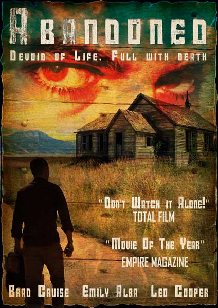
completed movie poster

1. To create this horror movie poster we will be using a selection of copyright free images, as seen below. First open these files in Photoshop by going to File-> Open and navigating through your files and selecting the relevant images. 


2. For the poster, we will be using an A3 canvas, to create an A3 canvas go to File-> New and in the options window choose International Paper as the Preset and A3 as the size.

3. Next open the house image in Photoshop, unlock the layer by double clicking the lock icon on it and selecting ok, and then use the quick selection tool (or other selection tools if using older versions of Photoshop) to select the background, press backspace or delete to remove  it.

4. The use the move tool to drag and drop the house into the A3 canvas and resize and position it as shown below, using Edit-> Transform-> Scale.


5. Next open the sky image in Photoshop and drag it onto the canvas with the move tool. Put the sky on a layer beneath the house and resize and reposition it until you are happy or it resembles the image below. 

6. Next open the road image in Photoshop and crop it down as shown below.

7. Next use the quick selection tool to select and delete all areas of the image apart from the road itself, as seen in the image below.

8. Now resize the image to fit into the canvas as shown below, to do this go to Edit-> Transform-> Scale. Ensure the road is on a layer below the house and above the sky layers.


9. Select the house layer and use the clone stamp tool to clone the existing grass into the empty space between the existing grass areas and the road. To use the clone stamp tool, Alt + Click to define a source point from which to copy then click over the area you want to 'brush' it into. Be aware the source point follows you around so you will have to repeatedly redefine new source point. Don't get too particular about it though as there will be multiple layers overlaid on top of the grass very soon, so just aim to achieve a basic coverage of the empty space.


10. Now open the man image into Photoshop and as with the other image, unlock the layer, remove the background using the quick selection tool, move it into the A3 canvas and move and resize it using Edit-> Transform-> Scale.


11. Now open the fire, paper, wood and eyes images in Photoshop. We will first drag and drop the fire and paper images onto the main canvas and stretch them to fit the full canvas. Next select each layer individually and select Layer-> Layer Styles-> Blending Options. In the pop up window choose the overlay blending option for the fire and drop the opacity below 50%. For the paper choose multiply.

11. The wood image requires editing before it is blended. First it will need to be removed from its background, cropped down, moved onto the canvas and stretched to fit half the canvas. Next go to Layer-> Duplicate Layer to create a copy, go to Edit-> Transform-> Flip Horizontally and then Flip Vertically. Now position the two wood layers so they fill the entire canvas as shown below.


12. To blend the wood into the image go to Layer-> Layer Styles-> Blending Options. In the pop up window choose the overlay blending option.


13. The final image to be blended in is the eyes. As before drag and drop it onto the canvas, resize it to a size you are happy with and blend it using the multiply blending option.


14. Now we will use the paper layer to create a rough, black border around the edge of the poster. Select the paper layer and use the magic wand tool to select the white area around the paper (you may need to use the ‘add to selection’ option to get all the area selected at once. While retaining the selection move from layer to layer hitting delete or backspace to remove the content within the selection until all layers, except the background later, are completed. Then deselect (Ctrl+D shortcut) and select the background layer and use the paint bucket tool to fill it in black.


15. The final part of the image is the text. The font I have chosen is called Calame and is available for free download HERE. The title I have chosen is Abandoned but you can choose any title you like. The image below shows the Layer styles used on the text. A basic drop shadow was added and then an inner shadow was added to increase the scratched looked of the text.


16. Next additional text was added to represent the actors in the movie and quotes from reviews of the movie. I have chosen to use the same font style as the heading (Calame) but again the choice is yours. As a final touch I duplicated the paper layer and placed it above the text as the very top layer, as shown below.


17. And that it, your poster should look like the one below...

Movie Poster Tutorial
The completed Movie Poster

If you enjoyed this check out our new video tutorial on how to create a Sci-fi movie poster.


close
Banner iklan disini