Showing posts with label photoshop. Show all posts

Thursday, October 6, 2016

Read How To Remove Green Eye In An Image Now

dog with green eye
Green Eye In A Photo

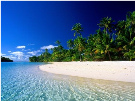
This tutorial will teach you how to remove green eye in pictures. Green eye commonly occurs in dogs and cats. This picture of a dog needs to be edited because the dog’s eyes appear green due to an effect the camera flash has on animals’ eyes. I will use the polygonal lasso tool, the sponge tool, the burn tool and the blur tool.


Step 1: Open Adobe Photoshop and import the image you wish to edit.

Step 2: Use the zoom tool to zoom in closer on the dogs’ eyes.

zoom on dogs face
Zoomed In On The Dogs Face

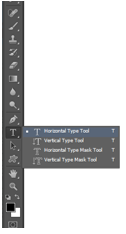
Step 3: Select the polygonal lasso tool and trace around the green part of the dogs eyes.

tracing the eyes using polygonal lasso tool
The Trace Around The Dogs Eyes Using The Polygonal Lasso Tool

Step 4: Select the sponge tool and set the size to approximately 15 pixels. Make sure the mode is set to desaturate and click over the dogs eyes so the green colour will desaturate.

using the sponge tool to desaturate colour in the eyes
Using The Sponge Tool To Desaturate The Colour In The Eyes


Step 5: Select the burn tool and set the range to shadows and the exposure to 17% and click on the eyes to make them darker.

using the burn tool
Using The Burn Tool To Darken The Dogs Eyes

Step 6: Select the blur tool and set the size to approximately 10 pixels and the strength to 15%. Click and go around the pupils so it will appear smoother and less sharp and jagged.

using the blur tool to smooth out the eyes
Using The Blur Tool To Make The Eyes Appear Smoother

Click here to see our How To Remove Red Eye Tutorial.

Read Downloading, Installing and Editing fonts in Photoshop Now

Design Quote from Steve Jobs
In this tutorial you will learn how to download a font from the website "dafonts", install onto your computer, and how to change and style the font using the properties of the Text Tool in Photoshop.


Step one:

Create new file

Creating a new file 

Step Two:

Go to the website “dafont”. And select desired font to download. I have chosen the font called “Elkwood” for this demo.

"dafont.com" Logo


The file will download as a zip file in the download area. Double click to unzip the folder and install the font file. This will then appear in the text section in Photoshop.

Installing of the font 

Step Three:

In Photoshop select the Text tool to create new text.

Text Tool option on Photoshop

Selected the font “Elkwood”. And click on the canvas. This will create a new layer.

Creating a new "Layer" in Photoshop

Step Four:

Enter your desired text. For the demo I am using a quote from Steve Jobs creator of Apple “Design is not what it looks like and feels like. Design is how it works”.

Example of the text used


I am now going to add different character setting using the character and paragraph panels.


Selecting the Character and Paragraph panels to change the text 

By changing the settings in the character and paragraph panels, it allows you to selected different sizes for the font, different colours. It also gives you the option to space out the letter both horizontal (across) and vertical (up and down). I have changed the font size, the colour and both the horizontal and vertical of the text. As shown in the image below.

Different options used in the Character and Paragraph for the text

Step Five:

Effects after changing the settings in the character and paragraph panels.. For this demo I have added a drop shadow to the text. To do this you need to right click on the text layer and a drop bar will appear, here you can select the blending mode to create different effects to the text. The Blending options show in the below image.


Blending Options on the drop down menu


Then I selected to add a drop shadow to the text. I added in different settings as show in the image below. This gives a shadow effect to the text. The sample is not intended to be inspiring! But rather a simple example showing that the text can be edited. Explore the various layers styles to create a text effect that suits your design project.

Setting for adding a Drop Shadow to the text layer in Photoshop

Before:


Original text with no effects in Photoshop


After adding the different effects on the text:


Drop Shadow effect and Character effects done to the text in Photoshop


Read Understanding Layers & Groups In Photoshop Now

chile flag

To show you how layers work in this tutorial I am going to create the flag of Chile as an example.
Layers are an important part of Adobe Photoshop to understand and using groups to keep them organised is also important to  help make it easier to keep track of layers. I will show you how to use groups in this tutorial.

Step 1: 

Create a white background, in this example I have used an A-3 size which is 420 x 297 mm in landscape mode.


setting page properties
Setting Up The Page

Step 2:

Select the rectangle shape tool and create a rectangle by holding shift which will keep all sides at the same aspect ratio.


using the shape tool
Using The Shape Tool To Make A Blue Rectangle


Step 3: 

Select the rectangle tool again and create another red rectangle that takes up the bottom half of the white A-3 background.

using the shape tool to create a red rectangle
Using The Shape Tool To Make A Red Rectangle

Step 4: 

Select the custom shape tool and go to all shapes. Select the star shape and size it appropriately to the size of the flag. Then place it over the blue rectangle layer.

using the custom shape tool
Using The Custom Shape Tool To Place A Star


Step 5: 

To make the area inside the star white, select the eraser tool and erase the blue part to reveal the white background layer underneath it.

using the eraser tool
Using The Eraser Tool On The Inside Of The Star

Step 6: 

As you see if you press the eye symbol beside a layer the layer will no longer be visible. To make the layer visible again simply press the box where the eye symbol was and the layer will now be visible again. Here I have turned off the blue rectangle layer.

using the eye symbol
Demonstrating Layer Visibility

Step 7: 

To put all of the shapes into the one layer you need to combine the layers. To do this go to Layer and select Merge Layers and all of the shapes will now be in one layer.

merging layers together
Layers Merged Together

Grouping Layers

Putting layers in groups is a good way to keep a project organised.

Step 1: 

Select the "create new group" folder icon underneath the layer section on the right side of the page. Name the group accordingly to what you will put in it. Here I have named the group "shapes".

creating a new group
Group Created

Step 2: 

Hold the shift key and click on the layers that you wish to put into a group. Now drag them into the group by holding the mouse over the group and let go. The layers are now placed in the group.

placing layers into a group
Layers Inside Group


Read Optimising Images for the web Now

Optimising an image in Photoshop
In this tutorial you will learn how to change the size by using the crop tool and how to optimise an image for the web in Photoshop. When an image is optimise it helps for a faster download when using the image on the web.

Step One:

In Photoshop, open up an image that you have saved by clicking on open and selecting the image you need.

Opening the image to be used in Photoshop


The image I am using the below image for the demo. I downloaded the image from google images. It is a non-copyright image,that means it’s free to use without having to pay any fees. I searched in the “Search Tools” area in google images and selected “Usage Rights” and selected “Labeled for reuse with modification”.

Selecting the usage rights on Google Images

Image used for the demo 

Image used for cropping and optimising in Photoshop

Step Two:

If you would like to get rid of any unwanted area of the image, you can crop the image. You can use the crop tool as show below to get rid of unwanted areas.

Selecting the Crop Tool in Photoshop


Appearance of the Crop Tool on Photoshop

Selection area on the image once the Crop Tool is selected in Photoshop

Step Three:

To save this image to use for the web. Click on file and the selected “saving for the web”.

Selecting  "Save for Web" in the file area on Photoshop

Step Four:

The “Save for web” window will appear. In this window, selected 4-Up, select png-24 for a faster download and for a greater number of colours of the image to be displayed when using it for on the web. 


Pop up menu to help you to select the correct format for your image to use for the web

Then you can save your image as beach_opt.png. 

Saving your optimized image 

Read Airbrushing Skin In Adobe Photoshop Now

using the blur tool to airbrush


Airbrushing models skin is very common in many the photo editing industry today and has been for some time. This short tutorial will teach you how to airbrush skin in a few easy steps.


Step 1: Import an image that you wish to edit.

Step 2: Select the polygonal lasso tool and trace an outline around the area the face.

using the polygonnal lasso tool to trace an outline
Outline Traced Using The Polygonal Lasso Tool

Step 3: After tracing an outline around the face, select the option "subtract from selection" so that you can trace around other parts of the face and keep your previous traces.

Step 4: Using the polygonal lasso tool trace around the eyes, mouth and nostrils next.

tracing around the face
                   Outline Traced Around The Eyes, Mouth and Nostrils 

Step 5: Now use the polygonal lasso tool to trace around the eyebrows.

tracing around facial features
Eyebrows Traced Using The Polygonal Lasso Tool

Step 6: Go to Layer, New and select New Layer Via Copy and press the eye symbol to turn the first layers visibility off so you can only see the outline you traced on the face with the polygonal lasso tool.

creating a new layer via copy
The Traced Outline Of The Face

Step 7: Go to Filter, Blur and then select Gaussian Blur.

selecting a gaussian blur
Selecting The Gaussian Blur


Step 8: Set the radius of the blur to 15 pixels.

adding a gaussian blur
Applying The Gaussian Blur

Step 9: Press the eye symbol again so that the first layer is now visible. The layer with the Gaussian Blur is on top of the original image so the skin on the face will now appear smoother due to the blur that was applied.

the blur effect on the face
The Blur Effect On The Skin


                                                                           BEFORE

before airbrush
Before Airbrush Was Applied


                                                                          AFTER

after airbrush
After The Airbrush Was Applied


Thursday, August 11, 2016

Create A Logo In 10 Easy Steps

This tutorial is completed in Illustrator but all the tools and techniques used are also available in Photoshop. The reason I am using Illustrator is that Illustrator is the best program (in my opinion) for creating vector graphics using the pen tool. Professional Logos are made as vector graphics, allowing them to be resized up or down without loss of quality.

Logo Design
The Logo we will be making in this tutorial

Although this tutorial focuses on the actual production stage of the logo it is important to remember that the graphic design process should always be used. Therefore this stage should be preceded by analysis of any brief, research, brainstorming, and idea development (ideally through sketching). Alongside these design process stages you should also be considering the logo design principles.

Ideally read the article in full before completing your own logo design but to recap quickly the principles state the logo should be...

  • Simple 
  • Versatile 
  • Timeless 
  • Memorable 
  • Appropriate 

For the purposes of this tutorial we will be creating a logo for a design company called 'Cut & Paste'. The design aims to reference the company name within the text styles and shapes used. Now lets begin.

Logo - Step 1

Go to File-> New and create a canvas 700px wide and 500px tall. This is not a mandatory size, as the logo (once completed and exported) can be scaled up or down to any size. However, if you want to follow the tutorial exactly using the font sizes and other dimensions used then keep to 700px X 500px.

Logo - Step 2

Open the layers window and rename the layer 'Shape 1'. Now use the rectangle shape tool to create a shape 610px x 125px. With the shape selected (with the path selection tool) open the stroke window and add a 5pt white stroke using the settings shown in the image below. Depending on how you clicked and dragged to create the shape the scissors arrow head on the stroke may appear in a different corner. To set the scissors to the position shown, go to Object-> Transform -> Reflect and edit the settings until you get it into the position shown.

Logo Design Stage 1

Logo - Step 3

Now, press the new layer button in the layers window and name the layer 'Shape 2'. With the new layer selected use the rectangle shape tool to create a shape 600px x 115px. Set the shape colour to white and add a uniform stroke of 5pt with the scissors arrowhead (the 5pt stroke all around should make the shape the same size as the previous shape). Position the shape directly on top of the first shape getting the scissors arrowheads to overlap as shown below. Once again go to Object-> Transform -> Reflect and edit the settings until you get the arrowheads into the position shown.

Logo Design Stage 2

Logo - Step 4

For the next shape we will once again create a new layer, call it 'Shape 3'. Use the pen tool to create a black coloured shape similar to the one shown below, remember to complete the shape by joining the last anchor point to the initial anchor point. Once completed you can move the anchor points of the shape into the exact form you want using the direct selection tool. Once again set a 5pt white stroke with a scissors arrowhead, the settings are shown alongside the shapes in the image below. That completes our work on the shapes.

Logo Design Stage 3

Logo - Step 5

Now we will add the text. You can add the text all on one layer but as we will be using 4 different fonts in 4 separate text boxes it is easier to create a new layer for each piece of text too.

TIP: For maximum flexibility in graphic design always create a new layer each time you add a new piece of text.

Logo - Step 6

Firstly we will add the 'CUT' text. Create a new layer call it 'CUT' and use the text tool to click and drag out a text box roughly to size you want (you can resize it afterwards if needed) and type the word CUT in Arial Bold and with a font size 110pt.

Logo Design Stage 4

Logo - Step 7

Highlight the text with the text tool and change the text colour to white and add a 2pt black stroke. Open the stroke window and tick the dashed line box and set the values to those shown in the image above.


Logo - Step 8

Next, we will add the ampersand. Create a new layer for the ampersand, and create a text box on that layer. Type '&' in font style Arial Bold, in a font size of 72pt and set the text colour to white.


Logo - Step 9

Now the 'Paste' text. Once again create and name a new layer, use the text tool to create a text box and type 'Paste'. The font used for the paste text is called 'Cut It Out' and is a free to download font available HERE. Set the font colour to Black and the font size to 90pt as shown in the image of the font settings tab below. Use the path selection tool to position the text as shown.
Logo Design Stage 5

Logo - Step 10

Finally the 'Design Company' text. As before, create and name a new layer, add a text box and type in 'Design Company'. The image below shows the text settings used.


The completed logo should now resemble the image below. You can continue to develop the logo by editing the colours of the text or shapes, trying out different font styles or adding effects from the 'Effect' tab in the top menu.
The completed logo design
The completed logo design 

You can easily create your own logo for new your company or a class project using the tools and techniques explained here but always remember to follow the previous steps of the design process as it is always easier and quicker to create the logo once you have a design sketch to follow. Trust me on that, you don't want to have to learn the hard way!

If you are still struggling or feel you need a detailed vector that your skill set isn't capable (yet) of creating you can find free vector graphics that you can then edit tot suit your needs.


close
Banner iklan disini