Showing posts with label Photoshop basics. Show all posts

Thursday, October 6, 2016

Read How to set up margins and guidelines in Photoshop Now

Rulers Set up in Photoshop
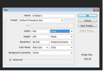
In this tutorial you will learn how to set up the use of Rulers in Photoshop. Rulers are use to help you to position images and text in the exact position you require when using Photoshop.


Step One:

Select file and new and create a new file. I have chosen the settings off 8.5 inches for the width, 11 inches for the height, with 300 for the resolution and RGB color for the color mode.


Setting up a new file for Photoshop
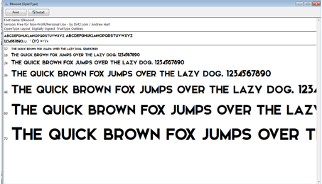
Step Two:

For this demo I am going use some text to show how using rulers can position your text correctly.

Sample of a new canvas for setting up the ruler example

Step Three:

To set up the rulers manually, click view and a drop down menu will appear.
View drop down menu in Photoshop

Click to turn the rulers on. A guide will then appear with numbers on the top (Horizontal) and on the left hand (Vertical) side of the page. This is your rulers guide.

Image of Rulers as the appear in Photoshop


Step Four:
Now with your mouse, hover over the numbers until a white cursor appears. Click and drag down the top line and place onto the template at desire level. Clicking and the pulling down of the rulers (Horizontal).


Adding of the Rulers (horizontal)

Bring the rulers in from the left hand size (Vertical)

Adding of Rulers (Vertical)

All the rulers in place.

All the Rulers in the correct positions

Step Five:

As you can see from the above image the text is on the outside of the rulers on the left hand side. To move the text into the correct place, select the text layer, on the right hand size and with the move tool and move into position. 

Rulers and Text in the correct position

Step Six:

You can also set up the rulers to the exact measurement required. To do this, again select view, and the drop down menu will appear, scroll down and select “New Guides”. A pop up menu will appear and you are able to select the correct measurement for the rulers by selecting either horizontal or vertical position.

Drop down menu once selected the View option on Photoshop

Pop up menu to select the correct measurements 

Selecting the measurements in the New Guide

For this demo I selected the measure for the Horizontal (top) for 3cm, with the Vertical (left side) set also at 3cm. Again for the bottom Horizontal and right side Vertical set the setting to this time 3mm for the rulers to appear.  Example show in the images below.


Creating the Horizontal Ruler with the correct measurement

New guides rulers for Horizontal and Vertical (3cm)

Horizontal and Vertical rulers appearing in Photoshop


Rulers in place after creating them with the new guide option in the view section of Photoshop. To move the text into the correct place, select the text layer, on the right hand size and with the move tool and move into position. 

Rulers and Text in the correct position on Photoshop

Read Downloading, Installing and Editing fonts in Photoshop Now

Design Quote from Steve Jobs
In this tutorial you will learn how to download a font from the website "dafonts", install onto your computer, and how to change and style the font using the properties of the Text Tool in Photoshop.


Step one:

Create new file

Creating a new file 

Step Two:

Go to the website “dafont”. And select desired font to download. I have chosen the font called “Elkwood” for this demo.

"dafont.com" Logo


The file will download as a zip file in the download area. Double click to unzip the folder and install the font file. This will then appear in the text section in Photoshop.

Installing of the font 

Step Three:

In Photoshop select the Text tool to create new text.

Text Tool option on Photoshop

Selected the font “Elkwood”. And click on the canvas. This will create a new layer.

Creating a new "Layer" in Photoshop

Step Four:

Enter your desired text. For the demo I am using a quote from Steve Jobs creator of Apple “Design is not what it looks like and feels like. Design is how it works”.

Example of the text used


I am now going to add different character setting using the character and paragraph panels.


Selecting the Character and Paragraph panels to change the text 

By changing the settings in the character and paragraph panels, it allows you to selected different sizes for the font, different colours. It also gives you the option to space out the letter both horizontal (across) and vertical (up and down). I have changed the font size, the colour and both the horizontal and vertical of the text. As shown in the image below.

Different options used in the Character and Paragraph for the text

Step Five:

Effects after changing the settings in the character and paragraph panels.. For this demo I have added a drop shadow to the text. To do this you need to right click on the text layer and a drop bar will appear, here you can select the blending mode to create different effects to the text. The Blending options show in the below image.


Blending Options on the drop down menu


Then I selected to add a drop shadow to the text. I added in different settings as show in the image below. This gives a shadow effect to the text. The sample is not intended to be inspiring! But rather a simple example showing that the text can be edited. Explore the various layers styles to create a text effect that suits your design project.

Setting for adding a Drop Shadow to the text layer in Photoshop

Before:


Original text with no effects in Photoshop


After adding the different effects on the text:


Drop Shadow effect and Character effects done to the text in Photoshop


Read Optimising Images for the web Now

Optimising an image in Photoshop
In this tutorial you will learn how to change the size by using the crop tool and how to optimise an image for the web in Photoshop. When an image is optimise it helps for a faster download when using the image on the web.

Step One:

In Photoshop, open up an image that you have saved by clicking on open and selecting the image you need.

Opening the image to be used in Photoshop


The image I am using the below image for the demo. I downloaded the image from google images. It is a non-copyright image,that means it’s free to use without having to pay any fees. I searched in the “Search Tools” area in google images and selected “Usage Rights” and selected “Labeled for reuse with modification”.

Selecting the usage rights on Google Images

Image used for the demo 

Image used for cropping and optimising in Photoshop

Step Two:

If you would like to get rid of any unwanted area of the image, you can crop the image. You can use the crop tool as show below to get rid of unwanted areas.

Selecting the Crop Tool in Photoshop


Appearance of the Crop Tool on Photoshop

Selection area on the image once the Crop Tool is selected in Photoshop

Step Three:

To save this image to use for the web. Click on file and the selected “saving for the web”.

Selecting  "Save for Web" in the file area on Photoshop

Step Four:

The “Save for web” window will appear. In this window, selected 4-Up, select png-24 for a faster download and for a greater number of colours of the image to be displayed when using it for on the web. 


Pop up menu to help you to select the correct format for your image to use for the web

Then you can save your image as beach_opt.png. 

Saving your optimized image 

Tuesday, March 15, 2016

How to use the clone stamp tool (Photoshop)

Before and after the clone stamp tool has been used

The clone stamp tool is a very useful tool in Photoshop. It allows you to clone one area of an image and copy (stamp) it onto another area.

Step 1.

So first, in Photoshop, open any image from your computer by clicking File > Open.

Open file

Select file

The clone stamp tool is located below the brush tool and above history brush tool. You can also use the keyboard short-cut "S"  to use the clone stamp tool.

Clone Stamp Tool

Step 2.

Once we click the Clone Stamp Tool, the options bar at the top of the screen will populate with the associated clone stamp tool options. You can set your clone stamp options for the brush size, type, shape, opacity, flow and blending modes.

Option bar for Clone Stamp Tool

If you only want to copy an exact area of an image you will leave the default settings here but you can also change the brush size and shape.

Image before the clone stamp tool is used

Step 3.

So this is what our image looks like before, let's say that I want to remove the house that's hanging down from the balloons. I hold alt and left click on area I want to copy from, in this case that would be another area of the white cloud. And slowly brush over the house. (You will get a preview of the action by hovering the brush over the area before you click to paint/clone).

Image after some use of the clone stamp tool

Step 4.

You can see that the copied cloud area is now covering the house. Keep repeating until the house is completely gone or you have achieved the desired cloning effect that you want.

The house now covered by 'cloned' clouds using the clone stamp tool

Play around with different brush settings and options and try replacing different areas of your image to practice and get the hang of your Clone Stamp Tool.


Monday, February 29, 2016

Create a Cartoon Character

The completed cartoon character will look something like this
1. To create this cartoon character we will be using vector graphics created by the shape tool, pen tool and associated Photoshop tools and techniques. First create a new A4 canvas in Photoshop by going to File-> New and choosing international paper and then A4. You could choose any other size but if you wish to follow this tutorial exactly then you need to choose an A4 canvas size.

2. The first part of the character we will create is the body, represented by a simple circle. Use the elliptical shape tool to click and drag out an ellipse and then hold on the shift key (while still clicking and dragging) to get a perfect circle. You can resize the circle once you have released the mouse using Edit-> Transform-> Scale. Try to create a circle approximately half the width, and one third the height of the overall canvas. To change the colour of the circle double click on the Finally, in the layers window, right click on the layer, select layer properties and name the layer 'body'.

3. Next, while still on your 'body' layer, go to Layer-> Layer Styles-> Blending Options. In the window which opens select inner shadow and stroke and set the options to those shown in the image below.


4. Next we will create the eyes of our little character. Again we will use the ellipse shape tool to create two ellipses for the eyes. Set the colour to white, add a stroke of between 10pt and 20pt and name each layer 'right eye' and 'left eye'. Now to reshape the eyes into the shapes shown below; First use the add anchor point tool (within the pen tool) to add two anchor points either side of the bottom anchor point on the left eye. Next use the direct selection tool to move that bottom anchor point upwards slightly. For the right eye add two anchor points either side of the top anchor point and two either side of the bottom anchor point and , once again, use the direct selection tool to move the anchor points to obtain the desired shape. Don't be too particular though as the eyes or eyebrows may cover any wobbly looking lines.


5. Now to add the eyeballs; once again start by using the elliptical shape tool to create two ellipses for the eyes, colour these layers blue and name them 'left eyeball' and 'right eyeball'. Next add an inner shadow to the eyeballs using the options shown in the image below. If the eyeball appears below the eye just drag and drop its layer above the eye layer in the layers window.


6. The pupils of the eyes will once again be started by using the elliptical shape tool to create the shapes. Next colour the shapes layers black and name them 'left pupil' and 'right pupil'. To complete the pupils add a bevel and emboss as shown in the image below.


7. We will now complete the eyes by rotating the eyeballs and pupils slightly and positioning and resizing them as necessary to match the image below. Don’t worry that the right eyeball is out of the eye as the eyebrow will cover this.


8. To create the eyebrows we will be using the pen tool. Click and drag to create the curved line anchor points used to create the shape of the eyebrow. Don't be too particular about the shape to start just be sure to join the last anchor point to the initial anchor point to complete the shape. You can then use the direct selection tool to move the anchor points around to achieve a better shape. Finally colour the eyebrows orange.


9. To complete the face of our character we will use the pen tool to create a quizzical smirk and for a little detail use the elliptical shape tool to create cheeks. Colour the cheeks either one tone darker or lighter than the yellow of the face and colour the mouth the same orange as the eyebrows.


10. The last parts of our little cartoon character are the arm and hand. To keep the quizzical look going we want to have the arm and hand scratching the chin (if he had one!) of our character. Similar to the eyebrows, we will use the pen tool to create the arm and hand in three separate shapes. First the arm. Use the pen tool to click and drag creating curved line anchor points and complete the shape by joining the final anchor point to the initial anchor point. Tip: The fewer anchor points you can use the smoother the curve on the arm will be, 6 anchor points would be enough if you can manage it!


11. Finally the hand is made up of 2 shapes, a simple warped ellipse for the wrist and then a detailed shape representing a hand with thumb and fore finger stretched out with the other fingers closed; only showing knuckles. Take your time to create these shapes and remember to complete the shape by joining the final anchor point to the initial anchor point. Don't be too particular about getting the shape perfect the first time around as you can always use the direct selection tool to move the anchor points around or even add or remove anchor points using the appropriate tools.

12. For added detail add an inner shadow to the hand and wrist shape using the options show in the image below.

The completed emoticon style cartoon character should now look something like this. Hope you enjoyed the tutorial, now how about trying to create different emoticon cartoons.


close
Banner iklan disini