Showing posts with label shape. Show all posts

Thursday, October 6, 2016

Read How to use Bezier Curves in Blender Now


An edited curve

What are curves within Blender?

Curves within blender are normally used to create the outline of an object or trace over something e.g. a picture. It is similar to the pen tool in Photoshop as to how it works and what it’s used for. There are two types of Curves, Bezier and Circle.

How to use the Curve tool

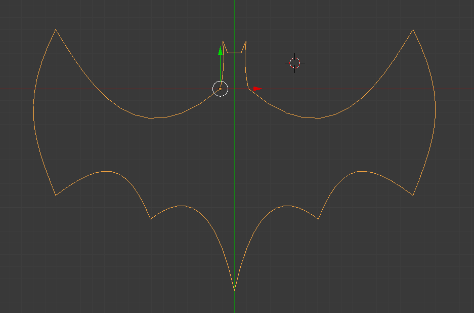
In this tutorial I will be drawing a Batman logo to show you how to use the Bezier Curve.

Step One:When you are ready to add your curve in to the stage, go into Orthographic view (numpad 5) and top down view (numpad 7) and delete the default box by right clicking it and pressing x then clicking delete. Then press shift+A> Curves>Bezier Curve and you will see the following:


newly added curve

This is your curve. It cannot be edited or re-shaped until you go into edit mode by pressing TAB. Once there you should see this:

handles on curve

The layout the curve is in can look quite complicated and the arrows tend to throw people off. If you’d prefer to turn them off press N then in the new menu that appears, under “Curve display” un-tick normal as shown below and the arrows will disappear.

getting rid of normal

Step Two: To change the shape of the curves you use the handles which are the red straight lines coming from the points. The points between the two red handles, on the curved line are where the curve's control points are. These points can be moved to change where the curve actually is. The red lines can be adjusted in length and position. The length changes how big the curve is and the position changes the direction. Play around with the handles a bit to get used to them.

adjusting the handles

Step Three:If you practised step two you will notice that when you change the position of one handle, the other handle stays in line with the one you changed. This is because of the handle type. To change this press V and click on vector and you will notice the handles go green and can be adjusted freely.

vector handles

The vector handles are necessary to create shapes where the curves on either side of a point go in different directions e.g. the Batman logo wings as seen below. To add a new point, right click the point you want it added on to, and press E (for extrude). You will then notice you are dragging a new point. Place it in a suitable location and adjust it how you want.

adding a new point

Continue this process until you have the shape you want. If the shape you want to make is symmetrical, you only need to draw up half of the shape. To see the shape without handles, go back into object mode using TAB. To continue editing, press TAB again.

how to see your shape

Step Four:If the shape your drawing with your curves is symmetrical then you will need to duplicate it, then mirror it. To do this get out of edit mode into object mode, press Shift+D then enter and then press CTRL+M+X then enter. Reposition it if it is off.

mirroring your shape

This has given us two different Bezier curves which can’t be edited at the same time. To change this go into object mode, right click one so it is highlighted as above, then Shift right click the other and press Shift+J to join them. You can then TAB back into edit mode. Here you can right click one point, then shift right click the corresponding one on the mirror side, and press F to connect them (stands for fill).This is how I connected the head above and the tail below.

finished shape

When you connect the two points at the bottom for the tail, you need to add a new point in the middle to drag down. To do this click subdivide in the left toolbar after you connect them by pressing F, as shown below:

subdividing your curve line

Step Five:We now have the outline of our shape finished but now we can make it more detailed, or turn it into a rendered image. This last step is not necessary, but it is good practice and turns the curve into a nice image.To begin this process we have to click the curves tab in the right toolbar and change it to 2D to fill the shape in. make sure you have the curve selected to get the curve tab to show. you can also change the resolution to 24 to give it more definition.

making your curve solid

You can then go to the top of the stage to where it says blender render and change it to cycles render. After that, click the world tab (you must have nothing selected. Press A while over the stage to deselect if you have anything selected) in the right toolbar to get the menu below displayed.
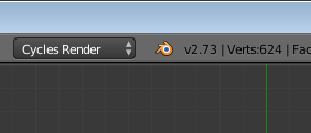
making your curve an image

changing colour of background

In this menu go to surface and change the colour to what you want the background of the image to look like. I chose black.

You can then right click the curve and click the material tab in the same area where the world tab was. Add a material by clicking the add material button then go down to surface. change the surface to emission, then pick the colour you want to use.


changing colour of curve

Finally, position your view of the image to wherever you want the camera to be. I recommend using a top down view (numpad 7). You then press CTRL+ALT+Numpad 0 to set the cameras location. You can press numpad 0 again to exit out of the camera view. Right click the camera then click the camcorder tab in the same place where the world and material tabs were. Change to Orthographic and use the Focal Length and the Shift options shown below to reposition the camera. To view these changes press numpad 0 over the stage again to show the view. It will update to the changes you make in real time.

taking a picture

Once you’re happy with the position of the camera and the other settings you have made, click the camera tab and then click render, or just hover over the stage and press F12 to take a rendered image of your curve. As you can see below, I have a fully finished rendered image of my custom made batman logo.

Bezier Curve Batman Logo in Blender
final image

Read Understanding Layers & Groups In Photoshop Now

chile flag

To show you how layers work in this tutorial I am going to create the flag of Chile as an example.
Layers are an important part of Adobe Photoshop to understand and using groups to keep them organised is also important to  help make it easier to keep track of layers. I will show you how to use groups in this tutorial.

Step 1: 

Create a white background, in this example I have used an A-3 size which is 420 x 297 mm in landscape mode.


setting page properties
Setting Up The Page

Step 2:

Select the rectangle shape tool and create a rectangle by holding shift which will keep all sides at the same aspect ratio.


using the shape tool
Using The Shape Tool To Make A Blue Rectangle


Step 3: 

Select the rectangle tool again and create another red rectangle that takes up the bottom half of the white A-3 background.

using the shape tool to create a red rectangle
Using The Shape Tool To Make A Red Rectangle

Step 4: 

Select the custom shape tool and go to all shapes. Select the star shape and size it appropriately to the size of the flag. Then place it over the blue rectangle layer.

using the custom shape tool
Using The Custom Shape Tool To Place A Star


Step 5: 

To make the area inside the star white, select the eraser tool and erase the blue part to reveal the white background layer underneath it.

using the eraser tool
Using The Eraser Tool On The Inside Of The Star

Step 6: 

As you see if you press the eye symbol beside a layer the layer will no longer be visible. To make the layer visible again simply press the box where the eye symbol was and the layer will now be visible again. Here I have turned off the blue rectangle layer.

using the eye symbol
Demonstrating Layer Visibility

Step 7: 

To put all of the shapes into the one layer you need to combine the layers. To do this go to Layer and select Merge Layers and all of the shapes will now be in one layer.

merging layers together
Layers Merged Together

Grouping Layers

Putting layers in groups is a good way to keep a project organised.

Step 1: 

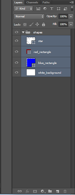
Select the "create new group" folder icon underneath the layer section on the right side of the page. Name the group accordingly to what you will put in it. Here I have named the group "shapes".

creating a new group
Group Created

Step 2: 

Hold the shift key and click on the layers that you wish to put into a group. Now drag them into the group by holding the mouse over the group and let go. The layers are now placed in the group.

placing layers into a group
Layers Inside Group


Tuesday, February 23, 2016

Elements of Design

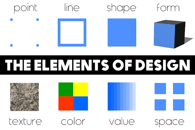
diagram of the design elements
The Elements of Design

The Design Elements refer to the different types of parts that can be used in the creation of any given composition or design. These elements can be combined and arranged in a variety of ways to create an endless variety of designs, both two and three dimensional. They may seem like obvious categorisations but understanding them is important to enhancing your ability to utilise them in your design projects. Each design element is discussed in detail below but for now let's quickly identify the elements of design.

The design elements are...

  • Point
  • Line
  • Shape
  • Form
  • Texture
  • Colour
  • Value
  • Space

Understanding design elements is key to creating professional designs that are both simple and stylish. Using the design elements correctly allows you to keep designs clear and minimal without looking plain or boring; it's a fine line but it is along that line that the best designs rest. Here the elements are outlined and explained, but how you use them is dependent of the principles of design that you choose to use. You should ideally follow up this article by reading about the Design Principles.


Point:

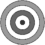
A point is a single dot or mark that has position but is otherwise limited. It is a single entity in itself and alone it can act as a focal point or a stopping point in a composition. For example a target or dart board has a single point as its focus. Together a number of points can have a leading effect where the eye naturally attempts to "connect the dots" to create a line or form. This is known as the Gestalt grouping principle.

design element - point
design element - point 

Line:

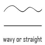
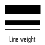
A line is essentially a series of connected points. There are characterised by their length, direction and weight. Lines can be straight or wavy, long or short, heavy or soft, architectural or organic. As such they can be utilised in a variety of ways in a composition. They can be used to create perspective, outline a landscape, frame a composition etc. The directionality of a line will also have a big effect on your composition with oblique or slanted lines suggesting movement and dynamism while vertical or horizontal lines suggest structure, balance and conformity.


design element - line

design element - line weight

Shape:

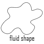
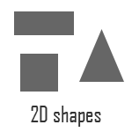
Shapes are essentially closed lines. Shapes are two dimensional and forms are three dimensional. The basic two dimensional shapes are squares, rectangles and triangles with the related three dimensional forms being cubes, bricks (technical name is a rectangular prism) and pyramids. An infinite amount of other shapes exist of course, whether they are fluid organic shapes or rigid abstract shapes.


design element - shape (fluid)

design element - shape (2d)

Form:

Forms are essentially three dimensional shapes. The basic two dimensional shapes are squares, rectangles and triangles with the related three dimensional forms being cubes, bricks (technical name is a rectangular prism) and pyramids. An infinite amount of other forms exist of course, whether they are fluid organic forms or rigid abstract geometric forms.


design element - shape (3d)

Texture:

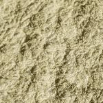
Texture is the appearance of a surface material. The main differentiation between textures is that it is either rough or smooth. Textures suggest what a form/shape is made of and can be created using points, line, shapes or colour. Unlike the other elements, texture is both a visual and tactile element.


design element - texture (rough)


design element - texture (smooth)


Colour and Value:

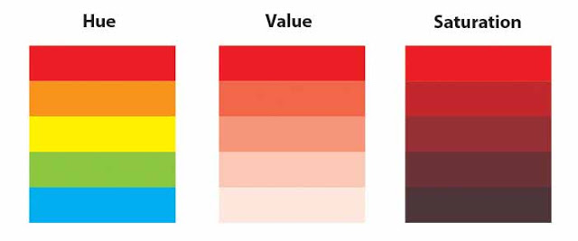
Colour, also called hue, is how the eye perceives reflected light. There are many different theories about colour which are covered in more depth in the section on colour theoryWhat I will explain here are the three main components of a colour: hue, value and saturation.
Colour properties
Colour properties
  • Hue is where a colour is positioned on the colour wheel. Technically the hue is the colour which it a design element in itself.
  • Value is the darkness or lightness of a colour and is a design element in itself.
  • Saturation is the intensity of a colour.

Space:

Believe it or but in a design what you don't add can be just as important as what you do. What i'm talking about is empty space. Space is mainly used to frame an item or object in a composition. By leaving space around something the viewer is better able to isolate and concentrate on it without the distraction of any other overlapping or intersecting objects.

space around items allows them to be 'read' more easily

* You should ideally follow up this article by reading about the Design Principles.


close
Banner iklan disini