Showing posts with label adobe photoshop. Show all posts

Wednesday, January 24, 2018

Top Ten Free Image Editors

best free image editing software
The best free image editing software for you

There’s no argument about it — Adobe Photoshop remains the best photo-editing software on the market. But unless you’ve undergone formal training, it’s a difficult program to master, and it’s not the cheapest of options out there. That’s why we’re taking a look at the best free photo-editing software on the market, each of which provides much of the same functionality as Photoshop but without the associated fees.

Each of the programs below can perform basic and semi-advanced tasks, for instance, allowing you to resize, crop, and correct exposure with ease. And you may be surprised to find that some offer all the features you will ever need. You may not need Photoshop as much as you thought, so read through these Photoshop alternatives and see which free image editor is right for your needs.


Rating 

According to Microsoft "Paint is absolutely the best image editor on the market. Paint allows you to edit existing images and draw your own. Forget about complicated layers and tons of useless effects. 'Paint' contains only tools you really need!". The reality is that unless you're a 9 year old child, that statement is simply not true. As nostalgic as I am about paint, having grown up without the internet, I just can't give it a better rating. In fact 'Paint' is probably what gives free image editors a bad name.

In better news for paint lovers, Microsoft Paint 3D is no available on windows 10 as a free app download. It is the classic Paint reimagined, with an updated look and feel and a ton of new brushes and tools. You can make 2D masterpieces or 3D models that you can play with from all angles.

Visit Website


Easel.ly

Rating 

Easl.ly is a free info-graphic oriented web app with a plethora of templates to choose from. If you want to turn your photo into a chart or include it in a report, this is the best free option you’ll find. The blank template allows you to add a number of objects and effects if you aren’t interested in an infographic but still want to spruce up your photo and have a little fun with it before posting online.

It is free to register but some options and functions are reserved for premium users only. However at $3 per month it is a much cheaper option than it's main rival Canva ($12.95 monthly)

Visit Website


PicMonkey

Rating 

PicMonkey is a free editing tool for amateur photographers who want to quickly edit their images and turn them into mini-masterpieces. There are four primary tools in the PicMonkey holster: Editing, Touch Up, Design, and Collage. Editing probably provides the most functionality, allowing you to apply effects, advanced filters, spot correction, and so on. However, Touch Up is also a popular choice for selfies, profile pics, event photos, and so on.

This suite is designed more for the average person, or those who want the best picture possible for social media or sharing, and aren’t afraid to work on it with more advanced tools. PicMonkey also offers a premium version app which offers added functionality, templates etc. Premium option starts from €7.49 a month with the option to trial for free for a seven-day period.

Visit Website


BeFunky

Rating 

BeFunky is another online photo editor that's really easy to work with. Similar to PicMOnkey it offers multiple tools including Photo Editor, Designer and Collage. There are labels, emoticons, tons of textures and frames, a text tool, several effects like oil painting and cartoonizer, as well as all the basic editing and touch up tools. There's also a Facebook Cover crop tool that crops the image to the exact size required to use as a cover image on Facebook.

Many of the effects, borders, etc. unfortunately require you to upgrade to a paid version of BeFunky to use them. This is a real downside but with premium prices starting at just $2.91 per month it is a very affordable premium option.

Visit Website


iPiccy

Rating 

This is an online editor with multiple tools just like PicMonkey and BeFunky but without the restrictions of premium membership for some features. So it's totally free and although some features require you sign up, there is no charge and no hidden strings attached.There are tons of useful tools and the interface couldn't be easier to work with.

The built-in designer editor is a very capable vector editing system with all the main tools you can think of and the collage maker has lots of interesting and useful layouts and templates for you to use when making a collage.

On the downside there are only two file format options when saving and only one sharing option available. Also, the images can't be resized within the collage editor and you are unable to create your own custom collage layout only being able to choose from the set options.

Visit Website


SumoPaint

Rating 

SumoPaint is one of those “Photoshop lite” image editors that have sprung up in recent years, but it stands out from the rest. There is a web-based editor and a downloadable option as well which is great for those with limited or no internet access. You get 30 days free for the downloadable editor before you need to upgrade to pro but it is so cheap and gives you a load of added features so you'll hardly mind.

You will find plenty of the standard, basic image editing tools in the free version of Sumo Paint plus many fun and whacky paint tool features. Using a menu bar that is similar to Photoshop's, you will find the familiar blur, smudge, gradient fill, line tools, clone, and more. But you will also get other cool features, including a bulky star tool, and symmetry and custom shape tools. Sumo's text tool (for adding text to images) is so simple to use it makes you wonder why other programs often lack in this area of software development.

Visit Website


Pixlr

Rating 

Pixlr is an online photo editing tool. Fast, simple and enough features to make this a great find for moderate-level photo editing. You can create a new image, upload an image, or grab one directly from a URL location. With Pixlr Editor you have full control over your images including layers and effects. I would class it as the best of the in browser image editors.

If you are already familiar with Photoshop, you will find the Pixlr Editor menu options familiar both in layout and in how they work. The website is short on tutorials, however, but if you read Pixlr's blog you will find more information about how to get the most out of Pixlr. If you are new to image editing and do not like to play around in software, KT Forlaget has produced 30 video tutorials in English to help you quickly master all the important basic features and tools Pixlr offers.


Inkscape

Rating 

Inkscape is a free and open source vector graphics editor with a clean, consistent, and very stable interface. It uses SVG and an open XML-based W3C standard. SVG is considered as an excellent format for creating and designing logos and banners or any media that has been modified in vector mode to create graphics that could be scaled to any size while retaining their original quality. Among its interesting features are objection creation and object manipulation, fill and stroke tools, paths operations, text support, rendering, and file formats.

Inkscape is a cross-platform vector editing program so it has the capability to run on Windows, MAC OS X, and Linux distributions.


Krita

Rating 

Krita is a free and open source painting tool designed for concept artists, illustrators, matte and texture artists, and the VFX industry. Krita is really easy to work with and is certainly an advanced image editor. Like some of the other programs above, you can work with layers in addition to many other tools located in a floating toolbox off to the side of the program, similar to Photoshop.

There are plenty of features available as well, such as brushes, blending modes, advanced selection and masking tools, drawing aids, filters, symmetry tools, and image effects. Krita is a downloadable only editor and is over 100 MB in size and works with Windows, Linux, and Mac.

Visit Website


GIMP - Editor's Choice

Rating 


First things first let's explain that name! GIMP is an acronym for GNU Image Manipulation Program. It is ideal for tasks such as photo retouching, image composition and image authoring.

Whether you are a graphic designer, photographer, illustrator, or scientist, GIMP provides you with sophisticated tools to get your job done. It can be used as a simple paint program, an expert quality photo retouching program, an online batch processing system, a mass production image renderer, an image format converter, etc.

As GIMP is expandable and extensible you can further enhance your productivity with GIMP thanks to many customization options and 3rd party plugins. GIMP is a cross-platform image editor available for GNU/Linux, OS X, Windows and more operating systems.

Visit Website


This article was courtesy of our friends over at www.freedesignstuff.net check out their website for more great, and totally free, design stuff.


Keywords related to the post:


Friday, June 23, 2017

How To Colourise A Black & White Photo

black and white photo colourised before and after
The photo before and after it is colourised

This article will teach you how to colourise a black and white photo using Photoshop in 7 simple steps. Some amazing results can be achieved using this relatively simple colourisation process. You can turn relatively dull black and white photographs into stunning full colour images in just a few minutes.

So let's get started colorising your black and white photos now!


Step 1: Open your black and white photo or image in Photoshop

Ok, so this is a nice and obvious first step. Simply open Photoshop then click on File in the top left corner of the screen and on the drop down click on Open. Then in the window that opens, navigate your way to your chosen image, select it and open it in Photoshop.

Step 2: Convert the image mode to CMYK

How to colourise a black and white photo
Convert the image to CMYK Color Mode

This process can be done in RGB but as the image you are editing likely started out as a print and in case you want to print it out after it is colourised it is best to edit in CMYK mode. So just click on Image > Mode > CMYK Color and Click OK to Confirm Conversion if prompted.

Step 3: Duplicate the layer

How to colourise a black and white photo
Duplicating the layer

This is just a precautionary step in case you accidentally make a mess of your image! This way we will be editing the duplicate layer and your original black and white image is safe and sound. There are numerous ways to duplicate a layer in Photoshop, the most obvious being the one shown above - click on Layer > Duplicate Layer, then name the layer in the pop up window. Crtl + J is the keyboard shortcut for duplicating a layer in Photoshop.

Step 4: Taking a snapshot via the history window

How to colourise a black and white photo
Taking a history state snapshot

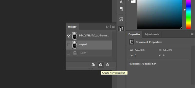
The process of taking snapshots will be key to this process. If you are not familiar with this process, it simply involves clicking the little camera icon on the history window in Photoshop. What this does is take a digital "snapshot" of the current history state of the layer, we will use this to store different colours which we will then use to "paint in " the original black and white image using the history brush.

This first snapshot,shown above, is another precautionary step here, really a bit of practice as we won't actually use this particular snapshot later on. However you may use it for your own image, especially if you want to retain some areas of black and white.

Step 5: Creating the skin colour snapshot...

So we'll start with creating the colour for the skin. As explained already, we will be creating a colour, storing it in a snapshot then using the history brush to paint it on the relevant areas later on.

How To Colourise A Black and White Photo
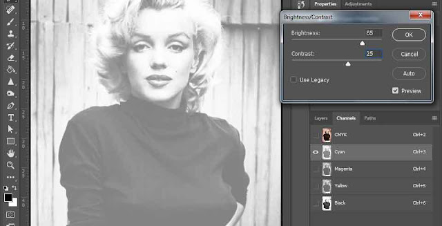
Select the Cyan layer in the channels window then edit the brightness and contrast as shown

First of go to Channels and select just the cyan layer as shown above.

Then in the top menu bar click Image > Image adjustments > Brightness/Contrast and input a value of  85 Brightness and 25 Contrast. Obviously you can use different values to achieve different skin tones.

Then, back in the channels window select the CMYK layer to see the skin colour, as shown below. If you are not happy just select the Cyan layer again and edit the values until you are happy.

Now, most importantly, we store this colour for later use by taking a new shapshot from the history window, rename the snapshot "Skin" so we know what we want it for later on.

How To Colourise A Black and White Photo
The colour which we will use for the skin tone

Step 6: Create the other colour snapshots...

The process for creating the colours for the other areas we want to colour is slightly different but even easier. The areas we need different colours for are Hair, Background, Lips (nail polish too), Eyes, Jumper and Skirt.

For each area we want to colour in we will go to Image > Image Adjustments > Hue & Saturation and edit the values to achieve the colour we want. Then save that colour in a snapshot.

Feel free to use different values to the ones I outline below but be aware that each colour change is an edit of the one before so if you change one then all will require different values.

For the hair go to Image > Image Adjustments > Hue & Saturation and choose the following values hue of -43, saturation of 61 and lightness -5.

Then take a new snapshot in the history window and rename it hair.

For the background go to Image > Image Adjustments > Hue & Saturation and choose the following values  hue of -20, saturation of 15 and lightness of  -15

Then take a new snapshot and call it background

How To Colourise A Black and White Photo
Keep building up the snapshots of the different colours making sure to name each snapshot as you go along


For her lips values of hue -15, saturation 72 and lightness 10. Which should create a rosy red/pink.

Take a new snapshot, call it lips. We will use the same colour for her nail polish.

For her eyes values of  hue -155, saturation 70 and lightness 5. Which should create a nice sea blue.

Take a new snapshot, call it eyes.

For her jumper values of hue -20, saturation 100 and lightness 20. Which should create a navy blue.

Take a new snapshot, call it jumper

And finally for the skirt values of hue 0 saturation -50 and lightness 0. Which is just a plain white.

Take a new snapshot, call it skirt

How To Colourise A Black and White Photo
All the snapshots have now been taken

Step 7: Colourising...

OK, so that's all the preparation done, now for the fun part, coloring in! You can do this in any order really but I prefer to start from the bottom and work up.

Select the last screenshot layer (skirt) then click the checkbox in front of the layer above (jumper), which will show the history brush icon, as shown in the image below. This will allow us to paint the colours saved from the jumper snapshot layer onto the skirt layer (which we'll use as our base).

How To Colourise A Black and White Photo
It helps to select the area you want to colour in first, in this case the jumper.
For accuracy you can use the magic wand selection tool to select the jumper area and use then use the history brush tool to colour it in as shown above. Cool, right!

We will repeat this process now for the other areas of the image.

Now click in the box in front of the eyes layer, again select the area you want to colour using an appropriate selection tool and then use the history brush to colour it in.

How To Colourise A Black and White Photo
Colourising the eyes in the black and white photo


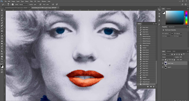
Next the lips, once again select the box on the relevant snapshot, select the area to be coloured in then use the history brush to colour it in.

How To Colourise A Black and White Photo
Adding colour to the lips in the black and white photo


Now the background...

How To Colourise A Black and White Photo
Our black and white photo is no mainly colour

Finally the hair and the skin...

How To Colourise A Black and White Photo
The black and white image is now full colour


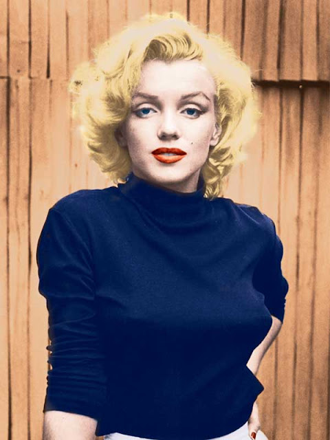
You can go back through the snapshot layers again in any order to tidy up or re-colourise any areas which require it.  You can also edit the image overall using any image adjustment technique you want, or use an adjustment layer to test out a variety of edits. In the final image below I used brightness and contrast to lighten the image overall. That's it, all done. You are now ready to start colourising your own black and white photos.

How To Colourise A Black and White Photo
The completed colourised image

Thursday, October 6, 2016

Read How to create Pause Screen in UE4 Now

This image shows a finished Paused screen.

Step 1:

Before you open Unreal Engine go to http://www.dafont.com/ for download a font suitable for your game. One you download extract the file and installed ttf file. Copy the ttf file and paste in C:\Program Files(Program Files (x86))\Unreal Engine(Epic Games)\4.5(engine version)\Engine\Content\Slate\Fonts

After when you installed font open Unreal Engine. Content Browser is located in folder “Game” create new folder for User interface screens call it “UI”. In UI folder press right mouse bottom and select “User Interface” option then select “Widget Blueprint” in order to save press right click on widget blueprint and select save. Then double click on the widget blueprint to enter to edit menu.

This image show where you should create folder for User Interface.

This image shows where you should create Widget Blueprint.


Step 2:

On left top corner of the screen there is a folder called “Palette” expand “Common” select “Text Box” hold and drag on canvas or you can hold and drag on canvas under [Root] but make sure that you put on canvas.

This image shows Pause Screen editor.

This image shows canvas for screen.

Steps 3:

If you select text box then on the top right side of User Interface editor you can see “Details” options. Chose “Layout (Canvas Panel Slot) and press on Anchors and choose the middle. You can mess around and change “Style”, “Appearance” and other options. In “Content” option you can type the heading of your title.

This image shows options for Pause Screen.

This image show Text Block applied on canvas.
This image shows Text Block operation.

This image shows text applied on canvas.
This image shows colour options.
This image shows costumer font style. This is spot where you should put the font name that you want use.

Step 4:

You can add image if you want by dragging image box. To select image that you want to use and drag to “UI” folder. When your Pause screen is finished and you are happy of it than press Compile. Save and close the editor. You can find good image on http://www.freeimages.com/ .

This image shows an image box applied on canvas.


This image shows an image box applied on canvas.
The image that I chose is grunge border from http://vyawie.deviantart.com/art/Border-Black-Grunge-187744467 . You can search in Google Image for grunge border.

This image shows an image that I use for Paused Screen.

Step 5:

Select “Blueprints” then select “Open Level Blueprint”. Press right click and search for letter “P” to pause game and “X” to un paused game and add other important objects that will be needed for “Pause Screen” to work. Create new variable and select and then in variable type change to Boolean. Then create new Variable but this time change to Float.

This image show programmer for Paused screen.

This image shows the program for Paused screen.

Step 6:

If you finish coding press compile and save your Pause screen and you can exit programming. The last thing that is left to test if pause screen is working is to “x” out of programming editor and see if it works.

This image shows a finished Game Paused screen.
You can also watch a video tutorial about how to create a Pause Screen.


Read How to set up margins and guidelines in Photoshop Now

Rulers Set up in Photoshop
In this tutorial you will learn how to set up the use of Rulers in Photoshop. Rulers are use to help you to position images and text in the exact position you require when using Photoshop.


Step One:

Select file and new and create a new file. I have chosen the settings off 8.5 inches for the width, 11 inches for the height, with 300 for the resolution and RGB color for the color mode.


Setting up a new file for Photoshop

Step Two:

For this demo I am going use some text to show how using rulers can position your text correctly.

Sample of a new canvas for setting up the ruler example

Step Three:

To set up the rulers manually, click view and a drop down menu will appear.
View drop down menu in Photoshop

Click to turn the rulers on. A guide will then appear with numbers on the top (Horizontal) and on the left hand (Vertical) side of the page. This is your rulers guide.

Image of Rulers as the appear in Photoshop


Step Four:
Now with your mouse, hover over the numbers until a white cursor appears. Click and drag down the top line and place onto the template at desire level. Clicking and the pulling down of the rulers (Horizontal).


Adding of the Rulers (horizontal)

Bring the rulers in from the left hand size (Vertical)

Adding of Rulers (Vertical)

All the rulers in place.

All the Rulers in the correct positions

Step Five:

As you can see from the above image the text is on the outside of the rulers on the left hand side. To move the text into the correct place, select the text layer, on the right hand size and with the move tool and move into position. 

Rulers and Text in the correct position

Step Six:

You can also set up the rulers to the exact measurement required. To do this, again select view, and the drop down menu will appear, scroll down and select “New Guides”. A pop up menu will appear and you are able to select the correct measurement for the rulers by selecting either horizontal or vertical position.

Drop down menu once selected the View option on Photoshop

Pop up menu to select the correct measurements 

Selecting the measurements in the New Guide

For this demo I selected the measure for the Horizontal (top) for 3cm, with the Vertical (left side) set also at 3cm. Again for the bottom Horizontal and right side Vertical set the setting to this time 3mm for the rulers to appear.  Example show in the images below.


Creating the Horizontal Ruler with the correct measurement

New guides rulers for Horizontal and Vertical (3cm)

Horizontal and Vertical rulers appearing in Photoshop


Rulers in place after creating them with the new guide option in the view section of Photoshop. To move the text into the correct place, select the text layer, on the right hand size and with the move tool and move into position. 

Rulers and Text in the correct position on Photoshop
close
Banner iklan disini