Showing posts with label how to create websites. Show all posts

Friday, January 19, 2018

Tips for Designing and Building a Multilingual Website

Create a multilingual website
English is not the only language out there, so why only design a website with one language in mind

As a modern society, the human race is continuing to grow, expand and connect to one another more instantaneously than ever before. In just a click of your mouse or a tap of your finger, you can be reading about the entire life and legacy of another human being that could have existed hundreds of years ago.

It’s amazing when you think about.

However, with such a connection comes the problem of language barriers. While you might be writing your content in English, statistics show that only 20% of the entire world population actually speaks the language, meaning your website is relatively inaccessible to the remaining 80%, which equates to around 6.6 billion people.

So, to counter this issue, you’ll want to design and build your next website as a multilingual platform that’s accessible to people around the world, or at least your target market. But how you do go about doing this? What problems and milestones will you need to overcome and what features does your website need to include?

To get you off on the right foot, here’s a complete guide to everything you need to know.

Getting Started

To start with, the first thing you’re going to want to consider is not actually the building of your website, but the content itself. You’re going to need to get it translated. Of course, translation services, such as Google Translate, are constantly improving and are updated or a near-daily basis.

However, these services definitely aren’t reliable if you’re looking for a professional finish. Ideally, you’re going to want to hire a human translator to edit and convert your content properly. For this, you have multiple options available.

Firstly, you could use translating companies such as International Translating or Big Assignments to translate your content for you on your behalf. This is of course if you have the budget. If you’re translating hundreds of pages of content, this can prove quite expensive, and you’ll need to find another way, perhaps by hiring someone long-term, such as a freelance translator from Upwork or Ukwritings.

If this is the case, or you plan on translating your content yourself, you’ll need to remember to proofread your content for errors, so your website remains professional. According to recent statistic, 59% of people said that they won't trust the company of service which has errors and mistakes on their website. So proofreading and editing is vital for your business reputation.


Implement Language Change Features

Of course, no multilingual website would be complete without the ability to actually change the language that the viewer wants to read your website in. Most commonly, you’ll notice that a lot of websites use a traditional drop-down menu which is clearly visible in the header or footer of the website.

In theory, you can put it wherever you want, but you want to make sure it’s clear and easy to see as soon as your website loads as people accessing your website will want to change it straight away.

Another key element to consider at this point is adding flag images to your drop-down menu. While this is a graphically powerful element to include, there are a few problems that come with this approach. Most notably is the fact that flags represent countries, not languages and many countries will have more than one official language.

Finally, you’re going to want to make sure that you refer to each language in its own language form, for easier identification purposes. For example, German should be referred to as ‘Deutsch’, French as Français, and Spanish as Español.

Checking Your Readability

You may not speak multiple languages but you can still create a multi language website with the right tools

While you may invest a lot of time in choosing fonts for your website and you’ve chosen one that looks clear and precise for your English readers, it’s important to make sure that the font will still be as legible when it comes to another language.

Sarah Stanford, a translator for Paper Fellows shares...
“One of the biggest problems that trip up multilingual websites up is choosing a fine and relatively small font that went translated, the symbols that appear in certain languages, such as the ‘n’ in ‘Español’ can become unreadable”

To alleviate this problem, be sure to check your character encoding, typically found in the head of your page. If your website is using Unicode, UTF-8 may work perfectly since it supports multiple languages, helping them to maintain their readability.

Reading Line for Line

One of the most common misconceptions that people have regarding other languages is the fact that languages don’t have a reading direction. However, the script in which the language is written in does. For example, Arabic script is read from right to left (RTL) whereas English and other European languages are left to right (LTR).

Of course, the vast majority of languages do read LTR, but if you include language settings for those who read RTL, this is something you’re going to need to consider. To achieve this easily, you simply need to mirror your website pages, which includes everything.

This means your menu bars, your icons, the layout of your navigation menu, the buttons and even the scrollbars will all need to be flipped and mirror what they are usually. Fortunately, there are a number of ways you can do this using basic code which can be found online, depending on what code you’re using to build your website.

Customising Your URL

Another important factor you’ll want to consider is the URL that your website is using when it changes the language. A country code top-level domain, more commonly referred to as ccTLD, are all linked to specific countries. For example, .fr is France and .es is for Spain.

This is such a vital part of the process that you’ll need to remember to complete since this is how search engines will help users to find the content they’re looking for. If you don’t implement it, users won’t be able to find your website easier. Of course, this will eat into your budget, but the ROI is worth it in the long run.

For more information on using ccTLD, as well as for your sub-domains and sub-directories, check out this Google guide on the matter.


Creating a Multilingual Store

If you’re creating a blog with content, this point may not concern you, but if you’re creating a multilingual website that sells products, this is very important as there are a few aspects you’ll want to consider.

Firstly, are all the products that you’re selling on your store available in all the countries you’re trying to sell in? If not, you’ll need to find a way to make certain products only available in a certain language, but of course, this solely depends on what framework and store platform you’re using.

Tom Dewis, SEO-expert at Ox Essays shares, 

What you have to consider is the currency options that are available to your customers. The cost and price tag of each product will need to be converted automatically in regard to the language that is selected, or using a clearly placed drop-down menu where users can choose their preferred currency.

Finally, you’ll want to consider your posting and delivery options. For example, if you’re not going to be able to sell products in France, you need to make this clear in your terms and conditions.


Consider the Details

This is one point that will solely depend on the content of your website and blog, but it’s definitely worth bearing in mind throughout the entire building process. Many cultures will have a different outlook on certain subjects in life, for example, sense of humor, sexuality, gender equality and symbolism.

When translating your content, be sure that you won’t offend anybody’s beliefs with the content you’re posting to avoid it becoming a problem in the future.

What’s more, if you’re using Captchas on your website, have you investing time in making sure the Captchas are in each language rather than just in English? The same if you’re adding citations to your website for this process, be sure to use tools like Cite It In to make sure they’re correct.

Finalising Your Content

Now that your website is nearing completion regarding the multilingual side of things, you’ll need to invest time in finalising your content to ensure that it’s perfect for release. The first thing you’ll want to do is to make sure that all your content has been translated properly.

One simple way to do this is using a tool for Easy Word Count. Using this tool, you can copy and paste in your original content and then your translated content and then refer to the word count. If the word counts are roughly the same, give or take a few words, you’ll know that nothing has been missed during the translation process.

Secondly, you’re going to want to check your translated content to make sure that it doesn’t breach any plagiarism requirements. While your original content may not be plagiarised, your translated copy might be. However, this is easy to check using plagiarism checking services like Academized or Plagium.

Conclusion

In reality, there is a tonne of features and aspects of your website you’ll need to consider when designing and building a multilingual website, but this will solely depend on the kind of website you’re building, its purpose and the industry that you’re operating in.

However, this article has covered the majority of the basics that you’ll need to consider and should give you the best shot at creating a successful multilingual website.


About The Author

Brenda Berg is a professional with over 15 years of experience in business management, marketing and entrepreneurship. Consultant and tutor for college students and entrepreneurs. She believes that constant learning is the only way to success. You can visit her personal blog at Letsgoandlearn.com


Monday, November 27, 2017

Free Website Templates

Free Website Templates
Sample of the free website templates available

If you are looking for free website templates then you have come to the right place. We have scoured the internet looking for the best totally free, website templates, including fully HTML5 templates, responsive template, animated templates, parallax scrolling templates, templates with bootstrap and much more. So whether it is a simple one column website template you need or a fully responsive business template with eCommerce capabilities you can find it here. Of course all there website templates will require knowledge of HTML and CSS so if you need to brush up on that first then click on the links to learn more.

We have also ranked the providers by stars to give you an idea of both how good we rate the quality of their templates, the ease of use of the website, range of website templates available, design and visual appeal of templates, live demo of templates etc.


Free CSS

Rating :

Free CSS has 2642 free website templates coded using HTML & CSS in its gallery. The HTML website templates that are showcased on freecss.com are some of the best that can be found in and around the net. The website itself is very basic though and as there is no search function to allow you to filter through the website templates so you have to sift through them all one at a time to find out their features, this is a major drawback.
Visit Website


OS Templates

Rating :

OS Templates offer some of the best website templates that can be found on the net. They  update their website regularly with premium and free HTML templates as well as PSD templates.
Whether you are a private person, a freelancer or a company, you are free to use their free website templates for both your commercial and personal websites. There is no search function to help you filter through the templates, which is a pity although the template previews are a decent size and are labelled by features such as HTML5 and responsive. At time of reviewing there are 270 free web templates available.
Visit Website


Styleshout

Rating :

There are currently a very limited (22) amount of free templates available here but they are all high in quality and definitely worth a visit. Beautiful handcrafted HTML5 and CSS3 website templates  with good attention to the details making them premium quality but free of charge. All designs are free of charge and available for personal and commercial projects, in exchange for accreditation. 
They also say their templates are updated on a regular basis. Again, no site search but templates can be categorized by label to help you find the right one for your needs.
Visit Website


Webflow

Rating :

"Webflow gives designers all the power of HTML, CSS, and JavaScript. But instead of writing code, you manipulate the real, working website, visually,  just like your favorite design tool." That is the blurb from the webflow website, the reality is that it is yet another Drag-and-Drop site builder similar to wix, weebly, squarespace and many others. I have included it here,as opposed to the others, as it is newer and people may not have heard of it. Like most site builders you start off on a free plan with limited functionality and can upgrade from there for a fee. Like all the others it is still a good option if you can't code, don't mind forced ads/branding and need limited website functionality.


Medium

Rating :

This is actually on article with a limited (37) number of free website templates as opposed to a dedicated template website but I have included it here as it includes some excellent premium quality templates for free. No search capability but as there are limited templates it's easy to scroll through and find one that's right for you with features like flat design, responsive layout, jQuery sliders etc.
Visit Website


Free Website Templates

Rating :

There are around 350 free templates here at time of reviewing as well as many other premium (paid) templates. These free templates really are no strings attached - you can download each template for free, modify it and create your own website with it. If you're a web design company, you can even use it for your clients as long as you don't charge them anything for the templates. You're allowed to use the templates without linking back. The website does have a search function to help you filter through although it is basic. The templates previews are large though which helps you quickly sift through them.
Visit Website


HTML5Up

Rating :

Again, there are currently a limited (45) amount of free templates available here but they are also all high in quality and definitely worth a look. They are all hand coded HTML5 and CSS3, fully responsive website templates making them premium quality but free of charge. All templates are available for personal and commercial projects, in exchange for accreditation. Again, no site search or even labeling but with so few it hardly matters. There are live demo previews though which allows you to fully explore the templates without needing to download and test.
Visit Website


Templated

Rating :

I like templated. They keep things simple. A quality collection of 866 simple CSS, HTML5 & Responsive site templates released for free under the Creative Commons license. The templates are all top notch and feature live demo preview. If only they had a categorization system or site search to more easily find the right template, the only flaw in an excellent website.Visit Website


Theme Wagon

Rating :

There are a limited number (175 at time of reviewing) free templates at theme wagon but they are all of a very good quality with premium features such as quality design, parallax scrolling and responsive layouts in many of the free templates. There is a site search function but it also includes the premium templates in results so be careful you don't fall in love with a template before realising you'll have to pay for it!
Visit Website


W3 Layouts

Rating :

This is probably my favourite place to get free website templates. There is a huge selection (2881) at time of reviewing and yet it is easy to find what you want as all templates are categorized as well as labelled for search so you can easily find a template that is right for your website as well as previewing each template in demo mode. In terms of usage,  you are not allowed to remove back-link to w3layouts in template unless you have donated for template, this is probably the only downside. But you can use the resources for personal and commercial projects.
Visit Website


*This article was created by our friends at free design resources who will be launching their new website on January 1st. We will be writing more about that at the time but if you want to be the first in the know be sure to subscribe to our newsletter.


Wednesday, May 25, 2016

Create A Website In 10 Easy Steps

how to make a website
Creating a website is a complex process but like any process you just need to take it step by step

This article discusses the 10 steps involved in designing and creating a website. While the web design process is a more theory based guide to approaching a web design project, this 10 step guide is more practically focused. Even if you are a total beginner, web design novice or web design student you can use these steps to successfully create your own website.


1. What is the aim of the website..?

All websites can be allocated into just 3 types...

Information:  

These type of websites simply supply information on a specific topic or topics that they hope people will find useful, sometimes just a bio and contact information of a business. The information is usually provided for free (but not always) and you can then monitise the website  through placing ads. This website is an example of an information focused website.

Entertainment: 

These type of websites provide entertainment for the visitor usually through videos, music or games. YouTube a is a prime example of an entertainment focused website. The information is usually provided for free (but not always) and you can then monitise the website  through placing ads.

Transaction: 

The name says it all really! These websites allow you to buy and/or sell goods online. Amazon and eBay are probably the most well known buy & sell focused websites. These websites usually have little or no ads as they make their money from the sales. Any ads are often for their own products.

Once you recognise what the purpose of your website is you should research existing websites of the same type to see what the competition are doing. After your research decide what the key aim of the website is. This may be for the visitor to click on a specific link, to make a sale, to contact you etc. Whatever it is you need to decide. You can have more than one aim for your website but you should still specify the key aim.

2. Plan The Layout (based around the key aim)

Plan out your website's layout
The layout of your website will be key to directing the visitor towards the outcome you want to achieve.
Whatever the key aim you decided on in the previous step now is time to plan out how best to achieve it. This might be through make a certain element pop up, be larger than others, be strategically positioned or colored, be animated, be framed etc. It could even be through multiple methods. Whatever you decide, create a sketched layout to display where you intend to place the different elements of the website.

There are even web design theories on how best to achieve this. The F Layout and the Z Layout  and the Gutenberg Diagram are the 3 most common.

3. Select An Appropriate Style 

Once decided upon a strategic layout for your website and armed with a sketched layout to work from you will next need to decide on an appropriate style for the website. By style I am referring to the colors, fonts and imagery that will be used in the website. It is very important to select a style appropriate for the website and not one based on your favorite colors or fonts as these may not match well with the website's purpose.

Colors...

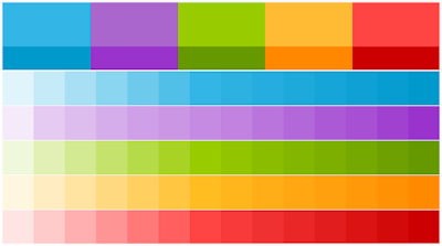
Creating a colour swatch like this makes designing the website easier
You should create a colour swatch for your website design project
  • Color emphasizes, highlights, and leads the eye to important points or links.
  • Colour identifies recurring themes (i.e. titles and subtitles are usually the same colours).
  • Conversely, colour can differentiate, such as different colours in pie charts and bar graphs.
  • Color symbolizes and triggers emotions and associations.
  • Create color schemes at www.paletton.com

Fonts...

Always use a minimum of 2 and a maximum of 3 fonts in your website
With so many fonts to choose from it can be hard to pick one

Legibility and readability refer to how easy a font is to see and also read as a block of text. Sans serif fonts are easy to read than serif fonts and mono-space are very legible but not very readable. For more about sans serif, serif and mono-space read this.

Appropriateness of fonts is similar to appropriateness of colors, choose a font based on it's suitability to the website and not based on your personal preferences. For free fonts go here.

Pairing fonts is a difficult business but in terms of websites the key tips are to never use more than 3 fonts (too cluttered) but never use less than 2 (too boring). Your body text should always be a relatively simple sans serif font while your headings can be any appropriate fonts once they are legible. For more advice on pairing fonts check out http://fontpair.co/

Font size is a very important aspect that must also be taken into consideration. When choosing a font size, one should keep in mind that choosing sizes closer to one another for various levels within your site will output a more professional and elegant webpage. 

Font emphasis is also an important factor as not only will font emphasis aid in search engine optimization, it also alerts viewers to what is important on a page or where the links are located. Search engine spiders look for phrases that are either in bold, highlighted or between header tags. These phrases are deemed as important. One can therefore control keywords by placing them in bold or italics.

TIP: Always use a minimum of 2 and a maximum of 3 fonts in your website

Images...

You should gather and optimize all your websites images first
There are now millions of free images available to web designers 

Professional: Don't even dream of using any out of focus, blurry or just generally amateur photos and don't get me started on clipart, suffice to say it's not a good idea. There are plenty of quality and free stock photos and graphics available online with the best FreeImage websites reviewed here.

Appropriate: As with the colors and fonts be sure to choose a photo based on it's suitability for the website not just because it is a "nice" photo. Also try to stay clear of the dull, lifeless stock photography which litters corporate websites the world over. The use of icons or graphics instead of photos is now a common practice and allows users to "read" the website more easily and quickly.

4. Gather and Create Website Content

File management is a key part of successful web development
A website is made up of a wide range of content types like text, images, videos and udio

This one is pretty self explanatory. Once you have decided on the style of the website design you want the next step is to get organised by finding or creating all the content you need. When I say content I am referring to text, images, video, audio, custom fonts, files for download etc.

As well as gathering and/or creating the content you will also need to Optimise the content in terms of file names and file types. The file type of audio and video in particular can effect is they will load on a particular browser and also how quickly they do load. Read more on that here. In general MP4 for video and MP3 for audio are your best options.

"An image tells a thousand words" or so they saying goes, however they are also big files which can be slow to load and therefore damage your websites' load speed and user friendliness. Softwares such as Photoshop have specific tools to optimise the size and file type of the image for you. Free Photoshop alternatives like Gimp and online editors such as Pixlr are also great options.

Depending on the method you choose for the actual creation of the website you may need to store content in order to link it from your website. For images Flickr or Picasa are best, YouTube or Vimeo for videos and Google Drive, One Drive or Drop Box for files.

5. Learn HTML and CSS (the basics at least)

Every web designer and developer should use HTML and CSS
HTML and CSS are the building blocks of all websites

Whatever method you choose to create a website through you will still need to know the basics of HTML and CSS in order to make the most of your website (No matter what you have been told!).

Even WYSIWYG website builders like Wix and Weebly (more on those in a moment) use HTML and CSS in the background and if you want to tweak the design or add custom widgets you will need to know basic HTML and CSS.

We have a nice and simple 10 step guide to learning HTML and another for CSS. You can also visit the W3Schools website for information on specific aspects of HTML or CSS.

6. Create the website (5 methods to choose from)

A website can be built a number of different ways
There are 5 main ways to create a website

So now that you have the basics of HTML and CSS it is time to create the actual website. It may seem silly to say this but if you have flicked through the article straight to this section I really recommend going back to the beginning! So many people jump straight in at this stage and waste a lot of their time because they have not completed the previous steps. Don't say you weren't warned.

With that little rant over, lets look at your options for creating the website.

Programmed from scratch: 

If you have good HTML and CSS skills or perhaps you are really enjoying the W3schools tutorials I recommended earlier then this is an option for you. It is also the most cost effective option but also the most time consuming. Komodo Edit is an excellent free code editor which you can use to make programming your own website a little easier.

Start with a template:

If you want to program the website yourself but need a little bit of a helping hand getting started then perhaps a website template is the way to go, just be sure to get a responsive template to ensure your website is as user friendly as possible. You can choose from an amazing 100 free responsive website templates here. A template is a great idea, especially for new web designers, just be sure to customise it!

Website builders:

Website builders advertise themselves as the easiest and quickest method to create a website. Companies like SquareSpace, Wix and Weebly are the best options for this approach and they both offer a starter package where you can get online with a free sub-domain name and free hosting. However, in my opinion, this is not a good option.

Website builders always seem to result in very rigid web designs, the free domain name is not a full domain and they tend to overcharge you for a full domain name. You often need to upgrade to a paid account to go to a custom domain too and the monthly or yearly pricing structure is usually quite expensive. Bandwidth restriction, custom ads and storage space are other things that often need to be paid to unlock. In summary, this wouldn't be a choice I'd recommend.

Content Management Systems: (Recommended Option)

CMS for short, content management systems are similar to, and often confused with, website builders. The difference being a CMS website design and structure is often created by a web designer first before being handed over to a client who only has access to a front end to make basic updates.

However, especially if you have learned some HTML and CSS, you can take charge and create the website design and structure yourself using systems like Blogger and Wordpress. Which one is better is constantly being debated online with my personal preference being Blogger (read why). Whichever you choose this is a great option which offers you templates to get started, widgets to drag and drop in while still having access to the HTML and CSS to make advanced or specific changes and tweaks.

Hire a web designer:

If you don't have the time to learn how to build a website, need to have complex functions or a very specific look... and you have a budget, then you will want to outsource the work.

Be careful who you hire, though. A poorly developed website can cost you money, drive away customers, and hurt your reputation. Following a few basic steps will increase your odds of hiring a creative, technically savvy, and cost-effective design firm or freelancer.

We can proudly recommend Opus Web Designs as an excellent option.

7. Purchase a Domain Name (and hosting)

A website needs a domain name so it can be found online
Select your domain name carefully
Depending on the method you chose to create the website you may also need hosting space for the website but all methods require teh purchase of a domain name. There a far too many domain name sellers to list and too many good ones to compare so what I generally advise is buy local.

Choose a company from your own country as if anything goes wrong you only need to make a local call instead of a national one and smaller companies can often deal with any issues you have more efficiently.

If you can afford it, I would also recommend purchasing a national and an international domain name extension to maximise the impact your website has in search engines in your own country.

8. Launch the website

Launching a website is only the beginning of the journey

Once the website is created and you have a place to put it and an address where people can go to view it then you are ready to go online. If you used a website builder or a CMS you may have already been online so there is not too much to say here.

Most web hosting platforms will have their own instructions and methods to upload the files to launch the website so I will not go into that either. I'll just say congratulations!

9. Perform SEO

SEO is an acronym for Search Engine Optimisation
Search Engine Optimisation is key to having a successful website

It may seem silly to be performing Search Engine Optimisation after you launch your website but realistically you need to anlayze your websites' online performance through Google's Search Console (webmaster tools) and Google Analytics before making any tweaks to your websites content.

SEO is a tedious task and requires attention to detail, a selecetive use of language and the optimistaion of all web content. You can read our top 10 SEO tips to help make it a little easier.

10. Market the website

Social networking tools are great for website marketing
"Build it and they will come" does not apply to websites! They must be marketed
Once SEO has been performed you should see an increase in traffic to your website but you will also need to market and promote the website through other methods to maintain and more importantly increase traffic.

The use of social media platforms is the most cost effective method of advertising your website to a large audience but don't try to use every single social media method as you simply won't have the time and an out of date or inactive account will only put people off. You will be better off choosing 3 or 4 methods and being as active as possible on those platforms to build your audience and keep them engaged. I would recommend Facebook, Twitter and then 1 or 2 others.

If you are regularly creating new content for your website, through a blog for example, then sending email newsletters is also a good way to remind people about your website and encourage them to return to access the new content. Mailchimp is definitely the market leader in this area.

Finally, you can always try to get other people to do it for you! By using share buttons or similar on your website you will encourage visitors to share your content with their contacts. It's a great method if it works but relies on you providing quality content otherwise it will not be shared. Addthis is an excellent option to easily integrate social sharing into your website.


10 Reasons Why You Should Use Blogger To Create Your Website

Blogger is an excellent resource for creating websites

Blogger is for creating blogs not websites, right...? Wrong! Although it may have started out that way, in fact it definitely started out that way, Blogger is now an extremely effective tool to easily and freely create full blown websites. If you don't believe me look at this website ,for example, which was created using Blogger - you wouldn't think it, would you! Even the website you are on now is a Blogger hosted website.

Like WordPress (but better IMHO) it is also an excellent Content Management System (CMS) tool which is just one of the many reasons why web designers should be using it. Unlike WordPress it is totally free with no hosting costs and a free sub-domain name given, there is also no charges or fees for using plugins or connecting to a custom domain. I use it regularly and there are really very few situations where it is not capable of meeting the needs of a client and more often than not it is a better, or at least simpler, option for both me and the client. So before I give away everything in the introduction and here's 10 reasons why Blogger is great for creating websites.

Blogger Is Free

It's free, totally free, ad free, no hosting cost, free sub-domain name provided and is therefore cheaper than everything else. The sub-domain name provided will be yourwebsite.blogspot.com which is fine for a blog but for a professional website it doesn't quite cut it right? Well that brings me to my next point...

Easy Custom Domain Integration

You cannot purchase a domain name directly through Blogger but you can connect your Blogger website with any domain name in a few simple steps, Blogger are even kind enough to provide you with instructions. The old .blogspot address will also redirect to the new domain with the content from your blogger website being displayed under your chosen domain without a visitor being any the wiser. Search engines will use the custom domain name to index the site, meaning it appears as a fully fledged professional website and not a run of the mill blog.

Although domain names are generally quite cheap, as low as $5 for an annual .com license, hosting on the other hand is not as cheap. I have seen hosting costs range anywhere from $50 to $500 a year depending on the amount of space, level of security and other features that a client can require. Blogger, as already mentioned, has no hosting costs. Where's the catch you ask? 

Free Unlimited Hosting

Well, one that used to stop me from using Blogger was that it does not support PHP. But nowadays for contact forms and other standard PHP things there are ways around it such as using JotForm to create and host your form, then embedding it into your Blogger site. Another big one that used to be a problem was that there used to be a limit of 20 static pages per site, but that has since been removed, so there is now unlimited space available which most paid hosting services can't offer. How is this possible you ask, well that brings us nicely to the next point.

It is Run By Google

Blogger is part of the Google family so you are guaranteed a quality and reliable service. But returning to the previous point about storage what a Blogger account also gives you is a Google account and with that comes lots of other free stuff. You see when you set up your blog you will need to create an account, which is actually a Google account (unless you already had one of course) and therefore you simultaneously set up a YouTube account, a Google Drive account, a Google + account, a Gmail account, a Google Calendar account, a Google Places account and much more besides. All of these tools can be used to expand the possibilities for your Blogger website like storing documents (Google Drive), hosting videos (YouTube), arranging or displaying events (Google Calendar) or literally putting your business on the map (Google Maps).

Easy SEO

(SEO is Search Engine Optimisation ) Within Blogger you can also label your blog posts with keywords and submit a specific description to be used by search engines while indexing your website. As a Google product it is also very well coded and hosted on a Google owned server so speed performance is usually very good. As mentioned above a Blogger account comes hand in hand with a Google account and 2 more SEO related tools called Google Webmaster and Google Analytics. Google webmaster allows you to index your Blogger website in the Google search listings and then control various aspects of that listing such as geographic targeting, robots.txt and sitemap.xml settings all the while receiving basic data about your websites performance. Google analytics takes performance data to the next level and allows you to monitor every conceivable detail about your websites performance.


Easy To Learn & Use

Blogger is genuinely very easy to learn and easy to use. It took me about 30 mins to get up to speed with all the main features of Blogger and I honestly could not say the same for WordPress, although that may say more about me as WordPress isn't popular for no reason. But I'm entitled to my opinion, and my opinion is that Blogger is easier to use than WordPress. There are also a wide selection of templates built in to help get you started as well as thousands available for free online from very talented and generous web designers. The layout is clean and simple with the ability to drag and drop the default sections around as well as the numerous widgets which can then be added to personalise your website.

Loads Of Gadgets

There are a wide selection of gadgets within Blogger that can be added to the default header, body, footer sections. Things like site search, follow by e-mail and Ad-sense can simply be selected, edited to suit your needs and then dragged and dropped into the site layout as you see fit. As well as these relatively standard gadgets there is one gadget simply called the HTML/JavaScript Gadget. If you are a web designer or coder and feel restricted by all the templates and standard gadgets this simply allows you to code anything at all to appear in your website. I use it mainly for slideshows and custom menus. Currently there are around 1,000 widgets/gadgets to choose from so there is plenty of choice.

More Than Just Templates

The 'customise' section within Blogger allows you to customise all the default elements of your website, on desktop or mobile, using a WYSIWYG system so even without any coding knowledge you can still personalise your website to the way you want it. As I touched on in the previous point if you don't like templates and standard web gadgets you can still edit the site H.T.M.L. and C.S.S. code of your Blogger website directly to create a unique and original design or just to tweak an existing template or gadget. Within the HTML code there are even 'conditional' sections such as (without the HTML to avoid confusion), if displaying on a mobile device then do x, y and z. This makes it really easy to customise the look of the mobile site option, which I just realised I forgot to mention as another great built in feature of Blogger websites!

Can Be Used As A CMS

This point is really only relevant for web designers/developers. For me and any web designer who already knows how to code a website from scratch anyway one would think that Blogger did not hold much appeal, however the fact is that a Blogger website is easy for a client to update the pages after you have designed them and therefore lends itself very well to being used as a Content Management System. A client simply needs to log into a Google account connected, through the blog's settings, to the website and on each page of the website they will then see little wrench icons at the bottom of each section. They can then click on the icon and use the pop up editor to make the changes they need. The editor is very similar to editing a word document as well as allowing the insertion of videos, images and links with relative ease. So if the client has basic computer skills then they should be fine. It can;t get much simpler than that! And if a client is a little more tech savvy then they can just used the Blogger system directly to edit the website in the same way that you set it up. 


*If you skimmed through and noticed only 9 headings you'll have to read through to discover the hidden 10th reason included in one of the sections - I say hidden but I only remember it as I was writing the article ;)

close
Banner iklan disini