 |
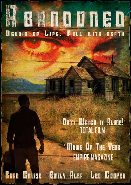
| completed movie poster |
1. To create this horror movie poster we will be using a selection of copyright free images, as seen below. First open these files in Photoshop by going to File-> Open and navigating through your files and selecting the relevant images.
2. For the poster, we will be using an A3 canvas, to create an A3 canvas go to File-> New and in the options window choose International Paper as the Preset and A3 as the size.
3. Next open the house image in Photoshop, unlock the layer by double clicking the lock icon on it and selecting ok, and then use the quick selection tool (or other selection tools if using older versions of Photoshop) to select the background, press backspace or delete to remove it.
4. The use the move tool to drag and drop the house into the A3 canvas and resize and position it as shown below, using Edit-> Transform-> Scale.
6. Next open the road image in Photoshop and crop it down as shown below.
7. Next use the quick selection tool to select and delete all areas of the image apart from the road itself, as seen in the image below.
8. Now resize the image to fit into the canvas as shown below, to do this go to Edit-> Transform-> Scale. Ensure the road is on a layer below the house and above the sky layers.
9. Select the house layer and use the clone stamp tool to clone the existing grass into the empty space between the existing grass areas and the road. To use the clone stamp tool, Alt + Click to define a source point from which to copy then click over the area you want to 'brush' it into. Be aware the source point follows you around so you will have to repeatedly redefine new source point. Don't get too particular about it though as there will be multiple layers overlaid on top of the grass very soon, so just aim to achieve a basic coverage of the empty space.
10. Now open the man image into Photoshop and as with the other image, unlock the layer, remove the background using the quick selection tool, move it into the A3 canvas and move and resize it using Edit-> Transform-> Scale.
11. Now open the fire, paper, wood and eyes images in Photoshop. We will first drag and drop the fire and paper images onto the main canvas and stretch them to fit the full canvas. Next select each layer individually and select Layer-> Layer Styles-> Blending Options. In the pop up window choose the overlay blending option for the fire and drop the opacity below 50%. For the paper choose multiply.
11. The wood image requires editing before it is blended. First it will need to be removed from its background, cropped down, moved onto the canvas and stretched to fit half the canvas. Next go to Layer-> Duplicate Layer to create a copy, go to Edit-> Transform-> Flip Horizontally and then Flip Vertically. Now position the two wood layers so they fill the entire canvas as shown below.
12. To blend the wood into the image go to Layer-> Layer Styles-> Blending Options. In the pop up window choose the overlay blending option.
13. The final image to be blended in is the eyes. As before drag and drop it onto the canvas, resize it to a size you are happy with and blend it using the multiply blending option.
14. Now we will use the paper layer to create a rough, black border around the edge of the poster. Select the paper layer and use the magic wand tool to select the white area around the paper (you may need to use the ‘add to selection’ option to get all the area selected at once. While retaining the selection move from layer to layer hitting delete or backspace to remove the content within the selection until all layers, except the background later, are completed. Then deselect (Ctrl+D shortcut) and select the background layer and use the paint bucket tool to fill it in black.
15. The final part of the image is the text. The font I have chosen is called Calame and is available for free download HERE. The title I have chosen is Abandoned but you can choose any title you like. The image below shows the Layer styles used on the text. A basic drop shadow was added and then an inner shadow was added to increase the scratched looked of the text.
16. Next additional text was added to represent the actors in the movie and quotes from reviews of the movie. I have chosen to use the same font style as the heading (Calame) but again the choice is yours. As a final touch I duplicated the paper layer and placed it above the text as the very top layer, as shown below.
17. And that it, your poster should look like the one below...
 |
| The completed Movie Poster |


No comments:
Post a Comment