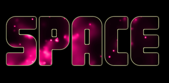
Showing posts with label graphics. Show all posts

Tuesday, April 19, 2016

Image inside text using Photoshop

finished piece
Finished piece

Step 1.

In Photoshop pen up an image you want to be inside the text

open file in Photoshop
Open file in Photoshop


select image
Select image


Step 2.

Create a text layer and add some text to it. In this example, I have typed the word 'Space'.


Step 3.

Right click on your image layer, in my case it is 'pink_gallaxy', and select the 'create clipping mask' option from the list that appears.

create clipping mask
Create clipping mask


Step 4.

Add a background colour (if you want) and that's it, simple as that.

Completed text effect with image inside it

Tip: you can left click inside the text and drag the image around to set it up the way you want.

Wednesday, March 9, 2016

Photoshop Text Tips

You can do a lot with text in Photoshop through both simple and advanced techniques

Photoshop was and still is primarily a photo editing software and always will be but it does have a wide range of text editing tools and capabilities that often go untapped or unnoticed by us. The tips below will help you to make the most of text in Photoshop.

Box Over Point

Always create a text box rather than a text point. Click and drag when using the text tool to create a text box. This gives you more control and options when positioning and formatting the text.

Diagonal Text

You can have text going horizontally or vertically. If you want to put it diagonally, type it horizontally first then use Edit > Transform > Rotate.

Divide and Conquer

Give separate pieces of text, such as paragraphs, a text box of their own. This will maximise your editing opportunities if you want to make major revisions or changes later. This is especially true with posters, magazines or CD/DVD covers.

Quick Access

To return into a text box double click on the ‘T’ beside the text layer. This is the easiest, fastest and most fool proof method. You may think to just double click on the box in the canvas but you need to be using the text tool first to do this while with the other method you don't.

Colouring In

To change the colour of text you must enter into the text box, highlight it and then choose a colour from the text colour picker at the top of the screen, not the colour picker on your tool bar. You never use the paint bucket or paint brush as this will force rasterisation of the layer. A layer style > colour overall will also work but takes longer to add and to edit.

Don't Rasterize

Never rasterize text unless it is totally necessary, read any pop ups that appear and if it says you must rasterize the text cancel it unless you had intended it. The text will no longer be an actual text layer once rasterized so If you rasterize text you will lose all the text editing capabilities like changing the font style or using text warps.

Text Warp

When using text warp you should reduce the text box to snugly fit the text. This is because the text warp actually warps the text box and not the text directly, so a snugger text box gives you more control with the text warp.

Styles before Filters

Layer styles can be applied to text without rasterizing it but filters from the filter gallery cannot be applied to text without rasterizing it.

Customising Letters

To edit the shape of text by editing anchor points you first need to convert it to a shape. To do this, select the layer, go to layer> type> convert to shape. This will turn the text into a shape layer. You can then edit the individual anchor points using the direct selection tool.

Images as Text

You can use the horizontal or vertical type mask tool to “cut” text from an image. It works by selecting part of the image in the shape of the text you have typed. This can be a nice effect to have an image running through your text as opposed to a flat colour or gradient. This tool works like normal text but after you have typed the text you will then need to use the move tool to move the selection to the canvas or canvas area you want it on.

Character and Paragraph

The Character and Paragraph windows give you additional text editing options such as line height, letter spacing, text height, font weight, alignment and much more. Good text is very important in design, spend time working on it and experimenting with the different options that can be achieved.


Thursday, March 3, 2016

Graphic Design Process

Graphic Design Process

The Graphic Design Process

The Graphic Design Process is a series of steps that a designer takes when working on a graphic design project; put simply it is a more graphic design focused version of the general design process. The details of each stage will differ depending on the type of design but the approach should always be the same. It is vital to stick to the process during a design as skipping a stage, completing stages out of order of not using the process at all will result in a lower quality outcome, an outcome the client is not happy with or even worse no outcome at all.

The diagram above outlines the basic stages of the graphic design process and below each stage is explained in more detail.


1. Analyse The Brief

Each design project will begin when a client delivers the designer with a brief. The brief will outline what the client wants although as the client will likely have no design experience it is important for the designer to carefully analyse all details given by the client and if necessary to make further enquiries about the needs of the client.


2. Identify Key Requirements

Based on the analysis of the brief you must identify the most important parts/key requirements. Ask yourself, what requirements must I fulfil? For example when designing a poster for an event, the simple act of including the time, date and venue are much more important than any other aspect as a poster without the necessary details is useless. It is therefore important to identify and prioritise the key requirements of the brief. The graphic design style most appropriate to the brief should also be identified at this point.


3. Research Existing Designs

Research is important to identify possible design styles and ideas which may also suit the needs of your client. These samples can be used when meeting with the client to identify the style of image/design which they prefer. For students research will also help to familiarise yourself with industry standard designs and the quality of design which is required.


4. Generate Ideas

Coming up with an idea for the design, a slogan for a campaign, an image for a poster, a name for a website etc. can be difficult. However, by focusing on fulfilling the key requirements of the brief and allowing your research to inspire you it is possible to generate original designs for your project. Brainstorming is often used where a lack of ideas is a problem. Free writing is a type of brainstorming which simply involves relaxing your mind and writing down any and all ideas you have as quickly as possible without really thinking. Having your research around you can help when doing this. It may seem very simple but generally people have numerous ideas but they tend to dismiss them before writing them down, considering them down and allowing them to be developed into viable design solutions. For help and assistance visit our article on idea generation.


5. Develop Ideas

It is good practice not to settle on simply one idea but rather to choose 2 or 3 of your best ideas and develop them through simple sketches, drawings, colour scheme test pages and font style sheets. These steps all help to develop your ideas and highlight which one has the most potential for success. Sketching will also help to identify possible layouts/compositions that can be used.


6. Produce The Design

Once an idea has been selected and sufficiently developed it is time to begin producing/creating the design. It is important to note that this is commonly the stage that overeager student designers begin at and without stating the obvious this should never be done. Depending on the type of design different softwares or materials will be used to create the design but regardless of the means of production it is important that the previous stages are not forgotten and that the key requirements are fulfilled. For help and assistance with the graphic design production stage you may find our Photoshop tutorials useful.


7. Test The Design

This is a quick and simple stage of the process but one that is often overlooked. For printed designs testing simply involves printing the design to ensure the resolution and colours are of good quality, that no clipping of important details occur and that text is readable and without errors. For website design this stage will involve checking that all features are functional, that links are working and that page loading speeds are acceptable.


8. Place The Design Insitu

For printed designs this will involve placing the poster/logo/sign/banner etc. in its intended position and ensuring that text is readable from an acceptable distant, images are clear and that the colours do not clash with or blend into their surroundings. For websites this will involve publishing the website online and rechecking all features and functions. For other types of designs, such as architecture or interior design, a programme such as Photoshop can be used to digitally place the design into its intended environment.


9. Evaluate The Design:

Before presenting your final design to the client it is vital that you evaluate it without bias. The easiest way to do this is simply return to stage 2 where you identified the key requirements of the brief and see if you have successfully fulfilled them. It may also be useful to get the opinion of others at this stage if you fear you will be unable to objectively evaluate your own design.


10. Redesign:

This step is only necessary if, after evaluation, you feel you have not successfully met the key requirements of the design brief. This stage involves returning to the beginning of the process and returning through each step correcting the errors which led to the key requirements not been fulfilled.


If you enjoyed this article then perhaps our articles on the web, interior, games or furniture design processes may also be of interest.


Monday, February 29, 2016

The Most Powerful Words In The English Language

Most Powerful Words In The English Language
Powerful Words Everywhere You Look In This Magazine Cover


They often say, it's always the ones you least suspect, but in the case of the most powerful words, that certainly isn't true. These words appear everywhere in graphic design, marketing, branding and promotional material, with magazine covers particularly guilty. Throughout this article, magazine covers are used to show the most powerful words in action. In each example the powerful word under discussion is circled, although you will notice numerous powerful words in some covers. The example above has 7 of them in the one cover! At any time click on an image to view it full size. And now to the most powerful words...

You 

'YOU' is the most powerful word in advertising for a reason - it's personal. "Let's talk about you", let's be honest, when it comes to you, you're all ears. If I make a promise to make people rich, you may be interested. If I promise to make 'YOU' rich, it becomes a different story. You is a word that must be used when talking to your customers, because that's who you're addressing. And when you do that, you're talking about a person's favourite subject. It's so powerful, many writers (especially in direct response) will not use a headline unless it has you in the title. Personally, I wouldn't go that far, but you is definitely something that 'YOU' should always consider. See examples below where the key word is circled.


Most Powerful Words - YouMost Powerful Words - You


Discover

This one is a prompt that advertisers use to say, "You're going to get something out of this, it's worth your time to keep reading." Or when it comes to product packaging, it indicates the product is worth checking out. Discover is a promise of something more to come. Like unwrapping a gift on your birthday, discoveries always bring a sense of excitement and adventure. And any time you evoke those fond childhood feelings, you're on to a winner. Personally I am nuts about adventure, excitement, new things. If the reader is too, the word Discover may work wonders. See examples below where the key word is circled.


Most Powerful Words - DiscoverMost Powerful Words - Discover


Results

Another word used in the headline of this piece, results is a word that also means success. And this word is powerful because it's a promise that helps you rationalise the purchase. "Oh, well if this gets results, it must be worth it." If you "guarantee results" you've just upped the ante. We all want results, whether it's from a household cleaner, our bank manager or the President of the USA. If they deliver, you feel satisfied. If they don't, well, don't expect re-election. I suppose this is powerful because everyone wants results. Perhaps this is better in a back-to-back context? See examples below where the key word is circled.


Most Powerful Words - ResultsMost Powerful Words - Results


Save          

'Save' or 'Saving' is an all time classic. And I think this one will work years after I have gone to my maker. Hands up if you don't want to save time or money... Exactly. Saving money is something that 99% of us want to do. Even the richest of the rich want deals, they just get them on more expensive purchases. If you can genuinely promise to save someone some money, you'd be foolish not to point this out. Of course, HOW you talk about it is just as important as what you're talking about. Do it wrong, and you will come across as either a pile-it-high-sell-it-cheap merchant, or untrustworthy. And as for saving time, well, time is money, which brings us right back to something we all want to save. See examples below where the key word is circled.


Health 

Especially powerful when it applies to a product. This is used a lot these days, and not just when talking about physical health. Perhaps the most commonly-used variation is "improve your financial health", and it works because we all know what good health is. If you can make a promise of good health, be it in a food, service or something else, you are doing well. But again, don't abuse the word. It is said to be especially powerful when it applies to a product or solution. Health is mostly effective against certain target markets. See examples below where the key word is circled.


New   

If I haven't heard about it before, never seen before, it's exciting! We all want new, even if it's not really all that new in reality. We want the next new phone model (which is why lines for the latest iPhone (see Trends in Mobile) span the block, despite having very few upgrades). We want new cars, new clothes, new shoes, new tastes, new smells, and we're willing to pay for it. Personally, I think NEW should be higher up on the list. It's a very powerful word that you will see in advertisements and promotions on a daily, if not hourly, basis from recipes to technology. See examples below where the key word is circled.


Proven

When selling anything, the word proven is a powerful one. It gives reassurance, nobody wants to be the guinea pig. Using the word proven in your marketing copy is proven to be effective! When you have a brand new product, not a new version of an existing product, there's a bump that you need to get over. It's basically "buyer beware," because the customer is dealing with an unknown. They can wait to see what the reviews on the product or service are, or they can ask friends and relatives. But one way to get over this bump is to provide the proof yourself. For instance, a famous cat food brand often used "8 out of 10 cat owners who expressed a preference said their cats preferred it". Wow, 8 out of 10. Must be good, it's proven. I'll try it. As Seen On TV products also do this well, with product demonstrations that prove a point. So, don't just say it. Prove it. See examples below where the key word is circled.


Easy  

Let's make this experience easy... Easy is better than hard. Who would choose a difficult option when an easier one is available? as long as the price/quality is just as good then easy is always better.


Love/Sex

This one has multiple meanings, you can be "in love" with something or you can "love" how well something works or performs. Either way, love is a strong word. But, be careful in its use. It's one thing to say "you're going to love the way it smells" when talking about a perfume. It's quite another to say "you will instantly fall in love with our toilet cleaner". Really? No one falls in love with a toilet cleaner. Remember, love may work well, but don't lay it on too thick. It can scare people away. 

There is another word starting with an S, three letters long, that I think is pretty powerful. Sex. But Sex can be come across as being a bit crude, however sexy is more acceptable and just as effective? Everyone wants to feel or be perceived as sexy. Play into that weakness and make it about them. See examples below where the key word is circled.


Now/Instant

Creating urgency is critical. We want things yesterday! The subject of delayed gratification is an important one among neuroscientists, as many famous studies showcase how being able to delay rewards to a later date is a skill needed to become successful. The reason this interests marketers is because it reveals an interesting aspect of human nature. This is an area where many business get too optimistic, and although it's smart to place an emphasis on these instant rewards, it's also always a good idea to under-promise and over-deliver, so be sure you can actually follow through on your promises or you may end up with a clan that hates your guts. See examples below where the key word is circled.


Free

The most powerful four letters in marketing. Nothing short of a conversion god, free never loses its power. Nothing free will be overlooked by anyone, what have they got to lose? When its free, nothing! So therefore they try it out. Simple. See examples below where the key word is circled.


Friday, February 26, 2016

Top Advertising Techniques In Graphic Design

Good Graphic Design Is A Key Aspect Of Advertising
Today every company needs to advertise its product to inform the customers about the product, make sales, acquire market value and gain reputation and stature in the industry. Every business spends lot of money to advertise their products but the money spent will lead to success only when the best techniques of advertising are used as part of a well designed image. So here are some very common techniques used by the advertisers in web and graphic design to get their desired results. These techniques can be used regardless of the design style but some techniques do work best when matched up with a particular design style.

Avant Garde

This ad on the official apple website used the avant garde technique to promote the iPad


Avant Garde is a French phrase used to refer to people or works that are experimental or innovative, particularly with respect to art and culture. In graphic design advertising it is the suggestion that using this product puts the user ahead of the times. Phrases like "revolutionary" or "cutting edge" are often used too but overall a general sense of the product/service being futuristic is the key aspect. Apple are the masters of this technique with all their recent product launches using this technique.

Weasel Words

"Bang and the dirt is gone" - an example of weasel words in an advert

“Weasel words" are used to suggest a positive meaning without actually really making any guarantee. A classic example being the Cillit Bang catchphrase "Bang and the dirt is gone!". IT sounds simple, has impact and is memorable but what does it really mean?

Magic Ingredients

Actimel advertise their magic ingredient in their advertisemnts

The suggestion that some almost miraculous discovery makes the product exceptionally effective such as the "L. Casei Immunitas" in Actimel. They constantly mention this ingredient in ads despite the fact that very few people outside of micro-biologists knows what it is! It sounds impressive though and "if we haven't heard of it then it must be very special",  that's what they want us to think.

Patriotism

An example of an advert using the patriotism advertising technique

The suggestion that purchasing this product shows your love of your country or supports your country through your purchase. In these ads there is often no effort to talk about the superiority of the product/service or it's attributes, the emphasis is solely on the fact it is a local or national product/service.

Diversion

Katy Perry is used as the diversion in this advertisement for .... chips! Sorry I got distracted.

Diversion seems to discuss a product or service or tackle a problem, but then throws in an unrelated topic or distraction. What distracted you in this above ad...?

Snob Appeal

The imagery and the text in this advertisement portray an elegant, sophisticated service through the snob appeal technique 

Snob appeal is the suggestion that the use of the product or service makes the customer part of an elite group with a luxurious and glamorous life style. We all aspire for a better life, that is human nature, and this type of ad appeals to that desire.

Bribery


This one is very simple and is therefore very common. The bribery advertising technique seems to give a desirable extra something when we use/buy a service/product. We humans tend to be greedy so getting something for free or for a reduced cost is very appealing, sometimes even if we didn't need or want the product in the first place!

Testimonial


Another simple one that advertisers use is to get a famous personality to endorse the product. In this way they can grab our attention using the iconic attention grabbing technique as well as adding a sense of the products appeal by associating it with the right type of person. In the above example the young, beautiful, talented and successful Taylor Swift adds a lot of positives to the Diet Coke brand.


Humour


Customers are attracted to products that give them a reason to laugh or to be entertained by clever use of visuals or language. Ads using humour also give a brand a fun factor which can make a customer "like" the brand's approach to doing things and thus favour them over competitors. The above ad uses humour but also a hint of the sexy attention grabbing technique as well.

Simple Solutions


Avoid complexities, and attack many problems to one solutions. Seems good, doesn't it! Thats what the advertisers are relying on of course. Phrases like "all in one" and "multi-purpose" are commonly used in these types of ads. We can tend to be lazy and is offered an easy, all in one solution to multiple issues then why wouldn't we take it?

Bandwagon


Bandwagon is a form of propaganda that exploits the desire of most people to join the crowd or be on the winning side, and avoid winding up the losing side. It's a popularity contest with these type of ads which often compare their customer base to competitors or suggest that "everyone" is with them so why aren't you. "Join us", "be part of it" or "get on board" are commonly used phrases in these type of ads.

Sexy...?

If you are thinking that surely sex is an advertising technique seen as beautiful people are commonly used in ads and of course we've all heard the phrase "sex sells". So why is it not in the list? Actually is it an attention grabbing technique as opposed to an actual advertising technique.


Saturday, February 20, 2016

Get The Right Paper Size For Your Design

ISO A Series Paper Sizes

The ISO (International Standards Organisation) 'A series' of paper sizes has become the global standard for document sizes, it based is based on the following principles:
  • A0 has an area of one square metre.
  • The height divided by the width of all formats is the square root of two (1.4142).
  • A1 is A0 cut into two equal pieces. In other words, the height of A1 is the width of A0 and the width of A1 is half the height of A0. All smaller A series formats are defined in the same way.
  • If you cut format An parallel to its shorter side into two equal pieces of paper, these will have format A(n+1).
  • The standardized height and width of the paper formats is a rounded number of millimeters.
In the ISO paper size system, the height-to-width ratio of all pages is the square root of two (1.4142 : 1). In other words, the width and the height of a page relate to each other like the side and the diagonal of a square. This aspect ratio is especially convenient for a paper size. If you put two such pages next to each other, or equivalently cut one parallel to its shorter side into two equal pieces, then the resulting page will have the same width/height ratio. This is especially useful in the creation of brochures, booklets, newsletters and magazines.
ISO B Series Paper Sizes
For publications where the ISO A series does not provide an adequate format, the B series has been introduced to cover a wider variety of paper sizes. The C series of formats has been defined for envelopes.


ISO C Series Paper Sizes
The following table shows the width and height of all ISO A and B paper formats, as well as the ISO C envelope formats. All dimensions are in millimeters (mm):

A Series FormatsB Series FormatsC Series Formats
4A01682 x 2378----
2A01189 x 1682----
A0841 x 1189B01000 x 1414C0917 x 1297
A1594 x 841B1707 x 1000C1648 x 917
A2420 x 594B2500 x 707C2458 x 648
A3297 x 420B3353 x 500C3324 x 458
A4210 x 297B4250 x 353C4229 x 324
A5148 x 210B5176 x 250C5162 x 229
A6105 x 148B6125 x 176C6114 x 162
A774 x 105B788 x 125C781 x 114
A852 x 74B862 x 88C857 x 81
A937 x 52B944 x 62C940 x 57
A1026 x 37B1031 x 44C1028 x 40

The ISO standard paper size system covers a wide range of formats, but not all of them are widely used. Among all formats, A4 is the most commonly used. Examples of common publications and the paper sizes they utilise are documented below.
The main advantage of the ISO standard paper sizes becomes evident when using copier machines. Copier machines designed for ISO paper sizes usually provide special keys for frequently needed magnification factors based on the ISO sizes, this allows the user to easliy scale the original ,up or down, to a size better suited to their needs.

Paper Size(s)Publications/Applications
A0, A1technical drawings, large posters
A1, A2flip charts
A2, A3drawings, diagrams, large tables, small posters
A4letters, magazines, forms, catalogs, laser printer and copying machine output
A5note pads
A6postcards
B5, A5, B6, A6books
C4, C5, C6envelopes for A4 letters: unfolded (C4), folded once (C5), folded twice (C6)
B4, A3newspapers, supported by most copying machines in addition to A4
B8, A8playing cards

If you found this useful you might also enjoy our article on the most common file types.


close
Banner iklan disini