Showing posts with label design theory. Show all posts

Thursday, August 11, 2016

Graphic Design Colour Schemes

Before reading this section it is recommended that you first read the section on colour theory as a basic understanding of colour related terminology is expected.

Colour Schemes for Graphic Design
With so many colour variations to choose from settling on a colour scheme can be difficult

A colour scheme is a combination of colours that, when put together, compliment or contrast one another in an aesthetically pleasing way. Colour schemes are used by artists, graphic designers and interior designers to create visually appealing imagery. Colour schemes can be put together at random, but most professionals choose colours based on their relationship to each other in the colour wheel. The colour scheme types explained here are monochromatic, primary, secondary, complimentary, analogous, triadic, warm and cool.


Monochromatic colour scheme:

Poster with a monochromatic colour scheme

A monochromatic colour scheme is made up of just one main colour, but features a number of shades of that one colour. A simple example of this would be a colour scheme of blue, dark blue and light blue, as seen below. Monochromatic colour schemes could also feature the base colour, shades of that colour, and white and black.

Sample Monochromatic colour swatch


Primary Colour Scheme:

Poster using primary colours

This is another basic type of colour scheme where the basic primary colours of red, yellow and blue are used. A primary colour scheme can be made up of any shade of each primary colour but works best when the shades match evenly. In other words don't mix a bright red with a muted blue and yellow.

 Sample Primary colour scheme


Secondary Colour Scheme:

Image with a secondary colour scheme

This is a type of colour scheme where the secondary colours of purple, green and orange are used. A secondary colour scheme can be made up of any shade of each secondary colour but works best when the shades match evenly. In other words don't mix a bright purple with a muted green and orange.

Sample Secondary colour scheme


Complimentary Colour Scheme:

This images uses the complimentary colours of blue and orange

This colour scheme involves matching a primary colour with the secondary colour opposite to it on the colour wheel. For example, a colour scheme based on shades of yellow and purple would comprise a complimentary colour scheme, as seen below. Other complimentary colour pairs are blue with orange and red with green.

Sample Complimentary colour scheme


Analogous Colour Scheme:

Poster using an analogous colour scheme

An analogous colour scheme is created by pairing colours that appear side by side on the colour wheel. For example, an analogous colour scheme may include purple, blue and green. More subtle combinations may also be created by matching mixed colour tone combinations such as blue-purple, blue and blue-green, as seen below.

Analogous colour scheme


Triadic Colour Scheme:

This graphic design images uses a triadic colour scheme

A triadic colour scheme is made up of three colours spaced evenly apart from each other on the colour wheel. The primary colour scheme made up of the primary colours--red, yellow and blue is an example of this. These colours are all an equal distance from each other on the colour wheel, and form a triangle on the colour wheel when connected to each other. To produce a different triadic colour scheme, move the triangle until it points to different colours on the colour wheel such as yellow, red-purple and blue-green.

Triadic colour scheme


Warm Colour Scheme:

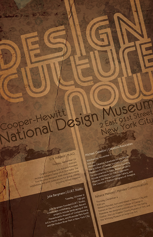
This movie poster uses a warm colour scheme


The colour wheel is divided into two halves, warm colours and cool colours. The warm colours include reds, oranges and yellows, including all variations of these colours. The warm colours are associated with action, passion, love, rage, danger and heat.

Warm colour scheme

Cool Colour Scheme:

This movie poster uses a cool colour scheme

The cool colours are found on the opposite side of the colour wheel, and these colours include all blues, greens and purples. Cool colours are associated with coolness, peace, calm, depression,
sadness, sky and water.

Cool colour scheme


Wednesday, August 3, 2016

Logo Designs of the Summer Olympics

Logos of the Summer Olympics
Logos of the Summer Olympics - Click to enlarge

The graphic above charts the logos of summer Olympic games from Paris 1924 to Rio 2016 and reads like a graphic design history timeline with historical design trends obvious in many of the logos. Recurring symbols in Olympic logos include the Olympic rings, the laurel leaf, Olympic flame and torch.

Most of the logos adhere to the 5 principles of logo design but some, have been very controversial and highly critiqued, such as the London 2012 logo. Below, each of the logos are described and explained in more detail, with some very interesting facts revealed along the way.

Paris, France, 1924 Olympic Logo

Paris 1924 Olympic Logo
The Games of the VIII Olympiad returned to the city of Paris for a second time after the first in 1908. In contrast to the poster and signboard paintings used to represent the previous Olympics, the 1924 Olympics was the first to create an official logo.

The logo depicts a wooden ship on the ocean in front of cloudy skies through a simple line drawing with serif lettering overlaid. The meaning or relevance of the symbolism of the ship is unclear with no obvious connection to Paris, France or even sport.

Back To Top

Los Angeles, USA, 1932 Olympic Logo

Los Angeles 1932 Olympic Logo
Los Angeles was the only city to make a bid to host the 1932 Olympics as the Great Depression hit the global economy. The 1932 Olympic logo was the first to use the Olympic rings in it , which was to become a feature in every Olympic logo which followed it. 

As well as the Olympic rings the logo also includes the stars and stripes of the American flag, the Olympic motto and a laurel leaf. Although quite obvious and blunt in its use of symbolism, the logo was at least appropriate and clear in it's purpose unlike the Paris 1924 logo.

Back To Top

Berlin, Germany, 1936 Olympic Logo

Berlin 1936 Olympic Logo
1936 was a dark chapter for the Olympic Games as Adolf Hitler saw the event as an opportunity to promote his ideals of racial supremacy. The game s would be the last for 12 years due to the outbreak of World War II.

In terms of the logo, the use of line art design, the absence of colours, and the symbolism eagle and bell give a sense of a rigid and stark environment. The Olympic rings are included but are not prominent and serve only as a platform for the eagle. In on way however, the logo was ahead of its time in it's simplicity as it was based entirely on a simple line graphic.

Back To Top


London, England, 1948 Olympic Logo

London 1948 Olympic Logo

London 1948 Olympic Logo
After a 12-year break because of World War II, London was given the opportunity to host the event for the second time, the first being in 1908.

The logo displays the Palace of Westminster and "Big Ben" behind the Olympic rings, which return to prominence as an Olympic logo feature. While black and white still dominates the logo, the logo is the best designed thus far. 

There are subtle features such as white space between certain rings to ensure it's dominance, "Big Ben" juxtaposing through the semi-circular headline text to help draw the eye through all areas of the logo. The semi-circular top text and straight line text at the bottom of the design also serve to frame the image.

Back To Top


Helsinki, Finland, 1952 Olympic Logo

Helsinki 1952 Olympic Logo

Helsinki 1952 Olympic Logo
The Olympic Games of 1952 were held in Helsinki, Finland, the northernmost city at which a summer Olympic Games has ever been held.

The 1952 Olympic logo design saw a return to the use of colour, albeit just a single one. It depicts the tower and stand of the Helsinki Olympic Stadium in front of the Olympic rings. The design is clean and minimal and is the fist Olympic logo to use negative space.

Back To Top

Melbourne, Australia, 1956 Olympic Logo

Melbourne 1956 Olympic Logo
After Helsinki being the northernmost city to host the Olympic Games, 4 years later Melbourne became the southernmost city to host the games. The 1956 Games were also the first to be staged in the Southern Hemisphere, as well as the first to be held outside Europe and North America. 

The logo was again designed using a single colour and depicted the Olympic rings and the Olympic flame, the first logo to do so, above the silhouette of Australia. We also see a return of the laurel leaf as a symbol after it's previous use in the 1932 logo. Like Helsinki, the Melbourne logo was generally seen as a success.

Back To Top


Rome, Italy, 1960 Olympic Logo

Rome 1960 Olympic Logo
After missing its first chance to host in 1908, the Olympic games finally arrived in the historic city of Rome in 1960.

The Olympic logo of 1960 is very different to it's predecessors and was the first and only Olympic logo to include an animal. The wolf and children represent the ancient story of Romulus and Remus the twin brothers and main characters of Rome's foundation myth.

The design has reverted back to black and white but is no flat like previous logos with a clear intent towards a 3 dimensional look. The logo is also the first to omit the name of the host city while also using Roman numerals instead of numbers to display the year.

Back To Top


Tokyo, Japan, 1964 Olympic Logo

Tokyo 1964 Olympic Logo

Tokyo 1964 Olympic Logo

The 1964 Summer Games were the first Olympics held in Asia. Tokyo had initially been awarded the 1940 Summer Olympics, but it was rescinded after Japan invaded China.

The logo for the 1964 summer Olympics depicts the red circle of Japan’s flag, signifying the sun, which sits atop the Olympics rings. It is a beautiful logo utilising minimal symbols and very effective graphical design. The red circle is not only the symbol of the country, but is also a great focal point with the use of subtle gradients in the red circle and the Olympic rings preventing it from looking too plain, flat or boring.

Back To Top

Mexico City, Mexico, 1968 Olympic Logo

Mexico 1968 Olympic Logo

Mexico 1968 Olympic Logo
The 1968 Summer Olympic Games was the first Olympic Games to be staged in Latin America and the first in a Spanish-speaking country. It was also the first Games to be held in a developing country.

The design by Pedro Ramirez Vazquez, Eduardo Terrazas, and Lance Wyman is said to be inspired by the patterns of the Huichole Indians and simply depicts the city, year and the five Olympic rings with the year. Although if you look closely you can see the XI as a roman numeral 6 and the CO being used to represent a sideways 8, together making up 68, the year of the games.

A different orientation as well as the lack of a graphic sets this logo apart but the placement of the Olympic rings above the year is very questionable. In general, not a good logo.

Back To Top

Munich, Germany, 1972 Olympic Logo

Munich 1972 Olympic Logo

Munich 1972 Olympic Logo

The 1972 Summer Olympics Games in Munich, Germany mindful of its connection to the Nazi regime, was eager to use the games to present a new, democratic and optimistic Germany to the world, as shown by the Games’ official motto, “Die Heiteren Spiele”, or “The Cheerful Games”.

The logo was designed by Otl Aicher, and depicts a blue solar logo which re referred to as the “Bright Sun”. This design recalls previous Olympic logo designs. Blue reappears as the main colour as it did in the 1928 Amsterdam and Helsinki 1952 Olympics, while there is also is a very similar approach in layout to the 1964 Tokyo design.

The spiral shape utilised in the logo has nice dimensions and visual movement. The full identity of the 1972 Summer Olympics has remained an iconic example of outstanding graphic design.

Back To Top

Montreal, Canada, 1976 Olympic Logo

Montreal 1976 Olympic Logo

Montreal 1976 Olympic Logo
The Olympic games of 1972 took place in Montreal, Canada. Most sovereign African nations, and a few other, boycotted the Montreal Games when the International Olympic Committee would not support the banning from competition of those countries whose athletes had participated in sporting events in South Africa during apartheid.

The official logo of the Montreal Games was designed by Yvon Laroche, Pierre-Yves Pelletier, Guy St-Arnaud and George Huel and much like its predecessor in Munich, is characterised by a minimalist look and feel. This Olympic logo features another strong design. The use of the letter “M” for Montreal on top of the 5 Olympic rings with everything appearing woven together.

Back To Top

Moscow, Russia, 1980 Olympic Logo

Moscow 1980 Olympic Logo

Moscow 1980 Olympic Logo
The 1980 Olympic Games were the first held in a communist country. The games were boycotted by 65 nations because of the Soviet war in Afghanistan. This, in turn, prompted the Soviet-led boycott of the 1984 Summer Olympics.

This logo bears some similarities with it's predecessor with a linear style featuring red as the predominant colour. The star, atop a six line tower, is a domino symbol which is designed to represent Moscow. As well as a tower, the lines can be seen to represent the lanes of a running track.

The logo was not well received however with“Misha”, the official mascot designed by Victor Chizhikov, becoming more popular than the actual logo.

Back To Top

Los Angeles, USA, 1984 Olympic Logo

Los Angeles 1984 Olympic Logo

Los Angeles 1984 Olympic Logo
The 1984 Olympic Games was hosted in Los Angeles, a second time for the city after the previous games in 1932. In response to the American-led boycott of the 1980 Olympics in Moscow, 14 Eastern Bloc countries decided to boycott the games in Los Angeles.

The official logo is owned by International Olympic Committee. The logo of the games featured five blue, white and red stars arranged horizontally and struck through with alternating streaks placed above the Olympic rings. It was named “Stars in Motion.”

This logo again features a version of the american flag as was done in the logo from 1932. The placement of the United States flag in the logo is very patriotic but also a little obvious and simplistic.

Back To Top

Seoul, South Korea, 1988 Olympic Logo

Seoul 1988 Olympic Logo

Seoul 1988 Olympic Logo
The 1988 Olympic Games took place in Seoul, South Korea. North Korea, and its allies, Albania, Cuba, Madagascar, and Seychelles boycotted the games but larger boycotts, as seen in the previous three Summer Olympics, were avoided.

In the logo the placement and size of the Olympic rings are similar to the ones utilised in the 1984 Los Angeles games but the abstract format of swirls is in contrast to the straight edges of the 1984 logo. There is a sense of movement incorporated into both logos however which embraces the athleticism and dynamism of the Olympics.

Barcelona, Spain, 1992 Olympic Logo

Barcelona 1992 Olympic Logo

Barcelona 1992 Olympic Logo
The 1992 Olympic Games in Spain were the first to be unaffected by boycotts since 1972. South Africa was allowed to compete in the Olympic Games for the first time since the 1960 Summer Olympics due to its apartheid policy. A reunified Germany sent a single unified team for the first time since 1964 to the games while a dissolved USSR and a separated Yugoslavia also sent their individual teams.

The 1992 Barcelona logo continues the template of the previous years: keeping the rings in the lower part and a graphic or motif above. The abstract forms are reminiscent in style of brush strokes, perhaps referencing Spain's history of producing world renowned painters.

The shapes themselves could represent a gymnast, runner, jumper or even a trace of Spanish bullfighting which would nicely reflect the host country.

Back To Top

Atlanta, USA, 1996 Olympic Logo

Atlanta 1996 Olympic Logo
In 1996, the Olympic Games was celebrating it's 100th anniversary back in the United States in the city of Atlanta.

The logo depicts the Olympic flame, which blows from a cauldron created by the Olympic rings on a column formed by the number 100. The transition of the flames into the stars, representing America, is smoothly done and is more subtle and aesthetic than the previous American symbols of the 1932 and 1984 logos. One of the very best Olympic logos in history.

Back To Top

Sydney, Australia, 2000 Olympic Logo

Sydney 2000 Olympic Logo

Sydney 2000 Olympic Logo
The 2000 Sydney Olympic Games known as the Millennium Olympic Games was the second time the event was held in Australia, the first being in 1956 in Melbourne.

Overall, the logo depicts a runner holding a flag but included in this vivid logo design are references to the cultural heritage of the Aborigines through it's style and the incorporation of boomerangs (arms and legs). The Sydney Opera House, which is the symbol of Sydney, is incorporated clearly in both the outline of the flag and the white line inside the shape of the legs. A very clever logo indeed.

 This Olympic logo design also uses a similar approach to the 1992 Barcelona games with the 3 main layers of shapes in blue, yellow and red/orange creating a human-like form.

Back To Top

Athens, Greece, 2004 Olympic Logo

Athens 2000 Olympic Logo

Athens 2000 Olympic Logo
With the motto “Welcome Home,” the 2004 Olympic Games returned to its roots in Athens, Greece marking the return of the games to the city where it first began.

This highly effective logo design shows a white laurel wreath drawn on a light blue background with “Athens 2004” and the Olympic rings place below. The more modern take on the symbolic laurel wreath subtly creates almost child like drawings of athletic poses using the leaves (arms/legs), stem (body) and berries (head) of the laurel wreath to make up the human form. Unfortunately, the unnecessarily large trademark symbol draws some attention away from the design.

Back To Top

Beijing, China, 2008 Olympic Logo

Beijing 2008 Olympic Logo

Beijing 2008 Olympic Logo
The 2008 Olympic Games was held in Beijing. The official motto for the 2008 Olympics was “One World, One Dream” (同一个世界 同一个梦想).

The official logo of the Games, titled “Dancing Beijing”, refers to the host city by featuring a stylised calligraphic character jīng (京, meaning capital) which resembles a sportsman, runner, gymnast or a Chinese dancer.

The font is also unique and very appropriate, as it has a resemblance to Chinese characters while the 'iji' in Beijing looks like a group of people with the 'e' almost like their shadow.

Back To Top

London, England, 2012 Olympic Logo

London 2012 Olympic Logo

London 2012 Olympic Logo
The 2012 Olympic Games returned to the city of London for the third time, previously hosting in 1908 and in 1948. The London 2012 Games also became the first at which every sport had female competitors.

Despite controversial and negative reactions, this logo by Wolff Olins was chosen to represent London 2012. Abstract shapes are arranged to spell out 2012 with "London" and the Olympic rings been placed inside the shapes. The presentation of the numbers in the design is meant to appeal to today’s Internet generation, although I don't see how.

The official London 2012 Olympic typeface was called Headline 2012 and it too suffered criticism.
Overall this logo is not as strong as previous years and has been criticised at length in the design community.

Back To Top

Rio, Brazil, 2016 Olympic Logo

Rio 2016 Olympic Logo
The 2016 Olympic Games will be held in Rio de Janeiro, Brazil. This is the first time the games will be hosted by a South American, Portuguese-speaking country and during the host country’s winter season.

The official emblem for Rio 2016 was designed by the Brazilian agency Tatíl Design. It represents three figures, in yellow, green, and blue the colours of the Brazilian flag. The figures are joined at the arms in an embrace, with the overall shape reflecting that of outline of the Brazilian landmark the Sugarloaf Mountain. 

The logo was based on four concepts: contagious energy, harmonious diversity, exuberant nature, and Olympic spirit. However is has been courted by some controversy with some alleging this logo is plagiarised from the logo of US not-for-profit the Telluride Foundation. Tátil’s Fred Gelli put any likeness down to coincidence and noted that the broad concept of people embracing each other is not novel. This is very true and personally I really like this logo and don't feel the likeness is enough to cite plagiarism.

If this review of Olympic logos has inspired you to get creative why not check out our article on the Logo Design Principles and then create a logo of your own.

Back To Top


Saturday, July 23, 2016

5 Must See Infographics for Design Students

An infographic about infographics
An infographic about infographics - click to enlarge
Don't know what an infographic is? Well we have even provided you an infographic on that too! See the example above. A well-designed infographic like the ones below can help you simplify a complicated subject, in case the subject is Design and we have carefully selected 5 must see infographics for any young designer or design student. We hope you find them useful.

Colour Theory Infographic

design colour theory infographic
design colour theory - click to enlarge

The design infographic above from paper-leaf.com covers all the main areas of colour theory for design. When presenting a design or an idea your choice of colours is very important. It is very important for a designer to understand the way colours are put together as this may help in the selection of the right colour scheme for a particular age group. You can learn more about colour design in design by clicking here.

Design Process Infographic

The steps in the design process
The design process - click to enlarge

The design process is the single most important piece of design theory that a designer needs to know. This design infographic outlines the stages of the design process and the order in which they are to be completed. It also highlights that design can be a cyclical process which is in constant evolution. If you want to know more about each stage of the design process then you can read more >>>


Design Careers Infographic

Careers in Design
Careers in Design infographic - click to enlarge

This handy little infographic is from photoshop-plus.co.uk and it outlines some of the main careers in the design area and the salaries available to designers. However the design of the infographic itself can also be used as an educational tool for design students as it's clean and crisp layout combined with the bright colours of each elements contrasting nicely with the light grey background. Click on any of these links to learn more about a career in web designinterior designgraphic designgames design or furniture design.

The Elements of Design Infographic


The elements of design
The elements of design - click to enlarge

The design infographic above simultaneously lists and demonstrates the elements of design.The Design Elements refer to the different types of parts that can be used in the creation of any given composition or design. These elements can be combined and arranged in a variety of ways to create an endless variety of designs, both two and three dimensional. If you would like to learn more about each of the elements of design you can read more >>>

 The Principles Of Design


The principles of design
The principles of design - click to enlarge

The design infographic above simultaneously lists and explains the 6 basic concepts or theories in the area of design, collectively known as the principles of design. They are Balance (Alignment), Rhythm (Repetition), Proportion (Proximity), Dominance (Emphasis) Unity (Harmony) and Contrast. Theses principles are sometimes know by different names hence the brackets.They represent the basic rules of how to arrange a composition and create a successful design. In order words they guide us in the way we arrange the elements of design. Sometimes we look at an image or object and we find it aesthetically pleasing or easy on the eye but we may not quite understand why - the reason is that one or more of the principles of design are at work. If you would like to learn more about each of the principles of design you can read more >>>


Wednesday, May 25, 2016

Principles of Design

The Principles of Design

It is recommended that you read the notes on Design Elements before reading these notes as some of the terms used here are explained in that section.

There are 6 basic concepts or theories in the area of design, collectively known as the principles of design; they are Balance (Alignment), Rhythm (Repetition), Proportion (Proximity), Dominance (Emphasis) Unity (Harmony) and Contrast. Theses principles are sometimes know by different names hence the brackets.They represent the basic rules of how to arrange a composition and create a successful design. In order words they guide us in the way we arrange the elements of design. Sometimes we look at an image or object and we find it aesthetically pleasing or easy on the eye but we may not quite understand why. The reason is that one or more of the principles of design are at work. These principles can be applied regardless of the style or genre of the design being created..

Balance:

Balance refers to the arrangements of design elements within a composition, how they relate to each other and the overall composition. Elements can have different visual weights dependent on their size, shape or colour and if positioned poorly they can unbalance a composition. There are two types of balance - symmetrical and asymmetrical.

Symmetrical balance
Symmetrical balance

Symmetrical balance is where the weight of a composition is evenly distributed either side of the centre point of the composition, usually horizontally or vertically (although radial symmetry is also possible).

Asymmetrical balance

Asymmetrical balance is where the weight of a composition is not equally distributed (but is still visually balanced). This is much harder to judge than symmetrical balance but can be more visually interesting.


Contrast:

Contrast refers to the arrangement of opposite elements in a piece so as to create visual interest, excitement and drama. This can be done in a variety of ways such as through light vs. dark colours, rough vs. smooth textures, large vs. small shapes, etc.

design principle contrast
contrast

Dominance / Emphasis:

Dominance (also known as emphasis) may seem similar to proportion but is actually more to do with the visual weight of an element. The dominant part of a composition is the one that stands out the most or appears closest to you. There are 3 stages of dominance: dominant, sub-dominant and subordinate.
principles of design dominance
dominance in weight and positioning

Dominant is the primary object/area, the one with the most visual weight, usually appearing in the foreground.

Sub-dominant refers to the secondary object/area, usually found in the middle ground of the composition.

Subordinate objects/areas carry little visual weight and usually appear to recede into the background of the composition.


Rhythm:

Rhythm can create a sense of movement in a composition by repeating or alternating elements (often but not always in a pattern). There are 3 main types of rhythm, each defined by their suggested meaning or the feeling they evoke in the viewer.

Progressive Rhythm
Progressive Rhythm

Progressive rhythm shows a progression of lines or forms to create a sense of moving forward or up.

Flowing Rhythm
Flowing Rhythm

Flowing rhythm implies a more natural sense of movement in a composition through the use or wavy lines or fluid forms usually or unequal size and length.

Regular Rhythm
Regular Rhythm

Regular rhythm is where the elements used are of the same or similar size, length and weight and are positioned in a pattern (usually but not always).


Scale / Proportion:

Proportion (also known as Proximity) is simply the comparative size of elements (usually shapes) relative to each other or the overall composition. Proportion can be used in a composition to create a sense of distance or demonstrate a size difference. Proportion can also be used to create or unhinge the balance in a composition as their visual size and weight will automatically establish themselves in the composition.


Proportion/ Proximity:Proportion/ Proximity:


Unity / Harmony:

Unity refers to the relationship or connection between the various parts within a composition and their relationship or connection to the composition as a whole, it is often achieved by utilising a number of the aforementioned principles. Unity can give a sense of entirety or wholeness to the composition or equally break it up and create a sense of variety or disharmony.

Unity
Unity

An image with good unity will draw the viewer in and focus them around the one area or a few connected areas and generally get the point across very quickly, so are therefore ideal for advertising. Images/compositions without unity can be difficult to read or visually awkward.

Disharmony
Disharmony


close
Banner iklan disini