 |
| What web design trends will merge in 2017? Find out here. |
2017 is here and it’s bringing more technological breakthroughs and surprising web design trends than the world has ever seen. With each passing day, the modern world hits a new record for digital advancement. The future of web design looks bright for those ready to embrace positive changes.
In this article we shine some light on the web design trends that we think will be big in 2017, so here they are, our tips for the big web design trends of 2017 ...
Touch...
 |
| We think haptic technology will be a big deal in 2017 |
There are three sensory systems related to sense of touch in humans: cutaneous, kinesthetic and haptic. All perceptions mediated by cutaneous and/or kinesthetic sensibility are referred to as tactual perception.
The sense of touch may be classified as passive and active, and the term "haptic" is often associated with active touch to communicate or recognize objects.
Haptic communication recreates the sense of touch by applying forces, vibrations, or motions to the user through their mobile device. Currently the Samsung Anycall Haptic enables users to feel clicks, vibrations and other tactile input. In all, it provides the user with 22 kinds of touch sensations in response to various user actions.
But how does all this relate to web design? Well, for example a strong vibration could be activated to discourage users when exiting a website or app. On the flip side a relaxing, pulsing sensation could be output from a meditation app on your mobile device. There are, of course, numerous other possibilities and I think 2017 is the year when we will see haptic technology emerge as a major feature in web and app design for mobile devices.
Back To Top
Big...
 |
| This website utilises big text and big images to dominate the screen |
With the rise in mobile usage, users are reading less, scrolling more and browsing quicker so designers are having to go big to grab attention.
Full screen background images were popular in 2016 and we also saw the introduction of full screen video backgrounds too on websites such as pay-pal, more on that later though. This trend is expected to continue and become more widespread in 2017 as websites try to get their point across quickly and visually.
Large custom typography is also set to be used more to create personality, evoke emotion and set tone. As device resolutions become sharper and type becomes more easy to read on-screen, companies will look to push the limits of typography even further in 2017 to appeal to their target audience.
So expect to see an increase in over-sized and full screen type this year, hopefully it'll be of the beautiful, unique and hand-rendered type and not the bold, blocky and in your face type. We'll have more on the benefits of a custom approach later.
Back To Top
Space...
 |
| This website makes good use of space in 2 ways! |
The right amount of empty space can make or break a design. Whether it is white space, a background color or image, “empty” space in a design can have a huge effect on the content that is there. if done correctly it will draw the user to the content you want them to focus on, and as mentioned earlier this is not easy nowadays!
Think about it from the user perspective. They will likely be drawn immediately to the open part of the design (whether they think about it consciously or not). From there, the eye will hop to the more populated part of the design. This simple two step process grabs users’ attention and almost shows them where to look.
Open space is an extension of minimal styles
For this reason we think exaggerated use of space is one of those design trends that will be utilised a lot in 2017. Open space is an extension of minimal styles that have been popular for some time but, this year, rather than a symmetrical outline with space all around, web designs will balance images and text with space in a more asymmetrical format.
This simple balancing act is also visually interesting and great for making a strong impact, another reason we think it'll trend in 2017.
This simple balancing act is also visually interesting and great for making a strong impact, another reason we think it'll trend in 2017.
Back To Top
Original...
 |
| Expect to see more illustrations like this in 2017 |
As discussed above, the rise of mobile device and UI patterns now places UX as the most important aspect of design, meaning that many sites now look and work in similar ways. This is fine for users as they now know, instinctively, how to navigate around a website that they have never visited but it's not fine for a company who wants to stand out from the crowd.
In order for a brand to really stand out and strike a connection with it’s audience, while still using a design users can manage, they’ll need carefully considered and completely bespoke visuals which are more representative of who they really are. We can see this being a big web design trend in 2017 and is one that we really look forward to seeing.
Original illustrations are fantastic, versatile mediums for creating playful and friendly visuals which add an element of fun to a site.
Talented illustrators are able to create illustrations which are full of personality and tailored to match the tone of the brand, something which brands will be striving for more than an ever in 2017.
 |
| A custom, purpose taken photograph is the main feature of this website |
With a unique style of illustration established, brands are then able to roll that out through their entire identity, for use in large header images, custom iconography and beautifully animated visuals. Dropbox, is a great example of a brand who uses illustration to create beautiful, friendly and totally unique visuals which are full of character to appeal to their users.
This demand for originality will hopefully lead to the death of the dreaded stock imagery that we see everyday across the web and lead to a rise in more authentic photography in 2017. Brands and designers will now be thinking more carefully about the imagery they use on site, hiring professional photographers to take their shots which frame them in the way they want to be seen.
Unfortunately, it’ll probably be a long time before much of the cheesy stock photography completely disappears, but expect to see it disappear a little in 2017.
Back To Top
Video...
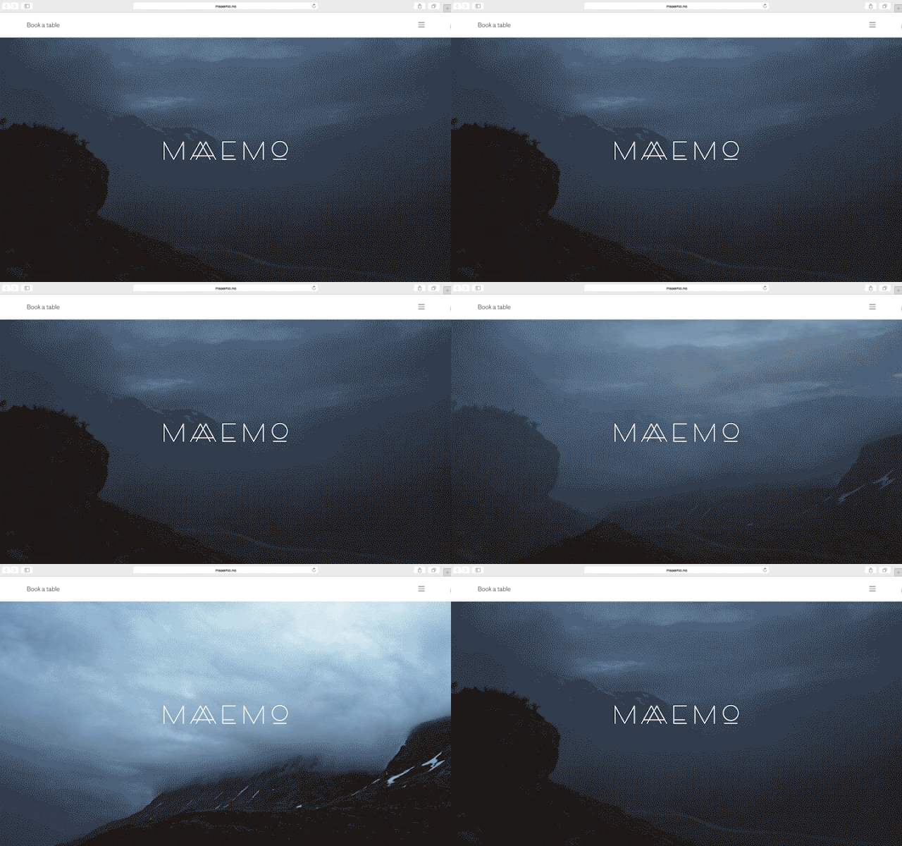 |
| This website utilises a full screen video background to epic effect |
One trend that grew quickly the past year is video content and we expect to see it grow further in 2017 especially as video content is now increasingly cost-effective to produce, with apps that enable quick and easy live video recording and professional-grade productions. The combination of decreasing costs of video and growing popularity of this medium is the perfect storm for video to overtake written content as king in 2017.
They say a picture paints a thousand words, but a video does that tenfold,
Video, although by no means new, is long-established and versatile medium, useful for story-telling, marketing and vlogging alike, and has several advantages over traditional photography. Where static imagery is flat and motionless, video is altogether more dynamic, using sound and movement to appeal to the senses and hold attention for longer.
Watch the video image above for a few seconds and see how encapsulating it can be. Much like with animation, a moving image on a page instantly captures the users attention, drawing them in so brands are able to get across their carefully constructed narrative and message.
Video is quickly taking over the internet, and the above reasons are testament to how successful it is as a means for content delivery. As well as using video for marketing purposes, it’s becoming more widespread in social media, with the recent releases of live-streaming services Periscope, and Meerkat illustrating the demand people have to not only view video content, but produce their own.
The benefits of video outlined above are reason enough for brands to want to incorporate it, but they are also great reasons for any freelance web designer to start using more video as a feature in their designs.
Back To Top
Custom...
 |
| Unique and personalised online user experiences are increasing sought after |
If you're a marketer today you probably know that targeted emails are effective. But what happens when someone clicks through that targeted email only to end up on a static, generic website? The natural progression of personalized emails should lead to a personalized website, but limitations in technology and strategy have delayed this realization so far. There are signs, however, that the time for more personalization across the online experience has come.
A 2013 Monetate/eConsultancy Study found that in-house marketers who are personalizing their web experiences see on average a 19% uplift in sales.
When it comes to shopping online, experiences tend to fall into two categories: The almost seamless experience offered by major retailers such as Amazon or the clunky too-many clicks to checkout experience that is common among small shops. In 2017 a third could emerge, a fully cutomised web experience to suit your exact and specific needs and desires - now doesn't that sound great!
Back To Top
Consumers are drawn to systems like Siri, Cortana and Alexa, who respond to voice commands and spoken questions. Voice search developments have made this the preferred search method for many consumers, who now ask their devices questions such as “Where are the nearest shops to me?” In 2017 businesses must consider these voice searches when creating content for their websites by making it more conversational and using natural phrases instead of generic keywords.
But it's not just the content creators that need to pay attention, the web developers and programmers have a bit of homework to do too. Although there are not a lot of studies and data currently available on the subject,you can be sure that users are likely to use different language when creating a search query by speaking, rather than typing.
Here are a few simple steps that web developers can take to ensure that their websites are making the most of their potential voice search opportunities...
Back To Top
As browsers and languages become more advanced, we’re seeing more websites move away from the use of static imagery and finding new ways to engage users and be unique in their approach to communicating. Animation is one of the main ways to do this and having seen many brands start the trend in 2016 we think 2017 is going to see that trend grow further.
Animations can come in all different shapes, sizes and styles; and can serve different purposes. For example animations can range from tiny loading-devices (see above) which entertains the user while waiting for content to load, to an interesting hover-state used as a UX device to show a user they’re hovering over a link.
They can also be used on a much larger scale, as rich, full-screen animations, which can integrated to work with scrolling, navigation or be used as the focal point of the entire site. Animation is another useful mechanic for brand’s to create meaningful micro-interactions between themselves and their users.
With such a broad array of internet capable devices ‘the fold’ is now harder to define, as users are viewing content of screens of all different sizes and resolutions. Scrolling, once reserved for getting from top of a page to the bottom, is being used in more creative capacities to deliver content online. Apple is a high profile brand making great use of scroll within their site.
Animated scrolling (as used on this website) and parallax scrolling are versatile mechanics which, when executed well, can work great with all varieties of content delivery. It works with video based content, where large full screen videos play and pause as the user scrolls, as well as static content, which can animate, move, or change depending on the users input.
So web animation has many applications, but if abused, or executed badly can be disastrous to usability. However, as with most developments, we expect that as more designers experiment and gain feedback from users, it’ll be something which gets better and better, adding more functionality and additional levels of interaction.
Back To Top
As with all trends, the above points have come about for good reason; as creatives and clever-thinkers across the globe have all learnt and borrowed from one another to form similar patterns which we see emerge online today. Not all of these trends may be relevant to you and your content, but it’s always beneficial to know what’s happening in the industry and to see where you’re able to improve in order to develop and progress.
With all this said, they should only be used sparingly, and carefully, to enhance the user’s experience and not detract from it. No-one wants to wait forever for content to load because of unnecessary design 'features' holding it up.
Back To Top
Voice...
Consumers are drawn to systems like Siri, Cortana and Alexa, who respond to voice commands and spoken questions. Voice search developments have made this the preferred search method for many consumers, who now ask their devices questions such as “Where are the nearest shops to me?” In 2017 businesses must consider these voice searches when creating content for their websites by making it more conversational and using natural phrases instead of generic keywords.
But it's not just the content creators that need to pay attention, the web developers and programmers have a bit of homework to do too. Although there are not a lot of studies and data currently available on the subject,you can be sure that users are likely to use different language when creating a search query by speaking, rather than typing.
Here are a few simple steps that web developers can take to ensure that their websites are making the most of their potential voice search opportunities...
- Schema is a markup language that works alongside HTML to provide information to search engines and other services that want to use the data that you provide to learn about your website. The information that you provide through schema already has an affect on your search optimization, but becomes even more important when targeting users that are using voice search. The more information that you are able to provide to search engines, the better that they will be able to understand the content on your website and connect relevant to voice searches that are performed by users.
- A website might provide search engines with a large number of feeds that provide data and information to help them properly categorize their listings. For instance, XML sitemaps and location data are integral for helping Google to crawl the entirety of your website and help to provide information that can help your business to rank in local search engine pages. Ensure that you are providing all data that is relevant to your company in the feeds so that search engines can correctly classify and detect when your content is appropriate for voice commands and search.
- Often, users that are using voice search are looking for very quick answers to their question. They want to know the answer and have it read back to them as quickly as possible. For this reason, you should try to ensure that the answers to common questions that users might have about your company, product, or industry are answered clearly on your pages. Frequently Asked Questions pages are an excellent way to provide quick, relevant answers to questions that voice searchers might have.
Back To Top
Animation...
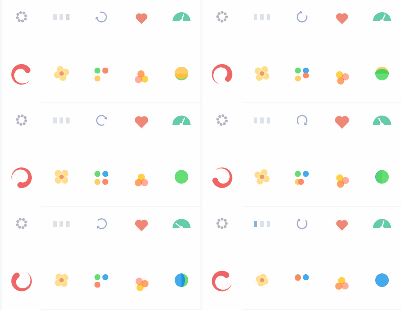 |
| css animation loading icons |
Animations can come in all different shapes, sizes and styles; and can serve different purposes. For example animations can range from tiny loading-devices (see above) which entertains the user while waiting for content to load, to an interesting hover-state used as a UX device to show a user they’re hovering over a link.
They can also be used on a much larger scale, as rich, full-screen animations, which can integrated to work with scrolling, navigation or be used as the focal point of the entire site. Animation is another useful mechanic for brand’s to create meaningful micro-interactions between themselves and their users.
With such a broad array of internet capable devices ‘the fold’ is now harder to define, as users are viewing content of screens of all different sizes and resolutions. Scrolling, once reserved for getting from top of a page to the bottom, is being used in more creative capacities to deliver content online. Apple is a high profile brand making great use of scroll within their site.
Animated scrolling (as used on this website) and parallax scrolling are versatile mechanics which, when executed well, can work great with all varieties of content delivery. It works with video based content, where large full screen videos play and pause as the user scrolls, as well as static content, which can animate, move, or change depending on the users input.
With content creation happening at a far greater pace than ever seen before, and companies finding more innovative solutions for delivering their content to users, we expect the clever use of scroll and parallax effects to be big in 2017.
So web animation has many applications, but if abused, or executed badly can be disastrous to usability. However, as with most developments, we expect that as more designers experiment and gain feedback from users, it’ll be something which gets better and better, adding more functionality and additional levels of interaction.
Back To Top
Conclusion...
There are 100’s of ‘trends’ going on in any creativity industry at any one time, and it’s hard to pin-point every single one, but we believe that the above are some of the more core ones to be focusing on in 2017 and beyond.As with all trends, the above points have come about for good reason; as creatives and clever-thinkers across the globe have all learnt and borrowed from one another to form similar patterns which we see emerge online today. Not all of these trends may be relevant to you and your content, but it’s always beneficial to know what’s happening in the industry and to see where you’re able to improve in order to develop and progress.
With all this said, they should only be used sparingly, and carefully, to enhance the user’s experience and not detract from it. No-one wants to wait forever for content to load because of unnecessary design 'features' holding it up.


