Showing posts with label photoshop tutorial. Show all posts

Tuesday, January 26, 2016

Simulate Depth in an Image

A Depth Mask is a mask layer with a grey gradient that gives the effect of fog, smoke, dust or water. It's an extremely useful tool to add volume and depth to an image that doesn't have it. In this tutorial, we'll be looking at how to create and apply a Depth Mask to a flat image.

Simulate Depth in an Image
It's best to choose an image that involves fog or smoke for this effect

First, open up Photoshop and open two layers; the background layer and another for your image. Make sure that the second layer image has a Transparent background, as the background layer won't appear otherwise. A good website for free stock images with transparent backgrounds is https://www.pixelsquid.com/. To get the best effect, be sure to choose an image that involves fog, smoke, dust or water.


Now hold Ctrl and click on the layer with the transparent image. A dotted line should outline the image you've selected. Right-click on the image and then select Save Selection. Name it whatever you like but since I'm using a car for this tutorial I'm naming it Car.
 

This will allow you to edit the image colours

Clicking OK will send the image to the Channels panel. To open this panel, click Window on the top toolbar and Channels should be listed. Click it and a small panel will appear where the layers were. Hold Ctrl and press D to get rid of the dotted line, then click on the Channel that you named.

 
We'll mostly be using the RGB layer
Clicking on the Channel will activate it so that only it is being edited.

The black is the transparent part of the image
Next, hold Ctrl and press I to invert the Channel. We'll be adding a Gradient to this now so select the Gradient Tool from the sidebar and press D to change the foreground colour to white. Now, open the Options Bar and select the Foreground to Transparent option (the second from the top left).

 
This will add transparency to the image

Make sure that the Linear gradient option is selected and drag the cursor along the entire image, the starting point should be where the fog is thickest and the further you drag it out the thinner it gets.

 
Note how it fades near the back of the car

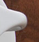
To make the car blend better into the fog we've created we have to desaturate some of its colour. Since this car is blue, we'll desaturate some of that colour from the overall image. First, hold Ctrl and click on the car layer to select it. While you're still in the Channels panel click the RGB tab to safely exit the panel. Make sure the Adjustments window is open (Click on Window in the top toolbar and then Adjustments) and click on the Hue/Saturation icon.

 
The colour you desaturate depends on what image you're working on
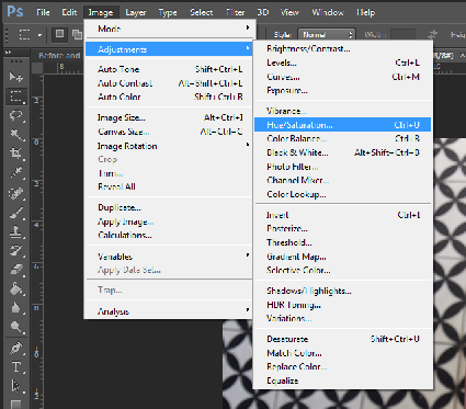
While this panel is open, click on the drop down beside the hand and choose blues and drag the Saturation slider to the left. This will desaturate the colour along the gradient you've applied so that it gets fainter the further away it is.

 
See how the back of the car is more faded

Now we'll obscured the car further by using the colour of the fog to paint over the car. Select the Eyedropper tool and take a sample of colour from the fog in the background. Hold Ctrl and click on the Hue/Saturation icon to create a new layer with a Depth Mask. Click on the Layer tab on the top toolbar and choose Fill Layer and then Solid Colour and click OK. When the Colour Palette window appears click OK again as we already chose our colour via the Eyedropper tool.
 

If you have more than one Hue/Saturation layer, delete the other one as there should only be one

To remove the solid colour from the image hold Ctrl and press G to add this layer to a group, then hold Ctrl and click the layer with the image (Layer 1, not the background) to load it as a selection. Next, add a layer mask by clicking the icon at the bottom of the layers panel. This will add the mask to the group you've just created.

Make sure that only the solid colour layer is added to the group

Reduce the opacity of the solid layer until the image is visible again. Now, we're done! Here's the finished image.

Now the car looks more like part of the image


Friday, January 22, 2016

Photoshop: Lasso Tool

Photoshop: Lasso Tool

Step 1: 

You can find the Lasso Tool, third from the top in the single column tool bar.


Or if your tool bar is in double column layout, second from the top, on the left.

Step 2:

Right click on the lasso tool and make sure the top tool in the sub menu is selected. Also you can select the Lasso tool by pressing the ‘L’ key in Photoshop.

Step 3

The basic premise of the lasso tool is to left click and hold on the screen and move the lasso line around the outline of the area you want to select. It’s usually good practice when learning the lasso tool to choose items or objects with a definite outline. Fuzzy and obscure furry objects can prove problematic. Take for example, this cup of coffee…


Pick any point on the outline of the saucer of the cup and move the cursor gradually around the object, holding the left mouse button through out, until you are back at the point of initiation. It is important to fully enclose the desired area with the lasso tool, if you do not complete the shape, Photoshop by default will finish the shape for you, with a straight line from where you released the left click to where it was originally pressed.

Then release the left mouse button and the object will be surrounded by what is commonly known as “marching ants”. When starting to select the item a general outline of the object is sufficient, you can go in to detail later with the add and subtract methods. 

Step 4:

When you attempt the fine details it’s a generally a good idea to avail of Photoshop’s zoom tool. You can do this by using the by pressing and holding Ctrl + Space barand left clicking where you want to zoom in. You can also zoom out in a similar fashion by pressing and holding Alt + Space-bar and left clicking to move out. You can then navigate by holding the Space-bar, left clicking and dragging on the screen and therefore dragging the view around the image.

Step 5:

If you have cut in on the area you were supposed to outline, you can use the Add to Selection mode by holding down Shift and left clicking. Just like with original shape you defined, if you do not complete the shape, Photoshop will finish the shape with a straight line, and in a lot of cases you will be left with a, perhaps undesired, island of deselected image.

Step 6:

Likewise if you have gone too far away from the outline and you need to remove some of the Lassoed image you can use the subtract key, by pressing down the Alt and holding down Alt. Again if you do not complete the shape Photoshop will complete it for you with a straight line possibly giving you an isolated island of selected image.

Step 7: 

After you have defined the shape you want, press and hold Ctrl + Shift + I to inverse the selection. Then left click on the Image, then click Adjustments. 

Step 8:

Once in the Adjustment sub-menu click Hue/Saturation. Then bring the Saturation down to 0, or the toggle bar all the way to the left. 

Step 9: 

Enjoy.

Photoshop: Lasso Tool


Thursday, January 21, 2016

Gold Effect Text in Photoshop

Photoshop Gold Effect Text
The final text


Step 1: Setting up the Text

In this tutorial we'll be transforming plain text into metallic gold text. This tutorial can also be useful for any metallic text that you'd want to create, just changing the colours can give you silver and bronze text. 

 
You can use any colour background but this effect looks better on black

First, open a new Photoshop file and click on the Edit tab and then Fill the entire background with black so that we can see our text clearly. Make sure that when the window appears that the Mode is set to Normal and the Opacity is 100%.  


Make sure that the colour is set to white, as it won't turn out on any other colour


Next, select the Text tool from the sidebar. Choose whatever font you like, but I've chosen Times New Roman. Don't worry about the size for now, as we'll be changing that later. Set the colour of the text to white. 


You can scale it as big as you want it

Click on the document and add whatever text you like and then accept by clicking the check mark in the upper bar once you're satisfied. If you want your text to be bigger, upscale it with the Transform tool and hold Shift so that it retains its shape. 


Make sure the background and original are on separate layers


Step 2: Adding Colour and Gradient

Duplicate the Text layer and make sure it's placed above the original. While the Copy layer is selected, click on the Layers Icon (fx) and choose Gradient Overlay.   


The direction of the gradient isn't important for now

While in the Gradient window, click on the black and white gradient to edit the colours. Double-click on the black tab, change the colour to R247 G238 B173 and then change the white tab to R193 G172 B81 


Alternatively, you could use any other colours for silver, bronze, etc 
This has to be darker than the previous colour

We'll be needing this same gradient later so save it as a pre-set by clicking New after you've named it. A thumbnail will appear in the Gradient tab when you open itClick OK to close the Gradient Editor but keep the Layer Style window open.   


Name it whatever you like

The gradient we've just made has been added on the bottom right

Change the Style of the gradient to Reflected. This will give the text more of a metallic shine. 


This will make the gradient look reflective like shiny metal


Step 3: Creating the 3-D Effect

Now select the Bevel and Emboss Layer Style and click into its options. 


Just ticking the box beside the tab won't open the options panel. You need to click on the actual text

Change the Technique to Chisel Hard, and then change the Gloss Contour to Ring Double. After you've done that, turn on Anti-aliased to smooth out any sharp edges.


This will give the text a solid outline to mold the 3-D effect from
Here's what your text should look like so far; 


It doesn't look like much now but we'll be using those edges to create a better effect

Next, you should size the Bevel and Emboss up until the edges of the text join together. The value for this differs from text to text but for this one a value of 26 is fine. 


The size also depends on the size of your text. The bigger the text the higher the size

Then increase the Depth of the text to about 170% to create a more solid texture. 


This will make it look 3-D

Now our text should look somewhat like this: 


Now it's beginning to take shape

Next, click on the Contour tab in the Layer Style window and just click the checkbox to turn it on, as we don't need to change anything. 


Just ticking the box is enough

Then add an Inner Glow by clicking onto it on the window. Go change the Blend Mode to Multiply and put the Opacity as 50%. Now change the colour of the glow by clicking on the colour swatch located underneath Noise. Set the colour to R232 G128 B31, and then increase the Glow size to about 75px. 


This will give it more of a golden sheen

Now your text should have a more golden sheen to it. 


Now it looks more like gold

Step 4: Creating the Stroke

When you're done, click on the original layer to make it active.  


Make sure the original is on a separate layer underneath the copy

Once it's selected, click on the Layer Styles (fx) icon again and add a Stroke to that layer. Change the Fill type to Gradient and change the Style to Reflected. Next, increase the Size of the stroke to about 8px and make sure the Position is set to Outside. Click on the gradient to change the colour and select the gold pre-set that we created a while ago. 


The stroke will make the text more eye catching
Next, we'll apply a Bevel and Emboss to the Stroke we just made. Click onto the Bevel and Emboss tab and change the Style to Stroke Emboss. Then change Technique to Chisel Hard, the size to about 8px and change the Gloss Contour to Ring - Double. Finally, click on the Anti-aliased box to smoothen the effect. 


This will strengthen the effect of the stroke

After this, just tick on the Contour box underneath Bevel and Emboss to add a contour to the stroke. 


Again, you just need to tick the box

Step 5: Adding a Glow

Now we just have to add one more Layer Style before we're done and that's an Outer Glow. Click on the Outer Glow tab and put the Opacity to 40%, then click on the Colour Swatch underneath Noise and change the colour to R232 G128 B31. When that's done, increase the Size to about 20-40px depending on the size of your text. 


This needs to be a more intense colour than your actual text. Orange will make it look more golden

Now to soften it so that it give the text a subtle glow


Once you've finished applying the Outer Glow click OK. 


You can also add optional sparkles if you'd like or change the colour to give a different effect

Now, we're finished our gold text. This can also be used for any other shiny/metallic effect like silver or bronze, just change the colours of the text and that should give you different results.


close
Banner iklan disini