Showing posts with label fonts. Show all posts

Tuesday, March 22, 2016

CSS Fonts

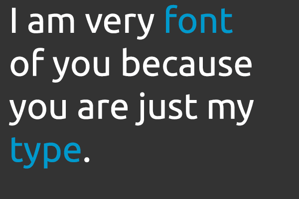
There are so many fonts to choose from but choose carefully as they have a huge impact on your websites success

Formatting Fonts With CSS

In this lesson you will learn about fonts and how they are applied using CSS. We will also look at how to work around the issue that specific fonts chosen for a website can only be seen if the font is installed on the PC used to access the website. The following CSS properties will be explained...
  • font-family
  • font-style
  • font-variant
  • font-weight
  • font-size
  • font

font-family 

The property font-family is used to set a prioritized list of fonts to be used to display a given element such as <p> or <h1>. If the first font on the list is not installed on the computer used to access the site, the next font on the list will be tried until a suitable font is found.
There are two types of names used to categorize fonts: family-names and generic families.


  • Family-name: Examples of a family-name (often known as "font") can e.g. be "Arial", "Agency", 'Verdana'.
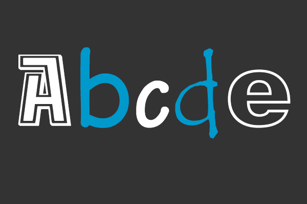
  • Generic family: Generic families can best be described as groups of family-names with uniformed appearances. An example is sans-serif, which is Latin for 'without feet'.


The difference can also be illustrated like this...

CSS Fonts


When you list fonts for your web site, you should start with the most preferred font followed by some alternative fonts. It is recommended to complete the list with a generic font family so at least the page will be shown using a font of the same family if none of the specified fonts are available.An example of a prioritized list of fonts could is seen:


In the sample code above, text marked as paragraphs will be displayed using the font "Arial". If this font is not installed on the user's computer, "Verdana" will be used instead. If both these fonts are unavailable, a font from the sans-serif family will be used. Notice how the font name "Times New Roman" contains spaces and therefore is listed using quotation marks.


font-style 

The property font-style defines the chosen font in normal, italic or oblique. The default setting is normal. In the example below, all headlines marked with <h2> will be shown in italics.


font-variant

The property font-variant is used to choose between normal or small-caps variants of a font. A small-caps font is a font that uses smaller sized capitalized letters (upper case) instead of lower case letters. Take a look at these examples:

If font-variant is set to small-caps and no small-caps font is available the browser will show the text in upper-case instead. In the example below all headings marked with <h1> will be shown in small-caps.


font-weight 

The property font-weight describes how bold or "heavy" a font should be presented. A font can either be normal or bold. In the example below all text marked with <td> (table data) will be shown in bold text.


font-size

The size of a font is set by the property font-size. There are many different units to choose from to describe font sizes; we will focus on the most commonly used units. See the examples below.


There is one key difference between the four units above. The units 'px' and 'pt' make the font size absolute, while '%' and 'em' allow the user to adjust the font size as he/she see fit.


font (shorthand)

Using the font short hand property, just like background it is possible to cover all the different font properties in one single property. For example, imagine these four lines of code used to describe font-properties for <p>:


Using the short hand property, the code can be simplified:


Remember that one of the major advantages of using CSS to specify fonts is that at any given time, you can change font on an entire website in just a few minutes. CSS saves time and makes your life easier.


@font-family


With the @font-face rule, web designers do no longer have to use one of the "web-safe" fonts. In the new @font-face rule you must first define a name for the font (e.g. myFirstFont), and then point to the font file. To use the font for an HTML element, refer to the name of the font (myFirstFont) through the font-family property.

Tip: Use lowercase letters for the font URL. Uppercase letters can give unexpected results in IE!

Defining the font....


Implementing the font...


Try it out for yourself and see how much it can improve the design of your website.

Next Up

In the next lesson we learn about pseudo-classes and how to use them to create link effects using CSS.


CSS Text

CSS Text and CSS Fonts
This will be funny once you've learned about CSS Text and Fonts

Formatting Text With CSS

Formatting and adding style to text is a key issue for any web designer. In this lesson you will be introduced to the amazing opportunities CSS gives you to add layout to text. The following properties will be explained:
  • text-indent
  • text-align
  • text-decoration
  • letter-spacing
  • text-transform

text-indent

The property text-indent allows you to add an elegant touch to text paragraphs by applying an indent to the first line of the paragraph. In the example below a 30px is applied to all text paragraphs marked with <p>:


The above CSS code will result in all paragraphs being effected like this in the browser...

This is a paragraph of text which has been indented. This is a paragraph of text which has been indented.


text-align

The CSS property text-align corresponds to the attribute align used in old versions of HTML. Text can either be aligned to the left, to the right or centred or you can justify the text, which will stretch each line so that both the right and left margins are straight. In the examples below the text in table headings <th> is aligned to the right while the table data <td> are centred. In addition, normal text paragraphs are justified.


text-decoration

The property text-decoration makes it is possible to add different "decorations" to text.

For example, you can underline the text, have a line through or above the text.

In the following example, <h1> are underlined headlines, <h2> are headlines with a line above the text and <h3> are headlines with a line though the text.


letter-spacing

The spacing between text characters can be specified using the property letter-spacing. The value of the property is simply the desired width. For example, if you want a spacing of 3px between the letters in a text paragraph <p> and 6px between letters in headlines <h1> the code below could be used.


text-transform

The text-transform property controls the capitalization of a text. You can choose to capitalize, use uppercase or lowercase regardless of how the original text is looks in the HTML code. There are four possible values for text-transform...
  • Capitalize: Capitalizes the first letter of each word. For example: "john doe" will be "John Doe".
  • Uppercase: Converts all letters to uppercase. For example: "john doe" will be "JOHN DOE"
  • Lowercase: Converts all letters to lowercase. For example: "JOHN DOE" will be "john doe"
  • None: No transformations - the text is presented as it appears in the HTML code.

As an example, we will use a list of names. The names are all marked with <li> (list-item). Let's say that we want names to be capitalized and headlines to be presented in uppercase letters.


The CSS Code above will result in this...

THIS IS AN UPPERCASE HEADING

  • This Is An Capitalised List Item
  • This Is An Capitalised List Item
  • This Is An Capitalised List Item
  • This Is An Capitalised List Item

Next Up


Monday, November 30, 2015

Which Font Should You Use?

Selecting Fonts
There are literally thousands of fonts to choose from so it's important to know the difference.

Why Care About Fonts?

Choosing the right type of font to use in a design is more important then you may think. Font size is a very important aspect that must also be taken into consideration. When choosing a font size, one should keep in mind that choosing sizes closer to one another for various levels within your site will output a more professional and elegant webpage.

Font emphasis is also an important factor as not only will font emphasis aid in search engine optimization, it also alerts viewers to what is important on a page or where the links are located. Search engine spiders look for phrases that are either in bold, highlighted or between header tags. These phrases are deemed as important. One can therefore control keywords by placing them in bold or italics.

All of these issues need to be taken into account with every website. Choosing the proper text is vital to readability as well as accessibility. However before we can make any of these types of decisions it is important to first understand fonts and all the terminology around fonts in more detail.

The Basic Font Terms...

There are two types of names used to categorise fonts: "generic families" and "family names". Both terms are explained below.

Generic Family Fonts:

Generic families can best be described as groups of family-names with uniformed appearances. An example is sans-serif, which is Latin for without feet. In this instance 'feet' refers to the small base lines that are seen on the bottom of a letter. So sans serif is a font family which is a collection of fonts where the letters do not have 'feet'. Then there are serif fonts which have 'feet' and finally there are the more obviously named mono-space fonts which are characterized by all letters/characters having a fixed width.

Font Family Names:

Examples of a family name (often simply known as "font") can e.g. be "Arial", "Verdana", "Times New Roman", "Courier", "Calibri" or "Tahoma".


The difference is also explained in the illustration below.

The image above explains the difference between generic families and individual font name

Choosing An Appropriate Font

In design, especially web design and graphic design, fonts play an important part in the success and overall aesthetic of your design image/project. Different fonts suggest different styles and have different connotations attached to them. For example the font below, taken from www.dafont.com is a horror style font. It suggests bloodshed, gore, monsters and vampires etc. You would expect to see it used for a horror movie poster or something similar. On the other hand you would not expect to see it used for the logo on a children's creche!


Appropriate for a scary movie...
This is obviously quite a severe example of a font style but even more subtle fonts will have an impact on the impression the viewer gets from the overall image. So carefully consider the font style and colour you use in all your designs.The example below shows how different fonts and colours project different styles for a design. The left image looks childish, cartoony and fun while the right suggests gore, horror and danger even though the words are the same in both.

The style and colours of fonts can have a big effect on how we interpret the meaning of a design


Font Readability...

Other considerations with regard to choosing a font include "readability", in other words, how easy a font is to read. In terms of web design the recommended font size to use is either 14 or 16 pixels for body text. This website uses 16px, hope you can read this OK.

Script style fonts can be very fancy but are also generally hard to read. Using them for a heading might be suitable but using them as a body text ( for a large amount of text) certainly would not be. For example try to read the text below! Not easy is it?


Can You Read This...?

In general sans-serif and mono-space fonts are easier to read, while serif fonts are a little more "fancy". Although with the ever expanding library of original fonts continuing to expand online there are really no set rules to choosing a font. Have at look here to find the best free font websites already reviewed and rated.

My advice is try out as many as possible while keeping in mind the style you want to get across in your image/design/project. If you wish to look into it further here are some recommended links to other sites which explore the issue of how to choose a font.

I hope you found this useful. Feel free to share any comments you have or recommend any fonts or font websites.


close
Banner iklan disini