I've recently been enjoying my copy of designer Timothy Corrigan's "An Invitation to Chateau du Grand-Luce" and was thrilled to hear he'll be speaking at Hillwood next week, Tuesday, February 3 2015 at 7pm! Information on the lecture available HERE.
While the pictures of the restored Chateau are the obvious reason to peruse the book, Corrigan's conversational writing is approachable and enjoyable. Not knowing much about the designer I assumed it would all sound rather pretentious; you know what I mean by 'my chateau in France'.
Corrigan's approach to the restoration and decoration of the chateau is one of ease and a true country house; taking the best of French design and translating it to modern life in a very Californian sense while respecting the history of the structure.
As the book is amazing you've probably already read and seen quite a lot about the book and the chateau itself online if you haven't purchased your own copy. If not Architectural Digest (where I found these images) is a host of information about the chateau. THIS main article will give you an overview of the book and estate, THIS video will have Corrigan charming the pants off of you, and THIS great slideshow has great 'before' and 'after' shots.
The most beautiful room in the chateau is probably the Salon Chinois, seen in the image above, with restored wall murals by the great 18th century artist Jean-Baptiste Pillement.
My favorite room though is probably the kitchen, seen in the image above. You just know this is where everyone hangs out! The cabinetry could not be attached to the walls in a typical manner, as the building is a historic landmark and the original boiseries could not be damaged or altered. The kitchen was designed with free-standing pieces of furniture which would not have to be attached to the walls. I'm sure this sunny corner room sees a lot of action!
The one thing missing from this entertaining and beautiful book is a floorplan! One can imagine the plan based on the simple nature of the classical French Chateau with enfilade seen above, but the interstitial spaces are harder to guess at. I'm always asking for this though, no surprise.
The book is organized as if one were spending the weekend at the chateau as Corrigan's guest (can you even IMAGINE!) and walks you through the spaces and activities one would discover. Stacey Bewkes and Susanna Salk had this privilege and you can read their reactions and watch their fun videos over on her blog QuintessenceHERE.
If I were ever a lucky guest out of the 14 guest rooms pictured in the book I would without a doubt select the Chambre de Bonheur (or Room of Happiness) seen above on the cozy 3rd floor. The beautiful color scheme, comfortable but stylish furniture, and cozy nature of the attic level all appeal to me. One can't read the book without choosing their own favorite! I hope to see you at the lecture next week and if you can't attend I hope you pick up your own copy of this beautiful book! Images in this post are from Architectural Digest or from the book by photographer Eric Piasecki.
I recently discovered that the Levi Morton house (1912) by John Russell Pope in my old neighborhood in Washington, DC, was for sale. For about a decade I lived a block away from this stunning mansion at 1500 Rhode Island Avenue, NW and always admired it.
For the past 75 years the National Coatings Association has been the (excellent) caretaker of this historic structure which has housed a former Vice President, a Russian ambassador, and even Alexander Graham Bell.
If you are familiar with a map of Washington, the regular grid of streets is broken by a number of Avenues which meet at traffic circles; this creates some odd triangular building sites. The Morton house is within one of these odd shaped lots which explains the strange angles in the first floorplan above.
The gracious porte cochere sits on the north side of the property on Rhode Island Avenue. Pope cleverly used the irregular slanted front facade for service spaces, situating larger and more important rooms around the more regular square facades. In 1912 these rooms faced gardens which are now (partially) parking lots.
The odd service wing in the floorplan which included storage and servant apartments either was never built or was torn down at one point for more parking. I always wondered if the stucco part of the building which you see to the left of the photo above was original and apparently it was. It looks different than the elevation drawing earlier in this post and rather like an after thought. It houses the original dining room and butler's pantry.
The (west) side facade above is the most prominent as it faces Scott Circle and affords beautiful views.
As with many parts of the city the area has changed significantly since 1912 and this mansion is surrounded mostly by large apartment buildings and hotels which you get a sense of in the above photograph or on google streetviews.
This existing house was an extensive renovation to an older red brick Victorian structure dating from 1879 designed by John Fraser, a well-known Philadelphian architect. The interior was completely redone by Pope in a Classical style which included this stunning staircase which includes Levi Morton's monogram.
The original fixtures are all extant and included with the sale offered by Lucia Wadeson of Cresa Corporate Real Estate. I can imagine this becoming rather grand condo's with a significant addition or ideally an embassy (Cuba?).
Images are not my own: B&W Photographs and drawings from the book "Mastering Tradition" by author James Garrison and color images from this article in the Washington Business Journal.
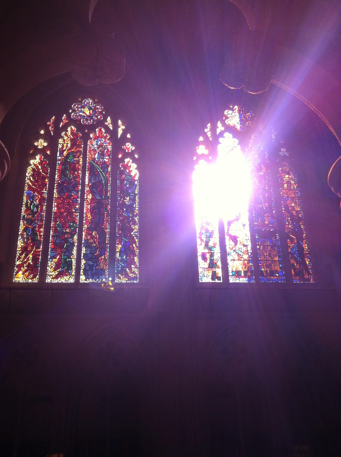
I recently paid a visit to the National Cathedral and was reminded of how beautiful stained glass really can be, particularly in this crisp winter light.
The windows soar towards the ceiling at a staggering 100'. The light still makes it down to the floor however, and to marvelous effect.
I posted some exterior photos a few years ago during a much warmer visit HERE (with a real camera instead of my iphone)
These sacred spaces really are special; thanks to artisans, architects, and perhaps a divine presence.
Yesterday (March 18, 2015) was the grand opening of our new Washington Design Center. Washington is finally coming into its own and our new design center just goes to prove that. These gorgeous light-filled showrooms are at the heart of the New Washington action on 14th street NW.
The crowds were soul-crushing, as one expects at these events, but it's important for design professionals to go out and network; share ideas and potential new jobs! I only attended the Holly Hunt showroom opening party out of many events with some very dear friends (hi Steph and Mark!) and thought I would share some highlights with you.
The Holly Hunt showroom is the largest in the design center I believe, measuring in at 10,000 SF over 2 floors. It also is the only showroom to feature a street entrance -welcoming in the public. The ground floor focuses on the more modern collections carried by Holly Hunt while the 2nd floor focuses on the more DC-centric traditional lines. Above the cozy Coco Sofa was empty and beckoning us over to get away from the crowd!
I briefly chatted with Holly Hunt who was delightful. She is intensely focused on bringing new artists and work to the public -meeting and working directly with the artists on items such as their lines of (brilliant) lighting which are the focus of my snapshots here! Alison Berger is one of the prominent lighting artists with these delicious handblown glass fixtures seen in the images here. Above is the Lure sconce - nothing is MORE alluring than a sconce (my favorite lighting source!).
Most popular with us were the Sea Urchin pendants with heavily seeded glass featured below over a nightstand. These are designed by an artist named Stefan Gulassa, no relation (for those readers who don't know, my name is also Stefan).
I loved their updated version of the classic wingchair below upholstered in rope with a luxurious velvet cushion (in my favorite turquoise -this would fit right into my own apartment, how I wish!)
Adjacent to Cleveland Park is a little wooded area which when one enters feels like the street that Washington forgot. Springland Lane and the beautiful houses and gardens which have grown into it is a tiny alcove nestled just north of Cleveland Park that until recent times was a farm and vineyard (right near the heart of the city!). On May 23, 2015 the Cleveland Park Historical Society is cohosting a garden tour of the area which is an exclusive look not just at the 16 pretty houses and private gardens but a look at the not too distant agricultural past of the neighborhood. Tickets are available on the website HERE - I hope to see you there!
If you follow me on Instagram (@architectdesignblog) this weekend you probably saw a number of pictures I posted of a grand apartment building here in Washington DC in the historic Kalorama neighborhood.
Buildings such as these are listed in the Washington real estate bible, Best Addresses, by the local authority on such matters, James Goode. I live in a 'best address' building myself, although not as grand as this, and it really was one of my apartment's selling features. It's always the first statement of any real estate description of any apartment in these buildings in Washington. I would recommend the book to others who don't live in DC as a great compilation of grand apartment buildings from 1900 till the 1970s, full of floorplans and historic photos.
The details matter here and separate this building from common apartments. Symmetry and aligned spaces are key, but delicate plasterwork, marble mosaic floors, and charming original stairwell doors and exit signs are all details that speak of care and quality.
Notice the well thought placement of modern HVAC grilles discretely placed above the exit door. I think also important to notice are the signs that this building is a home; minimal quality non-cluttery furniture and artwork grace the spacious halls. Compare this to atrocious new-construction apartments we see going up all over this city and also cities around the country as we experience this (wonderful) return to urbanism. Why do people prefer new construction to this again?
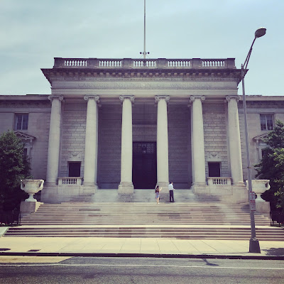
Last week I had the pleasure of touring the Carnegie Institute of Science with our local branch of the ICAA (these lunch time tours we offer are my favorite aspect of the ICAA). I have been walking past this building on 16th street NW for as long as I've lived in Washington but never knew the glories that were inside!
The old front door facing 16th street is seldom used (it is solid bronze and weighs literal TONS) which is a shame because the detailing on the front porch is phenomenal.
The original building (located on 16th street) was completed in 1908 by architects Carrere and Hastings for Andrew Carnegie (click the link for more projects by Carrere and Hastings featured on this blog). You can see the front facade in the first photograph of this post and the side elevation (on P street NW) below.
As the institution grew the need for more space was accommodated by a large addition by the architects Delano and Aldrich in 1938 (click the link for more projects by Delano and Aldrich featured on this blog). Part of this addition is the carriage drive and new entrance which is a streamlined version of the Carrere and Hasting's Classicism.
The block to the left of the new entrance very closely matches the original structure but with a stripped-down style of classicism so popular in the 1930s (which I find to be my favorite classical 'flavor').
The 'new' entry opens into a sedate 2 story stairhall which closely matches the pared-down classicism of the exterior. Notice the nod to Andrew Carnegie's Scottish heritage with the thistle motif incorporated into the balustrade (more on this later).
1938 was nearing the end of grand public classicism and hints of what were to come are to be found throughout the structure; the custom light fixture below was designed in a 'scientific' Art Deco style for the space by Delano & Aldrich. Notice the barrel vaulted ceiling with Greek key plaster trim.
At the top of the staircase is Carrere and Hasting's meeting room -which was a multi purpose room used as both large meeting room and auditorium.
The classical detailing here is superb. Notice the excellent care which the institute takes of the building - they are to be commended for it! Everything is original; maintained and kept in admirable working order.
The herringbone floors add a layer of scale to the enormous space.
The only modern touches are the occasional (dreaded) recessed lights. Other than occasional use in kitchens and bathrooms I would be very happy to BAN recessed lighting from all buildings - ceiling acne.
Symmetry and classical detailing make sense of the space and add human scale. This is something modern architecture has a hard time dealing with.
The enfilade effect created by symmetry make the building seem much larger than it actually is by setting up views. People may poo-poo lining everything up in plan but I've never met anyone who wasn't impressed with this architectural trick when viewing it in person; it just feels good.
The original entry foyer is a grand domed space; so sad it isn't still used as the entry! It is however available to rent and is frequently used for weddings and other private events. On these occasions they'll open up the original front doors as Carrere and Hastings intended (money talks).
The graceful stair to the 2nd floor is off the entry hall.
Who doesn't love a curved staircase like this?
The columns aren't marble but rather scagliola, a faux-finish which mimics the stone. The Carnegie just restored the scagliola finish to 8 of the columns last year and plan on doing the remaining 8 this next year -all part of the maintenance of an old building (or house!).
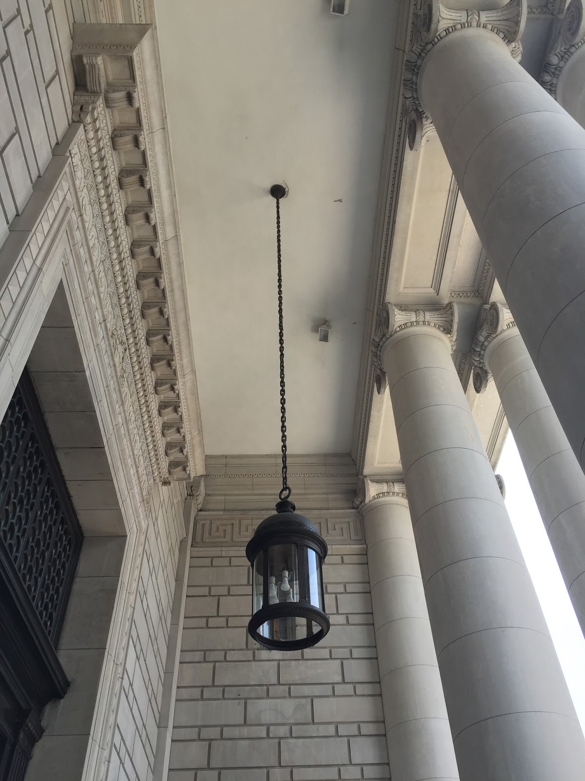
The use of natural light is found throughout the building with skylights as well as the large French doors found on the exterior.
Above are the original bronze front doors.
One's eyes are instantly drawn up into the dome though - topped with a chandelier centered on a skylight.
Probably my favorite part of the entire building though is the economical use of linoleum on the 2nd floor instead of the marble found on the main level. I think linoleum is going to be making a comeback and you can see why!
The wood paneled library on the 2nd floor is also lit by a large skylight making for a pleasant environment.
These HVAC vents in the library also feature the Scottish thistle. I wonder if they date to Carrere & Hastings and Delano & Aldrich picked up on this motif for their new staircase or if this custom vent was lated added by D&A.
On the main level this impressive wood paneled room with enormous marble mantel was originally the office of the president. It is used as rental space and for meetings today.
These enormous old brass andirons in the fireplace caught my eye.
As did the beautiful brass cremone bolts on the french doors.
An easy and inexpensive trick found in some of the other lesser rooms help with the proportions of the tall ceilings is seen above. Rather than a standard base of 5 to 8" tall a chairrail was added about 18" off the ground, everything below it painted the same color as the base. This raises the visual height of the base without a lot of expensive woodwork (which would sloppily jut beyond the door casing). I'm definitely filing this away for future use!
The main aspect of the Delano & Aldrich 1938 addition was a formal auditorium for lectures. This beautiful wood-paneled, art-deco vestibule seen above leads to the auditorium. Notice the barrel vaulted ceiling and bowed (rounded) ends - much like a ship. I also loved the very art deco linear light fixture.
The auditorium space is lined with an expansive mural which was recently restored.
This room has a lot of personality between the beautiful murals and the purple mohair upholstered seats!
The mural is painted on perforated homosote board to help with the acoustics.
The most unusual feature of the auditorium is the light fixture: recessed lights in the barrel-vaulted ceiling are covered with photocells featuring the phases of the moon! Ok -so maybe not ALL recessed lighting is so bad.
This bust of Andrew Carnegie is prominently displayed in the entry hall. He may have amassed his wealth in a less than friendly fashion (as is most wealth accumulated to this day) but he spectacularly donated it to the public through institutions such as this and the libraries we all know and love to this day. I hope if you're in the area you'll join us at the ICAA on our future tours!