Showing posts with label details. Show all posts

Saturday, October 8, 2016

Read Here Quality is in the details: Bunny Mellon Now

Now that the sale of the century (thus far) has ended, Mrs. Paul Mellon at Sothebys, we can all sit back from the hysteria and try to learn from this extraordinary taste-maker.  I read from both camps, that the items were just 'ordinary' and/or worn and then also that they were of the highest quality and perfection.  For what it's worth, I heartily agree with those who found the sale overwhelmingly good.
While I never got further than my auction catalogs, friends of mine attended the sale (and texted me these pictures) and attested that though the furniture was indeed not top notch condition (of course not, it is essentially used/2nd hand furniture!) there was no question to the quality of the items; in particular the details which is where this kind of simple perfection excels.
Even the simplest upholstered pieces featured astounding couture details; from ruffled trims to coordinated buttons.  Even the boxed upholstery of the (blurry) French chairs below had squared cushions to match their frames.
Thanks to Josh for sending me these images from the sale.  Now that the auction has ended the discussions will mostly be of the (boring to me)monetary values placed on the items. These high  prices achieved attest to the level of taste acquired by an aesthete in her 103 years and may we all now try to learn a bit from her years of wisdom.

Thursday, October 6, 2016

Read Here Alhambra details Now

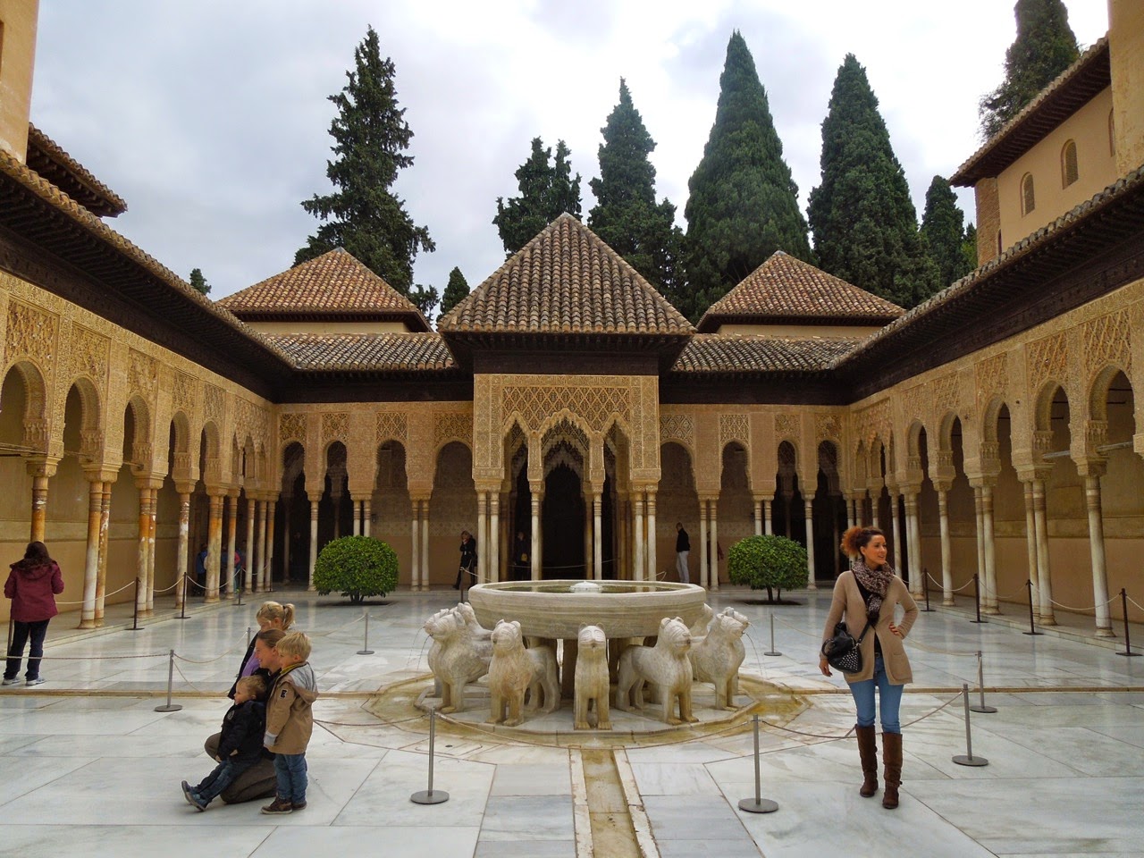
The Alhambra is a fortressed palace in southern Spain that dates back to the 9th century.  At the time this area was ruled by the Moors and it wasn't until the late 15th century that it came under Catholic rule (see previous post on the Palace of Charles V HERE). 

The Alhambra is really a warren of separate palaces built under different rulers all joined together on a hilltop as one fortress providing protection against invasion.
Numerous courtyards contain different gardens and water features.
Each are slightly different reflecting the tastes of each ruler and the style of the day but all followed the rule of  making a 'paradise on earth'.
On this cold snowy day I could imagine spending a lot of time in Southern Spain!
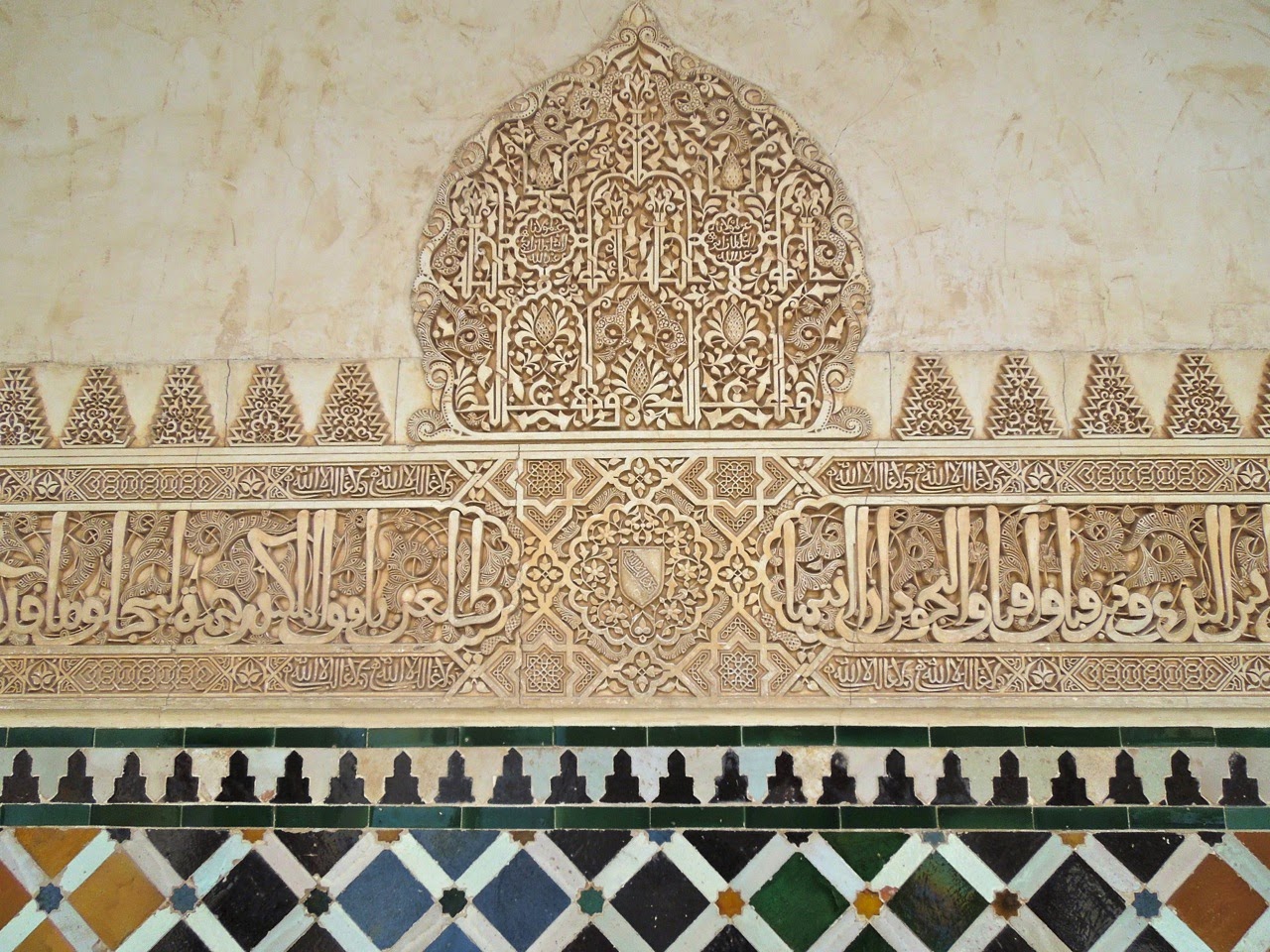
The striking thing about each section are the numerous patterns and decoration employed.
The earliest patterns were Arabic inscriptions which morphed into geometric patterns.

No interior surface was left unadorned. Imagine the crews of artisans required to create all of this!
No two rooms are alike, no two ceilings are even the same shape!
Patterns are found within patterns. The starshaped recess in the ceiling has each section broken into smaller and smaller ornate areas.
Bright colors were also orginally used and many still survive.
I love the wood ceiling below with the patterns incised and then inlaid with semi precious stones.


Tilework is also a common decoration found throughout the Alhambra as well as most of Spain.
Glazed and painted or else laid into patterns.
I love the colorful herringbone floor above which appears to be laid with common subway tile nearly; so modern!
The complex lay abandoned for centuries, full of squatters and vandals. Renewed interest led to rehabilitation in the 19th century.
While this level of detail isn't something we aspire today I think we could learn a lot from the attention to detail.
I hope you enjoyed this brief visit to the Alhambra! Many thanks as always to the world traveling Australian Neil

Wednesday, October 5, 2016

Read Here Details Matter Now

If you follow me on Instagram (@architectdesignblog) this weekend you probably saw a number of pictures I posted of a grand apartment building here in Washington DC in the historic Kalorama neighborhood.
Buildings such as these are listed in the Washington real estate bible, Best Addresses, by the local authority on such matters, James Goode.  I live in a 'best address' building myself, although not as grand as this, and it really was one of my apartment's selling features. It's always the first statement of any real estate description of any apartment in these buildings in Washington. I would recommend the book to others who don't live in DC as a great compilation of grand apartment buildings from 1900 till the 1970s, full of floorplans and historic photos.
The details matter here and separate this building from common apartments. Symmetry and aligned spaces are key, but delicate plasterwork, marble mosaic floors, and charming original stairwell doors and exit signs are all details that speak of care and quality.
Notice the well thought placement of modern HVAC grilles discretely placed above the exit door. I think also important to notice are the signs that this building is a home;  minimal quality non-cluttery furniture and artwork grace the spacious halls.  Compare this to atrocious new-construction apartments we see going up all over this city and also cities around the country as we experience this (wonderful) return to urbanism. Why do people prefer new construction to this again?
close
Banner iklan disini