Dumbarton Oaks has been owned by Harvard University since the early 1940s and hosts a number of their graduate programs on campus. Sections of the famous gardens are open to the public and their renowned museum has a separate entrance on 32nd street NW.
Although much changed and constantly evolving, the gardens are the the work of famous landscape designer Beatrix Farrand, seen in the portrait above.
Unfortunately the house is undergoing some renovation work (roof and some structure being replaced) so scaffolding covered the neo-Georgian facade. You can see photos of the house at my earlier post from 2009 HERE.
The library is housed in the wing seen above designed by Thomas Waterman -a really spectacular period room in which one can study the antique landscape books in an elegant setting.
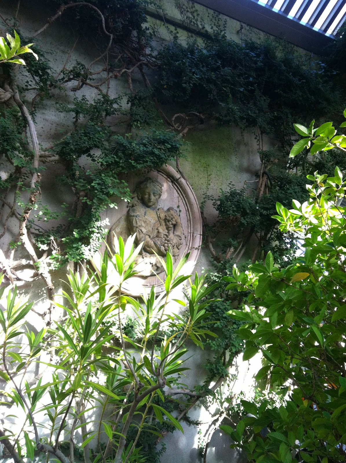
This grotto is only one of the many charming spots to be found throughout the gardens. The modern balustrade is very plain-jane compared to others found throughout the property but I suppose it meets code (most ugly railings do).
One of the best parts of attending the ICAA tours (everyone is welcome btw!) is that you get an opportunity to see many behind the scenes areas not open to the general public.
I had never seen most of the campus before and was thrilled with many of the original structures like the green house above, where plants are still grown for the gardens. The brick structure in the center was originally designed to be the library until someone came to their senses and realized antique books and water don't mix!
Washington is enjoying a spectacular fall this year which doesn't often happen. So often I feel we move directly from summer into winter.
Many of the older structures such as the garage above have been wonderfully preserved on the exterior while the interiors have been unfortunately gutted and rebuilt in an institutional manner. Don't even ask about some of the modern buildings I'm not showing here and other work done on campus by architectural firm Robert Venturi - the less said there the better ( # inappropriate, # generic, # ugly ).
Many of us architects marveled at the lovely back door above - nicer than the front doors on many houses! Also notice the intricate brick paving patterns designed by Farrand.
The use of ornate brick and stone walls throughout the hilly, terraced gardens is one of my favorite aspects.
While these are special details, they are to be found throughout the entire property.
Above is one of the many railing designs by Farrand - this may not meet modern day codes but is none-the-less pleasing to the eye.
Even the simple wooden garden bench above has lovely details; notice the scrolled bracket to the sides.
Inside the museum there are more wonderful treasures to check out. I particularly like the antique byzantine mosaics which are built into the flooring. The rather strange addition by Phillip Johnson, celebrating its 50th birthday, is growing on me and is a great example of marrying a modern addition to a classical structure (Robert Venturi take note!). Please join the ICAA on our next adventures and be sure to check out Dumbarton Oaks while in Washington, you won't be disappointed!
Why don't we have World's Fairs anymore? They provided us with some of the worlds great monuments such as the Eiffel Tower and the entire City Beautiful movement. If you have any Beaux-Arts styled buildings in your city or town, such as a courthouse, museum, or townhall, you can thank the World's Fair movement! I saw an exhibit on that at the National Building museum a few years ago and it was really an eye opening experience (read more about that and how it influenced modernism HERE).
Recently I was sent photographs of the Plaza de España in Seville, which was the centerpiece of the Ibero-American Exhibition of 1929, by my Australian Penpal which really took my breath away.
This enormous plaza designed by Jean-Claude Nicolas Forestier contains fountains and a Venetian-style lazy river complete with boat rides, surrounded by a semi-circular building which now houses government offices.
At the base of the building designed by architect Anibal Gonzalez which surrounds the plaza are 48 alcoves which represent the provinces of Spain, seen in the image above. These have provided great photography fodder with Spanish tourists posing in front of the alcove representing their home province.
This grand entry loggia leads one into the center of the main building and provides a shady respite from the harsh Spanish sun.
In true Spanish tradition albeit with an Art Deco twist, the ceiling of the loggia is beautifully patterned.
Lets step inside the main building to the central staircase, setting of many Spanish weddings. The image below shows why!
The tilework of painted encaustic tiles is beautiful and lends human scale to the otherwise massive stair.
As if one needed another reason to visit sunny Spain, be sure to check out the Plaza de España in Seville!
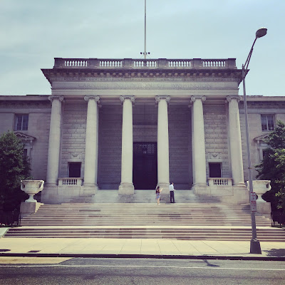
Last week I had the pleasure of touring the Carnegie Institute of Science with our local branch of the ICAA (these lunch time tours we offer are my favorite aspect of the ICAA). I have been walking past this building on 16th street NW for as long as I've lived in Washington but never knew the glories that were inside!
The old front door facing 16th street is seldom used (it is solid bronze and weighs literal TONS) which is a shame because the detailing on the front porch is phenomenal.
The original building (located on 16th street) was completed in 1908 by architects Carrere and Hastings for Andrew Carnegie (click the link for more projects by Carrere and Hastings featured on this blog). You can see the front facade in the first photograph of this post and the side elevation (on P street NW) below.
As the institution grew the need for more space was accommodated by a large addition by the architects Delano and Aldrich in 1938 (click the link for more projects by Delano and Aldrich featured on this blog). Part of this addition is the carriage drive and new entrance which is a streamlined version of the Carrere and Hasting's Classicism.
The block to the left of the new entrance very closely matches the original structure but with a stripped-down style of classicism so popular in the 1930s (which I find to be my favorite classical 'flavor').
The 'new' entry opens into a sedate 2 story stairhall which closely matches the pared-down classicism of the exterior. Notice the nod to Andrew Carnegie's Scottish heritage with the thistle motif incorporated into the balustrade (more on this later).
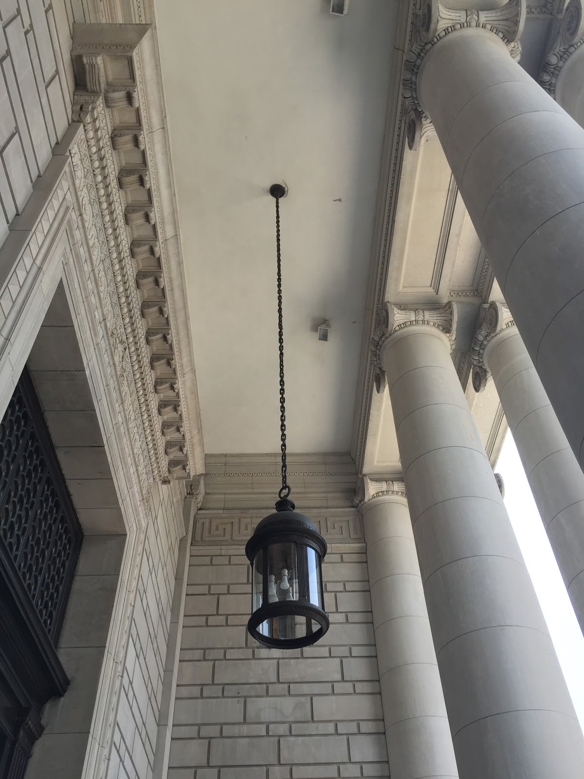
1938 was nearing the end of grand public classicism and hints of what were to come are to be found throughout the structure; the custom light fixture below was designed in a 'scientific' Art Deco style for the space by Delano & Aldrich. Notice the barrel vaulted ceiling with Greek key plaster trim.
At the top of the staircase is Carrere and Hasting's meeting room -which was a multi purpose room used as both large meeting room and auditorium.
The classical detailing here is superb. Notice the excellent care which the institute takes of the building - they are to be commended for it! Everything is original; maintained and kept in admirable working order.
The herringbone floors add a layer of scale to the enormous space.
The only modern touches are the occasional (dreaded) recessed lights. Other than occasional use in kitchens and bathrooms I would be very happy to BAN recessed lighting from all buildings - ceiling acne.
Symmetry and classical detailing make sense of the space and add human scale. This is something modern architecture has a hard time dealing with.
The enfilade effect created by symmetry make the building seem much larger than it actually is by setting up views. People may poo-poo lining everything up in plan but I've never met anyone who wasn't impressed with this architectural trick when viewing it in person; it just feels good.
The original entry foyer is a grand domed space; so sad it isn't still used as the entry! It is however available to rent and is frequently used for weddings and other private events. On these occasions they'll open up the original front doors as Carrere and Hastings intended (money talks).
The graceful stair to the 2nd floor is off the entry hall.
Who doesn't love a curved staircase like this?
The columns aren't marble but rather scagliola, a faux-finish which mimics the stone. The Carnegie just restored the scagliola finish to 8 of the columns last year and plan on doing the remaining 8 this next year -all part of the maintenance of an old building (or house!).
The use of natural light is found throughout the building with skylights as well as the large French doors found on the exterior.
Above are the original bronze front doors.
One's eyes are instantly drawn up into the dome though - topped with a chandelier centered on a skylight.
Probably my favorite part of the entire building though is the economical use of linoleum on the 2nd floor instead of the marble found on the main level. I think linoleum is going to be making a comeback and you can see why!
The wood paneled library on the 2nd floor is also lit by a large skylight making for a pleasant environment.
These HVAC vents in the library also feature the Scottish thistle. I wonder if they date to Carrere & Hastings and Delano & Aldrich picked up on this motif for their new staircase or if this custom vent was lated added by D&A.
On the main level this impressive wood paneled room with enormous marble mantel was originally the office of the president. It is used as rental space and for meetings today.
These enormous old brass andirons in the fireplace caught my eye.
As did the beautiful brass cremone bolts on the french doors.
An easy and inexpensive trick found in some of the other lesser rooms help with the proportions of the tall ceilings is seen above. Rather than a standard base of 5 to 8" tall a chairrail was added about 18" off the ground, everything below it painted the same color as the base. This raises the visual height of the base without a lot of expensive woodwork (which would sloppily jut beyond the door casing). I'm definitely filing this away for future use!
The main aspect of the Delano & Aldrich 1938 addition was a formal auditorium for lectures. This beautiful wood-paneled, art-deco vestibule seen above leads to the auditorium. Notice the barrel vaulted ceiling and bowed (rounded) ends - much like a ship. I also loved the very art deco linear light fixture.
The auditorium space is lined with an expansive mural which was recently restored.
This room has a lot of personality between the beautiful murals and the purple mohair upholstered seats!
The mural is painted on perforated homosote board to help with the acoustics.
The most unusual feature of the auditorium is the light fixture: recessed lights in the barrel-vaulted ceiling are covered with photocells featuring the phases of the moon! Ok -so maybe not ALL recessed lighting is so bad.
This bust of Andrew Carnegie is prominently displayed in the entry hall. He may have amassed his wealth in a less than friendly fashion (as is most wealth accumulated to this day) but he spectacularly donated it to the public through institutions such as this and the libraries we all know and love to this day. I hope if you're in the area you'll join us at the ICAA on our future tours!