Showing posts with label design styles. Show all posts

Saturday, January 14, 2017

Furniture Design Styles

Different Furniture Styles
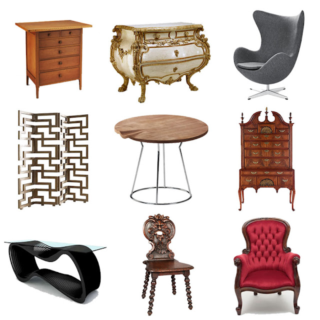
Can You Identify These Different Furniture Styles...?
Furniture design has been a part of the human experience since the beginning of history and as such there are a vast array of furniture styles that have developed over time. Some have faded away and can now be only found as antique furniture but other furniture styles live on through reproductions in that style. The fact that some furniture styles are still reproduced and mimicked is testament to the quality and style of that furniture that it is still in demand today.

It can be very difficult to differentiate between these styles though and you may have heard phrases like a "Queen Anne Chair", a "Shaker Kitchen" or "Bauhaus Nesting Tables" without being able to visualise what that actually looked like. Well that is where this article comes in handy as we will list all the main furniture design styles and outline their identifying features so you can tell your Art Nouveau from your Arts and Crafts!

This article outlines the following furniture design styles ...

Egyptian Furniture

Egyptian Style Furniture

When we think of Egyptian furniture we imagine the intricate gold gilded ornate furniture found in the tombs of the Pharaohs as opposed to the simple chairs, tables and baskets of the ordinary Egyptians.

The identifying features of ancient Egyptian furniture are...

  • beech wood and mahogany 
  • ornate designs using different colors 
  • depicting animals, gods and goddesses 
  • gold gilding and inlays 
  • mosaic designs 
  • mother-of-pearl inlays

Greek Furniture

Greek Style Furniture

Ancient Greek furniture is possibly still most remembered for the famous klismos chair, shown above.

The identifying features of ancient Greek furniture are... 

  • elegant and tasteful
  • detailed carving and inlays
  • select detailing, not cluttered
  • comfortable rather than decorative

Renaissance Furniture

Renaissance Style Furniture

Along with the other arts, the Italian Renaissance of the fourteenth and fifteenth century marked a rebirth in furniture design, often inspired by the Greco-Roman traditions.

The identifying features of renaissance furniture are... 

  • ornate and opulent
  • form above function
  • gilded designs 
  • floral, vegetable and scrolling ornamentation

Jacobean Furniture

Jacobean Style Furniture

After the Renaissance there was a gradual change to a less ornamented, quieter style of furniture.In general furniture profiles became lower and more rectangular.

The identifying features of Jacobean furniture are...

  • stern, square, and frugal
  • colourful upholstery with tasselled trim
  • straight lines & rigid designs
  • sturdy construction
  • dark finish

Queen Anne Furniture

Queen Anne Style Furniture

The Queen Anne style is a style with a moderate proportion and graceful appearance. It is named after Queen Anne of England who reigned from 1702-1714.

The identifying features of Queen Anne furniture are...

  • graceful and refined
  • cabriole legs terminating in a pad or drake foot
  • fiddle-back chair backs
  • bat wing shaped drawer pulls
  • cushioned and covered with fabric

Colonial furniture

Colonial Style Furniture

These pieces were generally sturdy and heavily carved, many with turned legs and bun feet. In the harsher environment of some of the Colonies these pieces were simpler representatives of their parent styles, befitting the more straightforward and utilitarian life of the settlers.

The identifying features of colonial furniture are...

  • less ornate than European furniture of the same style period
  • combing features of previous styles
  • variety of wood types used
  • chair arms have slight outward curve

Rococo Furniture

Rococo Style Furniture

In the eighteenth century, furniture design began to develop rapidly and styles such as Rococo and Neoclassicism were commonplace throughout Western Europe.

The identifying features of Rococo furniture are... 

  • Natural motifs
  • Elaborate carved forms
  • Asymmetry
  • Curved forms are common in Rococo
  • Rocaille carving
  • Acanthus leaf

Shaker furniture

Shaker Style Furniture

The Shaker style was produced by the religious group the United Society of Believers in self-contained communities in the United States.

The identifying features of shaker furniture are...

  • simple, utilitarian style 
  • straight tapered legs
  • woven chair seats
  • and mushroom-shaped wooden knobs
  • rectilinear and attenuated forms
  • restrained ornamentation

Back to Top


Victorian furniture
Victorian Style Furniture

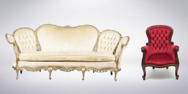
The Victorian style draws its influence from previous Gothic forms. It is named for Queen Victoria of England who reigned from 1837-1901 and was the first furniture style of mass production.

The identifying features of Victorian furniture are...

  • heavy proportions
  • dark finish
  • elaborate carving and ornamentation.
  • somber appearance
  • balloon-shaped chair backs

Arts & Crafts furniture

Arts and Crafts Style Furniture

Arts & Crafts furniture is simple, with straight lines and little ornamentation.The terms Mission and Craftsmen can also used to describe Arts and Crafts furniture.

The identifying features of Arts & Crafts furniture are... 

  • rectilinear design
  • simple, straight construction
  • exposed joinery
  • using medium or dark stained oak
  • bail handles with rectangular back plate

Art Nouveau Furniture

Art Nouveau Style Furniture

The name "Art Nouveau" is French for 'new art', and it emerged in the late 19th century in Paris. The style was said to be influenced strongly by the lithographs of Czech artist Alphonse Mucha, whose flat imagery with strong curved lines was seen as a move away from the academic art of the time.

The identifying features of Arts Nouveau furniture are...  

  • intricately detailed
  • lines and curves used as ornamentation
  • inlays and veneers also used
  • hard woods and iron commonly used
  • strong yet slim furniture pieces
Back to Top

Bauhaus Furniture

Bauhaus Style Furniture

The Bauhaus school was founded by Walter Gropius in Weimar in 1919. In spite of its name, and the fact that its founder was an architect, the Bauhaus was founded with the idea of creating a 'total' work of art in which all arts, including furniture would eventually be brought together.

The identifying features of Bauhaus furniture are...  

  • minimalist & non-ornamental
  • hand crafted but appears mass produced
  • organic and natural materials
  • mainly black in color
  • smooth and rounded shapes

Art Deco Furniture

Art Deco Style Furniture

The Art Deco movement began in Paris in the 1920s and it represented elegance, glamour, functionality and modernity. Art deco's linear symmetry was a distinct departure from the flowing asymmetrical organic curves of its predecessor style Art Nouveau.

The identifying features of Art Deco furniture are...

  • practical and simple designs
  • founded on mathematical geometric shapes
  • triangular shapes, chevron patterns, stepped forms, sweeping curves and sunburst motifs
  • new materials such as aluminum, stainless steel, plastics and lacquer
  • exotic materials like shark-skin and zebra-skin.

Modern Furniture

Modern Style Furniture

The forms of modern furniture sought newness, originality, technical innovation, and ultimately conveyed the present and the future, rather than what had gone before it as revival styles had done. This interest in new and innovative materials and methods produced a certain blending of the disciplines of technology and art.

The identifying features of Modern furniture are...

  • new materials included laminated plywood and fibreglass
  • continued use of steel, moulded plywood and plastics
  • simple and geometric shapes
  •  regular use of polished metal
  • style considered pioneering, even shocking

Scandinavian Furniture

Scandinavian Style Furniture

Simplicity and function are the guiding principles that have shaped the design sensibilities of Nordic Europe.

The identifying features of Scandinavian furniture are...

  • natural materials, mainly wood
  • favour neutral colour palettes
  • clean, simple lines 
  • optimal function out of every part of the piece
  • robust and fuss-free
Back to Top


    Wednesday, May 25, 2016

    Graphic Design Styles

    Graphic Design Styles
    Which Graphic Design Style Is Right For Your Project?

    At the start of any graphic design project, you wonder what style should I choose? what style do I like? what style is best for the topic? what style will I feel comfortable with? Whether you're designing a single image or a full house style / company brand the style you use will be dependant on the what is most appropriate for it.

    The following list of graphic design styles is not a definitive list but rather a selection of some of the most common or popular graphic design styles, more styles exist and more are being created all the time. You should use this list to gain a basic understanding of common graphic design styles and what is involved in each of them, how they differ and how to create them.

    This Article Discusses The Following  List Of Different Graphic Design Styles...


    Victorian Style Graphic Design:


    Victorian style graphic design
    Samples of Victorian Style Graphic Design

    The Victorian era of Britain was the period of Queen Victoria’s reign which ran from 1837 to 1901 and was a time of strong moral and religious beliefs. The Victorians loved complex and ornate objects and this influence filtered through to all areas of design including architecture, furniture, interiors, fashion, typography and commercial art. 

    The Victorian style was deeply influenced by their nostalgia for objects from the past. The Victorian design style almost always filled the entire page with images and type. Typical design elements of early Victorian style were the use of outer decorative borders and elaborate typography. Symmetry was also used heavily in layout and design.

    Later Victorian style tended to use the decorative borders less but still used ornate type and romantic imagery. Typography through the Victorian era generally appeared in a curve or wave and was commonly encompassed in a banner.

    To Recap, the main characteristics of the Victorian graphic design style are...

    • decorative outer borders
    • elaborate typography
    • symmetry
    • highly ornate and 'busy' imagery
    • very few straight lines or edges

    Arts & Crafts Style Graphic Design:


    Arts and Crafts Style Graphic Design
    Samples of Arts and Crafts Style Graphic Design

    The Arts and Crafts movement was an international movement in decorative and fine arts that began in Britain and then flourished in Europe and North America between 1880 and 1910, later re-emerging in Japan in the 1920s. It stood for traditional craftsmanship using simple forms, and often featured medieval, romantic, or folk styles of decoration with heavy use of textures and illustrated initials.

    Arts & Crafts advocated economic and social reform and was essentially anti-industrial. It had a strong influence on the arts in Europe until it was replaced by Art Nouveau and Art Deco before being eventually displaced by Modernism in the 1930s.

    To Recap, the main characteristics of the Arts & Crafts graphic design style are... 

    • reused traditional/older style features
    • simple forms
    • illustrated typography
    • lots of textures

    Art Nouveau Style Graphic Design:


    Art Nouveau Style Graphic Design
    Sample of Art Nouveau Style Graphic Design

    Art Nouveau is a style of decorative art, architecture, and design prominent in western Europe and the USA from about 1890 until about 1920 and was characterised by intricate linear designs and flowing curves based on natural forms and an 'earthy' colour palette.

    These identifiable flat, outlined illustrations and hand-drawn typefaces leads to Art Nouveau sometimes being confused with Art Deco, but there is a clear distinction between the two. Art Nouveau looks hand drawn and prefers natural lines and shapes to the highly geometric shapes that define the Art Deco style.

    To Recap, the main characteristics of the Art Nouveau graphic design style are... 

    • intricate hand drawn style
    • linear based designs
    • use of natural forms
    • regularly features female form

    Futurism Style Graphic Design:


    Futurism Style Graphic Design
    Samples of Futurism Style Graphic Design

    Futurism was not only an art movement but also a social movement that developed in Italy in the early 20th century. Although it was largely an Italian phenomenon, there were parallel movements in Russia, England and elsewhere. It emphasized speed, technology, youth, and violence, and objects such as the car, the aeroplane, and the industrial city. It was a movement that particularly despised not just certain aspects of classical antiquity, but everything that was not totally new - the antithesis of Arts & Crafts 

    The painters of Futurism were particularly successful and they often broke light and color down into a series of dots or geometric forms through a process called divisionism. Futurism influenced many modern art movements of the 20th century which in turn influenced the development of contemporary graphic design.

    To Recap, the main characteristics of the Futurism graphic design style are... 

    • eclectic style
    • featuring or using new technology
    • offset text
    • some cubist influences
    • no traditional features

    Art Deco Style Graphic Design:


    Art Deco Style Graphic Design
    Samples of Art Deco Style Graphic Design

    Art Deco had it's heyday in the 1920's and 30's but, as a term, it was not coined until 1925. Art Deco uses sharp, aero-dynamic shapes, Egyptian zigzags, motion lines and, in more modern times, an airbrushed / grainy look. Perfect examples of the Art Deco graphic design style can be found in period comic books, old car show posters, book covers and movie posters.

    These images are defined by geometric shapes, bold curves, strong vertical lines, aerodynamic forms, motion lines, airbrushing and sunbursts  Unlike the Early Modern style, Art Deco highly exercises its use of illustrations and graphic representations of everyday objects. But these features do not do justice to the spirit of the Art Deco style which was bold, positive, industrial and often futuristic and one which emerged from a world rising from the ashes of WW1.

    The Art Deco style itself has also seen a rebirth in recent years, having become increasingly popular over the last decade.

    To Recap, the main characteristics of the Art Deco graphic design style are... 

    • bold geometric shapes
    • use of motion lines and sunbursts
    • high contrast in colours
    • flat (in terms of depth)

    Heroic Realism Style Graphic Design:


    Heroic Realism Style Graphic Design
    Samples of Heroic Realism Style Graphic Design

    Heroic realism is a term which describes art and graphic design used as propaganda. Examples include the Socialist realism style associated with Communist regimes, and the very similar art style associated with Fascism. Its characteristics are easily identifiable from the name; realism and the depiction of figures as ideal types, heroes or symbols, often with explicit rejection of modernism.

    Heroic realism designs were used to propagate the revolution in the Soviet Union during Lenin's time. Both socialist art and Nazi art were explicitly ordered to be heroic and romantic, and were in consequence idealistic rather than realistic in form and style.

    To Recap, the main characteristics of the Heroic Realism graphic design style are...

    • realistic imagery 
    • usually featuring one person
    • promoting an ideal
    • strong message in the text
    • clear, bold font

    Early Modern Style Graphic Design:


    Early Modern Style Graphic Design
    Samples of Early Modern Style Graphic Design

    Early modernism was a time when artists and designers broke from tradition to create a new style of design which would influence all artists and designers around the world. Early modern artists were described as new or experimental, as they changed the way others saw design and art.

    Following on from some of the ideals of the Italian Futurists the Bauhaus was creating a new design philosophy, putting a design's function before its form and rebelling against tradition in preference of anything new and different. This style became known as "modern" and was the start of the rebelling against tradition that has carried through time influencing all the other art and design styles of the world.

    To Recap, the main characteristics of the Early Modern graphic design style are...

    • geometrically based
    • minimalistic approach
    • clean type
    • more photos, less illustrations

    American Kitsch Style Graphic Design:


    American Kitsch Style Graphic Design
    Samples of American Kitsch Style Graphic Design

    The Art Deco influence of rounded streamlined forms and enthusiasm for modern ideas continued to inspire design of all kinds for many years after the 1930s and American Kitsch design of the 1950s took futuristic styles even further with dramatic curves and space-age forms. Kitsch design was also characterized by its script fonts, informal shapes, and cartoon-like illustrations.

    Kitsch is a German word meaning "in bad taste". In design, kitsch had been used to describe art or design that is pretentious, vulgar and displays a complete lack of sophistication. On the other hand, the idea that something is so bad that it’s good is how "kitsch" became a term ironically embraced by the American designers using that style.

    To Recap, the main characteristics of the American Kitsch graphic design style are...

    • contrasting imagery and fonts
    • bold, vibrant colours
    • aerodynamic shapes
    • people in dramatic poses

    Late Modern Style Graphic Design:


    Late Modern Style Graphic Design
    Samples of Late Modern Style Graphic Design

    Late modernism encompasses the overall production of most recent art made between the aftermath of World War II and the early years of the 21st century. The terminology often points to similarities between late modernism and post-modernism although there are differences while the predominant term for artwork produced since the 1950's is Contemporary Art.

    Known for, distorted geometric shapes, and informal layouts. The only aspect of this style that isn't informal is the type, which was devoid of decoration.

    To Recap, the main characteristics of the Late Modern graphic design style are...

    • distorted geometric shapes
    • informal structural layout
    • plain, simple, non decorative type

    Swiss/International Style Graphic Design:


    Swiss International Style Graphic Design
    Samples of Swiss Style Graphic Design

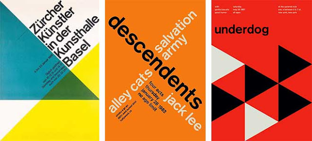
    Often referred to as the International Typographic Style or the International Style, the style of design that originated in Switzerland in the 1940s was the basis of much of the development of graphic design during the mid to late 20th century. Led by designers at the Zurich School of Arts and Krafts and the Basel School of Design, the style favoured simplicity, legibility and objectivity.

    Of the many contributions to develop from the two schools were the use of, sans-serif typography, grids and asymmetrical layouts. Also stressed was the combination of typography and photography as a means of visual communication. The primary influential works were developed as posters, which were seen to be the most effective means of communication.

    To Recap, the main characteristics of the International graphic design style are...

    • use of negative space
    • very 'clean' and simple
    • sans serif fonts favoured
    • asymmetrical layouts

     Psychedelic Style Graphic Design:

    Psychedelic Style Graphic Design
    Samples of  Psychedelic Style Graphic Design

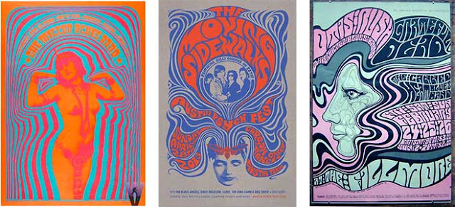
    The psychedelic movement began in the mid 1960’s and had an effect on many aspects of popular culture. This included style of dress, art, literature and philosophy. The name “psychedelic” refers to drugs that were popular with the youth culture of the time. Posters for rock concerts tried to visually express the feeling of tripping out. The visual motifs of psychedelic art include Art Nouveau-inspired curvilinear shapes, illegible hand-drawn type, and intense optical colour vibration inspired by the pop art movement.

    Use of abstracted curvilinear shapes, clashing colours, hard-to-read fonts. Rarely used in today’s designs, the trippy posters of the 60's are the most easily recognizable contribution of the Psychedelic style.

    To Recap, the main characteristics of the Psychedelic graphic design style are...

    • influenced by the prevalence of hallucinatory drugs 
    • featuring abstract swirls of intense color 
    • curvilinear calligraphy reminiscent of Art Nouveau. 
    • intense optical colour vibration

    Post-Modern Style Graphic Design:


    Post Modern Style Graphic Design
    Samples of Post Modern Style Graphic Design

    Post-modernism didn't have much impact on graphic design until the middle of the 1980's. Initially, many designers thought it was just undisciplined self-indulgence. A hodgepodge of styles, with no unifying ideals or formal vocabularies, dreamed up by students in the new graduate programs. But in fact it was a new way of thinking about design, one that instigated a new way of designing. This mixed up style is characterized by a tilted axis, collage-like illustrations, overlying figures, and impulsive decoration. This style has been used in varying degrees since its first uses and, if used correctly, can give projects a unique expression.

    They created works beginning in the 1970s without any set adherence to rational order and formal organization. They also seemed to entirely pay no attention to traditional conventions such as legibility. Yet, while post-modern design did not consist of one unified graphic style, the movement was an expressive and playful time for designers who searched for more and more ways to go against the system.

    To Recap, the main characteristics of the Post Modern graphic design style are...

    • collage like illustrations
    • overlapping elements
    • impulsive and playful
    • tilted axis

    Grunge Style Graphic Design:


    Grunge Style Graphic Design
    Samples of Grunge Style Graphic Design

    A recent design evolution, this emerged post millennium and is easily recognized by its extensive use of distressed textures, unrefined edges, and a seemingly nonsensical approach to layout.

    In such grunge designs dirty stains, torn images, 'broken' icons and creased pieces of paper are as popular as hand-drawn elements and dirty textures. The main purpose of hand-drawn elements lies in their ability to convey a personality and an individual note. And dirty textures are often used as background images for navigation menus, photos and overall layouts. Usually these elements are regular objects from our daily life, replicated in their real form without any glossy effects.

    To Recap, the main characteristics of the Grunge graphic design style are...

    • Dirty textures and background images
    • irregular lines and frames
    • coffee rings, spilled out liquids and dirty stains
    • torn paper and dirty edges
    • hand-written elements

    Flat Style Graphic Design:


    Flat Style Graphic Design
    Samples of Flat Style Graphic Design

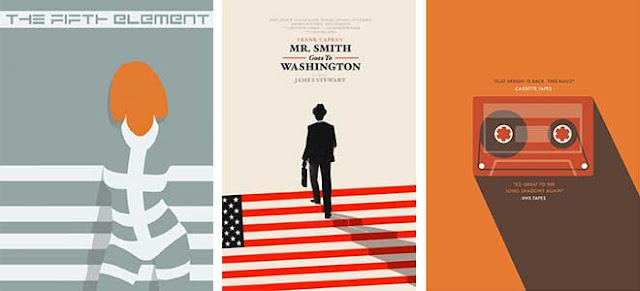
    Flat design is a current design style and trend, minimalist in nature, it was initially used in graphical user interfaces such as websites, web applications and mobile apps. The flat design style is now also commonly seen in graphical materials as posters, arts, guide documents, publishing products.

    Flat design is primarily influenced by the International Typographic Style (also known as Swiss Style), Text User Interface, Modernism, and the styles emerging from Bauhaus. The International Typographic style is often considered the most substantial influence on flat design and is regarded as the starting point of flat design, although the flat design style itself would not make an appearance until the dawn of the digital age

    To Recap, the main characteristics of the Flat graphic design style are...

    • minimalist
    • no depth
    • neutral tones
    • straight lines
    • use of negative space

    Quick Overview...

    The Graphic Design Timeline - Click to enlarge

    Back To Top

    *Having read this you also find our Furniture Design Styles or Interior Design Styles articles useful.


    Thursday, March 3, 2016

    Interior Design Styles

    Interior Design Styles

    At the start of any interior design project, you wonder what style should I choose? what style do I like? what style will look good in that space? what style will I feel comfortable with? Whether you're decorating a single room or a whole house, a bungalow or a mansion the style will change dependant on the existing space and what is appropriate for it.

    The following list of interior design styles is not a definitive list but rather a selection of some of the most common or popular interior design styles, more styles exist and more are being created all the time. You should use this list to gain a basic understanding of common interior design styles and what is involved in each of them, how they differ and how to create them.

    This article discusses the following types of interior design styles...

    Modern Style Interior Design:


    Modern Style Interior Design
    Modern Style Interior Design

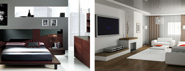
    The creation of the modern interior design style is credited to a group of European designers that started the Bauhaus School of Design in Germany in 1919. The Bauhaus philosophy is that form and function should combine in all designs. Modern Style design is clean-lined and focuses first and foremost on function and avoids the excessive accessories and decorative elements seen in many other styles. Some people feel the modern design is too simple, harsh or cold, however when well planned it can promote a sense of calmness and simplicity to your home.

    The modern style is ideal for apartments and small spaces as it maximizes space and create the impression that a room is larger than it actually is. Minimal textures and bold geometric forms, neutral colours accented with a single bold colour along with polished finishes and asymmetrical balance are key identifying features of modern style interiors.


    To Recap, the main characteristics of the modern interior design style are...

    • Clean lined design 
    • Function before form. 
    • Avoids excessive accessories and decorations 
    • Minimal use of textures 
    • Asymmetrical balance in furniture and layout


      Contemporary Style Interior Design:


      Contemporary Style Interior Design
      Contemporary Style Interior Design
      The terms modern interior design and contemporary interior design are often used interchangeably, however there is a difference between the two. Contemporary interior design can only mean trendy looks that are in style at any current moment, while modern interior design refers to the specific geometrical, clean-lined style called modern. The fact that the modern style may also be a part of a current look or trend adds to the confusion between modern and contemporary.

      Contemporary interiors are comfortable and welcoming without being cluttered and dark and is a style that is equally appropriate for offices and stores, lofts and homes. A contemporary style home can be a quiet and comfortable retreat. The key identifying feature of a contemporary style interior design is line. Line can be used through the use of bold colour blocks, high ceilings, "square" edged furniture, linear wooden floors, floor mats, bare windows and geometric shapes in wall art and sculpture. The bare space, on walls, between pieces of furniture, and above in upper areas also become just as important as the areas filled with objects. Each piece stands out as individual and unique.

      Smooth, clean, geometric shapes are essential for contemporary style furniture pieces with upholstered furniture usually in black, white, or another neutral tone.These pieces should be simple and uncluttered, without curves or decoration. Sofas, chairs, and Ottomans usually have exposed legs with Beds and chairs usually having no trims or tassels. In conclusion, with contemporary interiors, less is more. Go basic, bare, bold, and structural with bespoke, unique and individual furniture.

      To Recap, the main characteristics of the contemporary interior design style are... 

      • Refers to in style or trendy looks. 
      • Basic, bare but bold. 
      • Negative space as important as objects 
      • Smooth, clean and geometric shapes essential. 
      • Bespoke and unique furniture.


      Minimalist Style Interior Design:


      Minimalist Style Interior Design
      Minimalist Style Interior Design

      Minimalist architecture became popular in the late 1980s in London and New York, where designers worked to achieve simplicity, using white elements, cold white or blue lighting, large spaces with minimum objects and furniture. The concept of minimalist design is to strip everything down to its essential quality and achieve simplicity. Minimalism simplifies living spaces to reveal the essential quality of buildings and conveys simplicity in attitudes toward life. It is inspired from the Japanese traditional design and the concept of Zen philosophy.

      The idea is not completely without ornamentation, but everything is as reduced down to a stage where you cannot remove anything further to improve the design, or without dis-improving it. The basic geometric forms, elements without decoration, simple materials and the repetitions of structures can represent a sense of order and essential quality. The movement of natural light in minimalist buildings reveals simple and clean spaces. In order to successfully implement a minimalist style storage is key in order to allow the space to remain minimal while still retaining the essential objects you use within that space. Minimalist kitchens are an excellent example of this, where clever use of space and hidden storage is regularly used.

      To Recap, the main characteristics of the minimalist interior design style are... 


      • Cool colours and white or blue lighting. 
      • Large open spaces with minimum furniture, essentials only. 
      • Reduced to ideal quantity. 
      • Storage is key to maintaining minimalism. 
      • Natural light used as a feature.


      Classic Style Interior Design:


      Classical Style Interior Design
      Classical Style Interior Design


      Classical interior design is based on order, symmetry and balance which relates to the ideals of the Greek and Roman empires. A primary element in classical style is the use of a focal point around which visual balance is achieved, for example a feature fireplace flanked on either side by matching armchairs with an ornate mirror above. The colour palette common to classical interior design style is often inspired by nature. A variety of yellows, blues, greens, browns as well as softer, muted hues like terracottas, greys and pinks are commonly used. When accenting with whites, choose off-white if you want to stay in keeping with a more authentic classical colour palette. Choose bright white if you want a slightly more contemporary feel instead.

      Fabrics used in classical interior design style tend to be elegant without being overly ornate or attention grabbing. Cotton, canvas and velvet are some commonly used in classic interiors. Natural flooring of wood, stone or marble works best in the classically styled environment as they relate well to the natural colour schemes used.

      The key identifying feature of the classic style is symmetry with each side of the room mirrored on either side of a central focal point. Columns are also a feature of classic design, relating back to Greek and Roman architecture, and as such vertical, tone-on-tone stripes on the walls or curtains can represent this. The use of classical ornamentation can also be used to identify a room as being of the classical style.

      To Recap, the main characteristics of the classic interior design style are... 

      • Order, symmetry and balance are key. 
      • Room ordered around a focal point, such as the fireplace. 
      • Natural colours and materials. 
      • Elegant fabrics.


      Art Deco Style Interior Design:


      Art Deco Style Interior Design
      Art Deco Style Interior Design

      The Art Deco style was developed following World War I, to offer people a new style for a new era. The excitement and optimism of post-war Europe and America formed the basis for this glamorous and elegant style of design. Art Deco furniture is streamlined in design. It was modern and sleek for the time while still remaining comfortable. Many designs of furniture used industrial materials such as bent chrome base that gives the piece a rocking effect. Wood pieces are highly lacquered in black, with woods used including exotic Brazilian rosewood, ebony, birds-eye maple, and light maple veneers. Upholstery is typically of velour, making the rigid structural form more comfortable.

      Because Art Deco interiors were relatively minimalist for the time, colours are used sparingly. Most colour schemes include black, combined with another colour such as green, red or white while accent colours are usually chrome and/or gold. Pale blue or dove grey were also commonly used to provide a softening effect against the harsh black.

      Art Deco lighting is extensive including ceiling lights, floor lamps, table lamps and wall lamps. Floor lamps include tall torchieres in wrought iron or chrome with hand blown glass shades. Some are also of black wrought iron. Table lamps of bright nickel with white, clear, frosted, or colourful glass shades are common. Wall lamps can be bronze, aluminium, steel, or silver plated base metal with opaque white or colourful glass shades. All this lighting is warm, usually orange or yellow in colour.

      Surfaces in the Art Deco style are generally sleek and clean, lacking any texture in order to contrast the more decorative and ornate objects and furniture within the space. Mirrors made of nickel, chrome, or silver are decorated with motifs of deer, peacocks, roses, and geometric shapes. Bronze sculptures are sleek covered with coloured or pearl beads. Desk sets of pen and pencil on a base are streamlined in design. Door handles and candlesticks moulded of nickel, chrome, or silver have woodsy or chevron shapes. Frosted glass or black and white marble are used for vases. Inlay is common and adds colour and design. Cameo glass vases show under layers of colour exposed by etching away top layers of white or clear glass. All these decorative and slightly over the top objects were a show of renewed wealth and prosperity after the harsh rationing endured during the war.

      To Recap, the main characteristics of the Art Deco interior design style are... 


      • Glamorous and elegant style. 
      • Industrial metals and lacquered wood. 
      • Black as a main or background colour. 
      • Numerous light sources used. 
      • Bold, colourful patterns. 
      • Intentionally, overly decorative.


      Retro Style Interior Design:


      Retro Style Interior Design
      Retro Style Interior Design

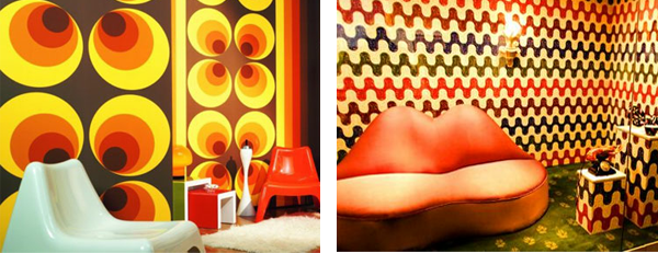
      Every few decades, old designs seems to make a comeback, but with a modern twist. This is referred to as the Retro style, and is an eclectic mix of old styles and new forms, or new forms with old materials and finishes. The post war fifties and psychedelic sixties saw a move towards brighter and bolder colours most likely as a backlash to doom and gloom of the war torn forties. Nowadays Retro interior designs can be described as taking a little bit of these features and bringing them back into the present in order to create a new style of interior design that is both modern and fun.

      As there is so much to choose from past styles, what you decide to include will ultimately be your own interpretation of the past, and will therefore be entirely unique and individual. During each of the past few decades there have been different materials, shapes, colours, artefacts, and gadgets that have left a lasting impression on all of us, some of which may be significant in the memories from our childhood and may therefore be more suited for your personal Retro style. Nowadays, anything from the 50's, 60's or even the 70's is fashionable again. However, because there are so many different ways to go about incorporating a Retro interior style into your home, it can be difficult to recognize it when you see it. The key identifying feature can therefore only be described as an old style with a modern twist.

      To Recap, the main characteristics of the retro interior design style are... 

      • Re imagined existing designs. 
      • Eclectic mix of materials. 
      • Classic objects used. 
      • Can be difficult to recognise.


      Urban Style Interior Design:


      Urban Style Interior Design
      Urban Style Interior Design

      Urban interiors feature non-traditional home materials and design features, often including objects that are more traditionally used in an industrial sense. The Urban style sees the use of galvanised steel, concrete floors, metal siding, exposed beams and unfinished surfaces to create a distinctly modern, bohemian look. Often random, non functional (in household terms) objects are included in Urban interiors to create an outdoor or industrial atmosphere. In more up scale urban interiors, however, the look is far more polished, with bespoke fixtures, sophisticated finishes and clever small space solutions, such as open floor plans that allow for multi-functional rooms.

      This alludes to the central function of urban interiors which is to create space, sometimes in surprising ways. Combination living/working spaces have become traditional in inner cities and industrial areas, often referred to as studio apartments. Renovated warehouses might feature a concrete floor for large scale artwork or production and an upper loft for a living space. Industrial building converted into high-rise apartments, up scale condominiums and mixed-use buildings are other innovations to urban living spaces and rather that fighting the existing industrial feature within these spaces Urban interior design embraces them.

      To Recap, the main characteristics of the urban interior design style are...


      • Use of industrial materials. 
      • Exposed structural materials used as a feature. 
      • Unique (non functional) objects used as features. 
      • Aims to create open space. 
      • Often seen in converted buildings.

      Country Style Interior Design:


      Country Style Interior Design
      Country Style Interior Design

      Country style interior design is cosy bearing the resemblance of cottage style. There are many various culturally different country style designs that have the features of the time and style that was traditional to those countries. Thus you may find such country style types as French country, English country, American country, Italian country or Tuscan, and Modern country. Each type of country style has taken characteristic features of the culture it was used in. English country is relaxed and comfortable incorporating many floral patterns as well as stripes and plaids. Natural light wood, such as oak, is used throughout the English country styles. Open space is not considered important in the country style with large furniture pieces often dominating a space with the walls often decorated with a variety of pictures, utensils or other objects.

      French country style is characterized by deep and bright colours - aubergine, lavender, yellow, azure blue. colours are built into floral and animal patterns. The furniture is robust and basic. Italian country style, also known as Tuscan is warm and rustic. It incorporates such colours as ochre, terracotta, golden yellow, and green. The flooring and fireplaces are made of natural stone. Unfinished wooden pieces and textured walls accentuate the rustic feel. American country style has its main feature in simplicity. The furniture can be stained, painted or unfinished. Modern country style has an updated look. Incorporating modern art, furniture or lighting into the traditional design makes it more up to date but still cosy and lived-in.

      To Recap, the main characteristics of the country interior design style are... 


      • Cosy and comfortable but sometimes cluttered. 
      • Traditional to the context, e.g. French Country, American Country etc. 
      • Natural and floral patterns used with plaids and stripes. 
      • Robust, bulky furniture. 
      • Rough finishes on materials.


      Rococo Style Interior Design:


      Rococo Style Interior Design
      Rococo Style Interior Design

      The Rococo style of interior design is flamboyant and rich with intricate and ornate features. Rococo style peaked during 1700 and 1780 in western Europe and the name Rococo means 'rocaille' in French, which is appropriate as the Rococo's ornate asymmetry was inspired by natural curves of trees, shells, clouds and flowers. Gold plasterwork is one of the key features of Rococo decorating style with lavishly decorated walls and ceilings featuring the contrast of pastels and gold. The use of mirrors was also a feature of Rococo Interiors and they were usually had intricately-shaped, gilded frames.

      Rococo furniture is made of mahogany wood or gilded and upholstered in leather, brocade or velour. It also has carved and sinuous silhouettes that compliment the wall and ceiling finishing, which strengthened the ornate theme. Rococo was known for such colours as yellow, pink, ivory and gold, azure blue and cream. The combination of pastels and gold is a signature mark of this style. Rococo style favoured curved lines so previously used asymmetrical square lines and forms were replaced with circular, oval, spiral and natural forms, even rooms were designed in oval shape or arranged to avoid square form.

      To Recap, the main characteristics of the rococo interior design style are... 


      • Flamboyant and rich. 
      • Lots of intricate, ornate, decorative features. 
      • Gold painted plasterwork contrasting with pastel wall colours. 
      • Multiple ornate mirrors commonly used. 
      • Expensive materials used in furniture, e.g. teak and mahogany. 
      • Curves, spirals and ovals are dominant.


      Georgian Style Interior Design:


      Georgian Style Interior Design
      Georgian Style Interior Design

      Early Georgian style was the tail-end of Queen Anne design, and this gradually became more severe in its lines and architectural detail. The style was copied from Ancient Greece and Rome, however a lot of Chinese design showed through in the interior. Chinese motifs like peonies and chrysanthemums were found in the fabric and Chinese porcelain and motif table lamps were common. colour schemes were pale and subtle cream, dusky rose, sage, pea green, powder blue. Florals were also found, and in more grander houses, gold and murals were the preferred wall coverings. Upholstery and curtains often had matching fabric.

      The Georgian interior design style is characterized by delicate furniture with elaborately carved cabriolet legs, ball-and-claw feet, broken pediments, ornate carvings, piercing and gilding. Fabrics were luxurious, with colours and patterns kept subtle. A royal style extended into common houses with cabriolet legs and claw feet on chairs and baths creating an almost throne-like feel. Mahogany slowly replaced walnut as the wood of choice. The fireplace was the heart of the room and was often fully outfitted with cast iron, carved pillars and medallions, and an opulent fire screen.

      To Recap, the main characteristics of the Georgian interior design style are... 


      • Copied from Ancient Greece and Rome but with Chinese influences. 
      • Decorative porcelain and luxurious fabrics as features. 
      • Motifs like peonies and chrysanthemums used. 
      • Colour schemes were pale and subtle. 
      • Cabriolet legs and claw feet on chairs and baths. 
      • Fireplace at the heart of the room.


      Victorian Style Interior Design:


      Victorian Style Interior Design
      Victorian Style Interior Design

      The Victorian style originated during the Victorian era and is often described as opulent and luxurious. Victorian style is the near opposite to minimalism, it is based on an excessive amount of ornate and flamboyant decorations, accessories, the more you have on display the better. But Victorian style also includes features in order to avoid clutter. The excessive decorative furniture and ornament are contrasted by plain floor and wall surfaces.

      The Victorian Style uses deep hues, pastels and neutral colours contrast the rich textures against the bright shades in upholstery and wall coverings. Exotic materials and heavy woods became available during Victorian era and were used extensively in the furniture of the time but today you can find pieces of Victorian style furniture in cheaper materials. This has seen a recent revival in the style with a type of modern Victorian style emerging.

      To Recap, the main characteristics of the Victorian interior design style are...


      • Opulent and luxurious with excessive decorations. 
      • Walls and floors kept plain to contrast decorative features. 
      • Decorative but uncluttered. 
      • Deep hues of pastel and neutral colours. 
      • Exotic woods used in furniture.
      Back to Top

      *If you enjoyed this you may also enjoy reading about Graphic Design Styles or Furniture Design Styles.


      close
      Banner iklan disini