 |
| Which Graphic Design Style Is Right For Your Project? |
At the start of any graphic design project, you wonder what style should I choose? what style do I like? what style is best for the topic? what style will I feel comfortable with? Whether you're designing a single image or a full house style / company brand the style you use will be dependant on the what is most appropriate for it.
The following list of graphic design styles is not a definitive list but rather a selection of some of the most common or popular graphic design styles, more styles exist and more are being created all the time. You should use this list to gain a basic understanding of common graphic design styles and what is involved in each of them, how they differ and how to create them.
This Article Discusses The Following List Of Different Graphic Design Styles...
Victorian Style Graphic Design:
 |
| Samples of Victorian Style Graphic Design |
The Victorian era of Britain was the period of Queen Victoria’s reign which ran from 1837 to 1901 and was a time of strong moral and religious beliefs. The Victorians loved complex and ornate objects and this influence filtered through to all areas of design including architecture, furniture, interiors, fashion, typography and commercial art.
The Victorian style was deeply influenced by their nostalgia for objects from the past. The Victorian design style almost always filled the entire page with images and type. Typical design elements of early Victorian style were the use of outer decorative borders and elaborate typography. Symmetry was also used heavily in layout and design.
Later Victorian style tended to use the decorative borders less but still used ornate type and romantic imagery. Typography through the Victorian era generally appeared in a curve or wave and was commonly encompassed in a banner.
To Recap, the main characteristics of the Victorian graphic design style are...
- decorative outer borders
- elaborate typography
- symmetry
- highly ornate and 'busy' imagery
- very few straight lines or edges
Arts & Crafts Style Graphic Design:
 |
| Samples of Arts and Crafts Style Graphic Design |
The Arts and Crafts movement was an international movement in decorative and fine arts that began in Britain and then flourished in Europe and North America between 1880 and 1910, later re-emerging in Japan in the 1920s. It stood for traditional craftsmanship using simple forms, and often featured medieval, romantic, or folk styles of decoration with heavy use of textures and illustrated initials.
Arts & Crafts advocated economic and social reform and was essentially anti-industrial. It had a strong influence on the arts in Europe until it was replaced by Art Nouveau and Art Deco before being eventually displaced by Modernism in the 1930s.
To Recap, the main characteristics of the Arts & Crafts graphic design style are...
- reused traditional/older style features
- simple forms
- illustrated typography
- lots of textures
Art Nouveau Style Graphic Design:
 |
| Sample of Art Nouveau Style Graphic Design |
Art Nouveau is a style of decorative art, architecture, and design prominent in western Europe and the USA from about 1890 until about 1920 and was characterised by intricate linear designs and flowing curves based on natural forms and an 'earthy' colour palette.
These identifiable flat, outlined illustrations and hand-drawn typefaces leads to Art Nouveau sometimes being confused with Art Deco, but there is a clear distinction between the two. Art Nouveau looks hand drawn and prefers natural lines and shapes to the highly geometric shapes that define the Art Deco style.
To Recap, the main characteristics of the Art Nouveau graphic design style are...
- intricate hand drawn style
- linear based designs
- use of natural forms
- regularly features female form
Futurism Style Graphic Design:
 |
| Samples of Futurism Style Graphic Design |
Futurism was not only an art movement but also a social movement that developed in Italy in the early 20th century. Although it was largely an Italian phenomenon, there were parallel movements in Russia, England and elsewhere. It emphasized speed, technology, youth, and violence, and objects such as the car, the aeroplane, and the industrial city. It was a movement that particularly despised not just certain aspects of classical antiquity, but everything that was not totally new - the antithesis of Arts & Crafts
The painters of Futurism were particularly successful and they often broke light and color down into a series of dots or geometric forms through a process called divisionism. Futurism influenced many modern art movements of the 20th century which in turn influenced the development of contemporary graphic design.
To Recap, the main characteristics of the Futurism graphic design style are...
- eclectic style
- featuring or using new technology
- offset text
- some cubist influences
- no traditional features
Art Deco Style Graphic Design:
 |
| Samples of Art Deco Style Graphic Design |
Art Deco had it's heyday in the 1920's and 30's but, as a term, it was not coined until 1925. Art Deco uses sharp, aero-dynamic shapes, Egyptian zigzags, motion lines and, in more modern times, an airbrushed / grainy look. Perfect examples of the Art Deco graphic design style can be found in period comic books, old car show posters, book covers and movie posters.
These images are defined by geometric shapes, bold curves, strong vertical lines, aerodynamic forms, motion lines, airbrushing and sunbursts Unlike the Early Modern style, Art Deco highly exercises its use of illustrations and graphic representations of everyday objects. But these features do not do justice to the spirit of the Art Deco style which was bold, positive, industrial and often futuristic and one which emerged from a world rising from the ashes of WW1.
The Art Deco style itself has also seen a rebirth in recent years, having become increasingly popular over the last decade.
To Recap, the main characteristics of the Art Deco graphic design style are...
- bold geometric shapes
- use of motion lines and sunbursts
- high contrast in colours
- flat (in terms of depth)
Heroic Realism Style Graphic Design:
 |
| Samples of Heroic Realism Style Graphic Design |
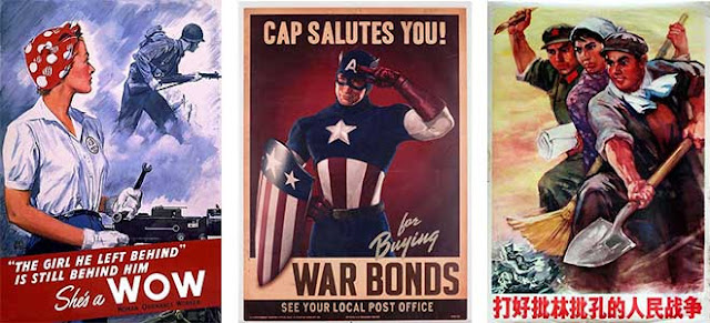
Heroic realism is a term which describes art and graphic design used as propaganda. Examples include the Socialist realism style associated with Communist regimes, and the very similar art style associated with Fascism. Its characteristics are easily identifiable from the name; realism and the depiction of figures as ideal types, heroes or symbols, often with explicit rejection of modernism.
Heroic realism designs were used to propagate the revolution in the Soviet Union during Lenin's time. Both socialist art and Nazi art were explicitly ordered to be heroic and romantic, and were in consequence idealistic rather than realistic in form and style.
To Recap, the main characteristics of the Heroic Realism graphic design style are...
- realistic imagery
- usually featuring one person
- promoting an ideal
- strong message in the text
- clear, bold font
Early Modern Style Graphic Design:
 |
| Samples of Early Modern Style Graphic Design |
Early modernism was a time when artists and designers broke from tradition to create a new style of design which would influence all artists and designers around the world. Early modern artists were described as new or experimental, as they changed the way others saw design and art.
Following on from some of the ideals of the Italian Futurists the Bauhaus was creating a new design philosophy, putting a design's function before its form and rebelling against tradition in preference of anything new and different. This style became known as "modern" and was the start of the rebelling against tradition that has carried through time influencing all the other art and design styles of the world.
To Recap, the main characteristics of the Early Modern graphic design style are...
- geometrically based
- minimalistic approach
- clean type
- more photos, less illustrations
American Kitsch Style Graphic Design:
 |
| Samples of American Kitsch Style Graphic Design |
The Art Deco influence of rounded streamlined forms and enthusiasm for modern ideas continued to inspire design of all kinds for many years after the 1930s and American Kitsch design of the 1950s took futuristic styles even further with dramatic curves and space-age forms. Kitsch design was also characterized by its script fonts, informal shapes, and cartoon-like illustrations.
Kitsch is a German word meaning "in bad taste". In design, kitsch had been used to describe art or design that is pretentious, vulgar and displays a complete lack of sophistication. On the other hand, the idea that something is so bad that it’s good is how "kitsch" became a term ironically embraced by the American designers using that style.
To Recap, the main characteristics of the American Kitsch graphic design style are...
- contrasting imagery and fonts
- bold, vibrant colours
- aerodynamic shapes
- people in dramatic poses
Late Modern Style Graphic Design:
 |
| Samples of Late Modern Style Graphic Design |
Late modernism encompasses the overall production of most recent art made between the aftermath of World War II and the early years of the 21st century. The terminology often points to similarities between late modernism and post-modernism although there are differences while the predominant term for artwork produced since the 1950's is Contemporary Art.
Known for, distorted geometric shapes, and informal layouts. The only aspect of this style that isn't informal is the type, which was devoid of decoration.
To Recap, the main characteristics of the Late Modern graphic design style are...
- distorted geometric shapes
- informal structural layout
- plain, simple, non decorative type
Swiss/International Style Graphic Design:
 |
| Samples of Swiss Style Graphic Design |
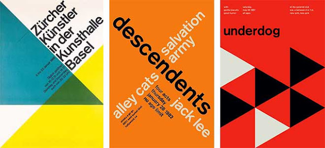
Often referred to as the International Typographic Style or the International Style, the style of design that originated in Switzerland in the 1940s was the basis of much of the development of graphic design during the mid to late 20th century. Led by designers at the Zurich School of Arts and Krafts and the Basel School of Design, the style favoured simplicity, legibility and objectivity.
Of the many contributions to develop from the two schools were the use of, sans-serif typography, grids and asymmetrical layouts. Also stressed was the combination of typography and photography as a means of visual communication. The primary influential works were developed as posters, which were seen to be the most effective means of communication.
To Recap, the main characteristics of the International graphic design style are...
- use of negative space
- very 'clean' and simple
- sans serif fonts favoured
- asymmetrical layouts
Psychedelic Style Graphic Design:
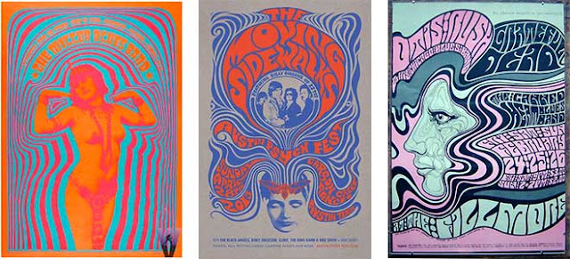
The psychedelic movement began in the mid 1960’s and had an effect on many aspects of popular culture. This included style of dress, art, literature and philosophy. The name “psychedelic” refers to drugs that were popular with the youth culture of the time. Posters for rock concerts tried to visually express the feeling of tripping out. The visual motifs of psychedelic art include Art Nouveau-inspired curvilinear shapes, illegible hand-drawn type, and intense optical colour vibration inspired by the pop art movement.
Use of abstracted curvilinear shapes, clashing colours, hard-to-read fonts. Rarely used in today’s designs, the trippy posters of the 60's are the most easily recognizable contribution of the Psychedelic style.
To Recap, the main characteristics of the Psychedelic graphic design style are...
- influenced by the prevalence of hallucinatory drugs
- featuring abstract swirls of intense color
- curvilinear calligraphy reminiscent of Art Nouveau.
- intense optical colour vibration
Post-Modern Style Graphic Design:
 |
| Samples of Post Modern Style Graphic Design |
Post-modernism didn't have much impact on graphic design until the middle of the 1980's. Initially, many designers thought it was just undisciplined self-indulgence. A hodgepodge of styles, with no unifying ideals or formal vocabularies, dreamed up by students in the new graduate programs. But in fact it was a new way of thinking about design, one that instigated a new way of designing. This mixed up style is characterized by a tilted axis, collage-like illustrations, overlying figures, and impulsive decoration. This style has been used in varying degrees since its first uses and, if used correctly, can give projects a unique expression.
They created works beginning in the 1970s without any set adherence to rational order and formal organization. They also seemed to entirely pay no attention to traditional conventions such as legibility. Yet, while post-modern design did not consist of one unified graphic style, the movement was an expressive and playful time for designers who searched for more and more ways to go against the system.
To Recap, the main characteristics of the Post Modern graphic design style are...
- collage like illustrations
- overlapping elements
- impulsive and playful
- tilted axis
Grunge Style Graphic Design:
 |
| Samples of Grunge Style Graphic Design |
A recent design evolution, this emerged post millennium and is easily recognized by its extensive use of distressed textures, unrefined edges, and a seemingly nonsensical approach to layout.
In such grunge designs dirty stains, torn images, 'broken' icons and creased pieces of paper are as popular as hand-drawn elements and dirty textures. The main purpose of hand-drawn elements lies in their ability to convey a personality and an individual note. And dirty textures are often used as background images for navigation menus, photos and overall layouts. Usually these elements are regular objects from our daily life, replicated in their real form without any glossy effects.
To Recap, the main characteristics of the Grunge graphic design style are...
- Dirty textures and background images
- irregular lines and frames
- coffee rings, spilled out liquids and dirty stains
- torn paper and dirty edges
- hand-written elements
Flat Style Graphic Design:
 |
| Samples of Flat Style Graphic Design |
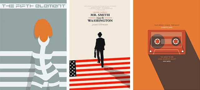
Flat design is a current design style and trend, minimalist in nature, it was initially used in graphical user interfaces such as websites, web applications and mobile apps. The flat design style is now also commonly seen in graphical materials as posters, arts, guide documents, publishing products.
Flat design is primarily influenced by the International Typographic Style (also known as Swiss Style), Text User Interface, Modernism, and the styles emerging from Bauhaus. The International Typographic style is often considered the most substantial influence on flat design and is regarded as the starting point of flat design, although the flat design style itself would not make an appearance until the dawn of the digital age
To Recap, the main characteristics of the Flat graphic design style are...
- minimalist
- no depth
- neutral tones
- straight lines
- use of negative space
Quick Overview...
 |
| The Graphic Design Timeline - Click to enlarge |
Back To Top
*Having read this you also find our Furniture Design Styles or Interior Design Styles articles useful.


