Details matter. Details are what separate a mansion from a mcmansion, a generic box from a lovely structure, a house from a home. They need not be as ornate or historic as those at the Musee Nissim de Camondo in Paris but any good architect or designer will fill a home with lovely touches that will separate the wheat from the chaff.
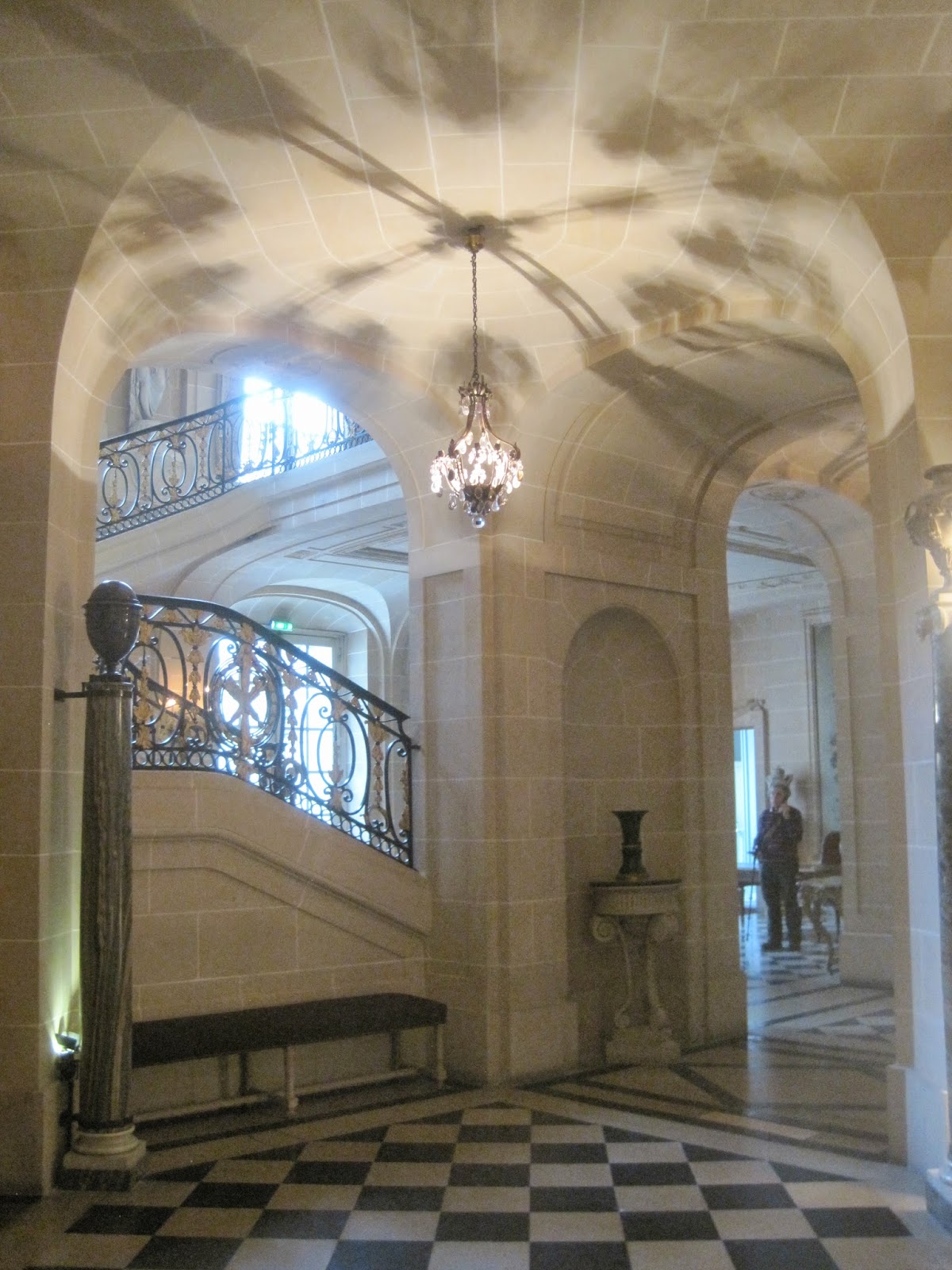
The stairhall that I mentioned yesterday HERE features this lovely plaster painted to appear as limestone blocks. Notice how each individual block, separated by the thin white 'mortar' lines, is a slightly different tone of French gray? This adds depth and texture to the walls and adds to the illusion of real stone walls.
The above image captures the curtains in the main salon and the boiserie. Notice the many different subtle shades of color picking out the detailing. Nothing high contrast mind you - subtle.
The boiserie in the dining room are also picked out in many colors. The color is softer in real life and less 'lettuce'.
The relatively simple iron railing leading up to the private 2nd floor is probably my favorite.
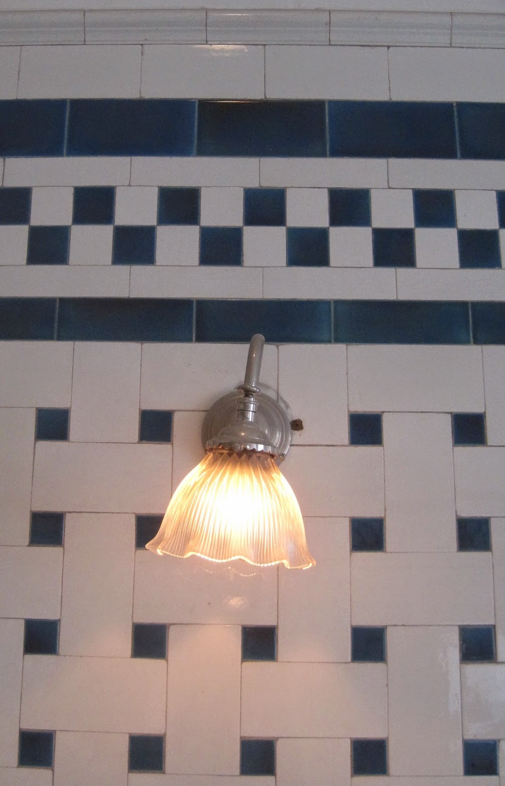
The perfect sconces line this intimate stair.
The interior halls on the 2nd floor which don't benefit from windows still are flooded with natural light from skylights. Notice how the chandelier is hung from the lay-light.
I love the worn finish on this simple door on the 2nd floor corridor with such elegant minimal hardware. Now you have to visit the museum yourself to pick out more lovely details to share!
The stairhall that I mentioned yesterday HERE features this lovely plaster painted to appear as limestone blocks. Notice how each individual block, separated by the thin white 'mortar' lines, is a slightly different tone of French gray? This adds depth and texture to the walls and adds to the illusion of real stone walls.
The lovely tapestry above is delicately designed into the treatment of the wall -not simply hung above the stair as an after-thought.
I warned there would be many light fixture photographs -here is one of them! These Classical gilded sconces line the stairhall.The above image captures the curtains in the main salon and the boiserie. Notice the many different subtle shades of color picking out the detailing. Nothing high contrast mind you - subtle.
The boiserie in the dining room are also picked out in many colors. The color is softer in real life and less 'lettuce'.
The relatively simple iron railing leading up to the private 2nd floor is probably my favorite.
The perfect sconces line this intimate stair.
The interior halls on the 2nd floor which don't benefit from windows still are flooded with natural light from skylights. Notice how the chandelier is hung from the lay-light.
I love the worn finish on this simple door on the 2nd floor corridor with such elegant minimal hardware. Now you have to visit the museum yourself to pick out more lovely details to share!


