Nestled into the ancient Alhambra is the Palace of Charles V which dates to the early 16th century Renaissance. This palace was modeled on ancient Roman architecture which was heavily influential at the time period. Later these Renaissance examples would come to rule and guide Classical architecture.
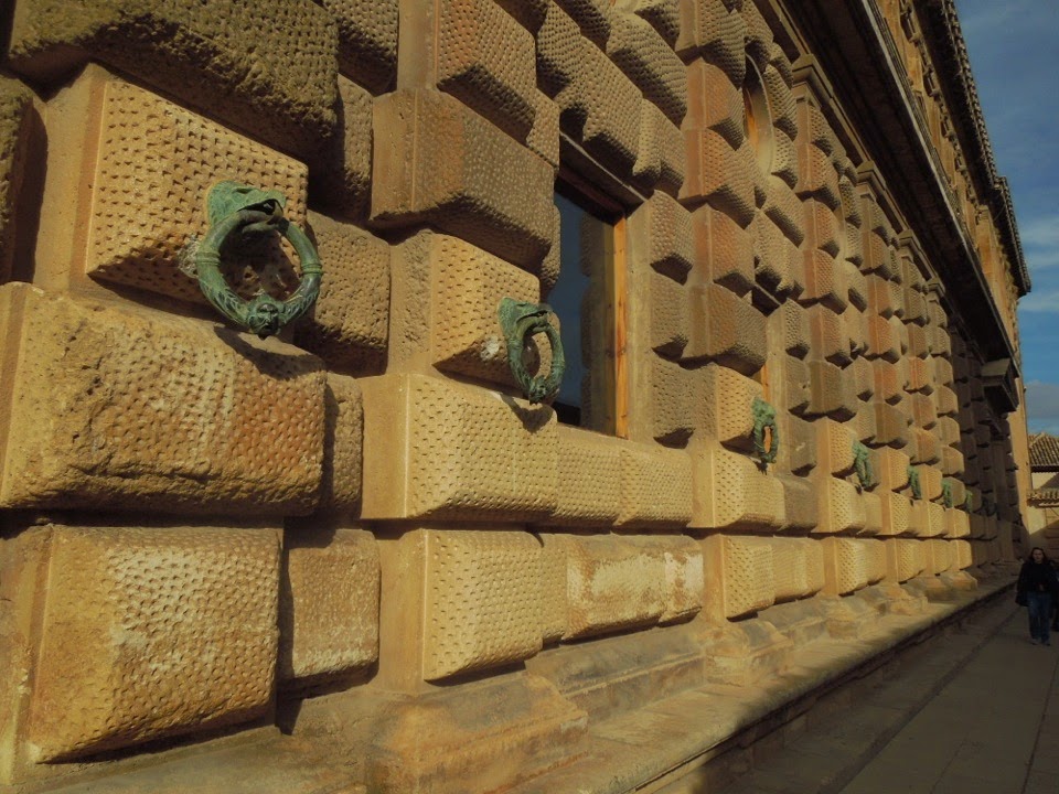
Lets start outside as that's what one encounters first. The strong rusticated base exudes strength but instead of small openings as in a fortress the palace is flooded with large windows and natural light. Fortification is not the primary goal here.
I love the ornate bronze rings that line the lower level. Notice the recent restoration to the stonework with the new stone crisp and clean leaving the weathered stone alone (the way it should be!).
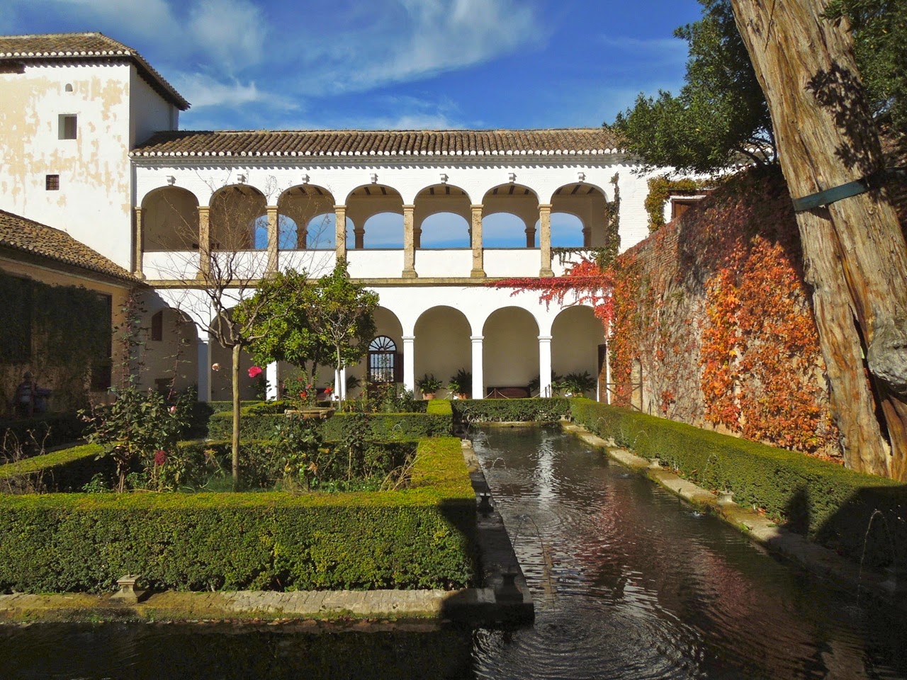
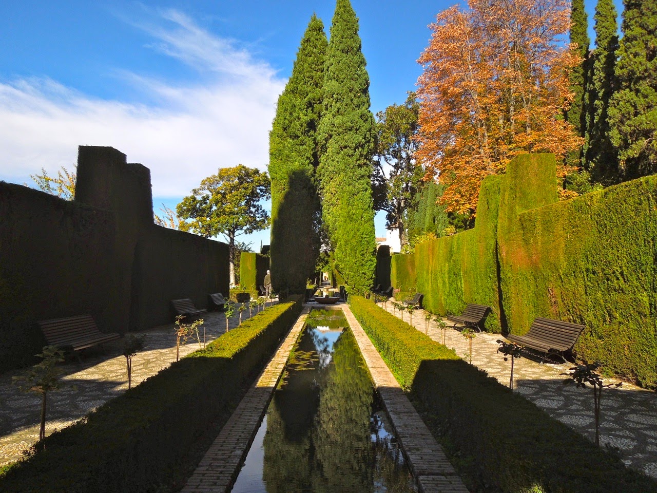
Once inside the gardens make a complete 180. When in Rome....or Granada in this case.....cooling water features are the focus of the gardens. The gardens were actually already in place when the palace was built having been started in the 14th century (the Palacio de Generalife). They were later restored in the 1930s to their current day appearance.
Architect Pedro Machuca was responsible for the building of the Renaissance palace which took over 20 years.
The enormous round interior colonnaded patio is what really impresses me.
Notice the detailed stone work on the interior face of the wall and the beautiful Ionic columns.
Is it any wonder that these Renaissance buildings would come to inspire artisans for 6 centuries?
In this cold winter weather here in Washington these gardens are speaking to me!
Symmetry, balance, and simplicity are key here.
The gardens terrace down the steep hillsides taking advantage of the view.
Thanks as always to my Australian Penpal for providing us with this inspiration!
Who says art museums need white walls? One of the finest art museums in the world, the Thyssen-Bornemisza in Madrid, sports walls in numerous natural shades of umbers, orange, sienna, and yellow (see my recent post on the Givenchy exhibit in the museum HERE)
The pleasant shades complement the art and flatter the skin; great spot for a date!
What do you think of this color palette? The great lighting helps as well. Thanks to my Australian Penpal as always for the photos!
Yesterday (March 18, 2015) was the grand opening of our new Washington Design Center. Washington is finally coming into its own and our new design center just goes to prove that. These gorgeous light-filled showrooms are at the heart of the New Washington action on 14th street NW.
The crowds were soul-crushing, as one expects at these events, but it's important for design professionals to go out and network; share ideas and potential new jobs! I only attended the Holly Hunt showroom opening party out of many events with some very dear friends (hi Steph and Mark!) and thought I would share some highlights with you.
The Holly Hunt showroom is the largest in the design center I believe, measuring in at 10,000 SF over 2 floors. It also is the only showroom to feature a street entrance -welcoming in the public. The ground floor focuses on the more modern collections carried by Holly Hunt while the 2nd floor focuses on the more DC-centric traditional lines. Above the cozy Coco Sofa was empty and beckoning us over to get away from the crowd!
I briefly chatted with Holly Hunt who was delightful. She is intensely focused on bringing new artists and work to the public -meeting and working directly with the artists on items such as their lines of (brilliant) lighting which are the focus of my snapshots here! Alison Berger is one of the prominent lighting artists with these delicious handblown glass fixtures seen in the images here. Above is the Lure sconce - nothing is MORE alluring than a sconce (my favorite lighting source!).
Most popular with us were the Sea Urchin pendants with heavily seeded glass featured below over a nightstand. These are designed by an artist named Stefan Gulassa, no relation (for those readers who don't know, my name is also Stefan).
I loved their updated version of the classic wingchair below upholstered in rope with a luxurious velvet cushion (in my favorite turquoise -this would fit right into my own apartment, how I wish!)
Continuing the conversation from last week (Shades of Umber at the Thyssen-Bornemisza HERE) another direction to go in an art gallery are black walls as seen here at the National Gallery of Victoria in Melbourne.
My Australian Penpal sent these to me -what do you think? I'm a fan of black (these almost look to have a blue tint to them in the lighting) as I think it shows all images in sharp contrast. Even at the small scale of these photographs the paintings are instantly recognizable and in sharp detail thanks to the black background.
I hate the 'trend' (I even hate the word) for black walls in the home but I think in a gallery or retail space it's a brilliant idea. I wouldn't have kept the same black background here at ArchitectDesign for 9 years if I didn't think it worked!